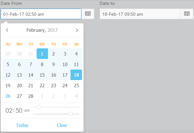
DynamicDateTimePicker is an item type plugin that allows users to select date and time from a calender picker. It is based on a JS Air datePicker (https://github.com/t1m0n/air-datepicker).
Your support means a lot.
- Import plugin file "item_type_plugin_com_planetapex_dynamicdatetimepicker.sql" from source directory into your application
- (Optional) Deploy the CSS/JS files from "src" directory on your webserver and change the "File Prefix" to webservers folder.
- 11 Types of Date and Time Picker to choose from.
- Multi-Languages, 16 Languages support
- Showing Inline as part of the page or On Show events like click, focus or mouse enter
- 8 Display Positions to choose from.
- Date validation Option.
- Custom Date Picker Title
- Previous and Forward Navigation Buttons Icons
Users have many options for the Date and Time Picker types, for example:
- Single Date Picker
- Date Range Picker
- Multiple Dates Picker
- Single Month Picker
- Months Range Picker
- Multiple Months Picker
- Single Year Picker
- Years Range Picker
- Multiple Years Picker
- Time Picker Only
- Date Time Split
To Date(Time) Item This item is used to set the 2nd Value in the following Date Picker Types
- Date Range Picker
- Month Range Picker
- Year Range Picker
- Date Time Split
Each of the Date and Time Picker Type option has an option to apend a time picker to it so that the user can select time as well.
Separator between date and time
Minimum and Maximum hours value, must be between 00 and 23. You will not be able to choose value higher than this.
Minimum and Maximum minutes value, must be between 00 and 59. You will not be able to choose value higher than this.
The expression is a comma separated value between set of Minimum(Hour:Minute) and set of Maximum(Hour:Minute) as Hour:Minute,Hour:Minute
Do not leave any part.
Time from start of the day to 9:30 am then enter as following:
00:00,9:30Restricting Time From 10:30 am to 6:45 pm is as following:
10:30,18:45Multiple Dates separator is used when concatenating dates to string in the following Date Picker types:
- Multiple Dates Picker
- Multiple Months Picker
- Multiple Years Picker
Determine which day the week will be started from.
By default Sunday is considered as first day of the week.
Available options include:
- Sunday
- Monday
- Tuesday
- Wednesday
- Thursday
- Friday
- Saturday
List of day's which will be considered as weekends. Class -weekend- will be added to relevant cells.
By default its Saturday and Sunday.
Available options include:
- Saturday
- Sunday
- Monday
- Tuesday
- Wednesday
- Thursday
- Friday
The minimum date for date picker. All dates, running before it can't be selected.
Minimum and Maximum date usually works well with the following settings:
Disable Navigation When Out Of Range Option. So the user also can't navigate to dates with Minimum and Maximum dates set.
The date value can be:
- an absolute value in "DD/MM/YYYY" or "DD/MM/RRRR" date format mask or
- can be dynamic based on an item substituition value.
Examples
- 02/19/2017
- Item Based . To set the minimum date to the start of the month, Create a P1_MIN_DATE hidden Item and refer it in the Minimum Date attribute as &P1_MIN_DATE. Set its value to start of the Month by the following After Header PL/SQL expression computation:
to_char(trunc(sysdate, 'MM'), 'MM/DD/YYYY')
Remember to use the date 'MM/DD/YYYY' OR 'MM/DD/RRRR' format Mask.
The maximum date for date picker. All dates, running after it can't be selected.
Minimum and Maximum date usually works well with the following settings:
Disable Navigation When Out Of Range Option. So the user also can't navigate to dates with Minimum and Maximum dates set.
The date value can be:
- an absolute value in "DD/MM/YYYY" or "DD/MM/RRRR" date format mask or
- can be dynamic based on an item substituition value.
Examples
- 02/19/2017
- Item Based . To set the maximum date to the end of the month. Create a P1_MAX_DATE hidden Item and refer it in the Maximum Date attribute as &P1_MAX_DATE. Set its value with the following After Header PL/SQL expression computation:
to_char(last_day(sysdate), 'MM/DD/YYYY')
Remember to use the date 'MM/DD/YYYY' OR 'MM/DD/RRRR' format Mask.
Selects the method the date picker calendar displays.
Available options include:
Position of date picker relative to text input.
- First value is name of main axis, and
- Second value is whether the Date Picker is rendered as
- Left(Leftwards)
- Right(Rightwards)
- Up(Upwards)
- Bottom(Downwards)
Available options include:
- Bottom Left
- Bottom Right
- Right Bottom
- Right Top
- Top Left
- Top Right
- Left Top
- Left Bottom
Examples
Right Top will set date picker's position from right side upwards of text input.
Content of datepicker's title depending on current view.
There are three views in the Date Picker
- Days view i.e when selecting days,
- Months view i.e when selecting months and
- Years view i.e when selecting years.
Missing fields will be taken from default values.
This setting can contain simple text, HTML with Styling and relevant, specific format mask. check out examples
Examples
For days view:
"days":"<span style='color:red;background-color:yellow;font-size:2em'>Check In:MM, yyyy</span>" For months view:
"months":"<span style='color:red;background-color:yellow;font-size:2em'>Year:yyyy</span>" For years view:
"years":"<span style='color:red;background-color:yellow;font-size:2em'>Decade:yyyy1 - yyyy2</span>" All can be combined with comma as following
"days":"<span style='color:red;background-color:yellow;font-size:2em'>Check In:MM, yyyy</span>","months":"<span style='color:white;background-color:green;font-size:2em'>Year:yyyy</span>","years":"<span style='color:yellow;background-color:green;font-size:2em'>Decade:yyyy1 - yyyy2</span>"Available options include:
  Hot keys:
        Ctrl + → | ↑- move one month forwards
        Ctrl + ← | ↓- move one month backwards
        Shift + → | ↑- move one year forwards
        Shift + ← | ↓- move one year backwards
        Alt + → | ↑- move 10 years forwards
        Alt + ← | ↓- move 10 years backwards
        Ctrl + Shift + ↑- move to next view
        Esc- hides date picker
Available languages include:
- Chinese
- Czech
- Danish
- Deutsch(German)
- Dutch
- English
- Finnish
- French
- Hungarian
- Polish
- Portuguese
- Portuguese (Brazil)
- Romanian
- Russian
- Slovak
- Spanish

