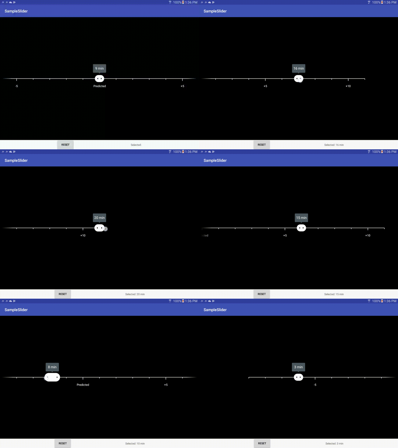
centersliderview-android will not be maintained in this repository going forward. Please use, create issues on, and make PRs to the fork of centersliderview-android located here.
Feel free to browse the sampleslider module for an example of how to use this view.
- The minimum api for this library is 23(M) because
AnimatedVectorDrawables have a minimum API of 23 to callreset(). - Most of the UI is drawn directly to the canvas and accessibility has not been added to this widget.
This repository is public and available to import from JitPack.
In the root build.gradle:
allprojects {
    repositories {
        ...
        maven { url 'https://jitpack.io' }
    }
}
Then, in the appropriate module's build.gradle:
dependencies {
    implementation 'com.github.postmates:centersliderview-android:v1.0.2'
}
The CenterSliderView is a widget, which can be added directly to
your layout files in xml.
See the wiki page on xml attributes for more details. There's also information for overriding colors in this wiki page
When it's time to use the view, a SliderInfo needs to be passed to the setSliderInfo
method on the CenterSliderView. This can be done using the SliderInfo's Builder:
CenterSliderView.SliderInfo info =
    new CenterSliderView.SliderInfo.Builder()
            .setBounds(0, 60)
            .setIntervalsToEdge(6)
            .setLargeTickInterval(5)
            .setStartValue(27)
            .setValueTextOverride(27, "Predicted")
            .build();
sliderView.setSliderInfo(info);
Android has used two different names to describe this type of widget. The material design guidelines call it a discrete slider whereas the original widget in Android's codebase is the android.widget.SeekBar. This custom view adopts the more recent slider name.
This widget selects a single value between a given min and max range, as would be expected from a discrete slider. Instead of showing the entire range, it shows a smaller subset of the allowed numbers and allows the user to pick between that subset. Once a number is chosen, the baseline will animate to recenter itself, such that the dragger sits in the center of the view again.
This slider is primarily achieved by drawing directly to the canvas in onDraw() (not by
adding views to a viewgroup). It uses two AnimatedVectorDrawables to animate the
dragger's expanding and contracting states. The two drawables are swapped out when the
user presses down on the dragger and then lifts up.
The animations themselves are processed by a handler that runs every 16 ms
(~= 60 frames/sec) and calls invalidate(), which then calls onDraw().
xml attributes
drawable overrides
slider design link
developer seekbar link
original blog post
