Statistical visualization functions for Matlab.
daviolinplot, daboxplot, and dabarplot are lightweight statistical visualization functions designed to address the limitations of Matlab's built-in tools and to encourage good data visualization practices (by highlighting features of the data crucial for assessing both its quality and the information it conveys).
All three functions:
- Are created for 2-level factorial data but also work with one-factor data
- Can handle different input types (cell or numeric arrays)
- Are easily customizable for emphasizing data features and maximizing reliability
- Export many handles for furher optimization
- Go hand in hand with 2-way (mixed) ANOVA analysis
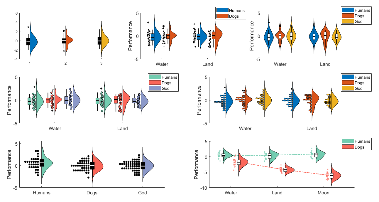
daviolinplot is the best option for highlighitng data distribution properties. It combines boxplots, kernel density, and data scatter to produce different hybrids of violin plots, half-violin plots, raincloud plots, and dotplots. Kernel density highlights the overall shape of the data distribution, which is relevant for the normality assumption. Dotplots, while similar in that regard, also convey information about the exact number of datapoints across the distribution.
Note: dotplots usually require some tweaking to make them look presentable. You may have to play around with bin number ('bins') and marker size ('scattersize') to make it look right.
The examples below illustrate most of the functionality and options (see daviolinplot_demo.m for the code).
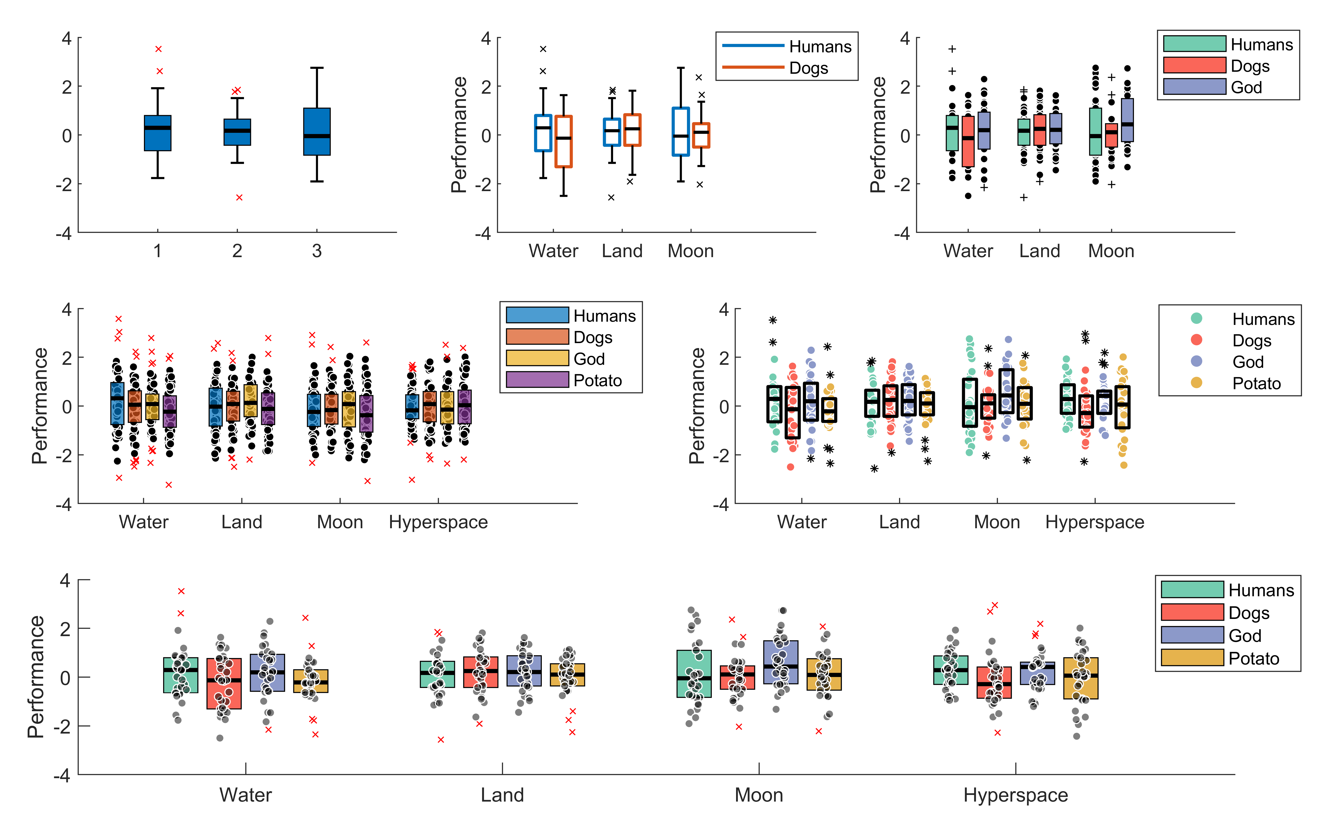
daboxplot is the second best option for highlighting data distribution properties. It does this mainly via combining boxplots with jittered data as well as indicating means and medians on the boxplots to reveal skewness. It also offers many options when it comes to the stylistic aspects of the plots.
The examples below illustrate most of the functionality and options (see daboxplot_demo.m for the code).
The examples below illustrate more recently added options (note, these options exist for daviolinplot too):
- Indicate means on each box (to show skewness)
- Link the boxes within each group (to emphasize interaction effects)
- Link datapoints across conditions (to emphasize within-individual effects)
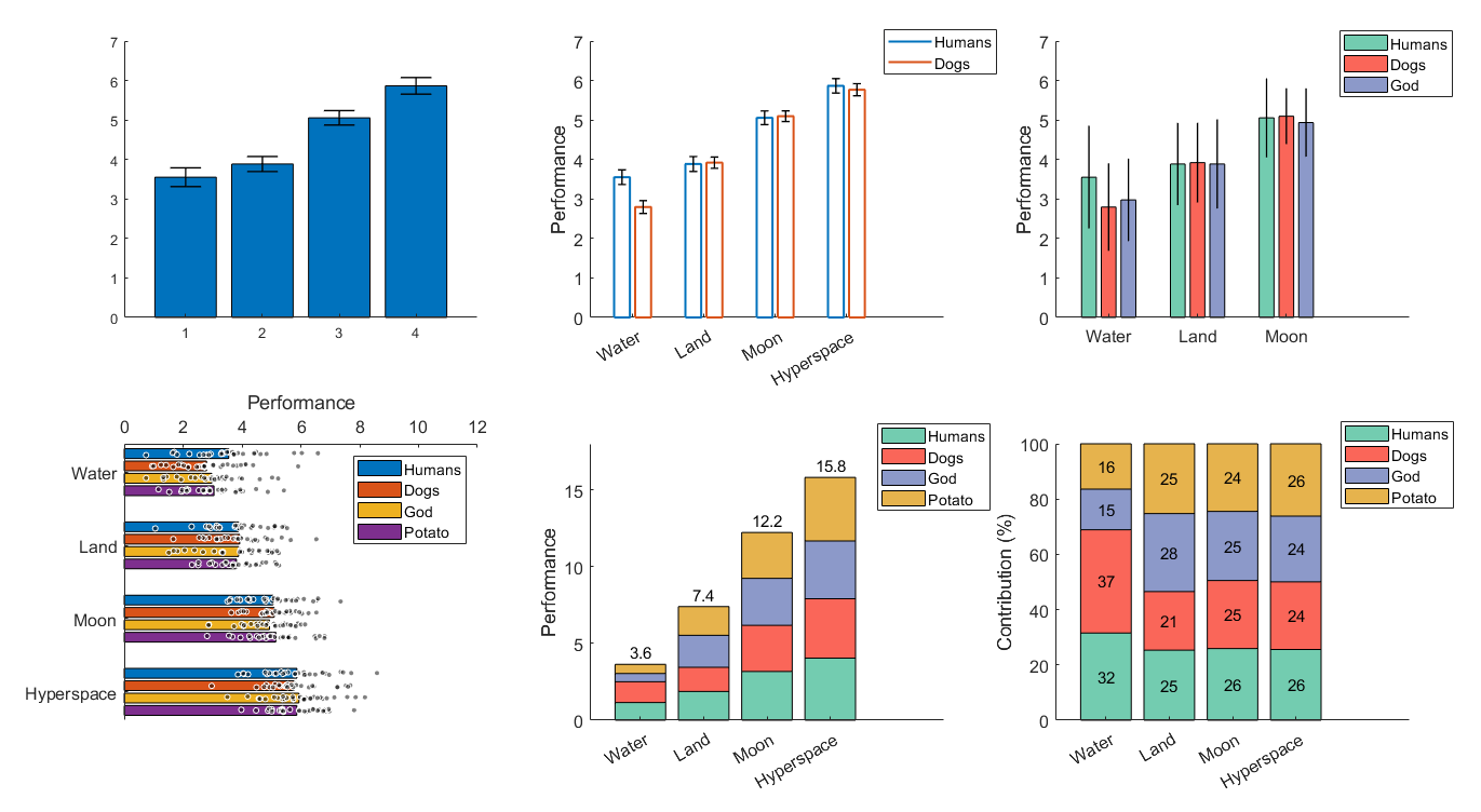
dabarplot is the least ideal for highlighting data distribution properties. However, it still encourages to add error bars (you can choose between standard error, within-subject error, or standard deviation) and allows overlying scattered data. Overall, it is best suited for situations where visualizing data distribution is not as important, when the emphasis is not on hypothesis testing and statistical significance but on effect size. Using stacked bars and adding number values on top of them can be particularly effective in conveying effect sizes among conditions or among groups.
The examples below illustrate most of the functionality and options (see dabarplot_demo.m for the code).
If you want to cite this toolbox in your work, follow the link to Zenodo and find a formatted citation for the latest release there.


