WARNING: this component is deprectated.
It is replaced by official Winter '18 built-in components:
- lightning:helptext for text only tooltips
- lightning:overlayLibrary for media tooltips
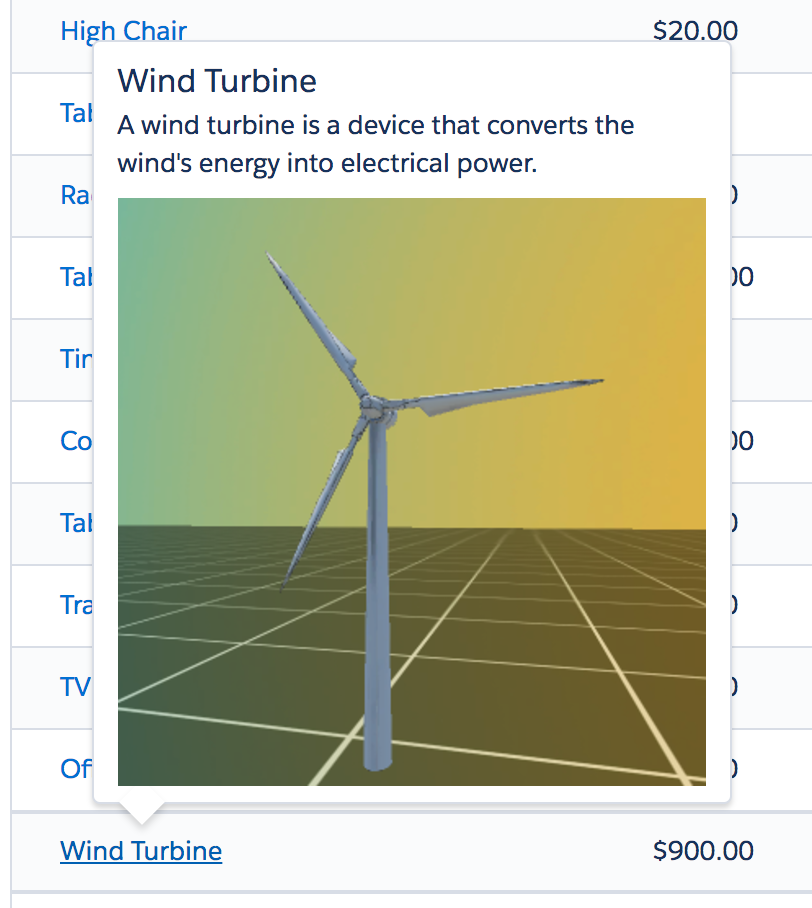
This is a generic popover (tooltip) component built using Salesforce Lightning.
This component is built with SLDS style and does not rely on third party libraries.
Features
The Lightning Popover component provides the following features:
- support for any kind of markup in popover dialog
- high performance thanks to a pure CSS implementation
Install the Lightning Popover component as a managed package by clicking on this button:

Component is documented using the Aura documentation. You can access it from this URL (replace the domain): https://<YOUR_DOMAIN>.lightning.force.com/auradocs/reference.app#reference?descriptor=ui_popover:popover&defType=component
Paste the following code in a new Lightning Application to try it out:
<aura:application extends="force:slds">
<div class="slds-grid slds-grid--frame slds-grid--align-center slds-grid--vertical-align-center">
<div>Note that
<ui_popover:popover>
<aura:set attribute="popoverBody">
<h3 class="slds-section-title">The Popover Title</h3>
<p class="slds-m-bottom--x-small">Some textual description or <b>any</b> kind of markup including other components.</p>
</aura:set>
<a href="javascript:void(0);">hovering over this content (not necessarily a link) triggers the popover</a>
</ui_popover:popover>
and it renders really nicely with SLDS.</div>
</div>
</aura:application>It will render like this:

