This repository displays data visualisations that assist in telling stories by organising the data into an understandable format and emphasising patterns and outliers. A strong visualisation highlights important information while reducing data noise.
We have done some exploratory data analysis in our project. Now, we will be visualizing the results obtained from our data exploration with COVID 19 data. In this process we will use Tableau to visualize in bar charts, tables, maps, line charts depending on the data results we achieved earlier in the project.
There is a sql file created from the data exploration exclusively including the queries that we want to visualize. The tables generated on executing this .sql file are saved in the tables folder.
In order to clean up the data, we remove extraneous variables, delete duplicate rows and observations, deal with outliers and erroneous data, etc. Managing missing values Correcting typographical mistakes as well as standardising or categorising values. For instance, the tables are having null values. Prior to uploading the data into Tableau, we would like to clean the data like replacing NULL values with 0 and re-checking the data types of all columns in each of the tables.
The chart or graph we choose must effectively convey the message we want to convey to our audience. Identifying the message we want to convey is the first step in selecting a chart.
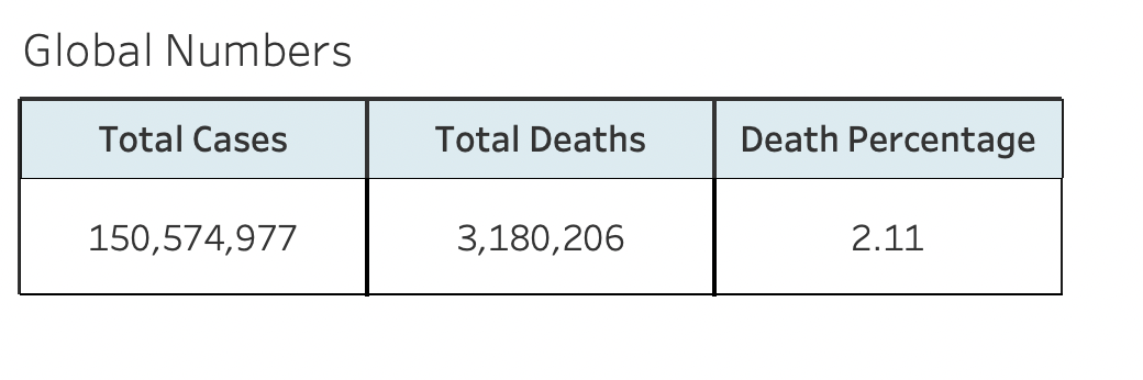
- This is a simple table showing the total number of cases, deaths and percentage of population affected by COVID 2019. I chose to display the straightforward table because I believed the audience needed to see the individual numbers.
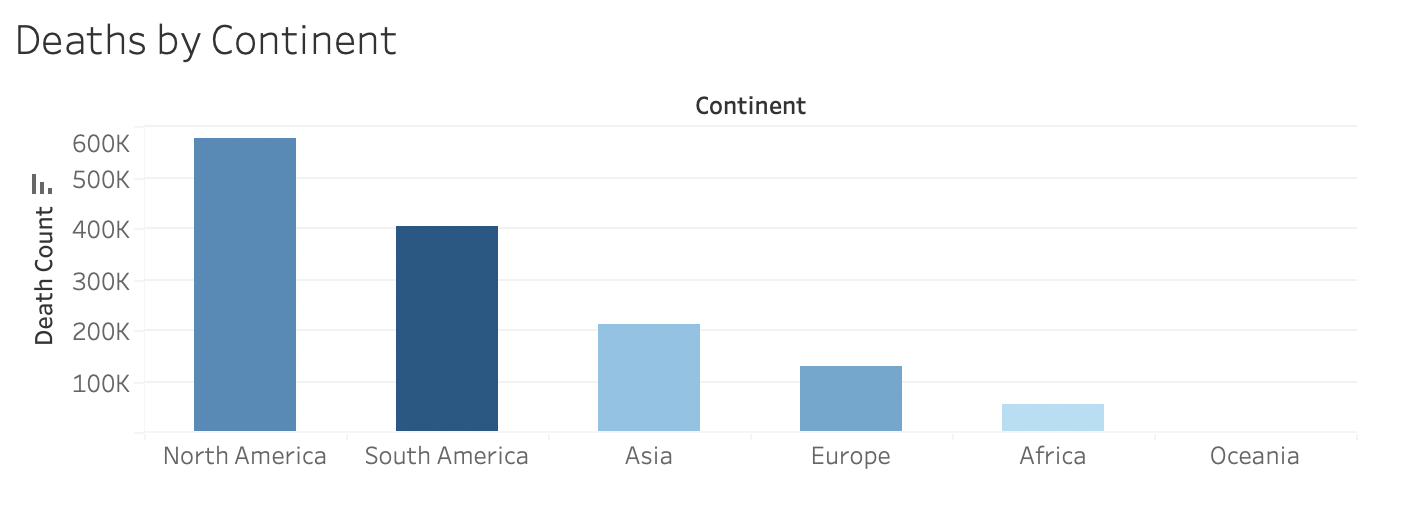
- This bar chart is the aggregation of COVID deaths across the globe grouped by continent.We deploy bar charts to display information in parts. Comparing distinct category or discrete data, such as continents, is made easier by vertical bar charts.
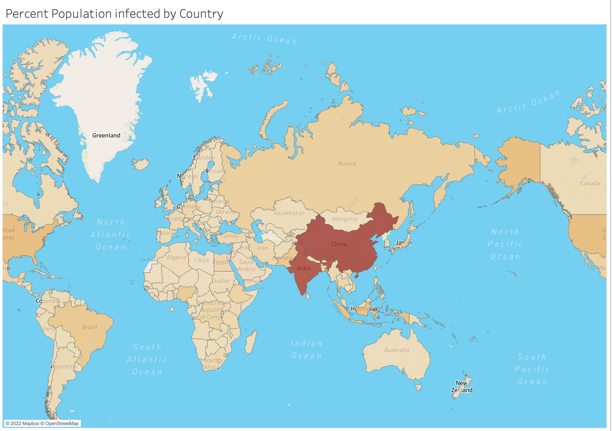
- Given that we have a geographical concern and need to utilise a map to analyse the trends or patterns in our data, we used a map in Tableau. The information on the map demonstrates the proportion of each nation's population that is impacted by the global coronavirus epidemic.
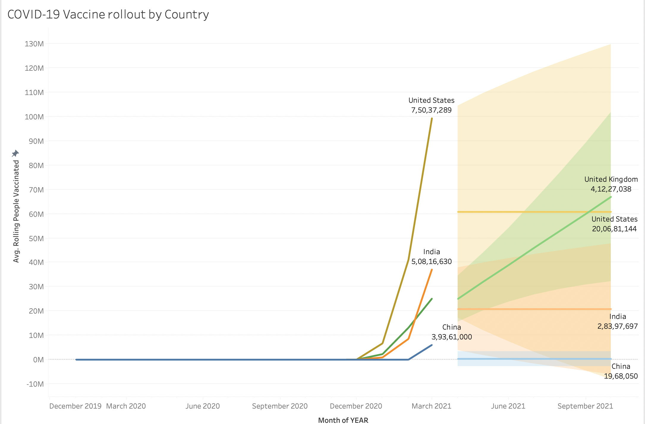
- Tableau employs an approach known as exponential smoothing for forecasting. Forecasting algorithms look for a consistent pattern in the data that may be carried over into the future. Given that immunisation is a continuous procedure, we aimed to anticipate the vaccine deployment using the already-available historical data. The forecast is shown below.
Using Tableau, one can quickly create dynamic, real-time visuals by building dashboards. We can integrate data sources, apply filters, and drill down into certain information with only a few clicks. View the dashboard COVID19_VIZ, built using the tabular data we covered earlier.
THANK YOU