Storybook
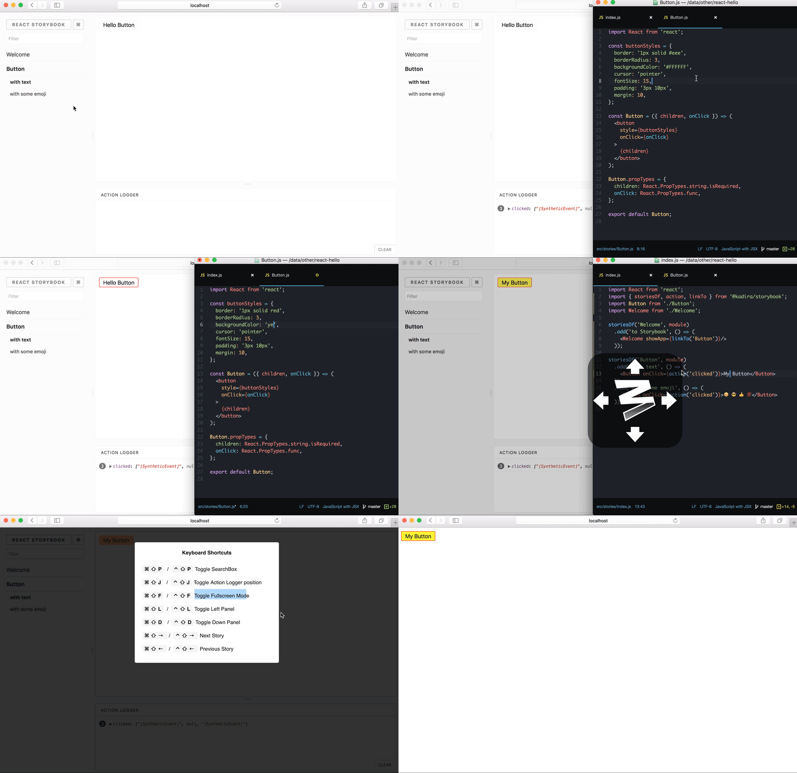
Storybook is a development environment for UI components. It allows you to browse a component library, view the different states of each component, and interactively develop and test components.
Intro
Storybook runs outside of your app. This allows you to develop UI components in isolation, which can improve component reuse, testability, and development speed. You can build quickly without having to worry about application-specific dependencies.
Here are some featured examples that you can reference to see how Storybook works: https://storybook.js.org/examples/
Storybook comes with a lot of addons for component design, documentation, testing, interactivity, and so on. Storybook's easy-to-use API makes it easy to configure and extend in various ways. It has even been extended to support React Native development for mobile.
Table of contents
Getting Started
First install storybook:
npm i -g @storybook/cli
cd my-react-app
getstorybook
The -g global install is used to run our cli tool in your project directory to generate templates for your existing projects. To avoid the global install and start your project manually, take a look at our Slow Start Guide.
Once it's installed, you can npm run storybook and it will run the development server on your local machine, and give you a URL to browse some sample stories.
Storybook v2.x migration note: If you're using Storybook v2.x and want to shift to 3.x version the easiest way is:
npm i -g @storybook/cli
cd my-storybook-v2-app
getstorybook
It runs a codemod to update all package names. Read all migration details in our Migration Guide
For full documentation on using Storybook visit: storybook.js.org
Projects
Main Projects
- Storybook for react - Storybook for React components
- Storybook for vue - Storybook for Vue components
- Storybook for react-native - Storybook for React-Native components
Sub Projects
- CLI - Streamlined installation for a variety of app types
- examples - Code examples to illustrate different Storybook use cases
Addons
- storyshots - Easy snapshot testing for storybook
- actions - Log actions as users interact with components in storybook
- links - Create links between stories
- comments - Comment on storybook stories
- graphql - Query a GraphQL server within Storybook stories
- info - Annotate stories with extra component usage information
- knobs - Interactively edit component prop data in the Storybook UI
- notes - Annotate storybook stories with notes
- options - Customize the storybook UI in code
Contributing
We welcome contributions to Storybook!
- ⇄ Pull requests and ★ Stars are always welcome.
- Read our contributing guide to get started.
Development scripts
yarn bootstrap
Installs package dependencies and links packages together - using lerna
yarn run publish
Push a release to git and npm will ask for version in interactive mode - using lerna.
yarn lint
boolean check if code conforms to linting rules - uses remark & eslint
-
yarn lint:js- will check js -
yarn lint:md- will check markdown + code samples -
yarn lint:js --fix- will automatically fix js
yarn test
boolean check if unit tests all pass - uses jest
yarn test:watch- will run tests in watch-mode
Backers
Support us with a monthly donation and help us continue our activities. [Become a backer]
Sponsors
Become a sponsor and get your logo on our README on Github with a link to your site. [Become a sponsor]
