Design Log and Code Repo for ''''Customizable'''' Split Keyboard
- Introduction
- Design Goals
- Design Justifications
- Row Placement
- Column Placement
- Compact Switches
- Thumb Cluster Design
- Palm Rest Design
- Tracking Device Design
- Observation
- Alternate Layout
Thanks to this ever-growing and enthusiastic community, there are several options for split scooped keyboard designs and if you are willing to put some effort into printing and building a pair, you can have your very own as well. However, once I began to play around with them, they raised more questions than what they seemed fix: typing experience of thumb cluster and pinkie columns improved, but still felt awkward at times, necessity to still move my wrist in order to access inner index columns, why not account the key orientations and contour radius to actual fingers motion? etc. etc. I could no longer justify why I need to suffer physically by design concepts of kind and knowledgeable, yet intangible netizen smug with their take on this modern torturing device. I want in on smugness quotas, too. So began my financial woe and mental suffering... And here you are, dredging up this repo page somehow and before your waning attention span exhaust, I will attempt to describe my concepts and experiences of this process in details you have never asked for.
Glory to Datahand and Tron, our ergo forefathers.
- Customizable parametric key placement
- Minimize finger movement
- Dense and comfortable thumb cluster
- Built-in
adjustablepalm rest - Adjustable tenting
- Tracking device
Mapping finger flexion to a placement function: To achieve a minimum finger movement, more aggressive row wise contour is desirable. Let us define two arcs of a finger tip during a flexion: inner (distal and intermediate flexion) and outer(distal, intermediate, proximal flexion) with palm side of metacarpal phalangeal joint as the origin. These arcs are mapped to a parametric functions defining the radius of an arc at a given angle from origin with 0° as neutral full extension and 90° as full flexion. They simulate trigger motion and grab motion respectively and it is assumed that optimal row placements of keys reside somewhere between two such functions.
Using a CAD program I devised following ad hoc rules that will accommodate switches in the arcs.
- Define R0 as a natural trigger, orientated tangential to the inner arc at θ= ~90° to simulate full flexion. Switch origin is offset to the top of mx switch housing.
- Define R2 as a natural tap, orientated normal to the outer arc at θ= ~60°. Switch origin is bottom of the mx switch housing.
- Define R1 as a neutral position that reside between above mentioned positions based on the following rules. Switch origin is bottom of the mx switch housing.
- Define secondary origin, an intermediate joint of a finger at natural full extension θ= 0°
- An angle bisected by vectors pointing to the secondary origin R0 and R2 position.
- Intersection of bisected vector and the outer path and key orientated normal to the path.
- Define R3 as a mirrored of R1 vector across R2. Switch origin is bottom of the mx switch housing.
path radius offset: for shorter fingers (ring and pinkie for me), switches origin must be offset to accommodate the switch and keycaps to avoid collision.
roll angle: When I fold my fingers, fingertip does not stay parallel nor in-plane with respect to vector spanned by proximal phalanx and metacarpal. This deviation becomes noticeable with high contour column and column origin transformation does not correct it.(such as adding yaw: see below section). Therefore, roll transformation was added to reorient switches out of columnar plane to bring key orientation closer to natural path of finger tips.
Each origins of columns defined above can be transformed to fit the natural spread and orientation of fingers. For better (ergonomically) or worse (design complexity), We can loosen the orthogonality restriction between columns and gain the freedom to yaw and roll the columns to conform to the arch of palm. With the traditional mx switch and keycap, the out of plane features collide with adjacent columns when optimized for correct placement. Without desperate measures, as we will discuss later, the compromised placement with a high contour leads to a typing experience that was subpar at best, given my finger length and spread. Major issue was that the outer most keys such as outer index and pinkie top rows required wrist motion and exaggerated extensions to hit the keys. This may not be the case for those with longer fingers and requires inputs from those who is willing to try this design.
Notes on some of the observations made during the design iteration on each columns without applying compact switches.
- Column 0: (Ternary Index) though feasible, difficult to press and infrequently used key set recommended (see Prototype 1) R0 is somewhat accessible, if you must.
- Column 1: (Secondary Index) Rolled by 20°, at this angle R0 caps (DSA) corner must be shaved.
- Column 2: (Primary Index) not rolled, though ideally 15° is desirable, but it would collide with C3. There is also natural yaw of ~12°, but in order to accommodate C0 & C1 it is ignored.
- Column 3: (Middle) 9° roll. ideally more is desirable.
- Column 4: (Ring) 12° switch roll. ~10° yaw is desirable.
- Column 5: (Pinky) neutral position has great enough yaw ~42° to split the column from the rest, as observed in top view. column without aggressive yaw was tested, but the result required continual effort to keep finger on columns.
- Column 6: (Secondary Pinky) R0 and R1 is good candidate. It's an attractive option if you wish to support such tradition rather than using the thumb cluster.
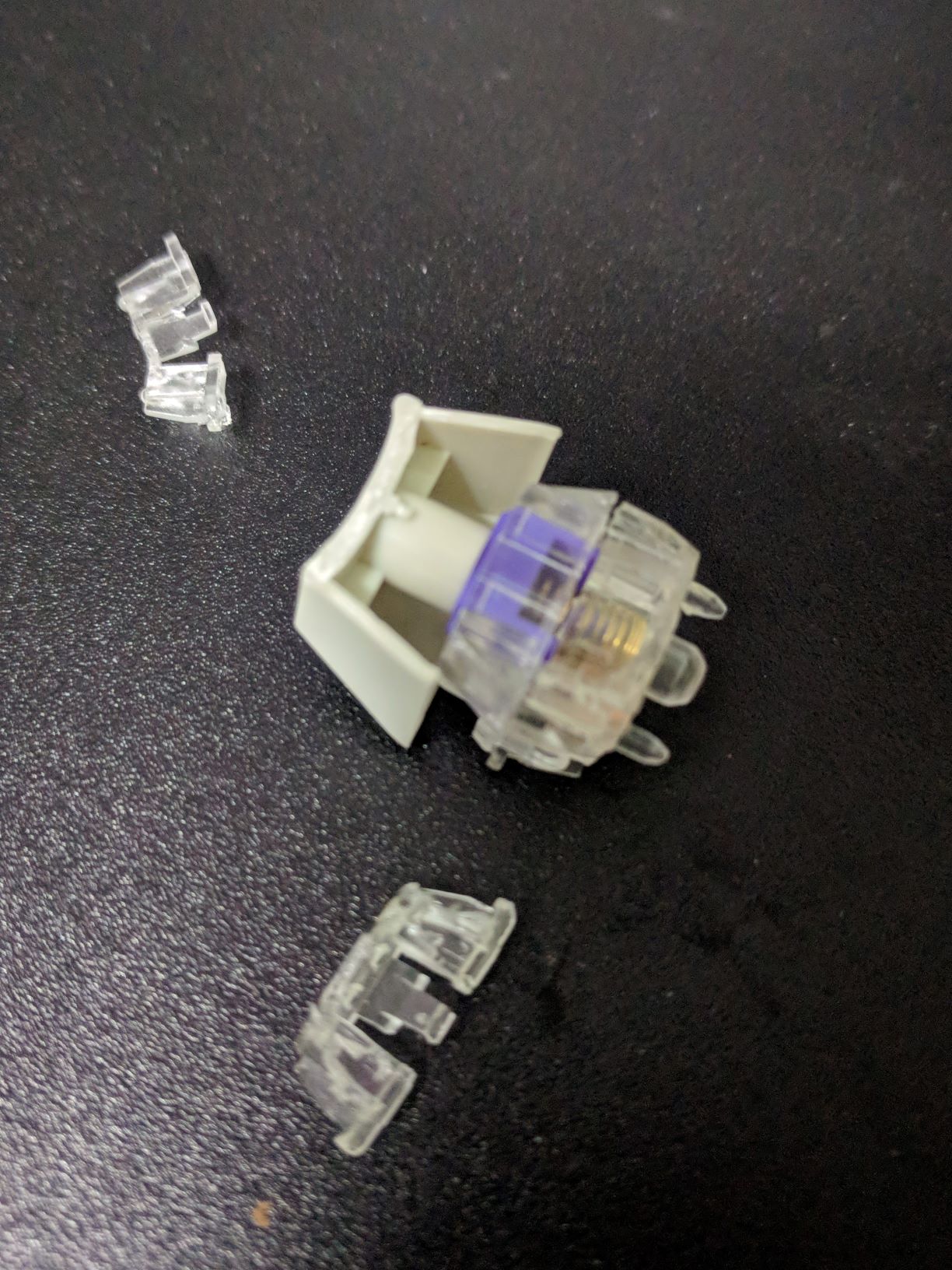
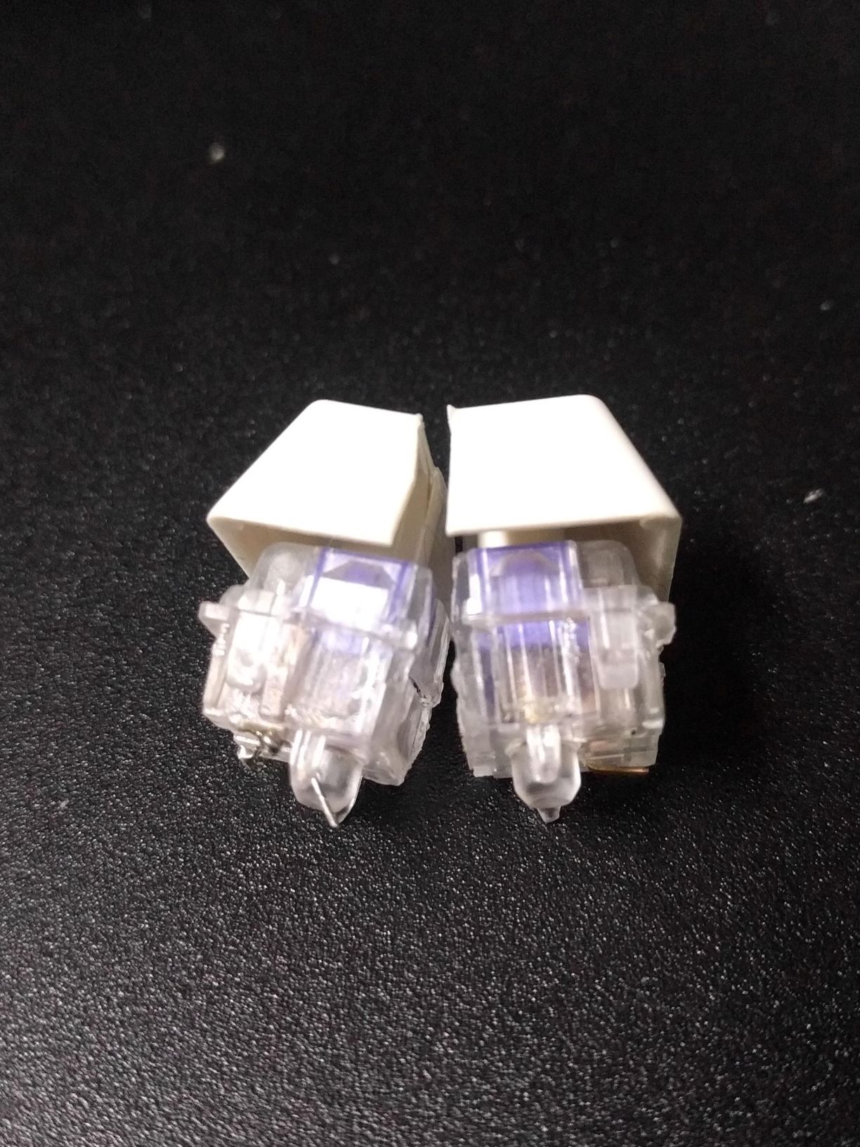 My initial intention of this project was to keep the design accessible by limiting to commercially available switches and keycaps, I did not wish to invest time redesigning key profiles; however, what was available no longer sufficed to the requirement: narrower design something along the line of alps SKCM compact was needed. These are not readily available in large quantities and keycaps more so. As a desperation, I resorted to lopping off the LED compartment of MX switches as well as few keycaps to test the feasibility of such. The result was not pleasing to say the least, but it allowed optimization. Not entirely enthralled, but few test prints proved that the pro out weighed the cons:
- produced large wobble that hinders off axis press without gluing casing together
- switch will no longer seat flush to the plate and will tilt without additional support (PCB or glue)
- normal clipped keycap profile are no longer viable and custom profile will be required to improve typing comfort.
- by clipping switch column wise, column separation can be reduced
- especially useful for outer columns, which reduce wrist motions and extension required.
- allows more aggressive row contour when necessary.
- by clipping switch row wise, extension need to actuate adjacent upper row can be reduced: pinkie home row (C5R1)
- by clipping switch row wise, reduce off axis press for num: ring and middle num row (C3&4R3s)
- allows more aggressive column rolling and yaw
- more natural ring and pinkie column orientation
- allows thumb cluster optimization (discussed next section)
Custom key caps brought some benefits as well:
- inclined tilt for upper row improves actuation motion
- convex curvature for R0 to reduce discomfort
Notes on column with compact switches.
- **Column 0: (Ternary Index)
- Column 1: (Secondary Index)
- Column 2: (Primary Index) not rolled, though ideally 15° is desirable, but it would collide with C3. There is also natural yaw of ~12°, but in order to accommodate C0 & C1 it is ignored.
- Column 3: (Middle) 9° roll. ideally more is desirable.
- Column 4: (Ring) 12° switch roll. ~10° yaw is desirable.
- Column 5: (Pinky) neutral position has great enough yaw ~42° to split the column from the rest, as observed in top view. column without aggressive yaw was tested, but the result required continual effort to keep finger on columns.
- Column 6: (Secondary Pinky) R0 and R1 is good candidate. It's an attractive option if you wish to support such tradition rather than using the thumb cluster.**
I have created stick representation of my thumb in OpenSCAD and initial attempts sought to pack as many switches near the ideal thumb motion without considering collision. While keys were accessible they did not produce efficient press and produced strain because thumb position. I've replicated and tested other notable design philosophy: datahard, manuform, and dmote to ended up with following design criteria ordered in priority:
- Place highest priority on thumb home. cluster must be as close to thumb neutral position and orientation
Compromising this is the cardinal sin of design and it is exacerbated when number of clutter keys density increases. To accomplish this for ErgoWarp, C1R0 (secondary index bottom row) was removed and replaced with C0R1 (ternary index home row) which allowed thumb cluster to come closer to its optimal location.
Natural thumb position should be measured with ones hand down by one's side not at the typing position (arm out); thumb abduction will be exaggerated leading to incorrect optimization
-
Prefer actuation with palm sides surface (adduction and flexion and not abduction and extension)
Most compact split keyboards rely on 1u thumb clusters, with it We are accustomed to pressing space bar with side of the thumb, so much so that I was recreating this bad design despite given the opportunity to correct them. All three mentioned forerunners have broken out of the box albite with their choice of priorities and compromises. When press orientation becomes thumb flexion near the neutral thumb position, the use of heavy switch must be avoided, as the torque will shift wrist position which creates strain when chording with same hand fingers. DataHand breaks this design philosophy, but it is the result of adapting light low travel switch irreplicable with mx switches. manuform follows this to the t, but by reducing the priority to minimize motion. dmote also follows this, but prioritize cluster density over correct orientations.needs edit -
Minimize travel distance while maintaining correct press orientation
This also means that high concave contour designs that conforms to the key profiles should be avoided. To reiterate, avoid adapting datahand like welled cluster with mx switches; they may reduce travel somewhat, but it is in no way a comfortable design nor do they allow accurate chording. The design goal seems conflicting statement with normal mx switches, but by uti
-
Ability to chord press
It is desirable to place modifiers and layers on thumb cluster, but without the ability to chord them effectively, their utility is hampered. especially when this design takes away conventional bottom row modifiers. Utilizing super, hyper modifiers, layers and tap modifiers are well intended, but compromised solution adding mental load when good thumb cluster design can do it all. Avoiding awkward wrist position and motion when chording requires all mentioned design goals.
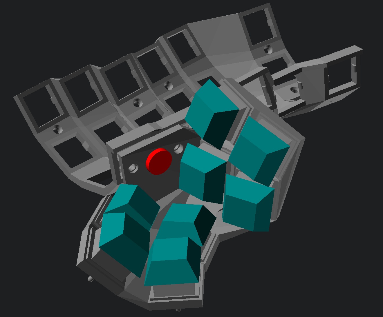
result is a compact six key design akin to dmote. justification and description of each position below:
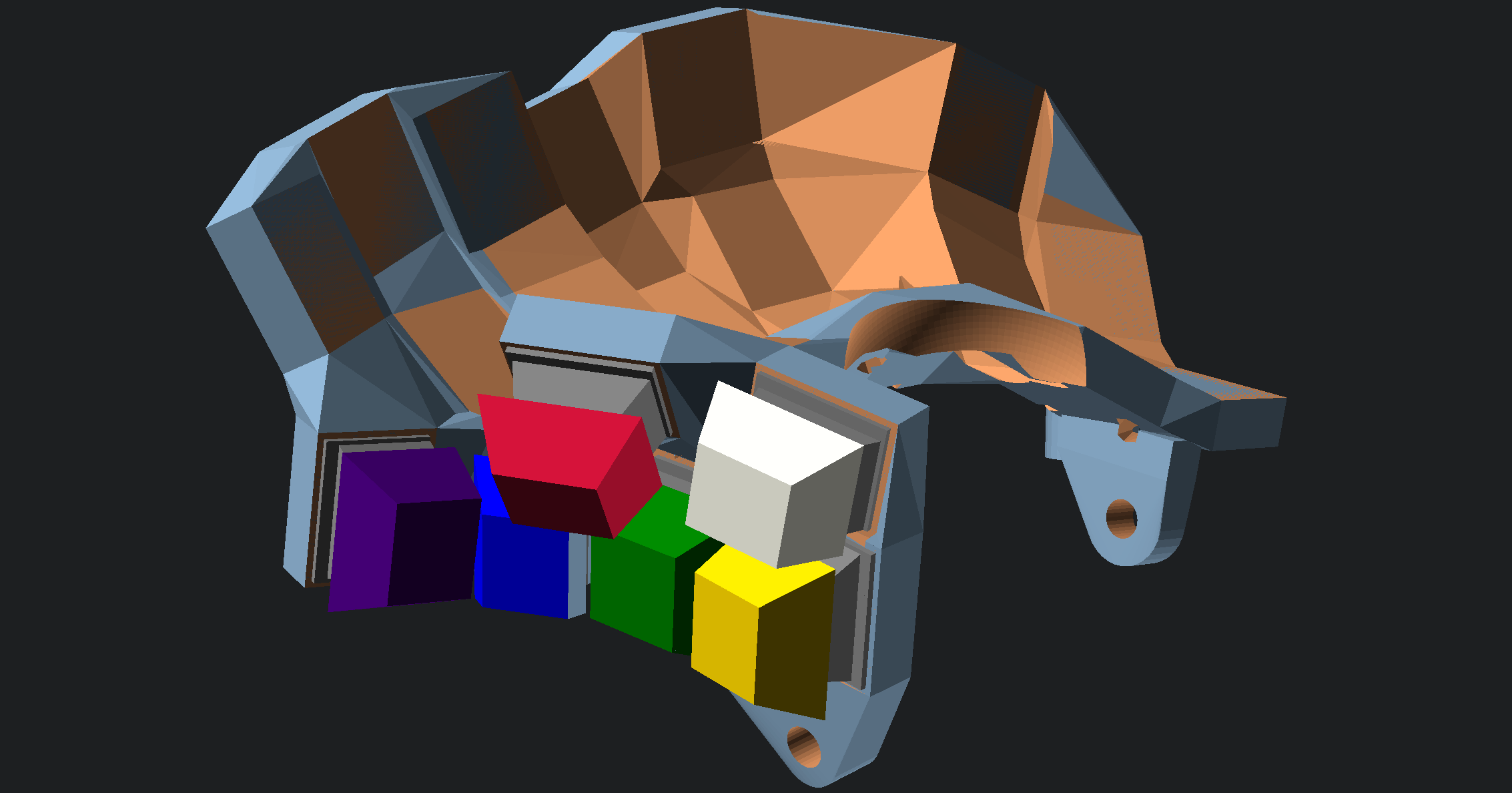 first three are neutral position cluster requiring minimum movement to actuate.
T0(red): actuated by a neutral tip addution, simulating a pinching motion. it is the most comfortable press and since its motion separate, least prone to miss-press. thus it is the home key.
T1(blue): neutral tip. this can be actuated by combing distal flexion. allows fast transition from homekey and is best suited for layer or shift.
T2(green): placement-wise this is closest to the true neutral position of thumb by flexing medial joint the switch can be actuated, or by sliding. also efficient allows chording between T3 and T4.
the next three are outer sets that T3(white): adduction with flexed distal faster of outer set. T4(purple): T5(yellow)
cylinder represents the thumb. (thumb cluster ver2)
Thumb cluster desirable traits:
dox like style attempt to minimize travel by having normal cluster and maintain chording to a degree, but often the thumb home is too. but problem with side adduction press is that it produce strenuous press when combine with high extension.
manuform break the compact cluster criteria to achieve correct orientation. but by doing so with normal switches produce longer travel distance and loose efficiency on outer keys.
datahard I have not tried, but cluster similar to such layout did not pass. mainly due to mx switches fails due to its longer actuation throws. similarly high concave contour was not good enough
dmote overall cluster press orientation is mostly correct, but chording is not ideal, home is too far from neutral(with my thumb length) and high collision with index columns. Clustering seems to be prioritize over orientation for anterior presses and seems awkward.
with compact mx switches
- narrower index columns improves thumb home position and reduces collision issue
- further improve thumb home position by getting moving of bottom row on secondary index to home row ternary index
- decouple orientation and distance, a) minimize adjacent switch distance with out resorting to high contour b) correct orientation without lower collision issues
wrist rest
putting load on nerve path of hand and palm all cost and distribute the load properly.
a supporting structure that conforms to the cavity created by the natural arch of the palm.
they are modeled by a sweep of traversing center with a ellipsoid
a supporting structure that conforms to the cavity created by the natural arch of the palm.
they are modeled by a sweep of traversing center with a ellipsoid. palm support alone is insufficient in my opinion as they do not distribute weight enough and not enough constraints as the hand moves and slips out of the support. an additional support were required.
a distorted ring that supports thumb metacarpal and it's ellipsoidal blob, but avoid index/thumb nerve channel.
a distorted ring that support pinkie metacarpal and it's ellipsoidal blob when angle of tenting becomes sufficiently high >30 a proper support is required at edge side of the palm to discourage slippage while allowing free movement of pinkie finger.
###Trackpoint Prototype 1, 4, and 5 were made with Trackpoint in mind, but due severe drifting issue I could not completed usage test. After some input from another forerunner, to The cause of the drift was most likely due to me roughing around the module housing and poor mounting which applied constant distortion on module. TODO Repeat test
####Trackpoint with Switch integration
An adapter for MX key stubs to trackpoint stub. compounding with navigation layer was attractive. Tried with prototypes 4 and 5. produced mushy feel and noise.
###Trackball: under construction
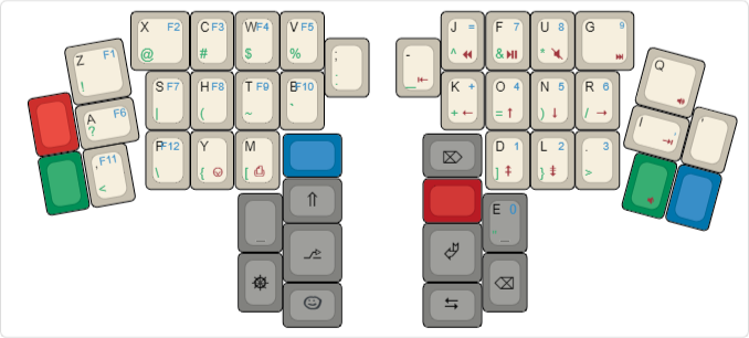
The effort map changed considerably to a point that I felt it was a valid excuse to consider my own layout. Vertical downward transitions are faster and Workman layout philosophy jived well on initial trial. With the reduced effort to actuate bottom row, allocating higher frequency letters was less of an issue. Generous thumb cluster also made sense to adopt maltron like thumb layout. As a personal preference, emphasis on rolling and same hand typing were also considered.
