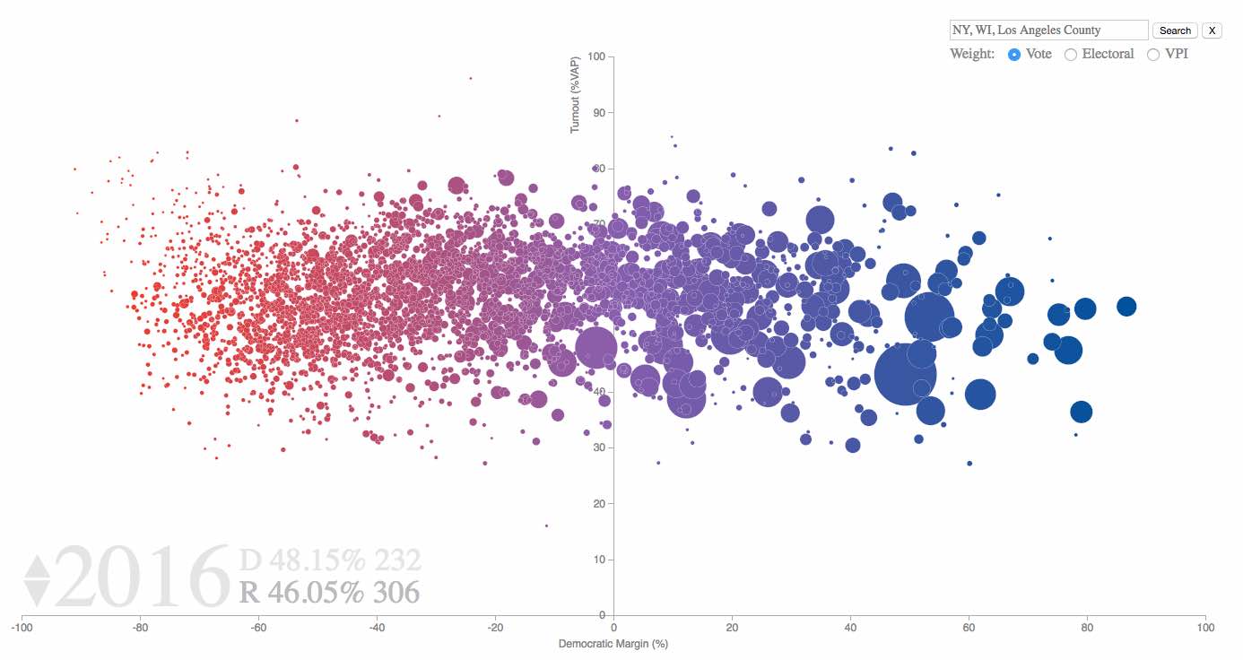
This is an interactive visualization built with d3.js for viewing the turnout and two party margin by county. It covers the presidential elections for 2004-2020. A blog post and demo of the project are available here. The goal is to improve the visualization and underlying data over time, so pull requests and suggestions are welcome.
- Click through years to see the changes in margin and turnout.
- Search by state or county to view a subset of counties.
- Bubble areas are proportional to the fraction of national votes, fraction of electoral votes, or the Voter Power Index (VPI) for each county.
- Electoral votes and national vote percentages are tallied in the bottom left.
- Tooltips show both the county level and state level data on mouseover.
- Click and drag counties to update the vote percentages and electoral counts if the party threshold for the state is crossed. I find this is a good way to consider "what if" scenarios for the elections.
- A dropdown menu to switch between county, state, and different demographic data sources.
