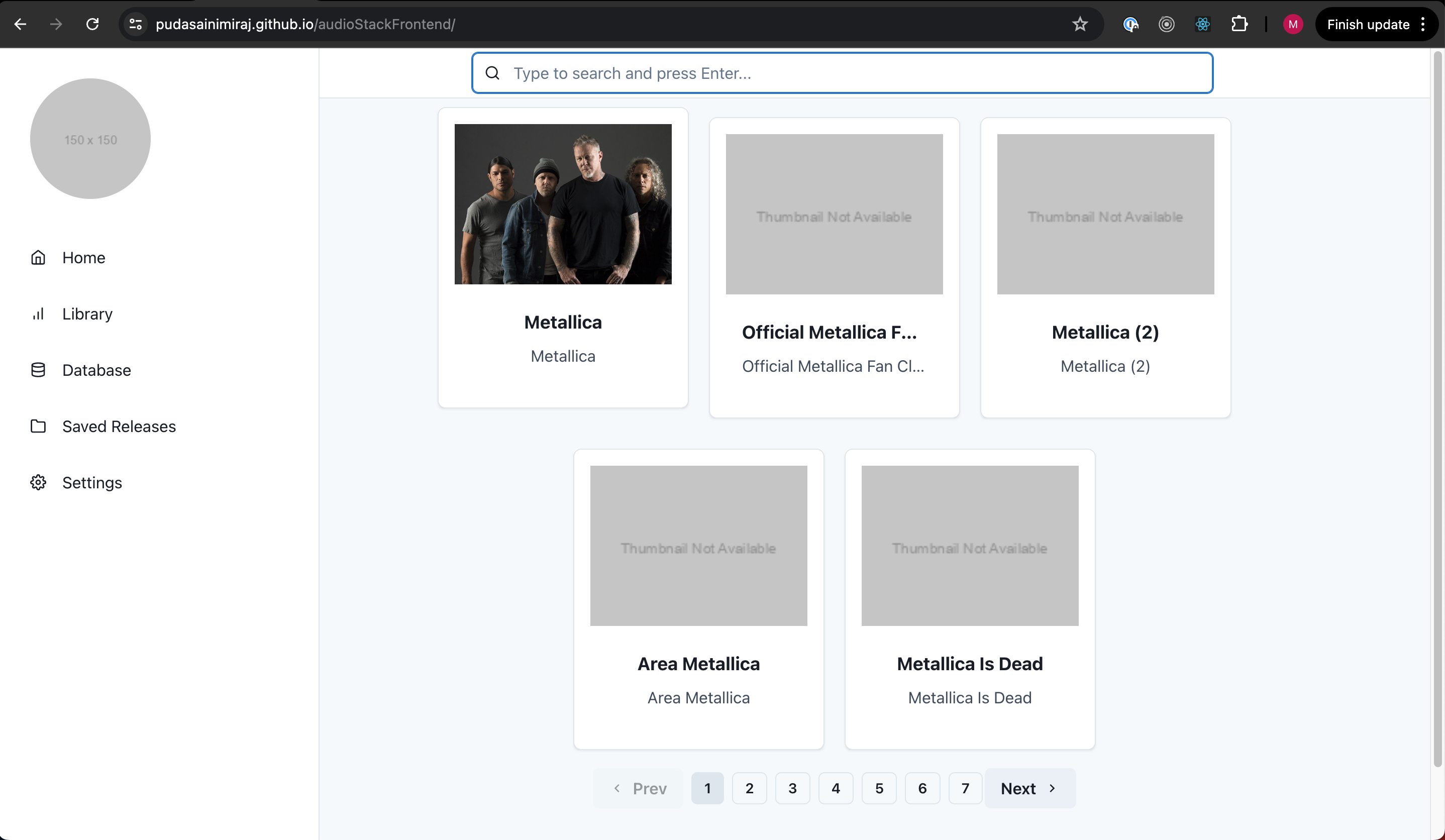
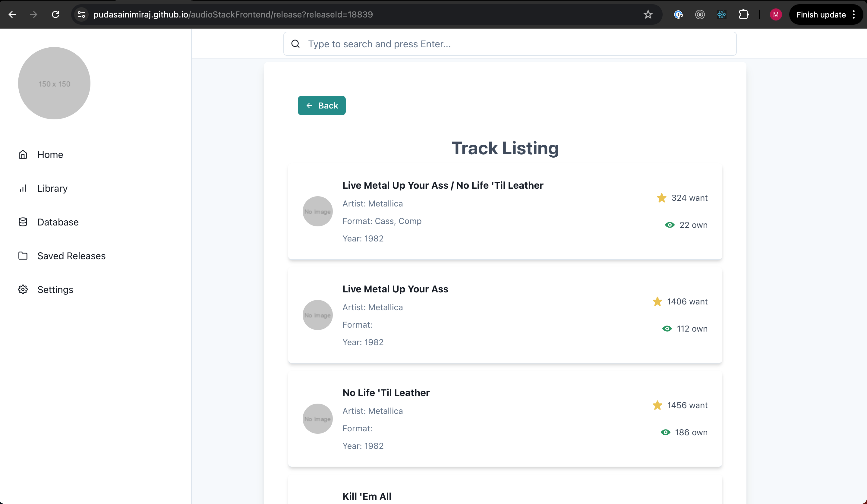
AudioStackFrontend is a web application that provides users with comprehensive discography data and enables efficient searching and browsing through a clean and intuitive interface. The app leverages the power of Chakra UI for a polished and professional user experience.
- Search Functionality: Quickly find specific releases or artists.

- Detailed Views: View detailed information about releases and artists.

- Responsive Design: Optimized for both desktop and mobile devices.
- Error Handling: Professional error handling with loading spinners and informative alerts.
- Discography Browsing: Browse through a wide range of music releases.
- User Authentication: Add users to the app and have authenticated.
- Saving Library: Let users to be able to save their favourite artists and their releases.
- React: For building the user interface.
- TypeScript: For type safety and improved development experience.
- Chakra UI: For a sleek and professional design.
- Next.js: For server-side rendering and optimized performance.
The deployed version of the app can be found at https://pudasainimiraj.github.io/audioStackFrontend/ .
- Node.js: Ensure you have Node.js installed. You can download it from nodejs.org.
-
Clone the repository:
git clone https://github.com/pudasainimiraj/audioStackFrontend.git cd audioStackFrontend -
Install dependencies:
npm install
To start the application, run:
npm run dev
This will start the development server and you can view the app by navigating to http://localhost:3000 in your browser.src/components: Contains all the React components used in the app. buttons: Button components. cardComponent: Components for displaying release cards. - genericCard : Card Component used to render the list of queried artist. - releaseCard : Card Component used to render the release page with the release details. layouts: Layout components such as Header and Sidebar. mainComponent.tsx: Main component of the app. modals: Modal components (e.g., ArtistDetailModal). searchBar: Search bar components. hooks: Custom hooks (e.g., useDiscogProvider). pages: Next.js pages (e.g., index.tsx, release.tsx). public: Public assets such as images and fonts.
We welcome contributions! Please follow these steps:
- Fork the repository.
- Create a new branch (
git checkout -b feature/YourFeatureName). - Commit your changes (
git commit -m 'Add some feature'). - Push to the branch (
git push origin feature/YourFeatureName). - Open a Pull Request.
### License This project is licensed under the MIT License. See the LICENSE file for details.