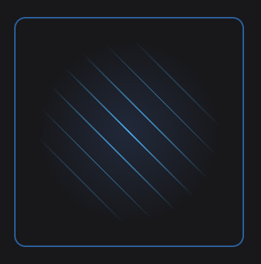
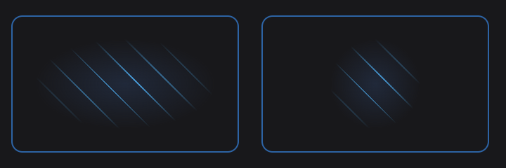
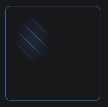
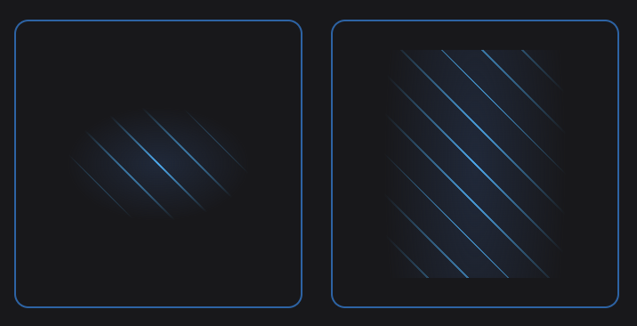
A mask-image plugin for Tailwind CSS.
Install the package with your preferred package-manager.
pnpm install @pyncz/tailwind-mask-image
After that, simply add the plugin into your tailwind.config.js:
// tailwind.config.js
module.exports = {
  // ...
  plugins: [
    // ...
    require('@pyncz/tailwind-mask-image')
  ],
}There are 3 default values the mask utility can accept:
linearradialnone
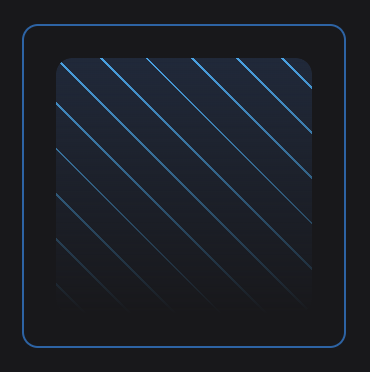
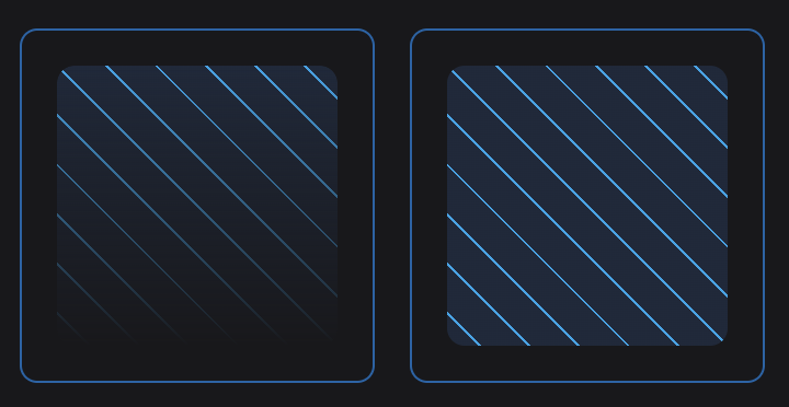
Applies a linear-gradient as the mask image. Opacity is set from 100% at the start to 0% at the end, by default.
<div class="mask-linear" />By default, the gradient is directed to bottom. You can easily customize the direction with mask-dir utility, including arbitrary values.
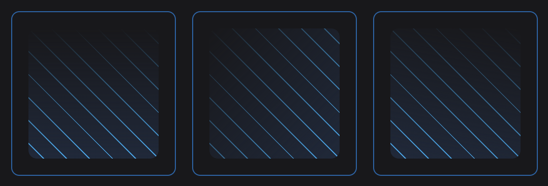
<div class="mask-linear mask-dir-to-t" />
<div class="mask-linear mask-dir-to-tl" />
<div class="mask-linear mask-dir-[10deg]" />The stops API is similar to tailwind's Gradient Color Stops core utils, so you can customize your linear mask in a familiar way.
But! An important difference is that here you should use not colors but opacity values.
The opacity values are taken from your theme specified in the tailwind.config.js, but you obviously can use arbitrary opacity values as well.
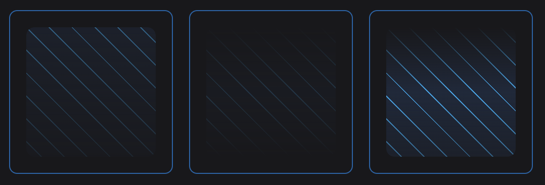
<div class="mask-linear mask-from-50 mask-to-[0.1]" />
<div class="mask-linear mask-from-0 mask-via-20" />
<div class="mask-linear mask-from-0 mask-via-100 mask-to-50" />
Note You don't have to specify all the stops, because the default values (100% for the start and 0% for the end point) still work.
In addition to setting the opacity of the stops, you can also set the position using mask-point.
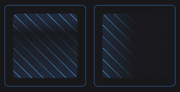
<div class="mask-linear mask-point-from-[10%] mask-via-10 mask-point-via-[30%] mask-to-100" />
<div class="mask-linear mask-dir-to-r mask-to-[0.05] mask-point-to-[50%]" />
This utility don't accept any default value, so use arbitrary values.
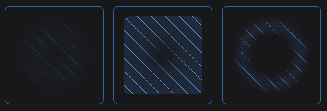
Applies a radial-gradient as the mask image. Like for the mask-linear util, the gradient is spread from 100% opacity at the center to 0% at the ending shape.
<div class="mask-radial" />Shape of the gradient, ellipse (by default) or circle.
<div class="mask-radial mask-shape-ellipse" />
<div class="mask-radial mask-shape-circle" />By default, the gradient's position is center. You can use the same values as for the background-position css prop (top, bottom left etc), as well as arbitrary values with explicit position.
<div class="mask-radial mask-at-[30px_40px]" />With this util you can specify the size of the gradient.
<div class="mask-radial mask-reach-closest-side" />
<div class="mask-radial mask-reach-closest-corner" />
<div class="mask-radial mask-reach-farthest-side" />
<div class="mask-radial mask-reach-farthest-corner" />
Besides as-they-are keyword-values, there are also a couple of aliases:
mask-reach-containforclosest-sidemask-reach-coverforfarthest-corner
You can also use arbitrary values:
<div class="mask-reach-[40%_2rem] mask-radial" />
<div class="mask-reach-[40%_150%] mask-radial" />Note The opacity stops for
mask-radialare the same as the ones described formask-linear, including points API.
<div class="mask-radial mask-from-0 mask-via-[0.25]" />
<div class="mask-radial mask-from-0 mask-via-[0.75] mask-to-100" />
<div class="mask-radial mask-from-0 mask-point-from-[2rem] mask-via-[0.75] mask-point-via-[3rem]" />This value matches mask-image css prop's default value so it makes no sense to use it separately, but it may be pretty useful if you apply the mask responsively.
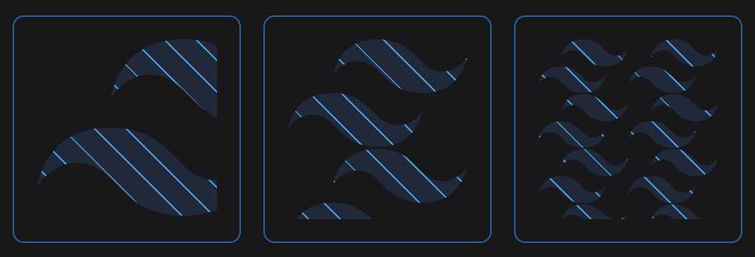
<div class="mask-linear sm:mask-none" />The mask-image css prop accepts not only gradients but images as well. You can use arbitrary values, for example, to apply url() as the mask image.
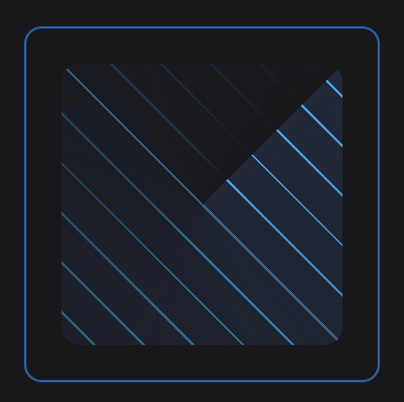
<div class="mask-[url('/your-pretty-image.png')]" />You can pass other types of the gradients, e.g. conic-gradient etc.
<div class="mask-[conic-gradient(from_45deg,_black,_transparent)]" />Also, you may want not to use the API above even for linear-gradient or radial-gradient so you can pass them arbitrarily too.
<div class="mask-[linear-gradient(12deg,_black,_transparent)]" /><div class="mask-[url('/your-pretty-image.png')] mask-size-cover" />
<div class="mask-[url('/your-pretty-image.png')] mask-size-contain" />
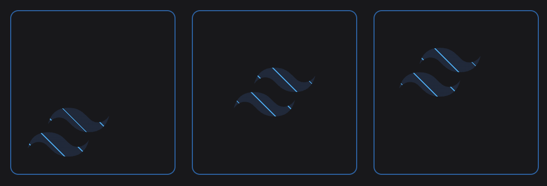
<div class="mask-[url('/your-pretty-image.png')] mask-size-[4rem]" /><div class="mask-[url('/your-pretty-image.png')] mask-no-repeat mask-position-left-bottom" />
<div class="mask-[url('/your-pretty-image.png')] mask-no-repeat mask-position-center" />
<div class="mask-[url('/your-pretty-image.png')] mask-no-repeat mask-position-[0.5rem_25%]" />You can manage the mask-repeat css property as well with the following utilities:
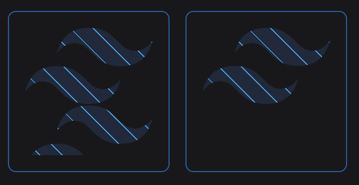
mask-repeatmask-repeat-xmask-repeat-ymask-repeat-spacemask-repeat-roundmask-no-repeat
<div class="mask-[url('/your-pretty-image.png')] mask-repeat" />
<div class="mask-[url('/your-pretty-image.png')] mask-no-repeat" />
