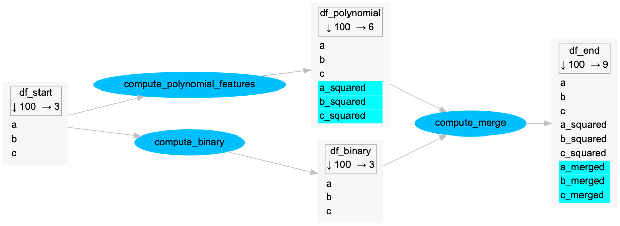
Python package to build a nice explanative schema of a data processing pipeline in pandas.
It's heavily inspired by dask's .visualize method, but improved with 2 useful features:
- visualize columns names in data nodes
- highlight created columns at each task
Here is an example from the examples folder:

Install with pip:
$ pip install pandas-pipeline-graphvizInstall manually:
- git clone
- use
python setup.py
There are no reliable methods in python to get variables names, either as input or as output. The methods used in this package are quite hacky, as discussed in this stackoverflow thread.
To build the graph, this package makes use of:
globals()to get the names of input dataframes, doing a comparison between the input dataframes and all the variables available in the global variables.inspect.stack()to get the name of the output dataframe, gathering the code lines calling the function and parsing it to find the output. Currently it supports only single-output transformations.
Both methods should be considered as experimental and the behavior of the decorator is expected to break easily if it's not used as presented in the examples.
- do not use several decorators on your function, only this decorator, otherwise it will break the output dataframe name detection through
inspect.stack() - use only single output transformation functions, i.e. functions which return only 1 dataframe.
See examples folder in the repository.