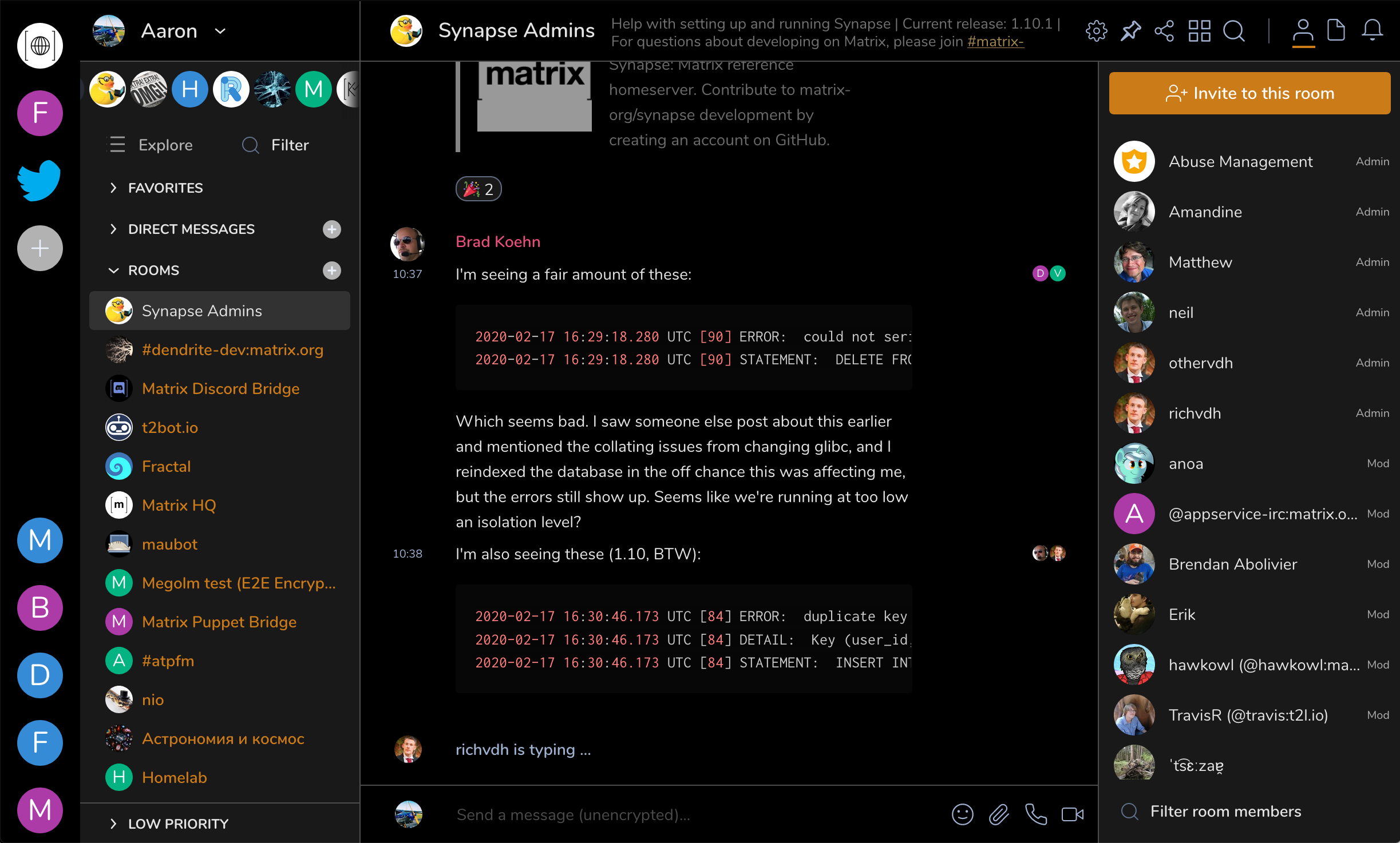
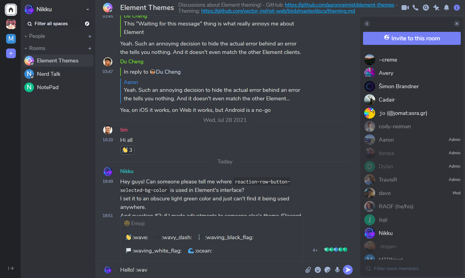
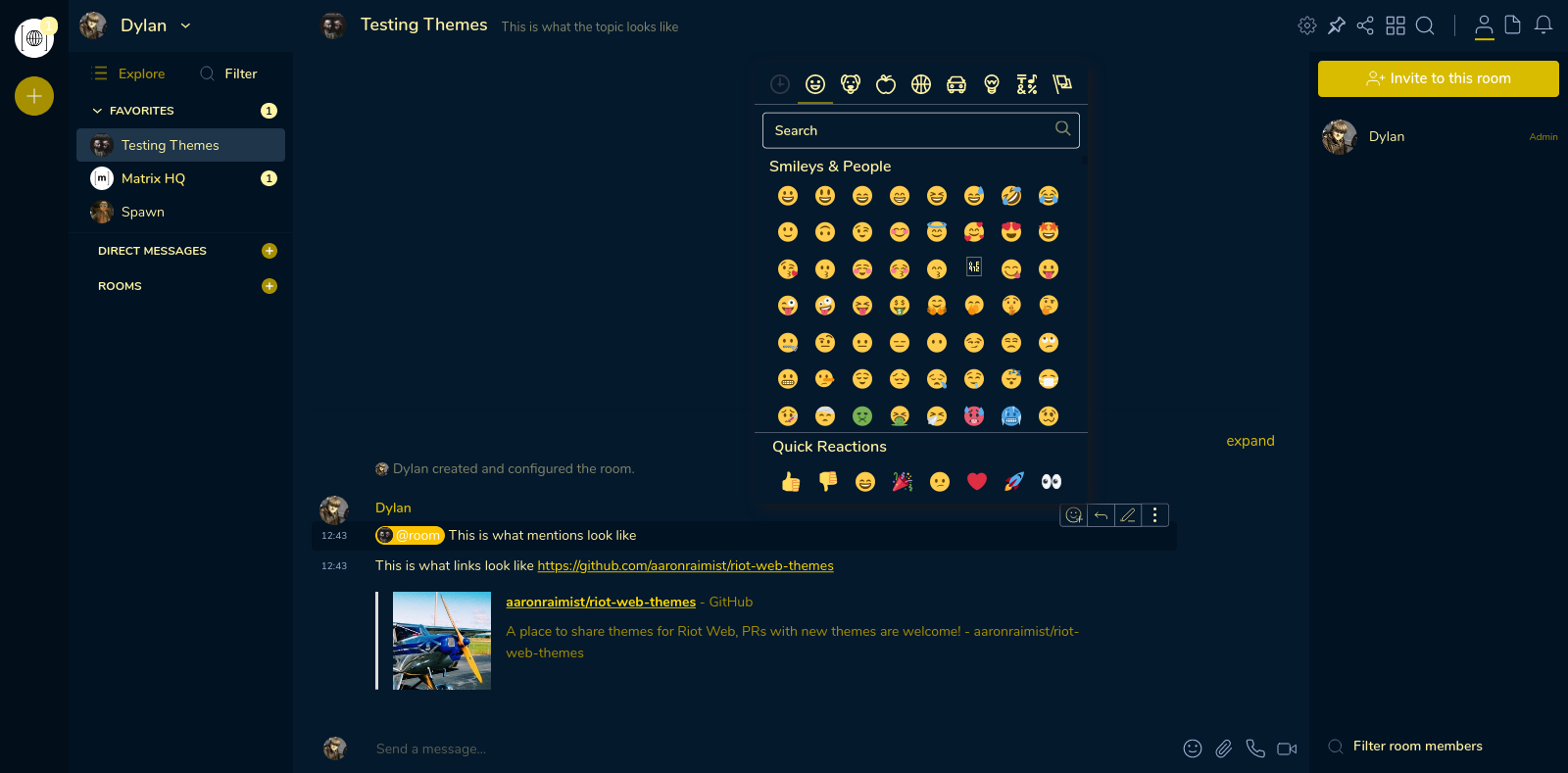
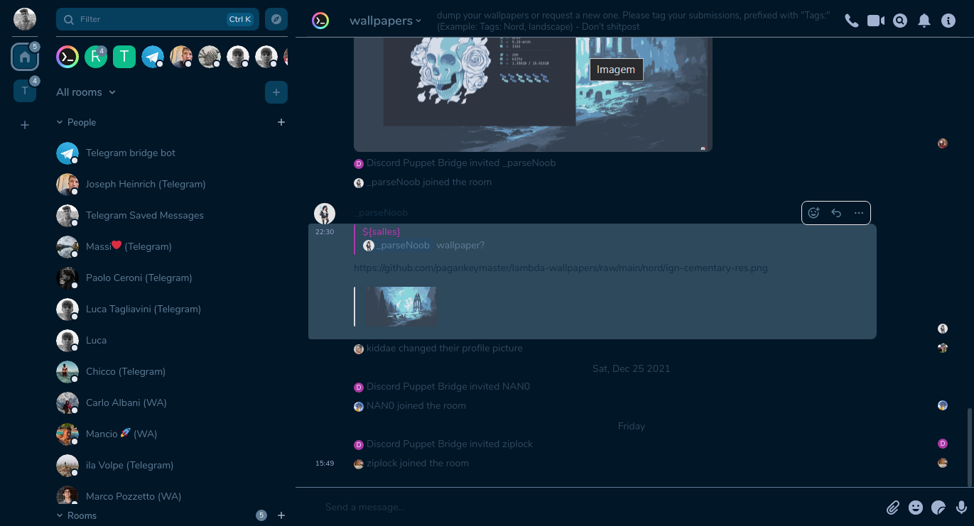
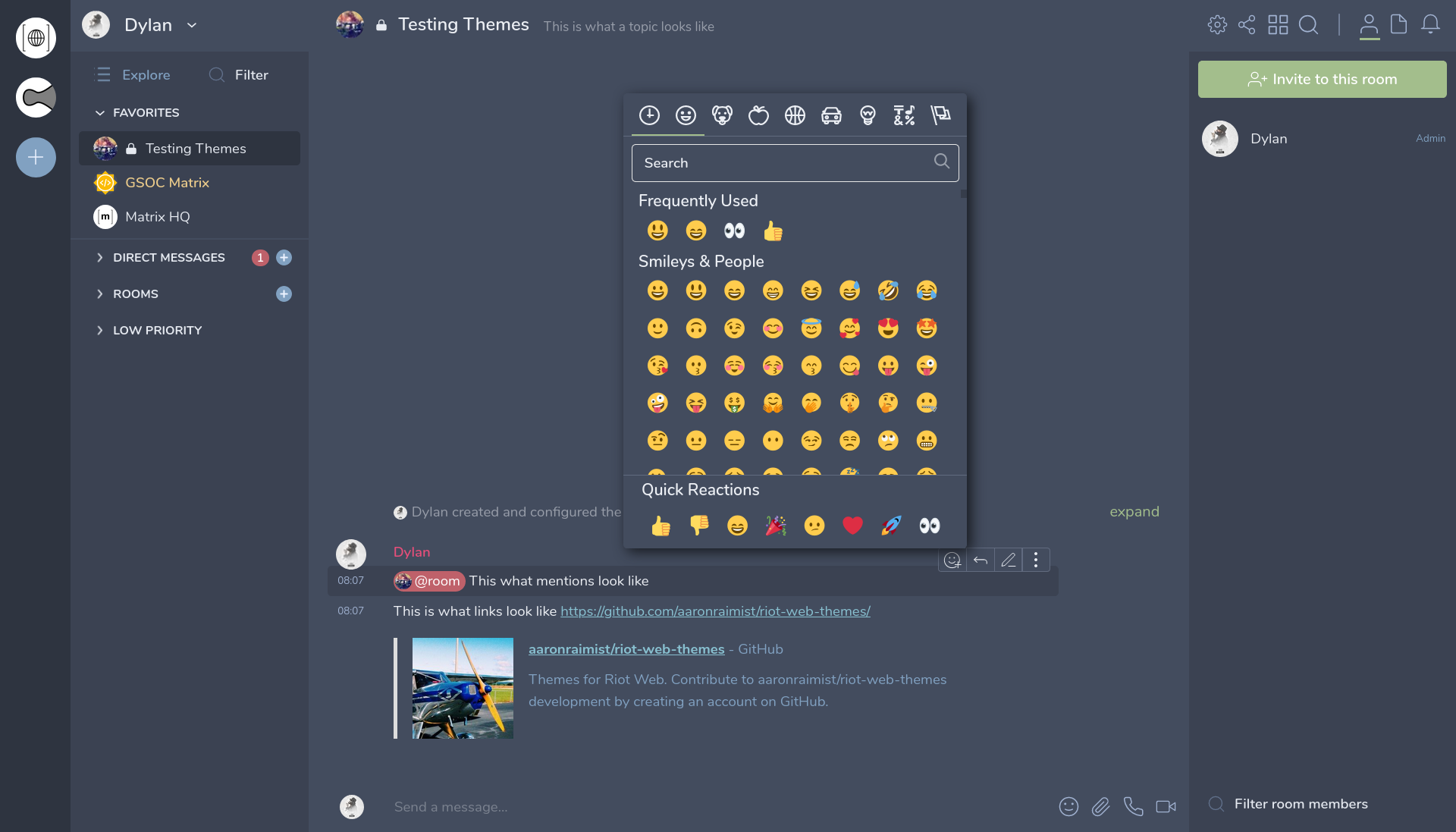
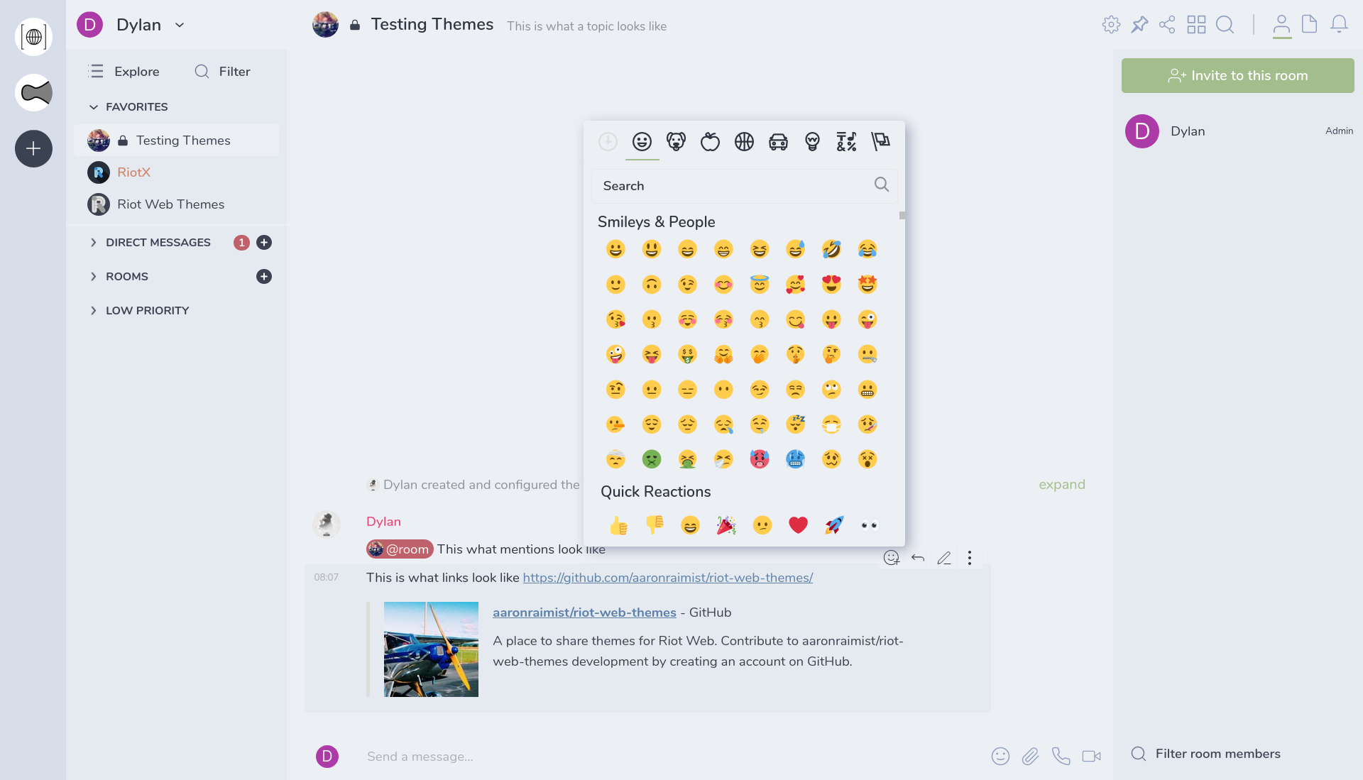
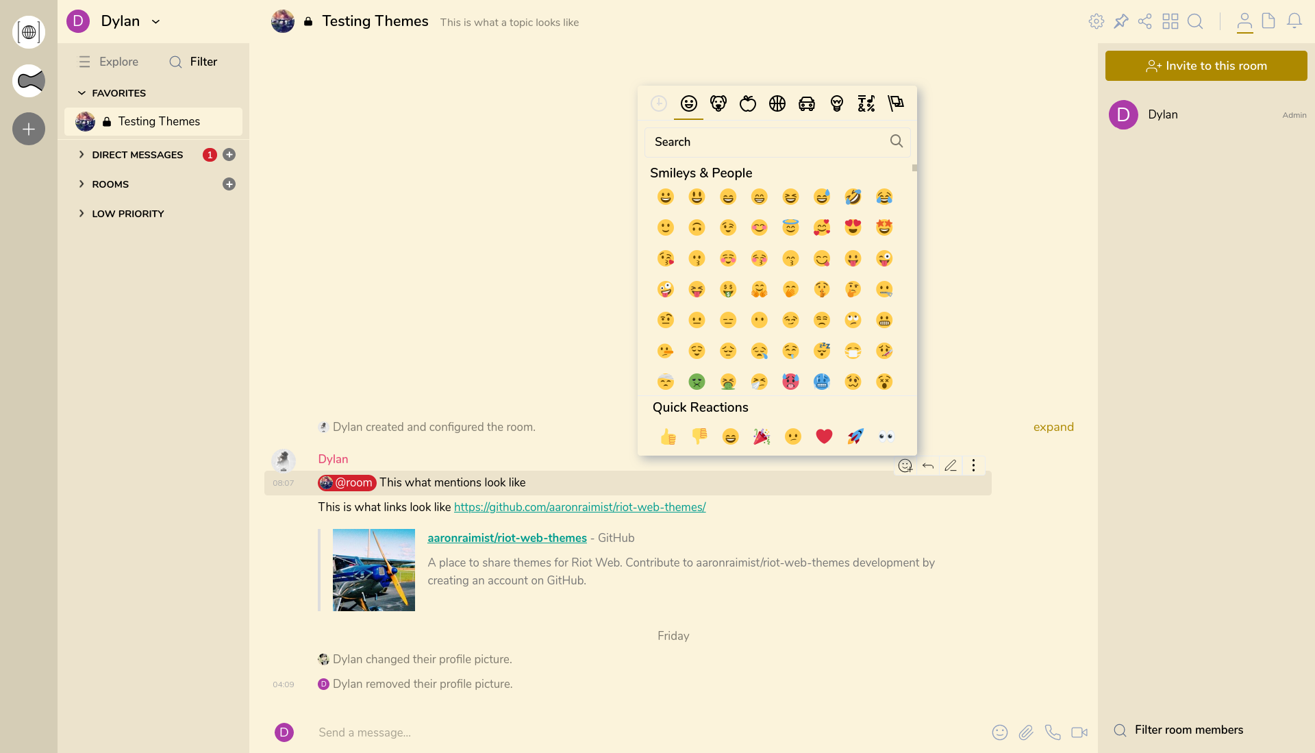
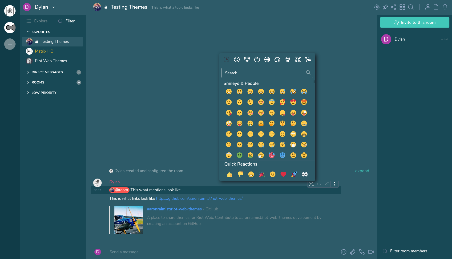
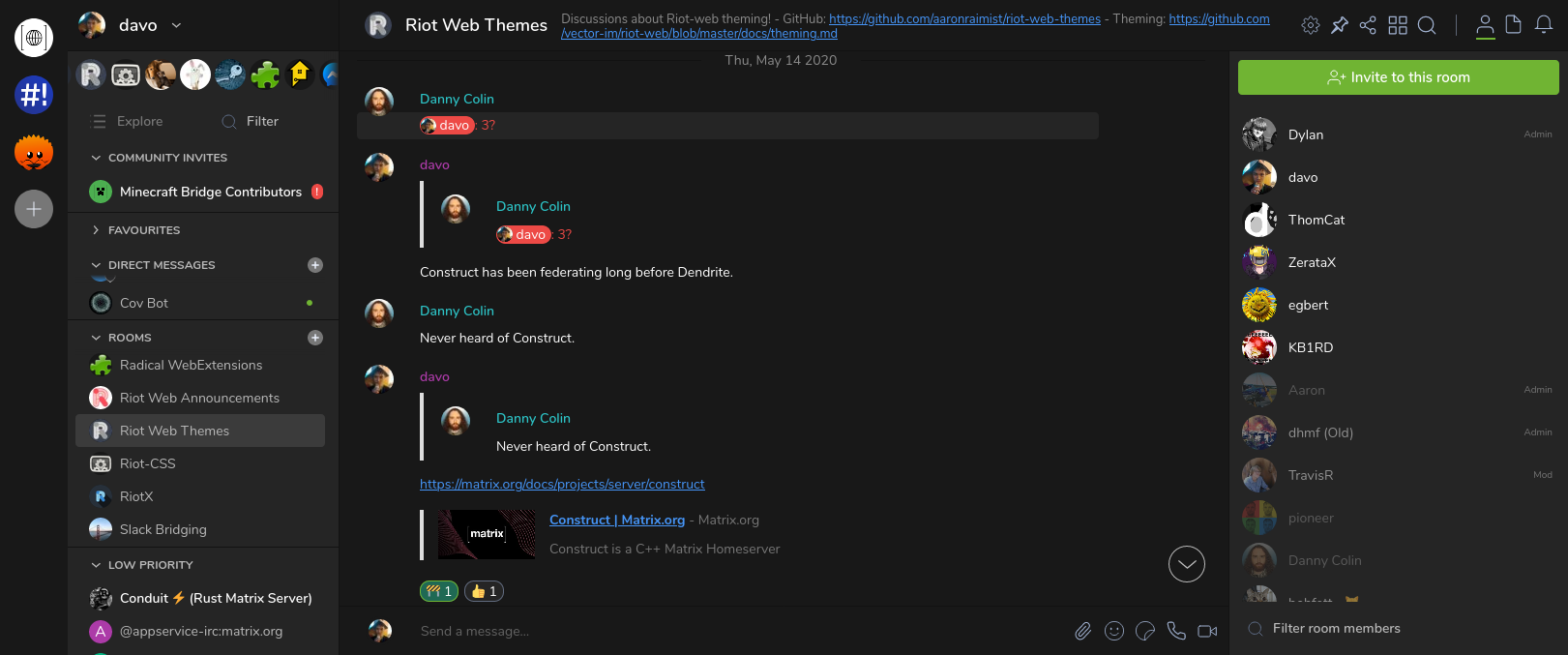
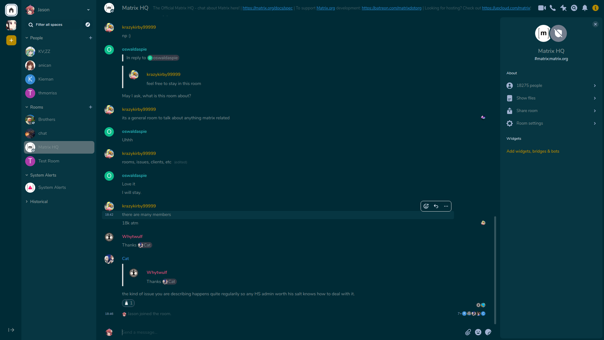
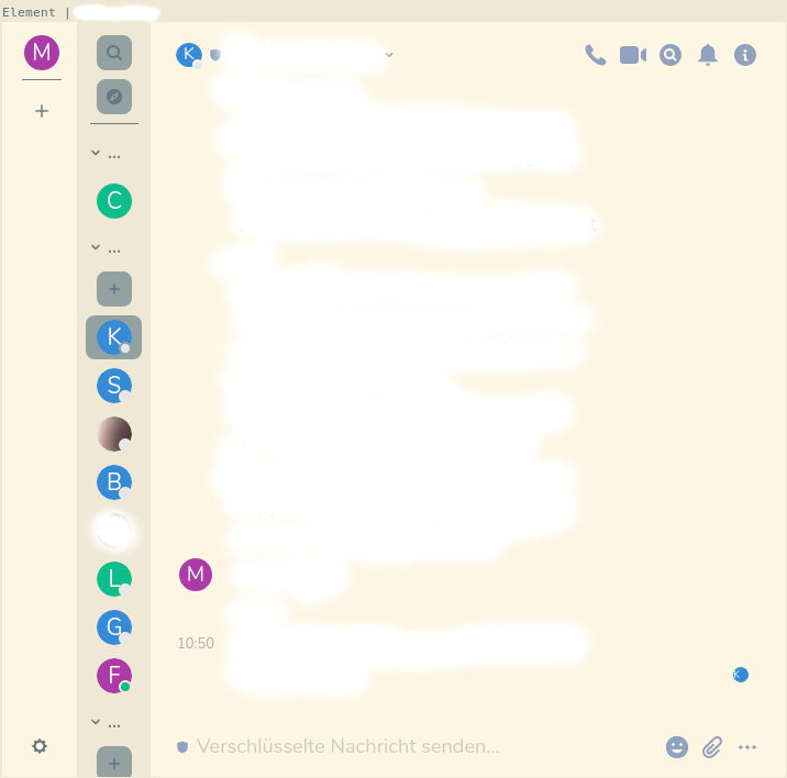
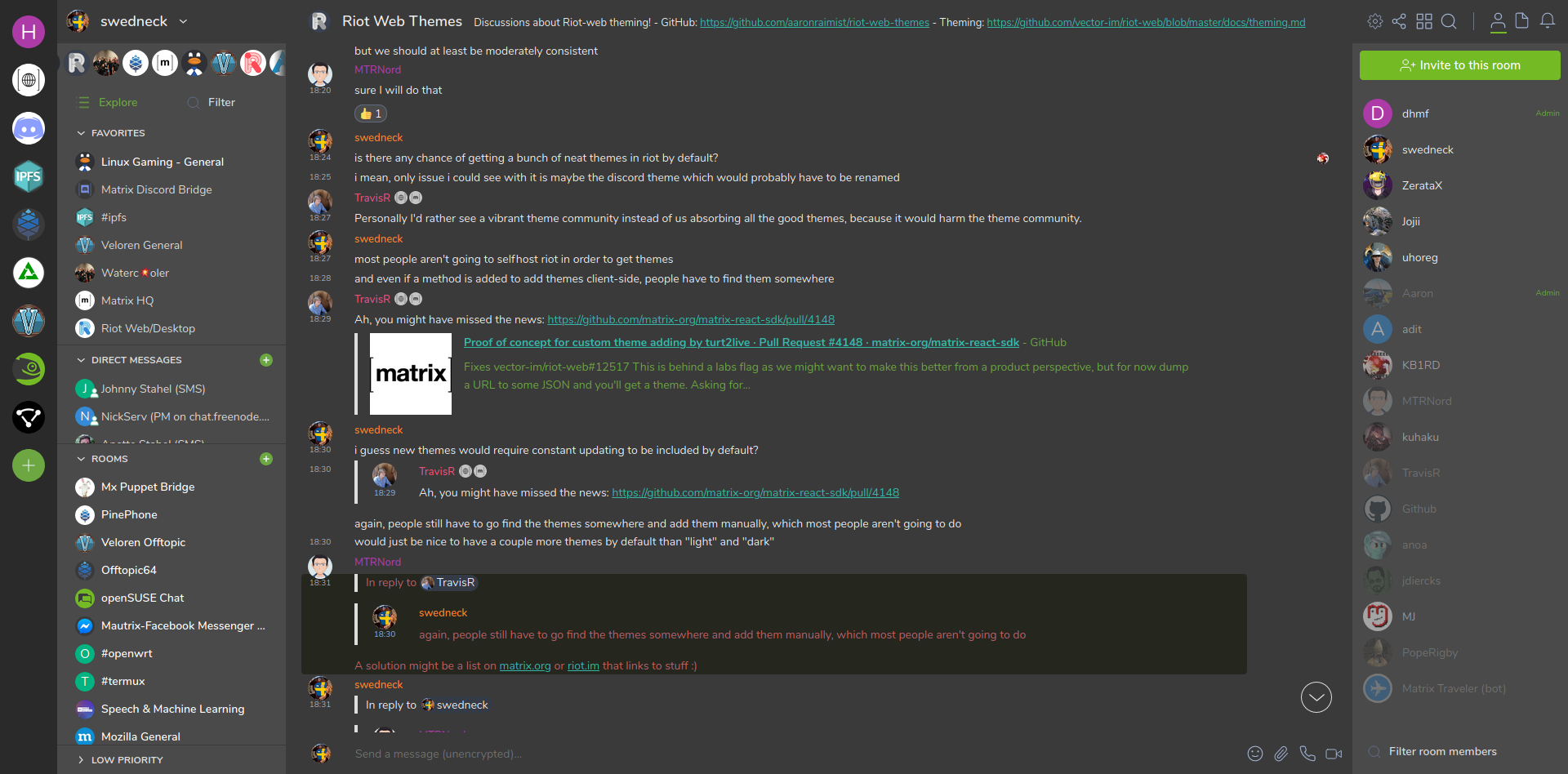
A place to share themes for Element Web/Desktop. Themes are currently a beta or "Labs" feature, so you won't be able to use them with every instance of Element. Read on to learn how to use them.
To get help or discuss themes, join us in #element-themes:raim.ist
There are several different ways to install these themes.
If you are using an instances of Element which has Labs features available then you can use these themes. Go to the Labs tab in Settings and turn on "Support adding custom themes". To add a theme, find one below that you would like to try. Then copy the URL to the JSON file that makes up the theme. Go to the Apperance tab in Settings and paste the URL into the "Custom theme URL" field and click "Add theme".
One example of an instance that has Labs enabled is https://develop.element.io however be aware this is a bleeding edge version of Element and you may run into bugs. Most stable instances of Element like https://app.element.io do not have Labs features enabled.
If you are self hosting your own instance of Element or you are using the Desktop app, you can use these themes by editing your config.json file. Put the themes you want inside of the settingDefaults section like this:
{
    "settingDefaults": {
        "custom_themes": [
            {
                "name": "Example theme",
                "colors": {
                    "primary-color": "#9F8652"
                }
            },
            {
                "name": "Another theme",
                "colors": {
                    "primary-color": "#526A9E"
                }
            }
        ]
    },
    "show_labs_settings": true
}
Once you do that, you will need to enable "Support adding custom themes" (feature_custom_themes) in the Labs section of Settings so that these themes appear in the Appearance section of Settings.
To use a custom config.json file with Element Desktop, see https://github.com/vector-im/element-desktop#user-specified-configjson
You can enable all of these themes just by setting matrix_client_element_themes_enabled: true in your vars.yml file. See https://github.com/spantaleev/matrix-docker-ansible-deploy/blob/master/docs/configuring-playbook-client-element.md#themes for more details.
Alternatively you can use my Element Web instance which has all of these themes preinstalled so there is no configuration required.
Made by @me:thomcat.rocks
Made by @dylhack:newcircuit.io and @Oha-you
Made by @dylhack:newcircuit.io
Made by @foxy:teapot.ovh
Made by @dylhack:newcircuit.io
Made by @dylhack:newcircuit.io
Made by @dylhack:newcircuit.io
Made by @dylhack:newcircuit.io
Made by @dylhack:newcircuit.io and @david:vovo.id.au
Made by @jasonic5:matrix.org
Made by Marius
Made by @swedneck:feneas.org
Made by @jakobr_107:utwente.io
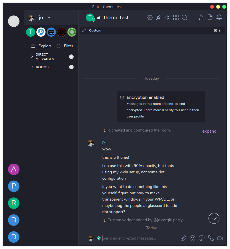
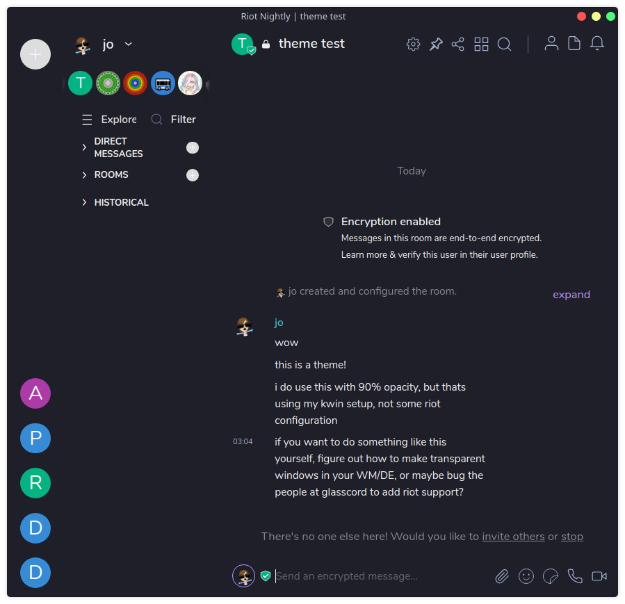
Made by @jo:catgirl.party
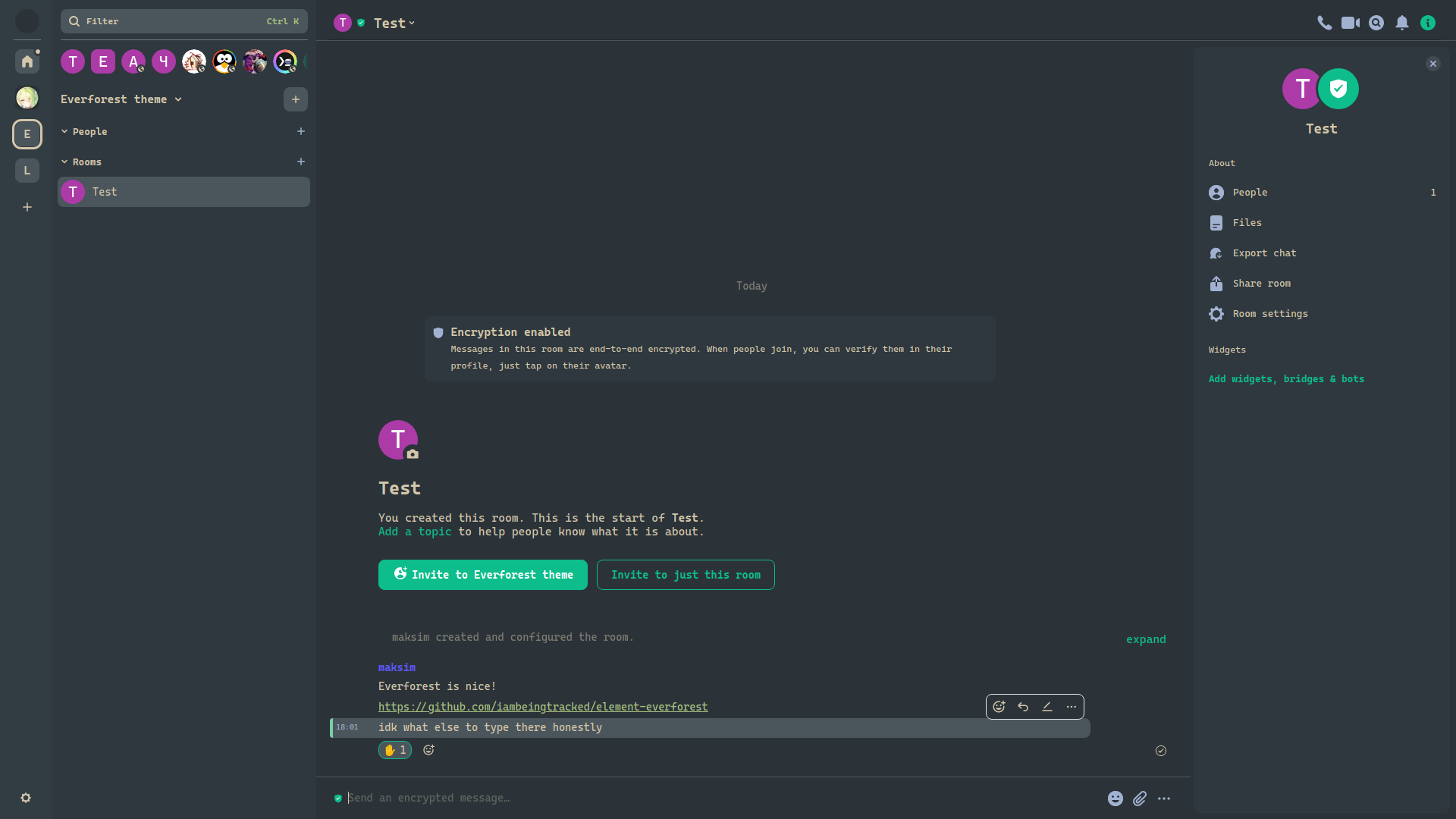
Made by @maksim:wherelinux.xyz
A theme that autogenerates colors based on your wallpaper.
Made by @acxz:matrix.org
The themes in this repository use Element's relatively basic theming system which can only change a limited number of colors. Element's theming documentation has more information on how these work. For more advanced themes where you want to customize things like fonts, button shapes, or all of the colors you'll need to use CSS which isn't supported by Element's theming system. To use CSS based themes you could use a browser extension like Stylus. https://github.com/dannycolin/riot-compact is an example of a more advanced theme.
Element's theme implementation is fairly limited so custom themes might introduce some odd elements. For example, when using ThomCat Black, the selected reaction 'pill' is outlined in green since Element doesn't give us a variable to control the color that is used there.
To fix this, we have to edit the custom theme CSS file directly, in this case theme-dark-custom.css. cssbeautify-cli is not necessary if your sed-fu is better than the author's is.
cssbeautify-cli -f theme-dark-custom.css > /tmp/theme-dark-custom-sed.css
sed '/.mx_ReactionsRowButton.mx_ReactionsRowButton_selected/!b;n;c\ \ \ \ background-color:var(--accent-color);' /tmp/theme-dark-custom-sed.css > /tmp/theme-dark-custom.css
sudo -u <nginx/apache_user> cp /tmp/theme-dark-custom.css /<element_directory>/bundles/<bundle_version>/
The results:
There is a build.py python file which takes all the themes and outputs it to a file as an array of JSON. Simply execute it in this directory.
