Synthesising graphs and simulating things
This repository contains tools for creating, manipulating, and visualizing node-edge network graph representations. It also contains some example code that puts those tools to use.
- If you want to learn how to create gephi-like graphviz images, go to the graphviz.py section
- If you want to learn how to create diverse and interesting synthetic graphs for your own use, go to the graph.py section
- If you want to learn how to create simulations using graphs created via graph.py, go to the politics_simulation.py section
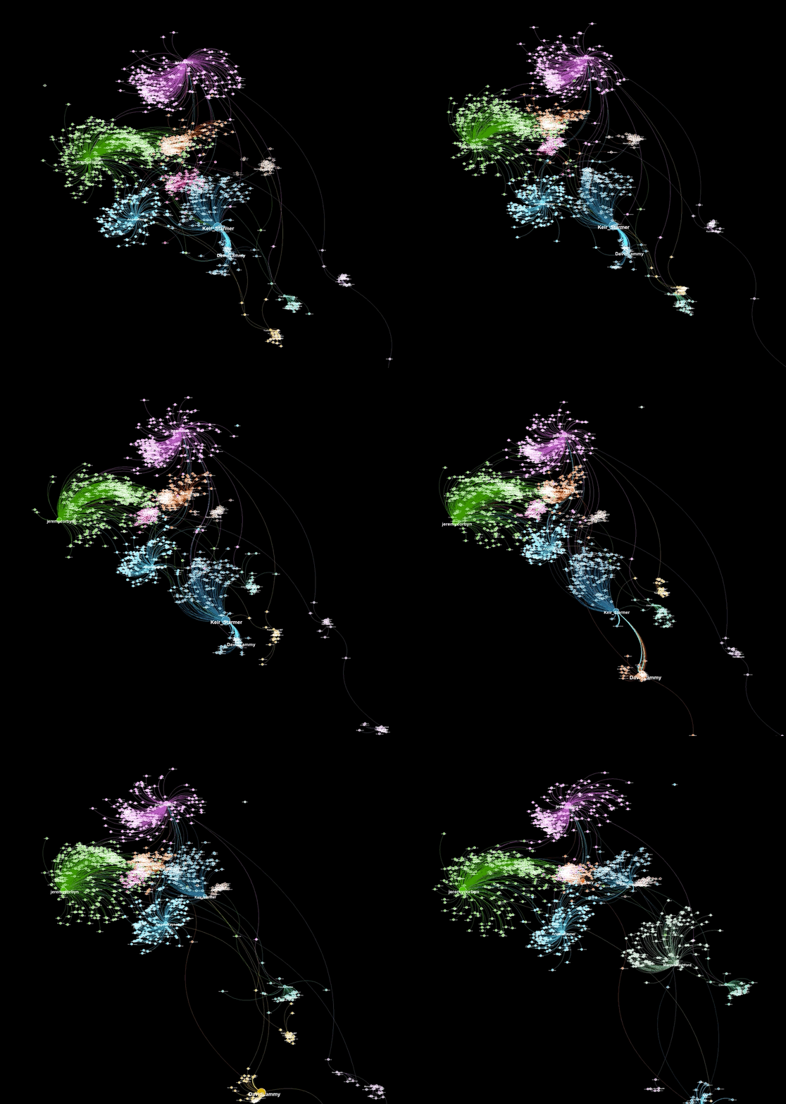
- If you want to learn how to create graphviz animations (such as the one below), go to the plot_timelapse.pysection
Graph.py and graphviz.py can be easily used together in the following manner. Download this repository and copy graph.py and graphviz.py to the folder where you're writing your code. Import both files at the beginning of your script. Here's an example:
from graph import *
from graphviz import *

g = Graph() # Set options for graph generation
gv = GraphViz(from_dict=g.interactions) # Add additional visualization options
im = gv.make_graphviz()
im.save("graphviz.png")
display(im) # If running in a jupyter notebook
I have been using gephi (https://gephi.org/) for many years to visualize node-edge graphs in an appealing and eye-catching manner. Even though the tool is straighforward to use and contains many useful features, I have always wished for a programmatic method to generate similarly visually appealing graph plots. Unfortunately, currently available tools either cost money or aren't capable or generating visualizations nearly as nice looking as those created by gephi. With this in mind, I decided to create a tool capable of generating graph visualizations similar to those that gephi outputs. That tool is graphviz.py.
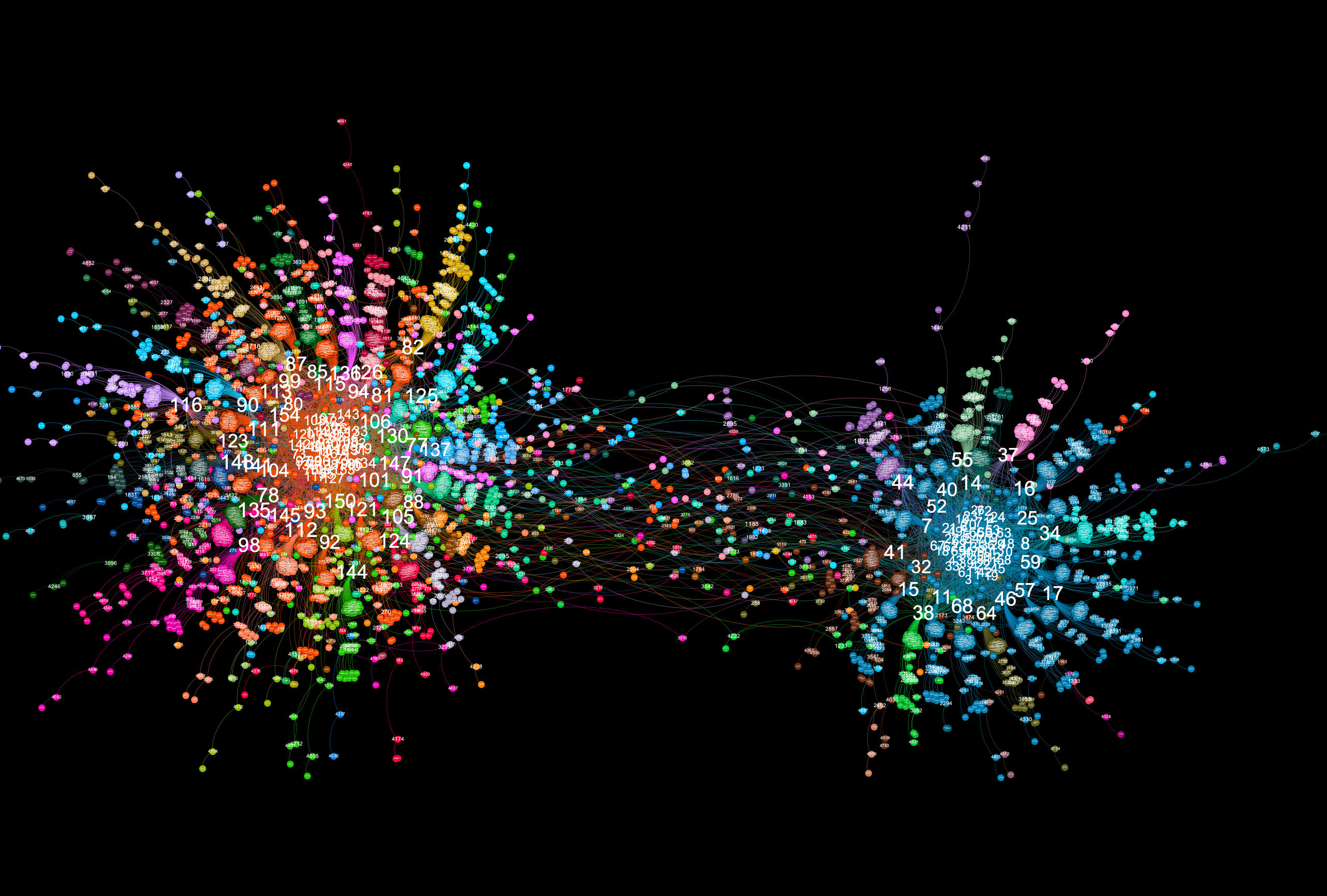
A graph visualiztion generated with graphviz.py looks like this:
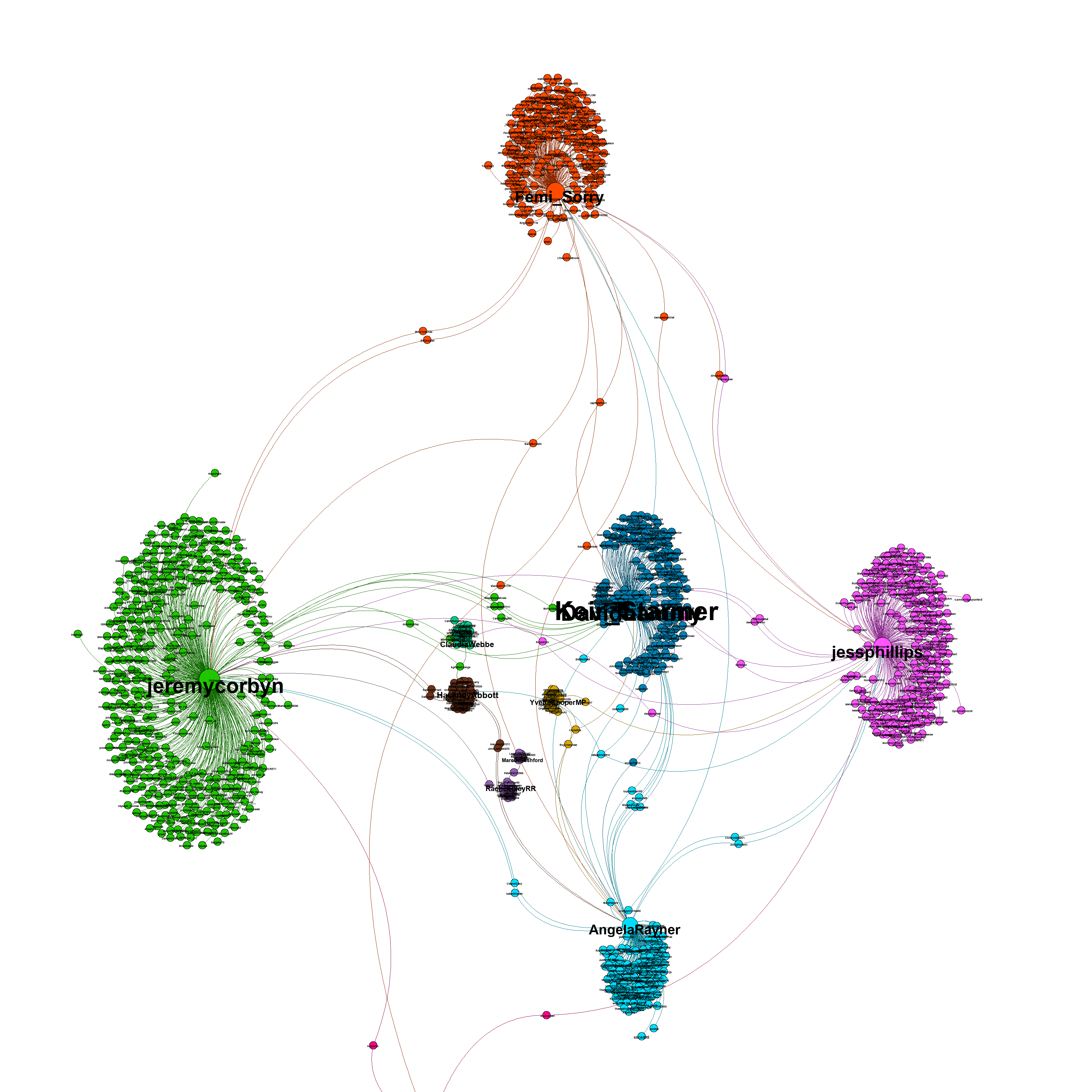
Here is an example of a visualization generated from captured Twitter data using background_mode = "white"
There's also a "glowy" mode available:
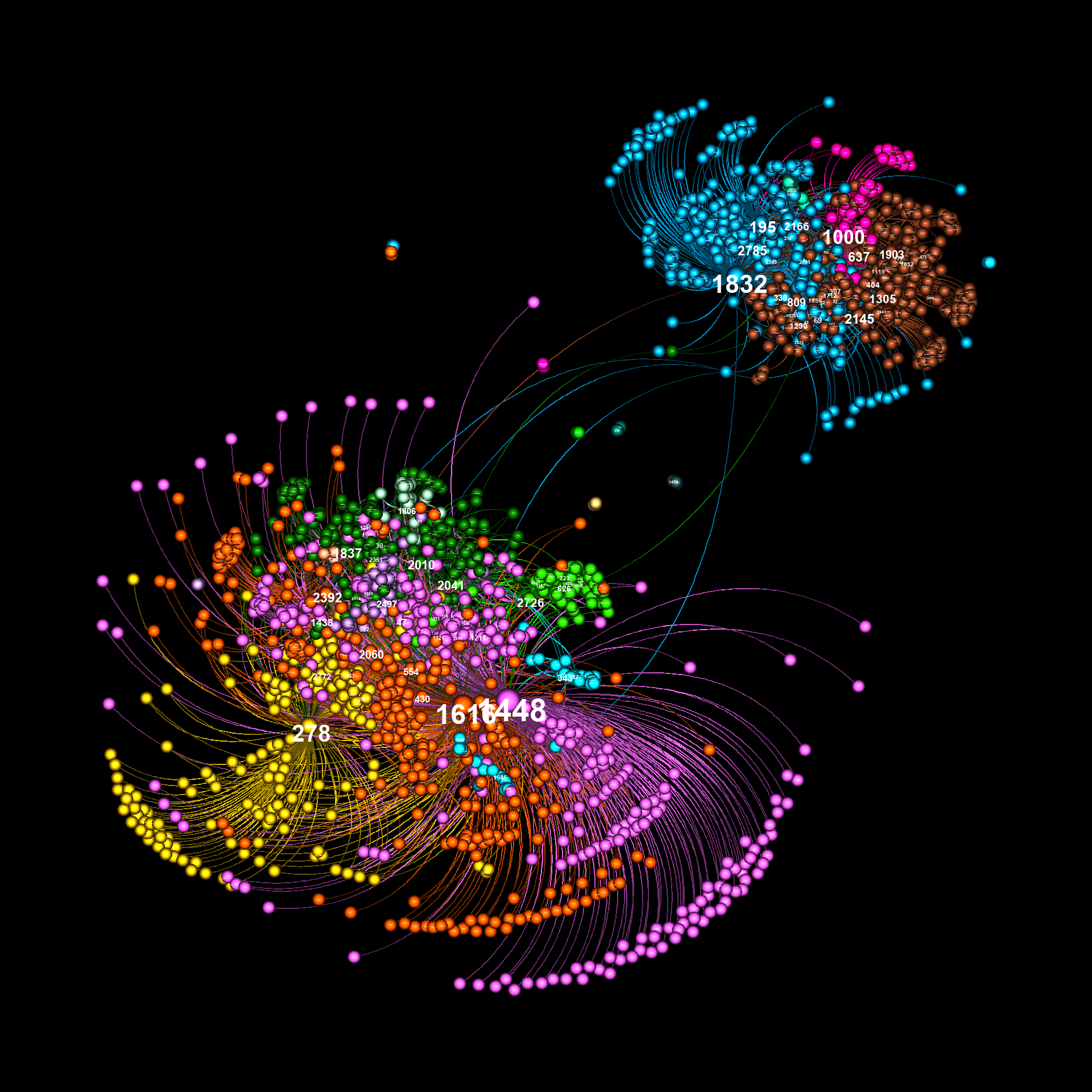
As illustrated in the above examples, graphviz.py is able to approximate Gephi's visualization style fairly accurately.
In order to use graphviz.py you'll need to install the following:
networkx (https://networkx.org/)
pip install networkx
louvain community detection (https://github.com/taynaud/python-louvain)
pip install python-louvain
forceatlas2 for python (https://github.com/bhargavchippada/forceatlas2)
pip install fa2
numpy (https://numpy.org/)
pip install numpy
pillow (https://pillow.readthedocs.io/en/stable/)
pip install Pillow
A GraphViz object can be created in three different ways:
- Initialize a GraphViz object using from_dict=dict. This takes a python dict that describes a graph in the following format:
{s1:{t1:w, t2:w, t3:w...} s2:{t3:w, t4:w...}}
Where s is source, t is target and w is weight. Both sources and targets can be strings or integers. Weight must be a positive integer value.
- Initialize a GraphViz object using from_mapping=mapping. This takes a list in the following format:
[[s, t, w], [s, t, w], ..., [s, t, w]]
Where s is source, t is target and w is weight.
This mode can be used to add edge labels. Just prepare the data in the following format:
[[s, t, w, l], [s, t, w, l], ..., [s, t, w, l]]
Where s is source, t is target, w is weight, and l is the label. Edge labels are stored in the GraphViz object as extra_vars['edge_labels'].
This mode can also be used to add specific edge colors. Just prepare the data in the following format:
[[s, t, w, l, c], [s, t, w, l, c], ..., [s, t, w, l, c]]
Where s is source, t is target, w is weight, l is the label, and c is the color. Edge colors are stored in the GraphViz object as extra_vars['edge_colors']. Note that the color specified in this field should correspond with an index in a defined color palette, not an actual RGB color tuple.
Finally, this mode can also be used to add specific edge styles. Just prepare the data in the following format:
[[s, t, w, l, c, y], [s, t, w, l, c, y], ..., [s, t, w, l, c, y]]
Where s is source, t is target, w is weight, l is the label, c is the color, and y is the style. Edge styles include "normal" (a full line), "dashed" and "dotted" (broken lines). These styles only work in "normal" mode - the "glowy" edges used in "sphere" and "glowy" modes override individually defined edge styles.
- Initialize a GraphViz object using from_nx=nx. This takes a networkx object as input.
Make sure to only initialize a GraphViz object using one of these three methods.
Creating a graph visualization using a dict looks like this:
from graphviz import *

interactions = {}
# Parse some data to create an interactions dict
# Your own code goes here

gv = GraphViz(from_dict=interactions)
im = gv.make_graphviz()
im.save("graph.png") # to save it
display(im) # if you're running this in a jupyter notebook
The GraphViz init() takes optional parameters that allow the user to adjust the final graphical output of the module. Some of those parameters are described below.
mag_factor (default: 1.0) Defines the size of the image output. At a value of 1.0, the size of the image is 1200 x 1200. Setting this to 4.0 or higher will allow even the smallest labels on a resulting image to be examined.
graph_style (default: "normal") Defines a style - either "normal", "sphere", or "glowy" which alters the way nodes and edges are displayed.
layout (default: "FA2") Defines the layout algorithm to use when positioning nodes for visualization. Options are "FA2", "spring", "kamada_kawai", and "spectral".
scaling (default: 5.0) A variable to be passed into the forceatlas2 algorithm. See https://github.com/bhargavchippada/forceatlas2 for details.
gravity (default: 20.0) A variable to be passed into the forceatlas2 algorithm. See https://github.com/bhargavchippada/forceatlas2 for details.
iterations (default: 200) A variable to be passed into the forceatlas2 algorithm. See https://github.com/bhargavchippada/forceatlas2 for details. Determines how many iterations the algorithm runs. A higher value will lead to longer runtime.
eadjust (default: 0.5) Applies slight dimming to edges, in-line with how gephi plots graphs. A lower value creates dimmer edges.
expand (default: 0.3) Equivalent to gephi's expand transformation. Moves all nodes away from the center point by a defined factor. Note that this will expand the canvas, resulting in a larger image.
zoom (default: [[0.0,0.0],[1.0,1.0]]) A manual method for zooming into the graph. The first two values represent how far from the left and top edges to zoom, the second two values represent right and bottom edges.
auto_zoom (default: True) When data is collected from natural sources (such as social networks), there are sometimes small "blobs" of nodes that aren't connected to the main graph. When forceatlas2 is applied, these blobs fly far away from the main clump. This causes the visualization to be "zoomed out". Autozoom corrects this by automatically setting the zoom variable to center the main graph.
label_font (default: "Arial Bold") the font to use when creating labels. Note that you must have the truetype (.ttf) font with the exact name installed on your machine.
min_font_size, max_font_size denote minimum and maximum font sizes in the resulting visualization.
font_scaling (default: "lin") This variable determines how fonts scale. Values can be "lin" (linear), "pow" (highlights fewer labels), "root" (highlights more labels) or "fixed". These are roughly equivalent to gephi's "spline" functionality. Both the "pow" and "root" options can include a float value (e.g. "pow2.5"). If no value is included (i.e. "pow") the value will be 2. The option "fixed" can include an integer value for the exact size (e.g. "fixed12"). If a value is not included in the "fixed" parameter, the maximum value will be used (i.e. for fonts, max_font_size will be used). Generally speaking, in order to get a complex graph visualization into a presentable state, you want only some labels to be readable. This is achieved by altering min_font_size, max_font_size and font_scaling. If the distribution of values used to set label size is high, "lin" or "root" may be better. If the distribution os low, try "pow". For simple graphs, "fixed" may be the best option. This advice also applies to node sizing.
min_node_size, max_node_size, node_scaling are the same as above, but for node circles.
min_edge_size, max_edge_size, edge_scaling are the same as above, but for edge lines.
background_mode (default: "black") - can be either "black" or "white". Examples were shown above.
edge_style (default: "curved") can be either "curved" or "straight".
extra_vars (default: None) This option allows additional data to be supplied to the GraphViz object. Extra vars must be supplied in the format: {"var_name": n1:val, n2:val, ..}. All nodes in the graph should contain a label.
color_by (default: "modularity") This option can be used to apply node coloring based on a different set of values. Values passed in via extra_vars can be used in this fashion.
size_by (default: "out_degree") This option can be used to change node and label sizes based on a different set of values. By default, graphviz.py includes "in_degree" and "out_degree". Values passed in via extra_vars can be used in this fashion.
palette (default: "intense") This option allows the user to switch between two default palettes: "intense" and "gradient". The "intense" palette is designed for coloring nodes based on modularity. If you wish to color nodes based on their values, use "gradient" (which provides a spectrum between red and blue).
You can find example settings in some of the other scripts in this repo, including graph_examples.ipynb, plot_timelapse.py, and test_graphviz.py.
Generally speaking, in order to find correct settings, start by passing your graph into graphviz and viewing the resulting output with default settings. Then add options to the gv=GraphViz() call and reiterate until satisfactory results have been achieved (in a similar way to working directly with gephi). Generating a new image should only take a few seconds (depending on the size of the graph, number of iterations, etc.)
graph.py is a python module for creating node-edge graphs from scratch. The tool is highly configurable, allowing for the creation of many distinct node-edge graph phenotypes. The tool requires you have the following python libraries installed:
networkx (https://networkx.org/)
pip install networkx
louvain community detection (https://github.com/taynaud/python-louvain)
pip install python-louvain
The following code creates a graph using default settings and then prints some statistics about it.
from graph import *

g = Graph()
g.print_basic_stats()
g.print_community_stats()
Graphs can be saved in csv and gefx formats using write_csv(filename) and write_gexf(filename):
g.write_gexf("graph.gexf")
Additional node description parameters can be added to a graph using the set_node_desc() function. This function takes three arguments:
- name - a string used to name the column
- vtype - a string representing the data type of values assigned (e.g. integer, float, string, etc.)
- values - a dict containing nodeid, value for all nodes in the graph
Here's an example that shows how community modularity values can be set:
g = Graph()

communities = community.best_partition(g.nx_graph)
nd = dict(communities)
g.set_node_desc("community", "integer", nd)
Note that modularity values are automatically set when a graph is created. They are stored in a node_desc called "community".
Here's another example, assigning random floats to each node:
g = Graph()
node_desc = {}
for n in g.nodeids:
    node_desc[n] = random.uniform(0,1)
g.set_node_desc("random", "float", node_desc)
A more detailed example using assigned node_desc values can be found in a later section that descibes how to use graph.py in simulations.
node_desc values are automatically included in gexf files, and so will show up in Gephi's data laboratory tab.
The point of the graph.py tool is to allow researchers to create node-edge graphs with interesting properties. You no longer need to use the "karate" graph for everything! The properties of graphs generated with this tool can be studied on their own, and may be interesting when applied in simulations.
The Graph() initialization routine allows for the following parameters:
num_nodes (default:1000) is a value that is used in graph generation. It does not specifically determine the final number of nodes in a generated graph. However, the larger the num_nodes value, the larger the graph.
num_cores (default: 1) in the initial phase of graph generation, a number of cores are created in the following way - a set of nodes (roughly equal to num_nodes/20 * num_cores) is created for each core. These nodes are then connected to one another based on the intra_core_connectivity variable. Cores are then connected together (based on core_connectivity and connect_cores_directly). Finally additional nodes and edges are added to the entire graph. The minimum value for num_cores is 1.
intra_core_connectivity (default: 0.3) defines the density of connections inside the initially created cores. Higher values add more edges during initial core formation.
core_connectivity (default: 0.7) defines the density of connectivity between initially formed cores. The mean number of nodes across all created cores is multiplied by this coefficient to determine the number of connections to be made between cores. Each time two cores are connected, the cores to be connected are determined at random. Hence, for larger values of num_cores, larger values of core_connectivity may be required. Note that this setting is ignored when num_cores is 1.
add_nodes_random (default: 0.4) After cores have been created and connected together, additional nodes are added to the graph. In one case, new nodes are created and connected to other nodes at random. This value is multiplied by num_nodes to determine how many nodes are created in this way.
add_nodes_popularity (default: 1.4) After cores have been created and connected together, additional nodes are added to the graph. In one case, new nodes are created and connected to other nodes such that nodes with higher numbers of connected nodes are more likely to further receive new nodes. This value is multiplied by num_nodes to determine how many nodes are created in this way.
popularity_cutoff (default: 1.0) When choosing a node such that existing connections weight the node more likely to be chosen, all nodes are still considered in the final categorical distribution. To limit the number of nodes available for selection, one may set popularity_cutoff to a value between 0 and 1. A lower value will select a smaller portion of the most connected nodes.
connect_cores_directly (default: 0.2) defines the chance that nodes belonging to cores are connected directly to other cores, or via intermediate nodes. Setting this value to 0 will guarantee that cores are always connected via intermediate nodes. Setting the value to 1 ensures cores are always connected directly. Note that this setting is ignored when num_cores is 1.
connect_second_neighbours (default: 1.5) after random nodes are added to the graph, some additional edges are created between existing nodes. Some connections are intentionally formed between a node and its second neighbour. The number of connections made this way is determined by multiplying num_nodes with connect_second_neighbours.
connect_random (default: 0.4) after random nodes are added to the graph, some additional edges are created between existing nodes. Some connections are intentionally formed between a randomly selected pair of nodes. The number of connections made this way is determined by multiplying num_nodes with connect_random.
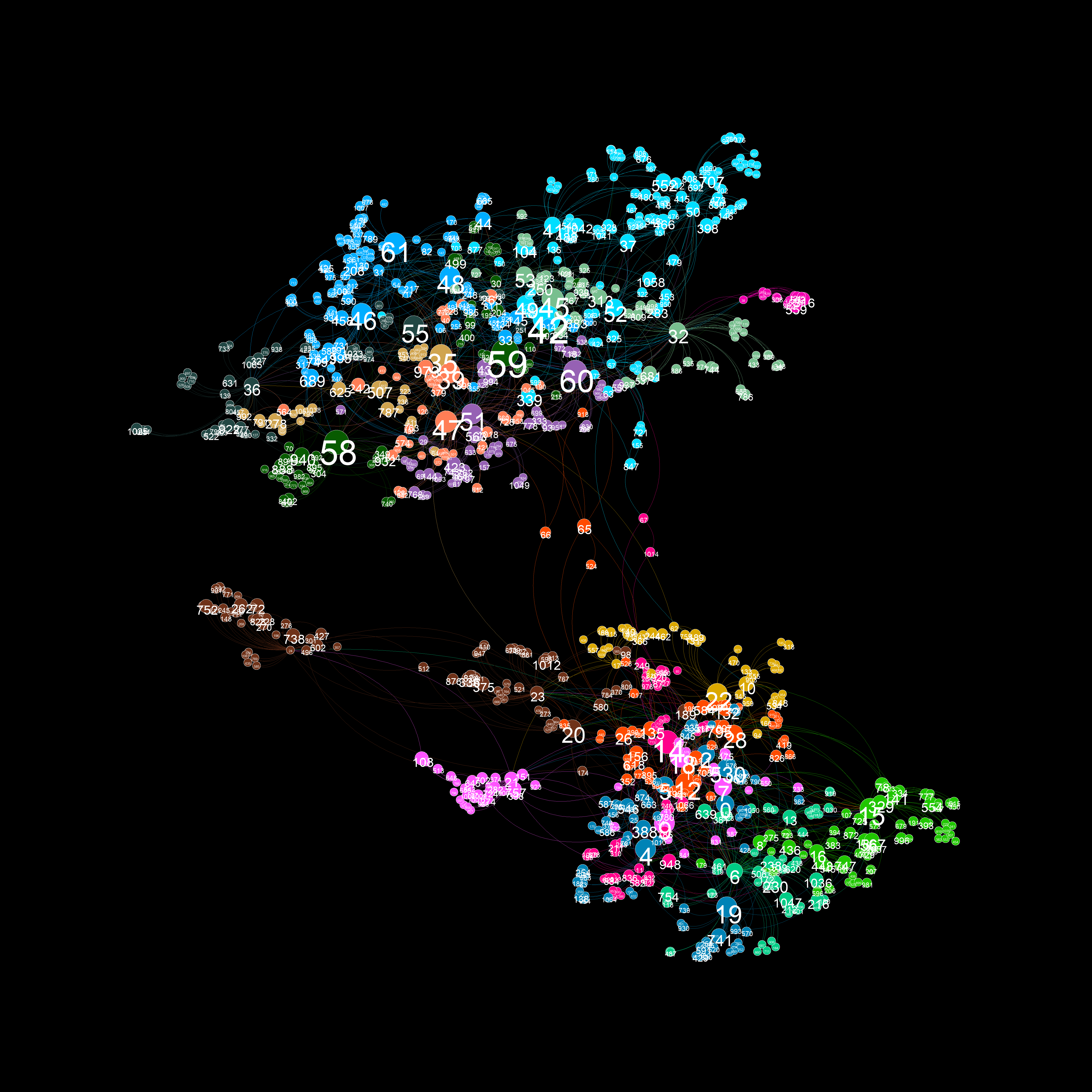
The above description of graph.py's initialization options probably doesn't make sense. However, how these parameters work will be illustrated in the following examples.
Default settings are as follows:
g = Graph(num_nodes=1000,
          num_cores=1,
          intra_core_connectivity=0.3,
          core_connectivity=0.7,
          add_nodes_random=0.4,
          add_nodes_popularity=1.4,
          popularity_cutoff=1.0,
          connect_cores_directly=0.2,
          connect_second_neighbours=1.5,
          connect_random=0.4)
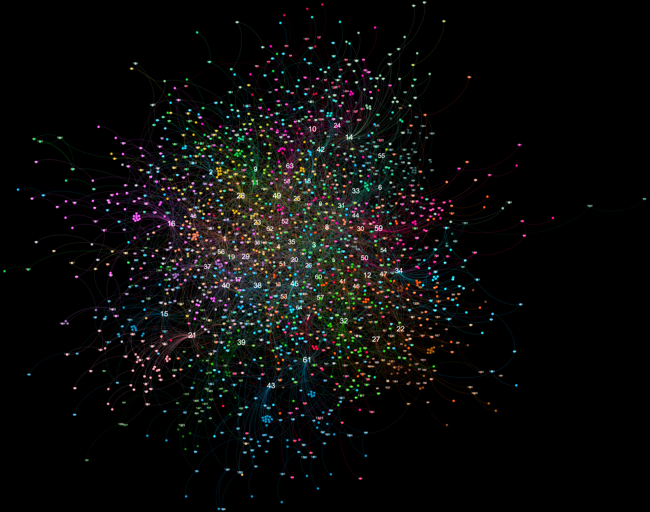
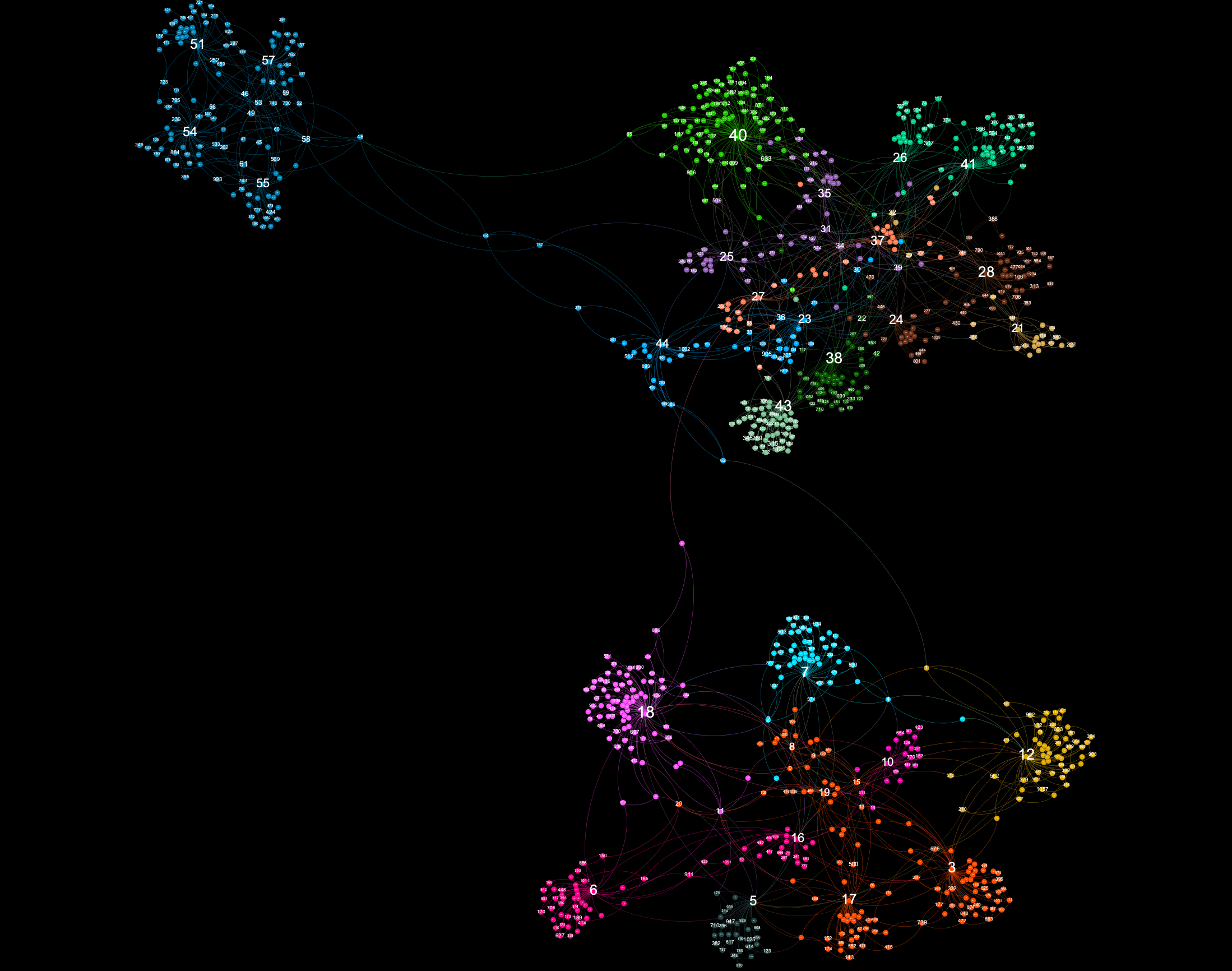
In this config you will notice more "umbrella" clusters connected to nodes with high in-degree.
g = Graph(num_nodes=1000,
          num_cores=1,
          intra_core_connectivity=0.3,
          core_connectivity=0.3,
          add_nodes_random=0.0,
          add_nodes_popularity=1.0,
          popularity_cutoff=1.0,
          connect_cores_directly=0.2,
          connect_second_neighbours=1.0,
          connect_random=0.0)
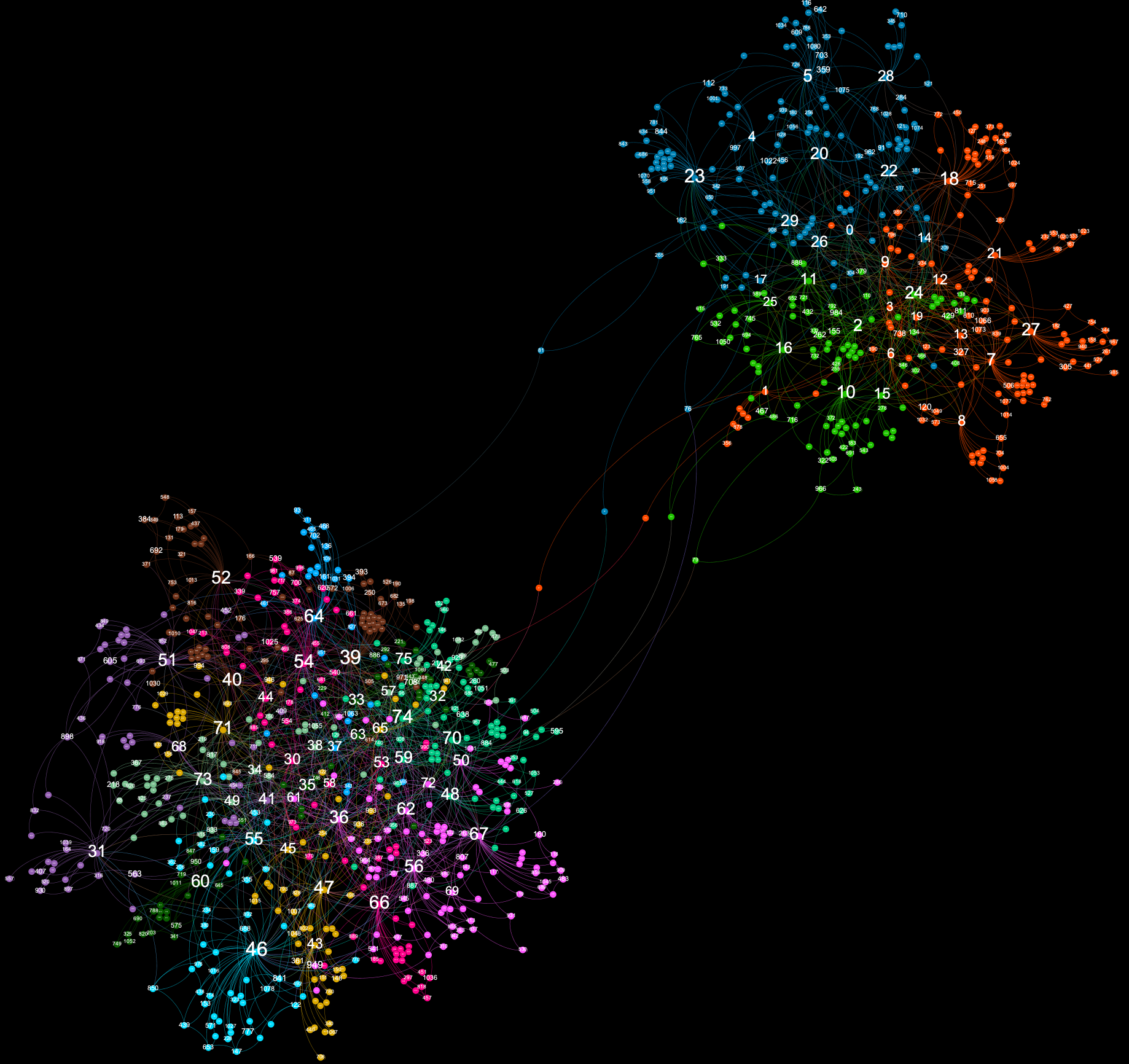
This is an example of how to create a loosely-connected two-core network. Such patterns are commonly seen when studying political content on social networks.
g = Graph(num_nodes=1000,
          num_cores=2,
          intra_core_connectivity=0.3,
          core_connectivity=0.2,
          add_nodes_random=0.0,
          add_nodes_popularity=1.0,
          popularity_cutoff=1.0,
          connect_cores_directly=0.0,
          connect_second_neighbours=1.0,
          connect_random=0.0)
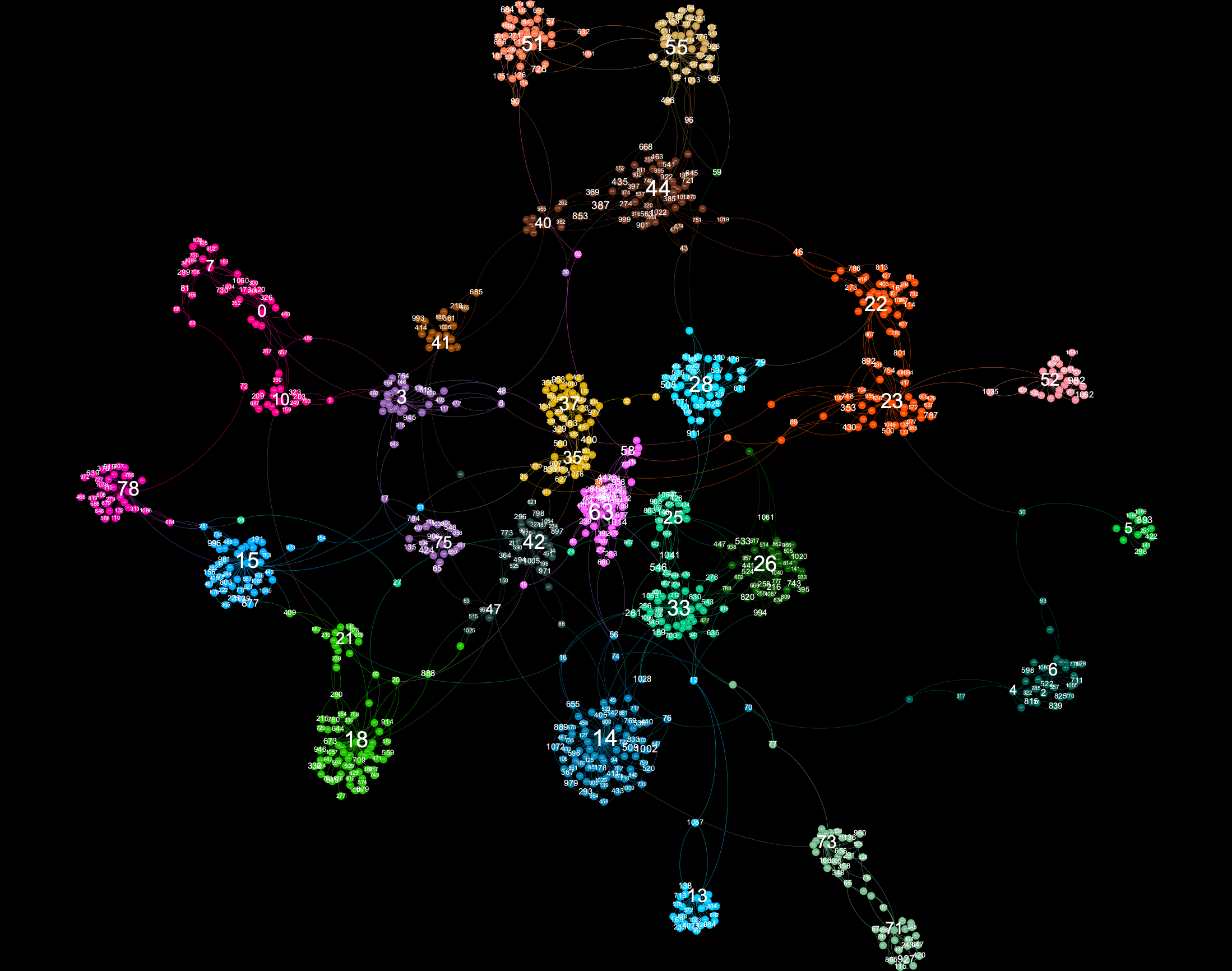
Such networks are rare in the real-world, but may be of interest to study.
g = Graph(num_nodes=1000,
          num_cores=3,
          intra_core_connectivity=0.3,
          core_connectivity=0.2,
          add_nodes_random=0.0,
          add_nodes_popularity=1.0,
          popularity_cutoff=0.5,
          connect_cores_directly=0.0,
          connect_second_neighbours=1.0,
          connect_random=0.0)
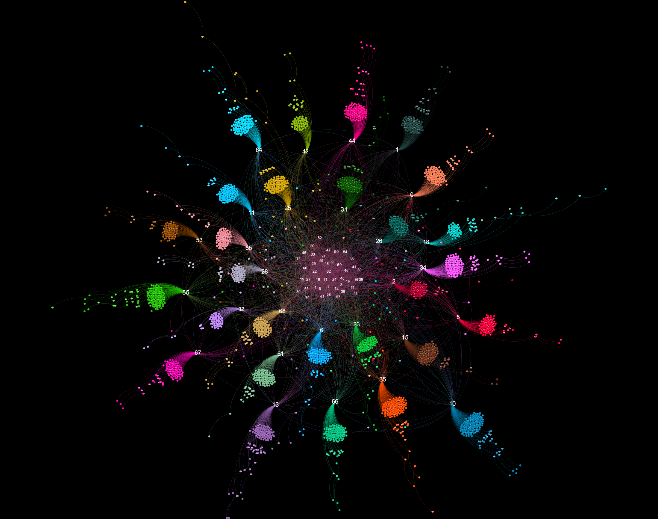
This is an example of what happens when num_cores and core_connectivity are set to very high values. This pattern is sometimes seen in follower-following interactions of botnet accounts on Twitter. Each separate cluster is highly connected and forms its own community. Such a graph might be interesting for simulation purposes.
g = Graph(num_nodes=1000,
          num_cores=6,
          intra_core_connectivity=0.1,
          core_connectivity=3.0,
          add_nodes_random=0.0,
          add_nodes_popularity=1.0,
          popularity_cutoff=0.5,
          connect_cores_directly=0.5,
          connect_second_neighbours=1.0,
          connect_random=0.0)
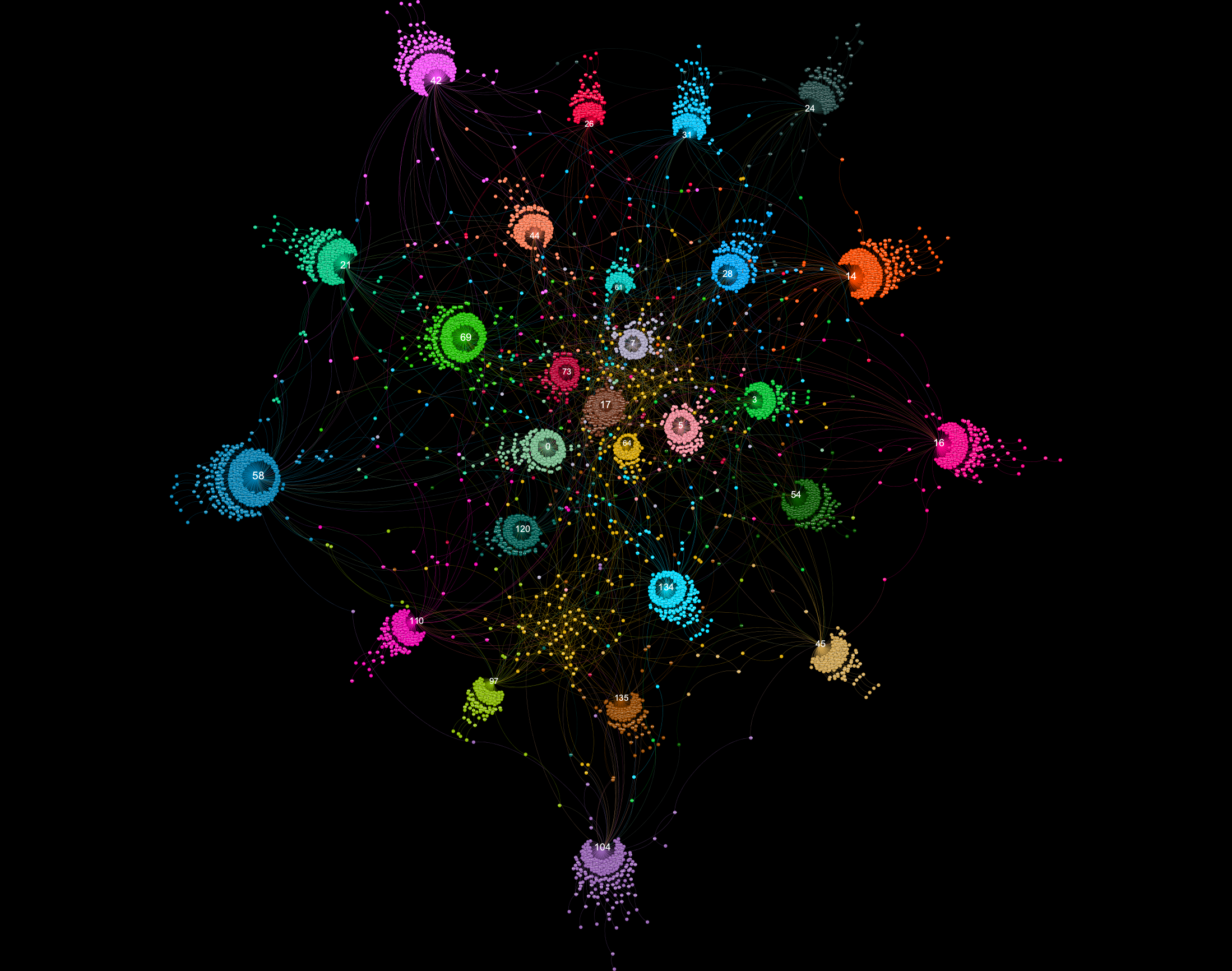
This configuration illustrates what happens when add_nodes_popularity is set to a very high value and popularity_cutoff is set to a very low value.
g = Graph(num_nodes=2000,
          num_cores=2,
          intra_core_connectivity=0.1,
          core_connectivity=0.5,
          add_nodes_random=0.1,
          add_nodes_popularity=3.0,
          popularity_cutoff=0.2,
          connect_cores_directly=0.1,
          connect_second_neighbours=0.5,
          connect_random=0.1)
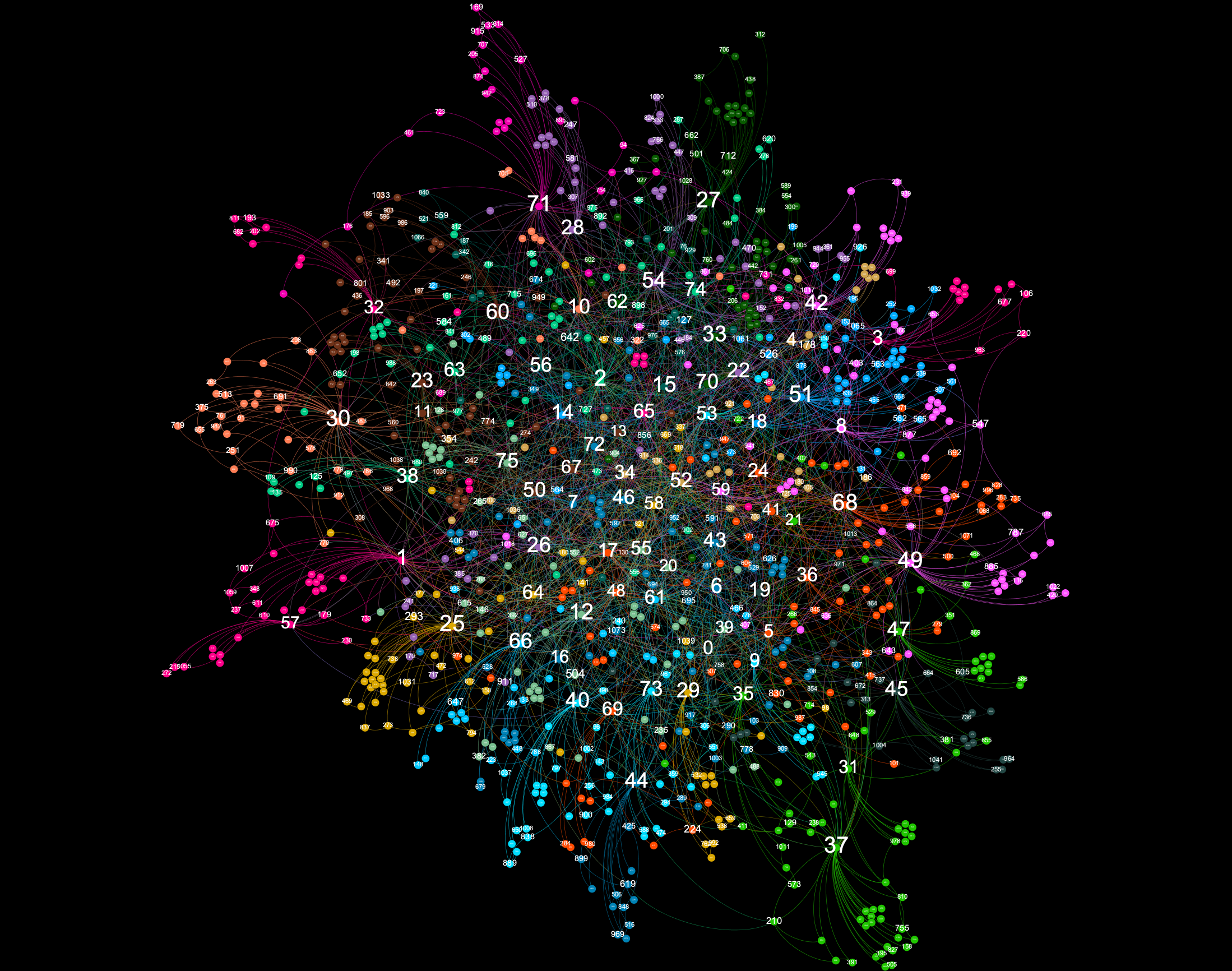
This configuration also illustrates what happens when add_nodes_popularity is set to a very high value and popularity_cutoff is set to a very low value. However, in this example, intra_core_connectivity is also set high.
g = Graph(num_nodes=1000,
          num_cores=1,
          intra_core_connectivity=0.8,
          core_connectivity=0.5,
          add_nodes_random=0.1,
          add_nodes_popularity=3.0,
          popularity_cutoff=0.4,
          connect_cores_directly=0.1,
          connect_second_neighbours=0.3,
          connect_random=0.0)
This is a two-core example of the scenario where add_nodes_popularity is set to a very high value and popularity_cutoff is set to a very low value. In this example, core_connectivity and connect_cores_directly are both low values.
g = Graph(num_nodes=2000,
          num_cores=2,
          intra_core_connectivity=0.7,
          core_connectivity=0.2,
          add_nodes_random=0.5,
          add_nodes_popularity=2.0,
          popularity_cutoff=0.4,
          connect_cores_directly=0.05,
          connect_second_neighbours=0.3,
          connect_random=0.1)
All the above graph examples can be generated in the graph_examples.ipynb notebook. Running the appropriate cell will also generate a gexf file that can be opened using gephi (https://gephi.org/). In order to run the notebook, you'll need to install requirements for graphviz.py (covered elsewhere on this page).
A jupyter notebook for playing around with and testing different configuration options is available in this repo (graph_testing.ipynb). In order to run the notebook, you'll need to install bokeh (https://docs.bokeh.org/en/latest/#)
pip install bokeh
The reason I created graph.py was that I wanted to create a simple political simulation designed to determine how scandals affect voting intention. Having worked extensively with graphs in the past - especially with graphs derived from social network interactions - I decided to create a script capable of creating the various types of graphs I've seen in my research. While creating this tool I also added functionality designed to assist in the creation and running of simulations.
Using graph.py to run a simulation is best illustrated by example. I have included a toy simulation (politics_simulation.py) in this repository that does the following:
- Creates a graph using graph.py
- Randomly picks a number of "influencer" nodes from each of the graphs's communities.
- For each community, a political party (red or blue) is chosen at random. Chosen influencers in that community are assigned high "voting intention" values. (Close to -1 for "blue" voting intention, and close to +1 for "red" voting intention). Voting intention is assigned to each node using graph.py's set_node_desc() function that was described earlier.
- Voting intention in then propagated out to other nodes in the graph based on each node's neighbours' voting intention (see the code for how this is performed). This process utilizes graph.py's functions for finding neighbouring nodes, such as get_neighbours(), get_incoming_weights(), and get_outgoing_weights().
- A number of steps are then run in which occasional scandals are simulated. Scandals affect the voting intention of all nodes in the graph. A scandal introduces a small non-integer value to the voting intention of all nodes, except those who are designated "solid voters" (voters whose voting intention values are very close to maximum or minimum).
- Voting intention is propagated again.
- Election results are recorded based on voting intention values of all nodes. Each community simulates a constituency in which all members of the community vote. Votes occur based on a node's voting intention value. If the value is close enough to zero, the voter will abstain. Otherwise they'll vote "red" or "blue" based on how close their voting intention value is to upper or lower limits. The seat for that consituency is then assigned based on who won the most votes. This scenario is designed to model "first past the post" style elections such as those in the UK and US.
- Steps 5-7 are then repeated. Votes and seats are constantly recorded and graphed.
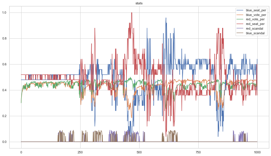
Running the simulation for a few thousand steps generates a plot like the following.
The above demonstrates that, while scandals alter short-term voting intention, it eventually returns to its original equilibrium when no scandals are happening. Thus it is best to "strike while the iron is hot" and call an election if your party is polling favourably.
A second example simulation, social_media_simulation.py is included in this repository. It can be used to create simulated social media traffic. It works in the following manner:
- Create a graph using graph.py
- Determine a set of nodes with highest in-degree in each of the graph's communities as "influencers".
- Assign all nodes with an "originality" value that determines how likely they are to create an original post. Influencer nodes are assigned higher originality values than others.
- Assign a verbosity value to each node that determines how likely it is to share a post.
- Run a number of steps where posts are randomly created, and randomly shared by neighbours.
- Each time a post is created or shared, append a json-formatted entry to a file.
- End when the desired number of posts have been written to disk.
Other implementation details can be obtained by reading the code. This script is used to create data used for timelapse videos in the next section of this report.
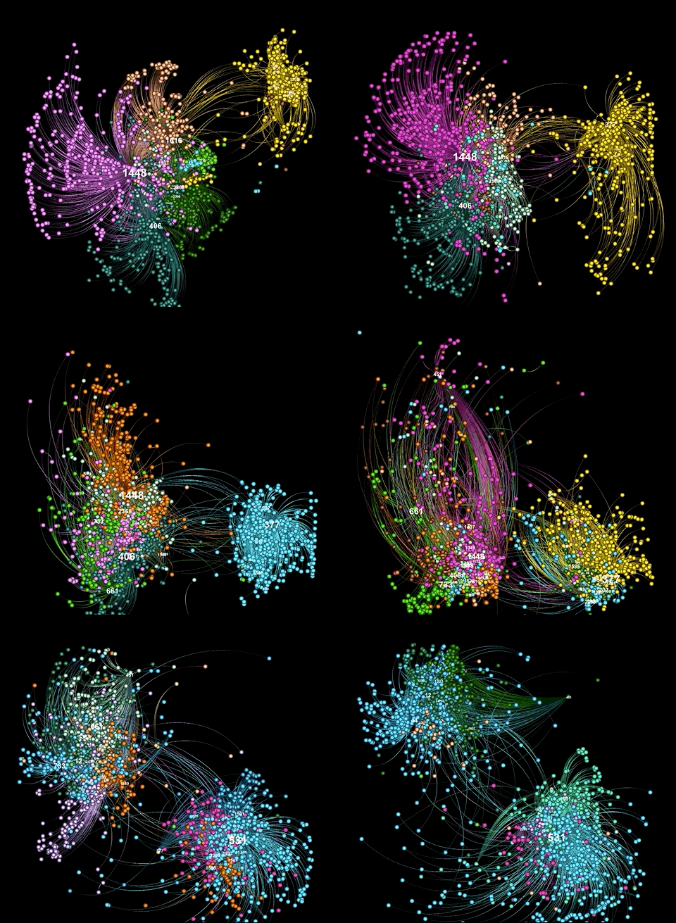
Real-world social network data is temporal in nature. Static graph visualizations can be constructed from slices of this data. However, it would be interesting to observe such data as an animation across a sliding window. Whilst gephi does have a way of animating data across a sliding window, the animation produced is based on a layout constructed from the entire timeslice. In order to view an animated graph visualization of multiple timeslices of social media data, it would be better to create multiple frames derived from layouts made of each timeslice. However, layout creation is non-deterministic, and thus assembling a video constructed of layouts created from different timeslices will "jitter" around way too much. One way to prevent this is to smoothly animate node position transitions between each created layout. This is what plot_timelapse.py demonstrates.
It works in the following manner:
- Read raw data from a file containing raw json objects (one per line) that were generated with social_media_simulation.py. I have included a generated_data.json file in this repo in case you'd like to try running plot_timelapse.py without running social_media_simulation.py first.
- Obtain a slice of data starting at position p and ending at position p+n.
- Process the raw data, extracting interactions between accounts (i.e. accounts that shared posts created by other accounts)
- Create an interactions dict using the selected data representation.
- Create a graphviz object using the interactions dict. Append it to a list of Graph() objects.
- Repeat all steps for the next slice, and so on, until all required slices have been collected.
- Pass the list of graphviz objects into the GraphViz interpolate_multiple() function. This function will create a number of frames that smoothly animate nodes between each layout. The function writes each frame to disk as a png image.
- Combine all png images into a video.
How does interpolate_multiple() work?
- Nodes are moved by plotting a bezier curve across all points extracted from layouts.
- Modularity values are mapped back to the values represented in the first input layout, to preserve color schemes.
- To attempt to make layouts somewhat deterministic, initial positions are derived from users' Twitter id_str first and last 4 digits.
The following animation depicts a synthesized timelapse using data created with social_media_simulation.py.
