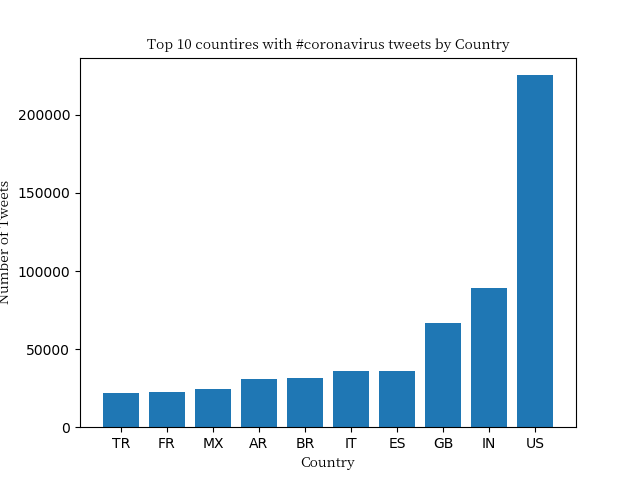
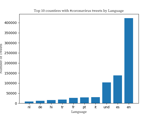
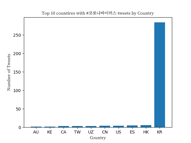
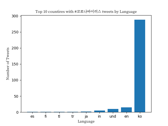
In this project I scanned all geotagged tweets sent in 2020 to monitor for the spread of the coronavirus on social media. In order to complete this I used large scale data sets, worked with multilingual text, and used the MapReduce divide-and-conquer paradigm to create parallel code.
For this project I used geotagged Tweets. Approximately 500 million tweets are sent everyday. Of those tweets, about 2% are geotagged. In total, there are about 1.1 billion tweets in this dataset. The tweets were stored by days in .zip files in the format: geoTwitterYY-MM-DD.zip. Inside each zip file there are 24 text files, one for each hour of the day. Each text file contains a single tweet per line in JSON format.
I followed these steps in order to visualize the coronavirus data on Twitter:
-
Created a mapper. This is the
map.pyfile that is located in the src/ folder. This file tracks the usage of the hashtags on both a language and country level. It outputs two files: one that ends in.langand one that ends in.country. -
Ran the mapper. To run
map.pyI created a shell scriptrun_maps.shthat loops over each file in the dataset and runs themap.pycommand on that file. -
Reduce. The files outputed from the
run_maps.shfile are stored in theoutputs/folder. Using thereduce.pyfile found in thesrc/folder,reduce.pycombines all the.langfiles into a single file and all of the.countryfiles into a different file. -
Visualize. The
visualize.pyfile, found in thesrc/folder, generates a bar graph of the results and stores the bar graph as a.pngfile. The final results are sorted from low to high, and only include the top 10 keys. I created 4 different pngs that are found in tehplots/folder: two with the--keyset to#coronavirus(one based on the languages and the other based on the countries) and two with the--keyset to#코로나바이러스(again a language and then a country png).
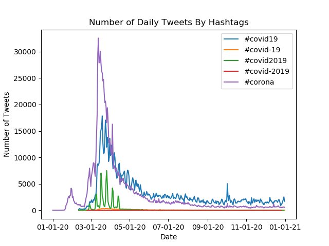
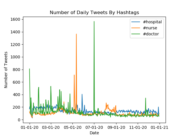
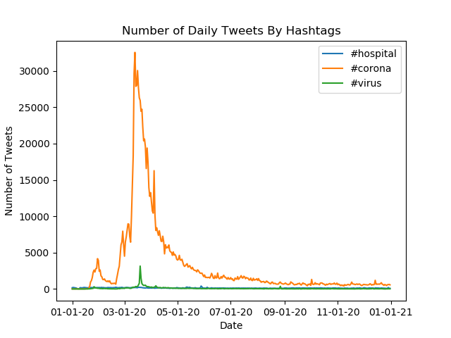
- Alternative reduce. Lastly, I created a new reduce file that take as input on the command line a list of hashtags, and output a line plot where there is one line per input hashtag, the x-axis is the day of the year, and the y-axis is the number of tweets that use that hashtag during the year. Found in the
alt_reduce_plots/folder, here are four example plots that show the trend in hashtag during 2020 that relate to the Covid-19 pandemic:
