To start using the components in your project, Copy-paste the stylesheet <link> into your <head> before all other stylesheets to load our CSS.
    <link
        rel="stylesheet"
        href="https://palasio-designs.netlify.app/style.css"
/>Alerts can be used to show a message to the user.
You will find the following types of Alert on https://palasio-designs.netlify.app/components/alert/index.html
- Danger Alert
- Info Alert
- Update Alert
- Success Alert
Avatars can be used for user profile picture.
You will find the following types of Avatar on https://palasio-designs.netlify.app/components/avatar/index.html
- Image and Text Initials Avatars
- Different Sized Avatars
Badge can be used to show either status of the user (online, offline or dnd) or you can use it show notification count.
You will find the following types of Badge on https://palasio-designs.netlify.app/components/badge/index.html
- Number Badge
- Status Badge
- Text Badge
Buttons can be used to make your web page interactive to your user. You can use them to take user action.
You will find the following types of Button on https://palasio-designs.netlify.app/components/button/index.html
- Default Button
- Filled Buttons
- Outlined Buttons
- Different Shapes of Buttons
- Link Button
- Icon Button
- Floating Button
Cards can be proved very useful. You can use them to display content on an e-commerce app, or on a social media app. You can also use them to show user feedback in the form of text-only card on your site.
You will find the following types of Card on https://palasio-designs.netlify.app/components/card/index.html
- E-commerce Card
- Social Media Card
- Simple Text Card
- Text Card with Actions
- Text Overlay Card
- Dismiss Card with Shadow
CSS Grid can be used to structure elements in rows and columns.
You will find the following types of Grid on https://palasio-designs.netlify.app/components/grid/index.html
- Two Columns Grid
- Three Columns Grid
- 70-30 Layout Grid
- 30-70 Layout Grid
Image can be used to display large picture on the website.
You will find the following types of Image on https://palasio-designs.netlify.app/components/image/index.html
- Round Image
- Responsive Image
Input can be used to take input from your user. It can make your site more interactive.
You will find the following types of Input on https://palasio-designs.netlify.app/components/input/index.html
- Responsive Input Field
- Responsive Input Field on Errors
- Input with Icon as a Label
List can be used to show a list of items.
You will find the following types of List on https://palasio-designs.netlify.app/components/list/index.html
- Styled Ordered List
- Styled Unordered List
- Notification Stacked List
Modal can be used for creating dialog boxes, to communicate with user.
You will find the following types of Modal on https://palasio-designs.netlify.app/components/modal/index.html
- Modal Component
Navigation can be used to give the user facility to navigate between different pages.
You will find the following types of Navigation on https://palasio-designs.netlify.app/components/navigation/index.html
- Navigation Bar for E-commerce Website
- Navigation Bar for Social Media Website
- Navigation Bar with Hamburger Menu
Rating can be used to show ratings on the product, or it can also be used for taking ratings from the user.
You will find the following types of Rating on https://palasio-designs.netlify.app/components/rating/index.html
- Filled Rating with 5 Stars
Toast can be used to show notifications to the user.
You will find the following types of Toast on https://palasio-designs.netlify.app/components/toast/index.html
- Conditioned Toast on the Top
- Default Snackbar on the Bottom
Use Typography to format text content on your web site.
You will find the following types of Typography on https://palasio-designs.netlify.app/components/typography/index.html
- Display
- Headings
- Alignment
- Inline text elements
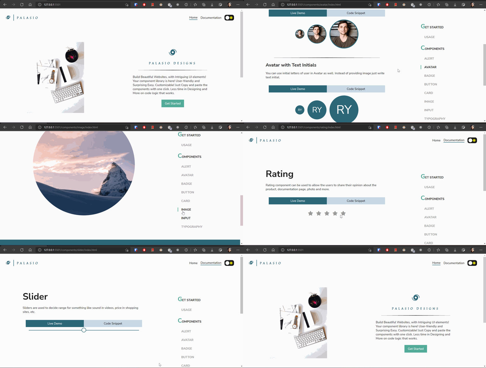
Have a look at the implementation of Palasio Designs Components.


