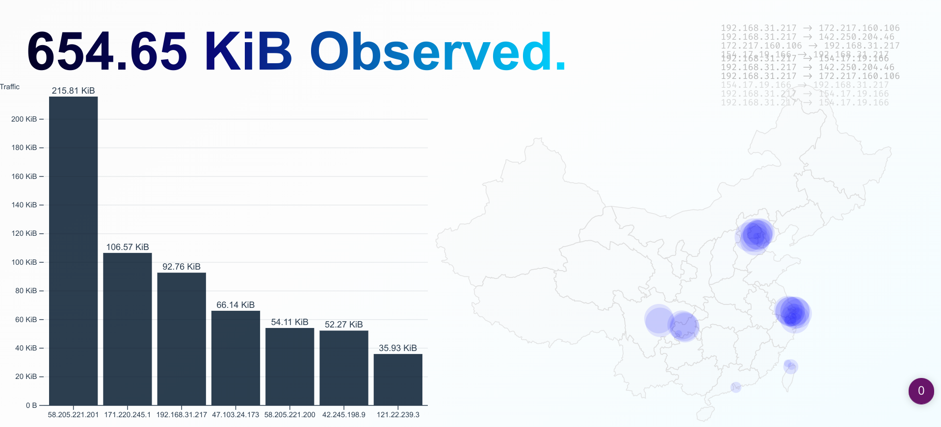
A Simple and Stupid Pcap Visualization application, with some fancy charts.
This project is just a naive attempt to mix pcap, web front-end tech, and d3js together. It intends for nothing serious and definitely comes with no warrant.
- Build and run
pcap2ws, which is the backend that captures traffic and pipes the data to the websocket. - Build and run
pcap-visual, which is the web front-end that visualizes the data.
See their READMEs for more information.
The project contains two module: pcap2ws and pcap-visual.
There's no magic that allows you to capture the network traffic from the browser :)
So a native backend is needed to pipe the data into the browser.
pcap2ws is a simple and stupid websocket server built upon websocketpp. It will broadcast the pcap data at port 9002 by default.
A static web page built with d3js. It will connect to localhost:9002 to fetch the pcap data and visualize it.
It draws the traffic in a certain period as a bar chart, as well as points on the map. The map component uses the data of PRC but it should be possible to use others. The format is mostly geojson, I guess.
Disclaimer: The map data of PRC is just dumped from the wild and random Internet. Including the data(as well as borders, regions in it) is mainly for the convenience and does not represent my opinions or positions.
I don't maintain this.
I will neither respond to any issues nor pull requests. But feel free to use them for discussion or showcase.
I don't care what you're going to do with it.
Hopefully, you can find this project useful in your case, or at least fun :)
