The Material-UI Rich Text Editor and Viewer
mui-rte is a complete text editor and viewer for material-ui v3 and v4 based on draft-js and written in Typescript.
npm install mui-rte --save
If you haven't, install the peer dependencies: @material-ui/core, @material-ui/icons, react and react-dom.

import MUIRichTextEditor from 'mui-rte'

ReactDOM.render(
    <MUIRichTextEditor label="Start typing..." />,
    document.getElementById("root")
)
Or in read only mode, with no rendered controls but text selection and component interaction available (such as clickable links):
import MUIRichTextEditor from 'mui-rte'

const data = getSavedContentStateFromDb()

ReactDOM.render(
    <MUIRichTextEditor value="{data}" readOnly={true} />,
    document.getElementById("root")
)From version 1.1.0 you can define your custom inline styles, block styles and callback actions to the editor. Just select an icon from @material-ui/icons and define your rules.
This sample adds a control to change the background color and font color of the selected text:
import MUIRichTextEditor from 'mui-rte'
import InvertColorsIcon from '@material-ui/icons/InvertColors'

<MUIRichTextEditor
    controls={["my-style"]}
    customControls={[
        {
            name: "my-style",
            icon: <InvertColorsIcon />,
            type: "inline",
            inlineStyle: {
                backgroundColor: "black",
                color: "white"
            }
        }
    ]}
/>This sample adds a block to the editor based on a React Element defined:
import MUIRichTextEditor from 'mui-rte'
import InvertColorsIcon from '@material-ui/icons/TableChartIcon'

const MyBlock = (props) => {
    return (
        <div style={{
            padding: 10,
            backgroundColor: "#ebebeb"
        }}>
            My Block content is:
            {props.children}
        </div>
    )
}

<MUIRichTextEditor
    controls={["my-block"]}
    customControls={[
        {
            name: "my-block",
            icon: <TableChartIcon />,
            type: "block",
            blockWrapper: <MyBlock />
        }
    ]}
/>This sample adds a control that will trigger a custom callback function:
import MUIRichTextEditor from 'mui-rte'
import InvertColorsIcon from '@material-ui/icons/DoneIcon'

<MUIRichTextEditor
    controls={["my-callback"]}
    customControls={[
        {
            name: "my-callback",
            icon: <DoneIcon />,
            type: "callback",
            onClick: (editorState, name) => {
                console.log(`Clicked ${name} control`)
            }
        }
    ]}
/>
Check the examples directory for more.
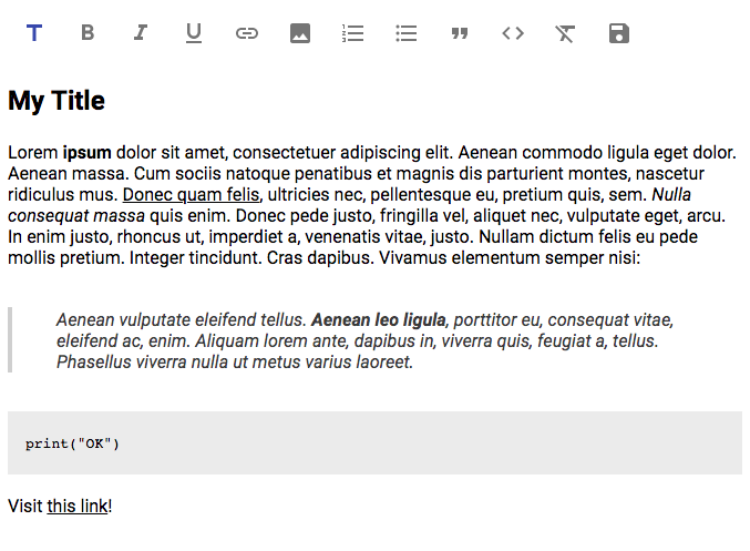
<MUIRichTextEditor />
| Property | Type | description | |
|---|---|---|---|
| label | string |
optional | String to show when there is no content |
| readOnly | boolean |
optional | Read only (viewer) mode. No controls are rendered |
| value | string |
optional | Default content to load. Should be a stringified Draft.Model.Encoding.RawDraftContentState object |
| inheritFontSize | boolean |
optional | Inherit font size from parent. Useful for read only mode |
| error | boolean |
optional | Renders the editor with an error style |
| onSave | (data:string) => void |
optional | Function triggered when the save button is pressed. The data is a stringified Draft.Model.Encoding.RawDraftContentState object |
| onChange | (state: EditorState) => void |
optional | Function triggered on any change in the editor (key input, delete, etc.). The state is a Draft.Model.ImmutableData.EditorState object |
| controls | string[] |
optional | List of controls to show. If not provided, all controls will be rendered. Current available values are: "title", "bold", "italic", "underline", "strikethrough", "highlight", "undo", "redo", "link", "image", "numberList", "bulletList", "quote", "code", "clear", "save" |
| customControls | TCustomControl[] |
optional | Defines an array of user custom inline styles, blocks and callbacks. See more information in 'Custom Controls' below. |
TCustomControl
| Property | Type | description | |
|---|---|---|---|
| id | string |
optional | The HTML id attribute for the control |
| name | string |
required | The name of the custom control. For rendering the control this name should be added to the MUIRichTextEditor controls property. |
| icon | JSX.Element |
required | The @material-ui/icons icon for the control. Check this for available icons. |
| type | string |
required | Either "inline", "block" or "callback" |
| inlineStyle | string |
optional | The React.CSSProperties object for styling the text when using the custom inline style. |
| blockWrapper | React.Element |
optional | The custom React component used for rendering the custom block. |
| onClick | (editorState: EditorState, name: string) => void |
optional | The callback function triggered when the custom control is clicked. |
Check the examples directory for details. For development, you can run the examples as follows:
$ npm run serve
- Add custom decorators
- Add custom blocks such as
material-uicomponents (Card, etc.) - Increase test coverage
Please feel free to leave your comment on the Issues tab.
Licensed under MIT License.