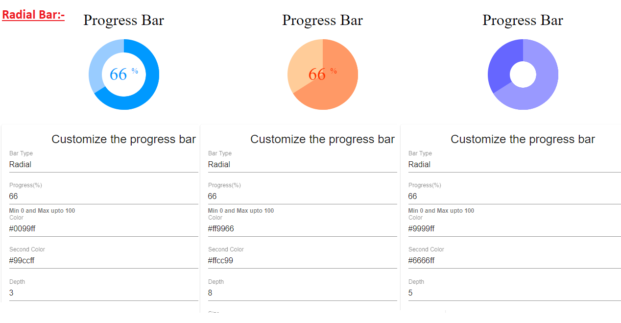
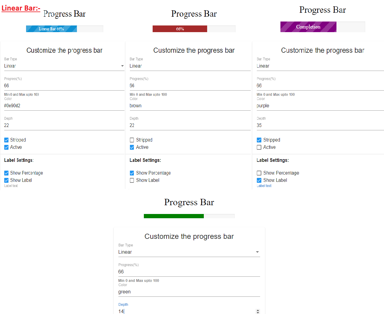
Fully customizable, responsive and light weight 'Progress Bar' angular component without external libraries/dependencies. Special effort has been made to keep the component files free from coding logic which has been handled on the HTML file of the component.
Checkout the demo on StackBlitz - https://angular-progress-linear-radial-bar.stackblitz.io/
1) Change between 'linear' and 'radial' progress bar.
2) Fully 'customizable'. Change color, size, label properties, animations etc.
3) 'Responsive' design to adjust all type of project requirements.
1) 'Vertical' mode for 'linear' bar.
2) Custom HTML template option for content inside the center of 'radial' bar.
3) Overall structural changes to separate both 'linear' and 'radial' bars at a component level.
4) Update readme file and add detailed property description in table format.
Import
import { ProgressBarComponent } from './progress-bar/progress-bar.component';
Declaration
declarations: [ ProgressBarComponent ]
<progress-bar [barProperties]="barOptions"></progress-bar>
Property barProperties accepts JSON object which customize the progress bar according to user choice.
You can send value linear for linear bar and radial for radial bar with barType key.
Key progress can have value between 0 to 100.
Change and play with other key-values to get bar which fits your purpose.
barOptions = {
    barType: 'linear', //or 'radial' for radial bar
    color: "#0e90d2",
    secondColor: "#D3D3D3",
    progress: 66, //between 0 to 100
    linear: {
      depth: 22,
      stripped: true,
      active: true,
      label: {
        enable: true,
        value: "Linear Bar",
        color: "#fff",
        fontSize: 15,
        showPercentage: true,
      }
    },
    radial: {
      depth: 3, //max 8
      size: 9,
      label: {
        enable: true,
        color: "#09608c",
      }
    }
  }
