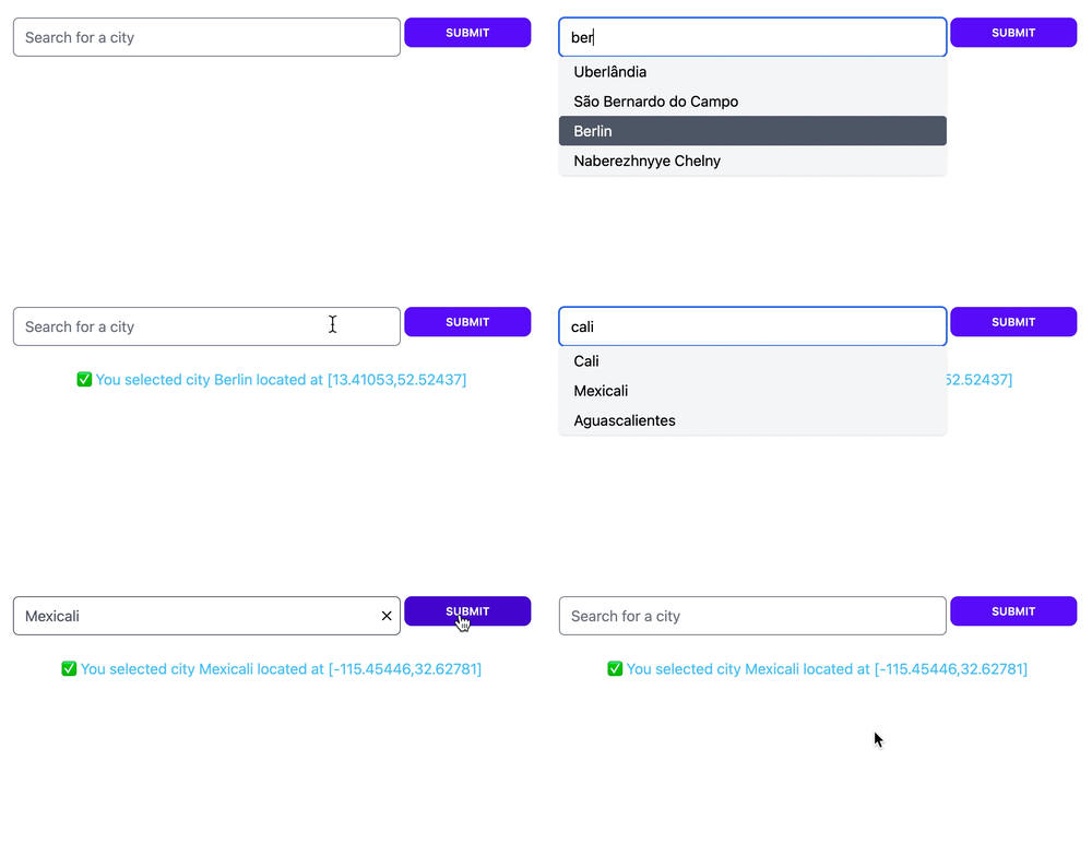
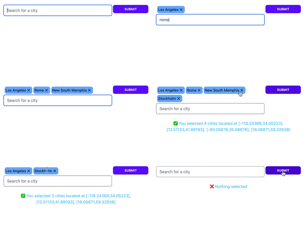
Dynamic selection field for LiveView.
LiveSelect is a LiveView component that implements a dynamic selection field with a dropdown. The content of the
dropdown is filled dynamically by your LiveView as a reaction to user's input. This allows you to easily create an
interface for features such as search. It supports both single and multiple selections.
Template:
<.form for={:my_form} :let={f} phx-change="change">
    <%= live_select f, :city_search %>
</.form>
LiveView:
import LiveSelect

@impl true
def handle_info(%LiveSelect.ChangeMsg{} = change_msg, socket) do
  cities = City.search(change_msg.text)
  # cities = [
  # {"New York City", [-74.00597,40.71427]},
  # {"New Kingston", [-76.78319,18.00747]},
  # ...
  # ]

  send_update(LiveSelect.Component, id: change_msg.id, options: cities)

  {:noreply, socket}
end

@impl true
def handle_event(
      "change",
      %{"my_form" => %{"city_search_text_input" => city_name, "city_search" => city_coords}},
      socket
    ) do
  IO.puts("You selected city #{city_name} located at: #{city_coords}")

  {:noreply, socket}
end
Refer to the module documentation for the nitty-gritty details.
To install, add this to your dependencies:
[
    {:live_select, "~> 0.4.0"}
]LiveSelect relies on Javascript hooks to work. You need to add LiveSelect's hooks to your live socket.
In your app.js file:
import live_select from "live_select"

// if you don't have any other hooks:
let liveSocket = new LiveSocket("/live", Socket, {params: {_csrf_token: csrfToken}, hooks: live_select})


// if you have other hooks:
const hooks = {
    MyHook: {
        // ...
    },
    ...live_select
}
let liveSocket = new LiveSocket("/live", Socket, {params: {_csrf_token: csrfToken}, hooks})LiveSelect supports 3 styling modes:
tailwind: uses standard tailwind utility classes (the default)daisyui: uses daisyUI classes.none: no styling at all.
The choice of style is controlled by the style option
in live_select/3.
tailwind and daisyui styles come with sensible defaults which can be selectively extended or completely overridden.
If you're using tailwind or daisyui styles, you need to add one of the following lines to the content section in
your tailwind.config.js:
module.exports = {
    content: [
        //...
        '../deps/live_select/lib/live_select/component.*ex', // <-- for a standalone app
        '../../../deps/live_select/lib/live_select/component.*ex' // <-- for an umbrella app
    ]
    //..
}
Notice the different paths for a standalone or umbrella app.
Refer to the Styling section for further details.
The repository includes a showcase app that you can use to experiment with the different options and parameters
for LiveSelect.
The showcase app is available here.
To start the showcase app locally, simply run:
mix setup
PORT=4001 mix phx.server
from within the cloned repository. The app will be available at http://localhost:4001. The showcase app allows you to
quickly experiment with options and styles, providing an easy way to fine tune your LiveSelect component. The app also
shows the messages and events that your LiveView receives. For each event or message, the app shows the function head
of the callback that your LiveView needs to implement in order to handle the event.
Contributions are very welcome!
Use mix test to run the entire test suite, which is subdivided into 3 main files:
test/live_select/component_test.exs- everything that can be tested by rendering the component staticallytest/live_select_test.exs- tests forsinglemode that require a running LiveViewtest/live_select_tags_test.exs- tests fortagsmode that require a running LiveView
Tests that require a LiveView use the showcase app as the parent LiveView.
- Add
package.jsonto enableimport live_select from "live_select" - Make sure component classes are included by tailwind
- Enable custom styling
- Rename LiveSelect.render to live_select
- Customizable placeholder
- Enable configuration of styles in the showcase app
- Add support for vanilla tailwind styles
- Enable multiple selection mode
- Expose as function component (and drop LV 0.17 support)
- Maybe additional multiple selection mode(s)?


