Thanks for checking out this project.
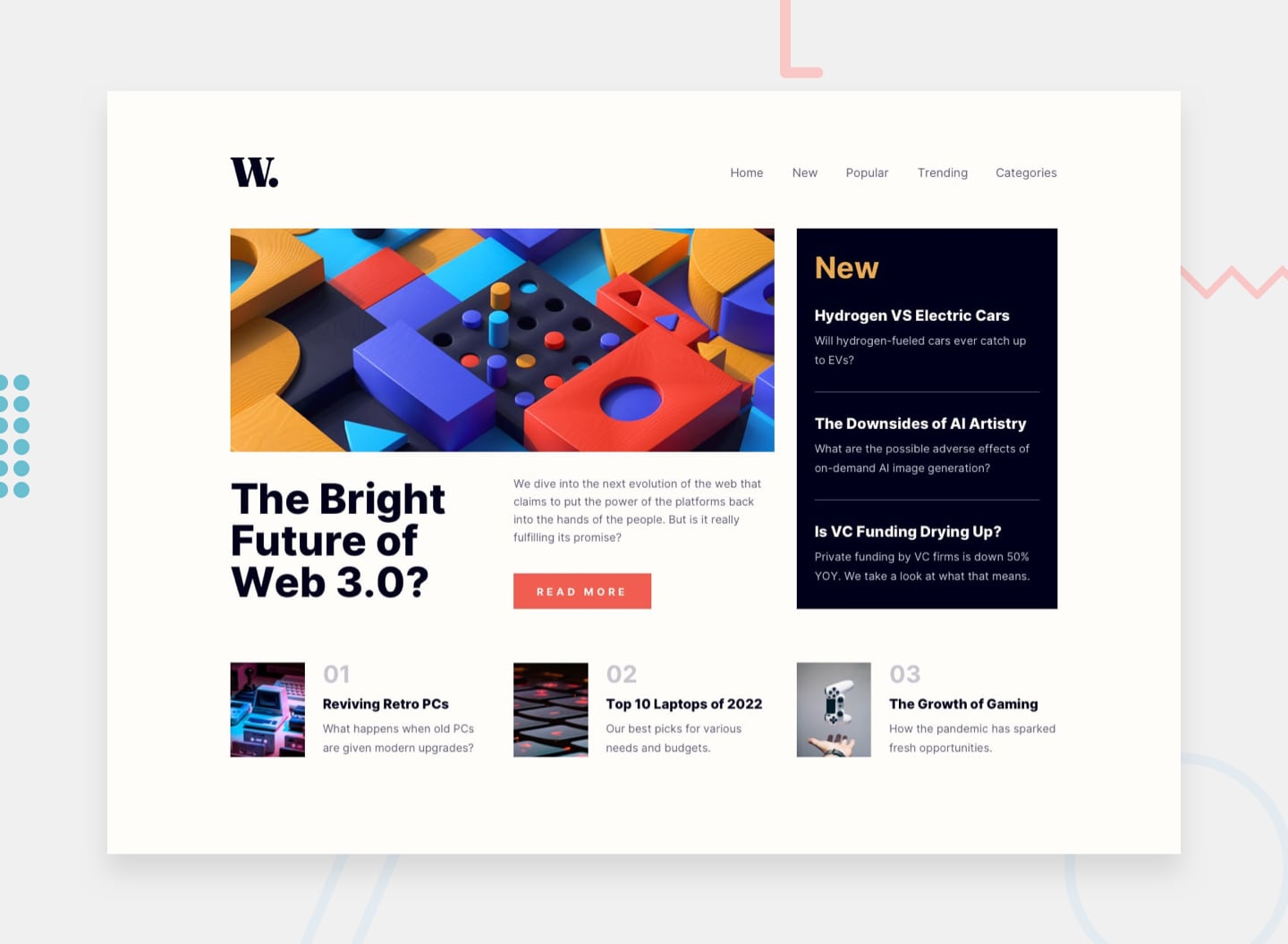
The challenge is to build out this news website homepage and get it looking as close to the design as possible.
Users should be able to:
- View the optimal layout for the interface depending on their device's screen size
- See hover and focus states for all interactive elements on the page
The task is to build out the project to the designs inside the /design folder. You will find both a mobile and a desktop version of the design.
The designs are in JPG static format. Using JPGs will mean that you'll need to use your best judgment for styles such as font-size, padding and margin.
If you would like the design files (we provide Sketch & Figma versions) to inspect the design in more detail, you can subscribe as a PRO member.
All the required assets for this project are in the /assets folder. The images are already exported for the correct screen size and optimized.
Feel free to contribute.
Thanks for checking! 🚀
