Download framer components as simple files
- Works with any React framework (Next.js, Remix, Vite, etc)
- Includes all your components dependencies
- Has Typescript support, inferred from your component variables (like
variant)
-
Install the package
npm install unframer
-
Map
framer-motiontounframer. This is required because the Framer runtime ships its own version offramer-motion, this will prevent you from having multiple instances offramer-motionin your project.npm install framer-motion@npm:unframer
-
Create an
unframer.config.jsonfile like the following (the key will be used for the component folder insideoutDir){ "$schema": "https://unframer-schema.vercel.app/schema.json", "outDir": "./framer", "components": { "logos": "https://framer.com/m/Logo-Ticker-1CEq.js@YtVlixDzOkypVBs3Dpav", "menus": "https://framer.com/m/Mega-Menu-2wT3.js@W0zNsrcZ2WAwVuzt0BCl" } } -
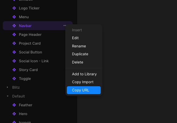
Copy your framer component url and add it to your config (remove the part after
@to always use the latest version) -
Run the command
npx unframerto download the components and their types in theoutDirdirectory -
Import the component inside your
jsxfiles, for example
import './framer/styles.css' // load base Framer styles
import Menu from './framer/menus'

export default function App() {
    return (
        <div>
            <Menu componentVariable='some variable' />
        </div>
    )
}import './framer/styles.css'
import Logos from './framer/logos'
export default function App() {
return (
<div>
{/* Changes component variant based on breakpoint */}
<Logos.Responsive
variants={{
lg: 'Desktop Variant',
md: 'Tablet Variant',
base: 'Mobile Variant',
}}
/>
</div>
)
}You can use className or style props to style your components
Notice that you will often need to use !important to override styles already defined in framer like width and height
import './framer/styles.css'
import Logos from './framer/logos'

export default function App() {
    return (
        <div>
            {/* Changes component variant based on breakpoint */}
            <Logos.responsive
                className='!w-full'
                variants={{
                    lg: 'Desktop',
                    md: 'Tablet',
                    base: 'Mobile',
                }}
            />
        </div>
    )
}Framer components can have a fixed size, this comes from the root element in the Framer component editor. To override this size you will need to use the style prop or use a class with high specificity.
import './framer/styles.css'
import Logos from './framer/logos'

export default function App() {
    return (
        <div>
            <Logos.responsive
                className='!w-full' // use !important to override framer default size
                style={{ width: '100%' }} // or use style prop, which has higher specificity than the Framer class
                variants={{
                    lg: 'Desktop',
                    md: 'Tablet',
                    base: 'Mobile',
                }}
            />
        </div>
    )
}You can change the breakpoints by passing an object in your unframer.config.json config
{
    "$schema": "https://unframer-schema.vercel.app/schema.json",
    "outDir": "./src/framer",
    "breakpoints": { "sm": 300, "md": 760 },
    "components": {}
}unframer will add TypeScript definitions for your Framer components props and variables, some example variables you can use are:
variant, created when you use variants in Framer- functions, created when you use an
eventvariable in Framer - Any scalar variable like String, Number, Boolean, Date, etc
- Image variables (object with
src,srcSetandalt), created when you use animagevariable in Framer - Link strings, created when you make a link a variable in Framer
- Rich text, created when you use a
richTextvariable in Framer - Color, a string
- React component, created when you use a
componentvariable in Framer, for example in the Ticker component
- Color styles (also known as tokens) can get out of sync with your Framer project, if this happen you will have to find the corresponding css variable (in the form of
--token-xxxx) in the component code and define it in your CSS, for example:
:root {
    --token-64603892-5c8b-477a-82d6-e795e75dd5dc: #0b5c96;
}-
Links to Framer pages won't work, this is because links to Framer pages are encoded with opaque ids. Instead you should
- use link variables
- absolute links (starting with https://, not links to other Framer pages).
-
Internationalization is not supported
Every Framer runtime change is upstreamed automatically via Github Actions to this file and an example app is deployed here. This means that if something breaks it's easy to bisect the specific change and fix it.
For example in May 2024 Framer upgraded to React 19 and unframer broke, the reason was that framer runtime no longer injected ssr styles to head because react should do it automatically from version 19, this however broke unframer when using react 18, but i was able to quickly fix it by adding back the code to inject styles to head in unframer.
Look at the nextjs-app source code folder for an example and the deployed website here
