In this workshop, our goal is to finish building an e-commerce store!
The good news is, most of our work is done already. We just need to write some additional CSS to construct the layout; things are a bit messy right now!
This project uses Create React App. To get started, run the following terminal commands:
npm installnpm run start
You can then visit the app in-browser; it defaults to http://localhost:3000.
Note that we're only focusing on the design. The links and inputs don't do anything.
Want a bigger challenge?
This workshop comes with a lot of starter code — we'll be adding Flex-specific properties, but for the most part, we don't have a ton of code to write. If you'd prefer, you can build the app from scratch, to practice all the CSS we've learned so far!
If you go that route, you can find the sneaker assets you need in
/public/assets, and their metadata in/src/data.js. Design tokens can be found in/src/constants. The custom font is Raleway, from Google Fonts.
If you run into problems running a local development server, check out our Troubleshooting Guide on the course platform.
This guide addresses the common Digital Envelope Routine error you may have seen.
Let's build the “Superheader” a thin grey strip that runs along the top of the page:
Use Flexbox to correctly align the elements within src/components/SuperHeader.
Continuing on down, let's tackle the main header:
The trickiest part of this exercise is the position of the main navigation. We want it to be perfectly centered within the container:
This is a thorny problem, and it's not something we've explicitly seen in the course. Give it your best shot, but please don't be discouraged if you can't figure it out!
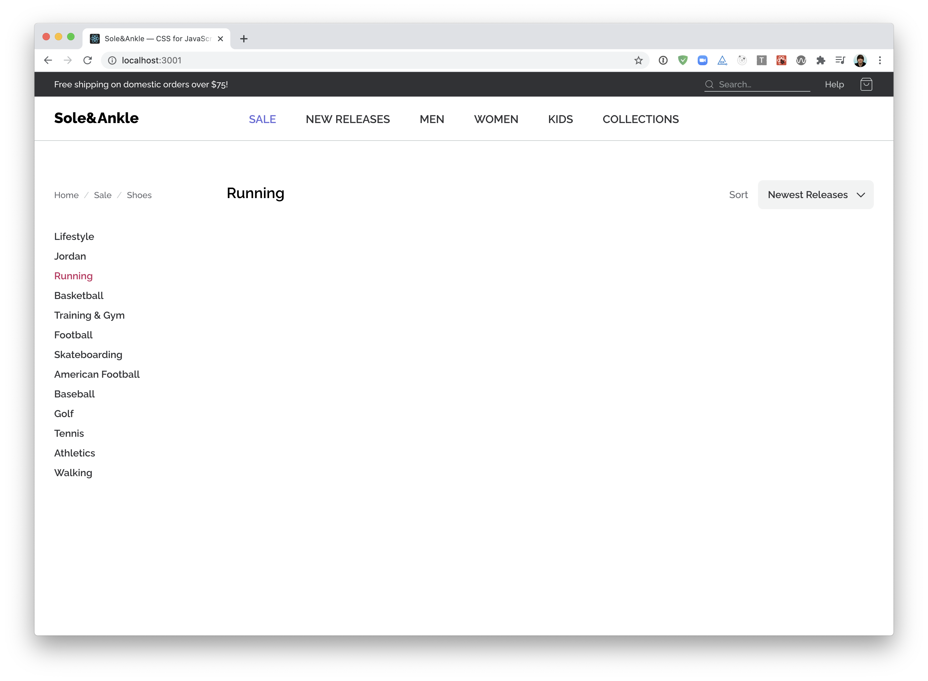
Next up, we want to tackle the "framing" around the shoe grid — the sidebar and title/filter.
NOTE: To make life a bit easier, you may wish to comment out the <ShoeGrid> component. We'll work on integrating it in the next exercise.
This exercise features two mini-challenges. The second one is a chance to revisit some of the lessons learned in previous modules, and isn't as specific to Flexbox.
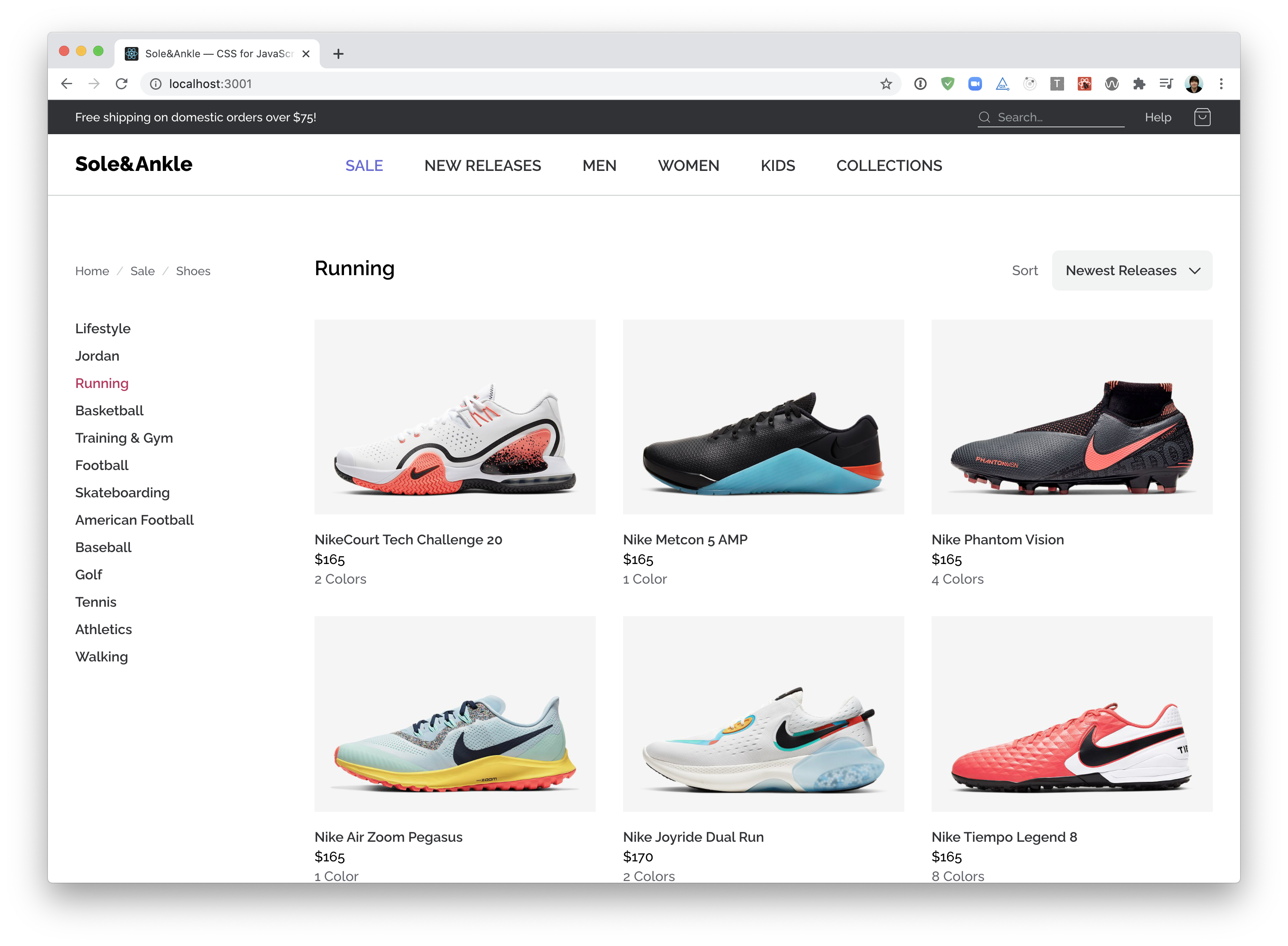
Time to tackle the main feature of this application, the shoes!
Here's a screenshot of the final result:
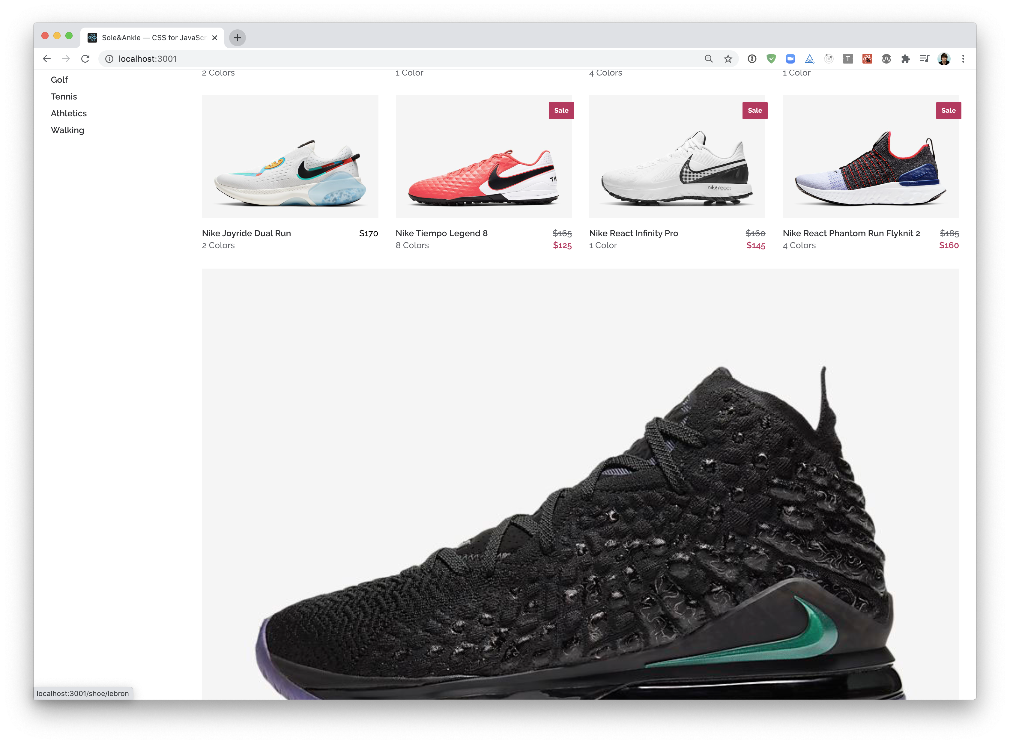
This is a tricky problem to solve with Flexbox—CSS Grid is a better tool for this job! Nevertheless, it can be done using Flexbox, with one caveat: the last row may be oversized:
In a future module, we'll revisit this and see how CSS Grid can help us out :)
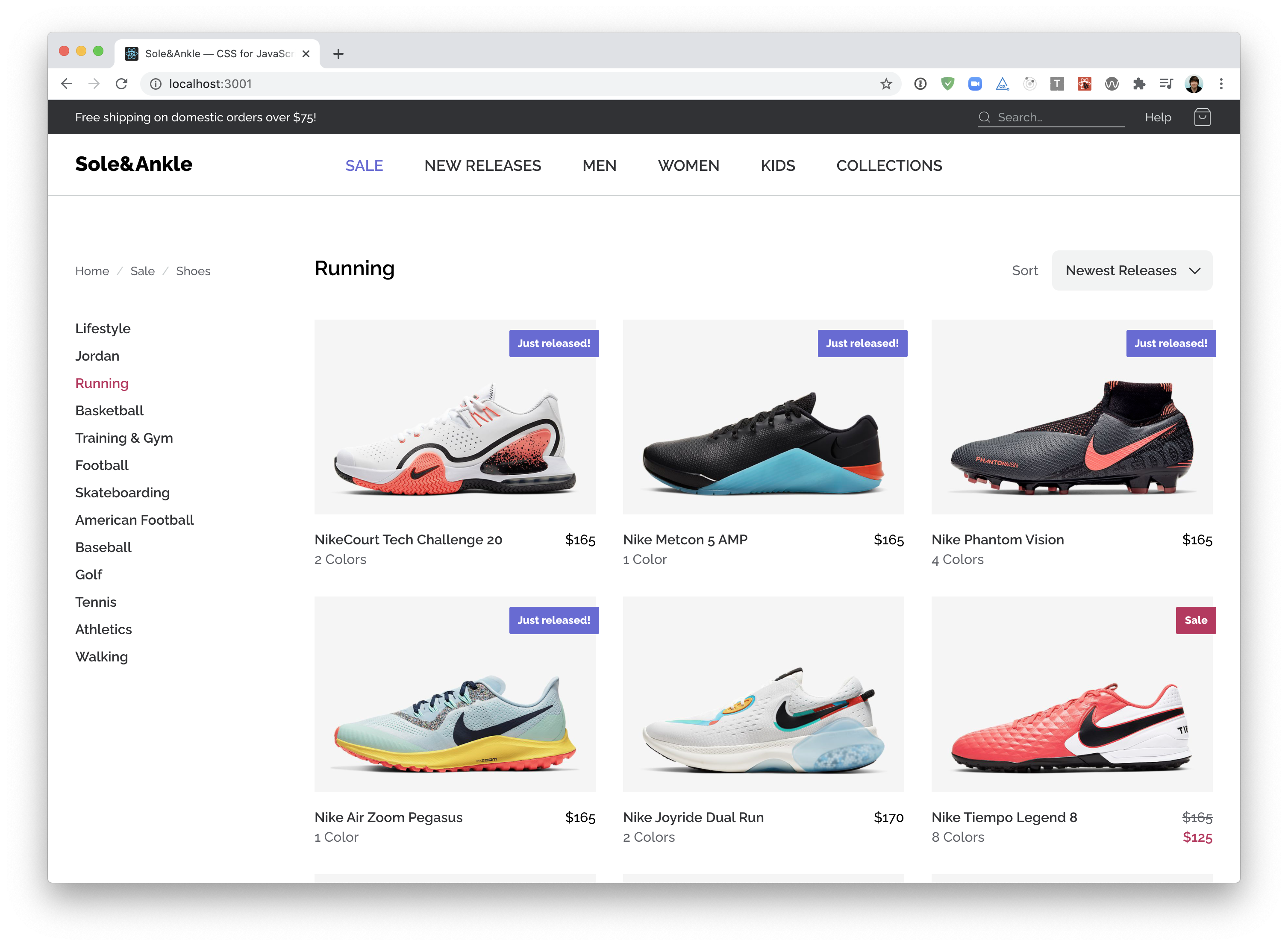
Our sneaker store is in pretty good shape, but there's two small details missing:
- The “Sale” and “Just Released” flags.
- The crossed-out prices, for items that are on sale.
Inside ShoeCard.js, you'll find a variant variable you can use to figure out which flag, if any, needs to be rendered. It's up to you to create the flag, using styled-components.
For the crossed-out prices, you can use the price and salePrice props.
NOTE: This exercise has minimal flexbox implications, and is mainly about revisiting lessons learned in the previous modules (including positioned layout and styled-components). Feel free to skip it if you'd prefer!
Our sneaker store can flex to support different screen sizes, but there isn't a proper mobile or tablet view. Don't fret — we will revisit this workshop in a future module!
In the meantime, take a moment to congratulate yourself for making it through the Flexbox module!!


