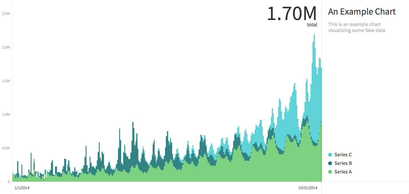
Charted is a tool for automatically visualizing data, originally created by the Product Science team at Medium. Provide the link to a data file and Charted returns a beautiful, interactive, and shareable chart of the data. The charts look like this:
Charted is deliberately sparse in formatting and data transformation options, and instead gives you a few powerful core features:
- Rendering well on all screen sizes, including monitors
- Re-fetching the data and updating the chart every 30 minutes
- Moving data series into separate charts
- Adjusting the chart type, labels/titles, and background
Charted currently supports the following file types:
- .csv files
- .tsv files
- Google Spreadsheets (set to shareable)
- Dropbox share links to supported files
Charted treats the first column of the data file as the labels for the x-axis. All subsequent columns are added as y-series. Charted does not parse the first column (x-axis), but instead always equally spaces the data points along the x-axis.
To try Charted out, simply download the repo and run npm install
to install dependencies. After that you will be able to run
npm start. This will start a server at localhost:3000.
You can also run Charted via docker by running
docker build -t charted . in the repo to build the container. You
will then be able to run the container using
docker run -p 3000:3000 charted. Server will be accessible at
localhost:3000

