Huckleberry Agency Website
In this workshop, you'll build a minimal landing page for an agency.
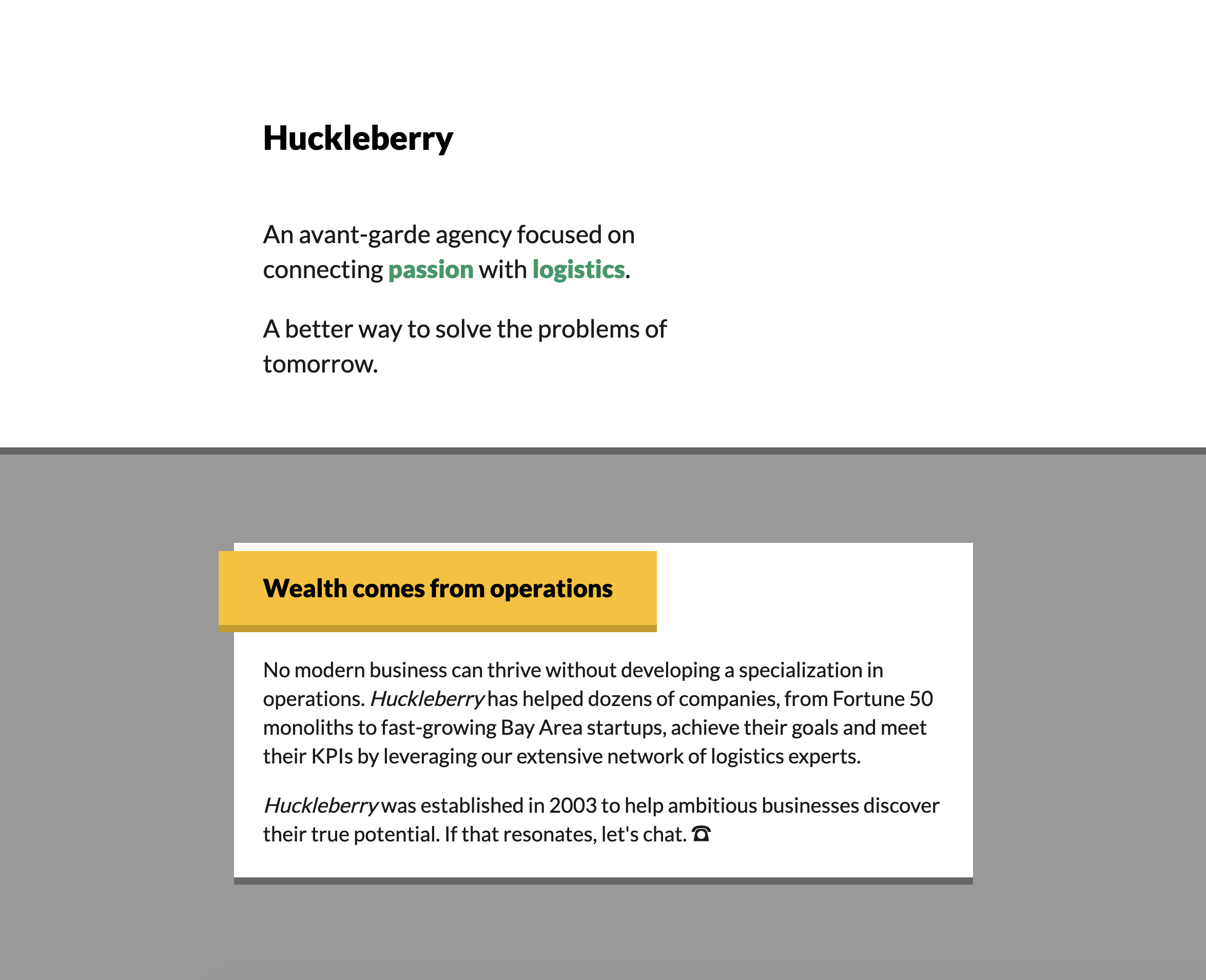
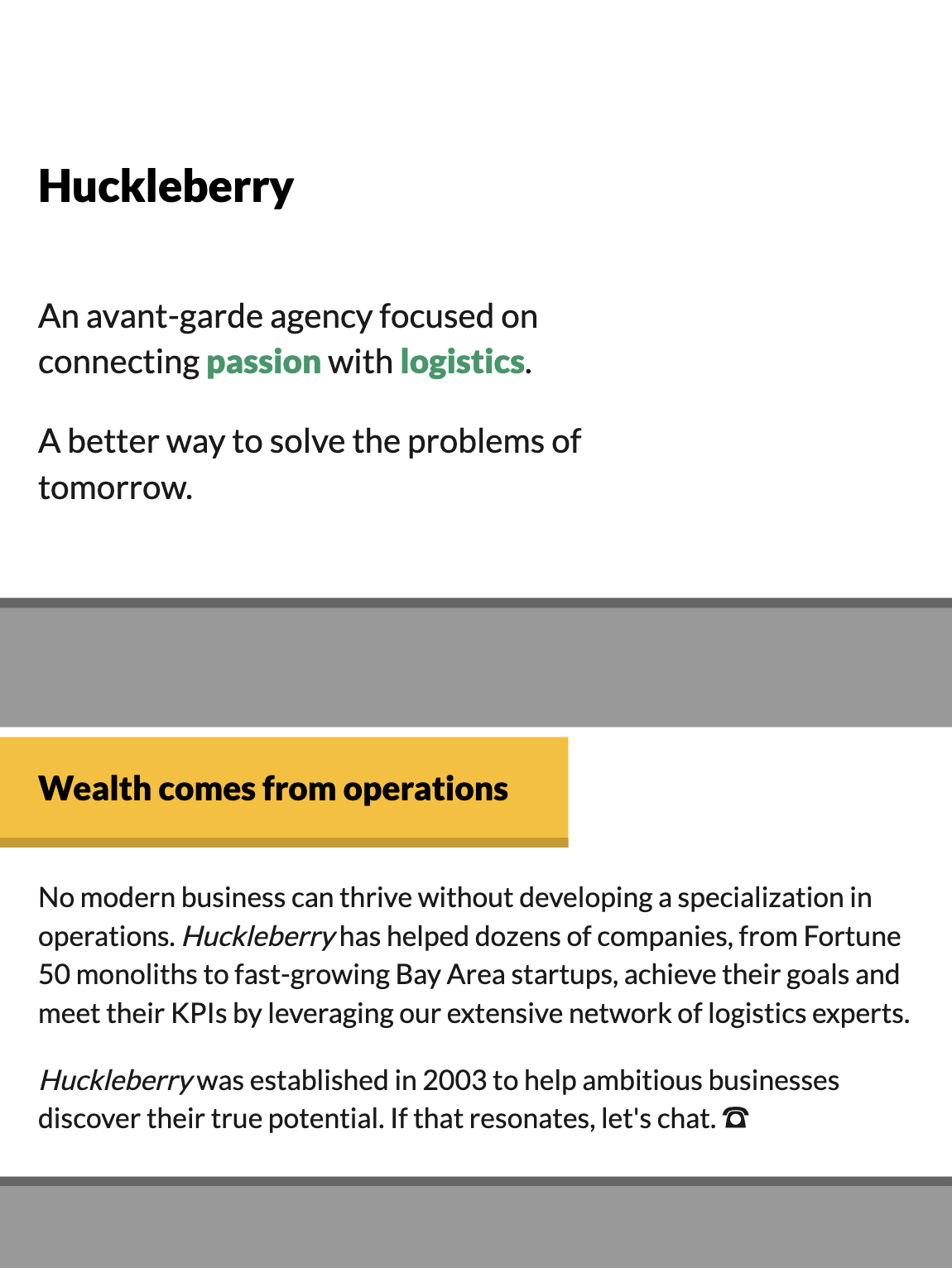
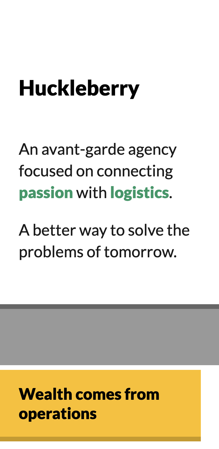
This mockup is built entirely using flow layout: no Flexbox, no grid, no absolute positioning. It relies heavily on padding, margin, and border.
Mockups
Desktop:
Tablet:
Mobile:
Setup Instructions
This project uses Parcel, to provide a development server with lightning-quick hot-reload.
Start by installing dependencies:
npm install
Boot up a dev server:
npm run start
You should see a confirmation message like this:
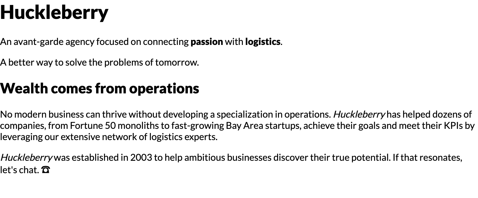
You can visit http://localhost:1234 to view the page. You should see a bunch of unstyled content:
Getting Started Notes
-
You're given a decent start in terms of the HTML markup, but not much in the way of styles. You'll be expected to edit
style.cssto implement the styles. You can also editindex.htmlif you wish, though it should be possible to solve this project touching onlystyle.css. -
Don't worry too much about "best practices". Later in this course, we'll see how to create scalable encapsulated styles. For now, the goal is simply to implement the designs in the screenshots, with whatever organizational strategy comes most naturally to you.
-
You may be tempted to reach for CSS strategies we haven't yet seen in the course, like flexbox or absolute positioning. Please try and complete this workshop without them. This module is focused on flow-layout and the box-model, and it is possible to lay everything out on the page using only padding, border, and margin. It's important to be comfortable with these primitives before moving on to more-complex subjects.
-
Future workshops will provide a React starter. For the early workshops, the focus is on the fundamentals, so we're using pure HTML and CSS. If you feel more comfortable using a JS framework like React, you can go ahead, but please don't use any component libraries or CSS frameworks. All CSS should be written by hand.
-
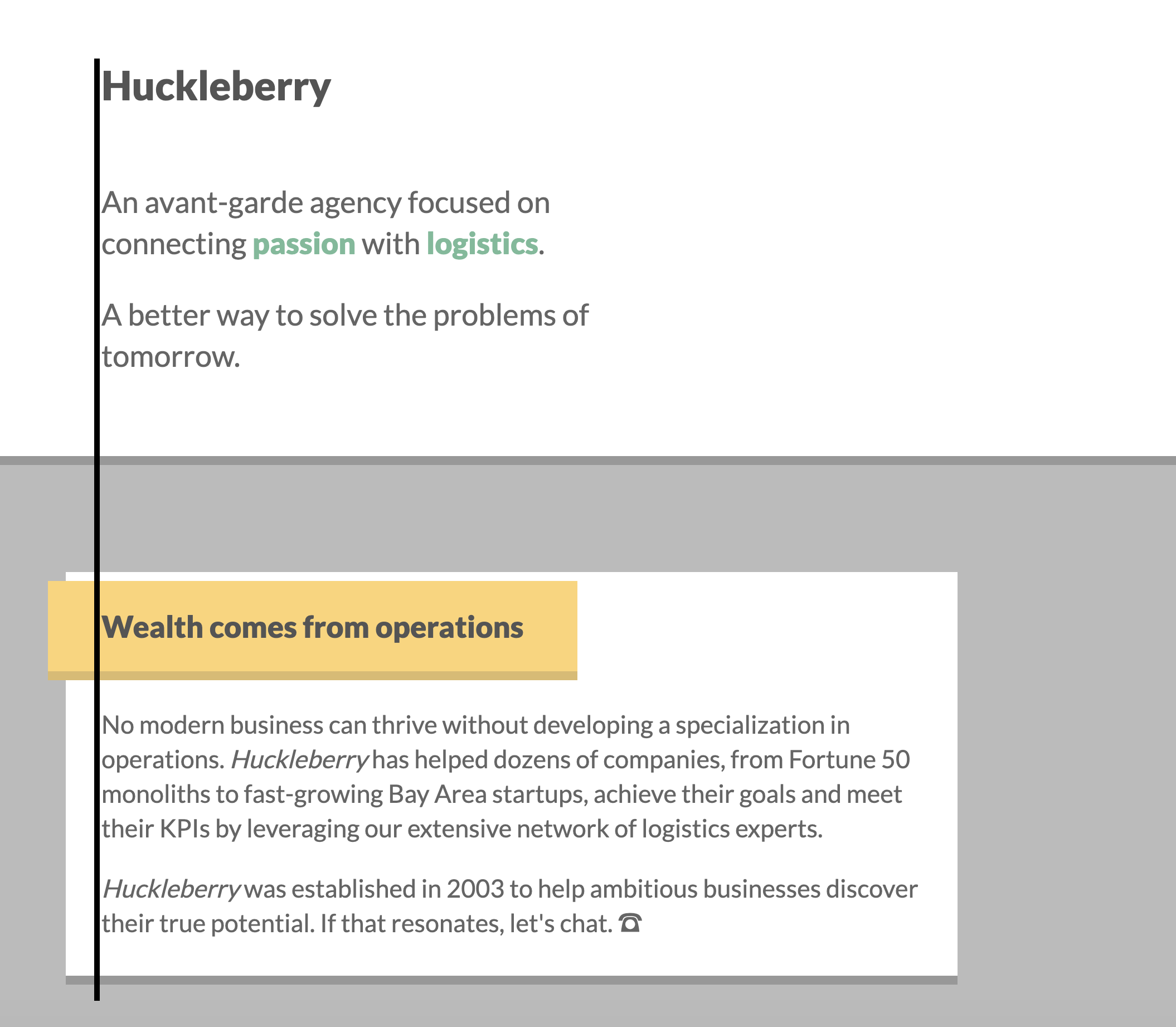
Pay close attention to alignment. For example, you should be able to draw a line along the left, and all text should be neatly aligned:
That said: Don't worry if you can't create a pixel-perfect recreation. In the solution video, I'll show you exactly how I did it. Spend an hour or so on this project, and submit whatever you have at that point.
Design tokens
In the early days of the web, sites would be built largely on "feel". Colors and sizes would be chosen based on the whims of the moment. This led to some very inconsistent-looking websites!
Nowadays, it's common to have a set of design tokens. A design token is a value that can be reused. Typically it's part of a collection or a scale.
We'll learn more about this idea later, but for now, you can copy/paste the values from this list as-needed. Don't worry about being DRY or using variables; Plop these values in, wherever you need them.
If you find it difficult to use these tokens, or if you're not able to achieve a result you're happy with, don't worry about it. Solve it however you can, and then watch the solution video to see how I did it.
Spacing
This app uses an 8px unit. All spaces are a multiple of 8px:
8px16px24px32px48px64px96px128px
When it comes to max widths (eg. the maximum width of the card), arbitrary values can be used.
Font
1 font is used in this project: Lato. It is already included in the stylesheet.
For font sizes, the rem unit should be used.
The scale is:
1rem1.25rem1.5rem2rem
Because the base font size is 18px, this works out in pixels to:
18px22.5px27px36px
Color palette
Primary (green):
hsl(160deg, 100%, 30%)
Secondary (gold):
hsl(45deg, 100%, 50%)(lighter)hsl(45deg, 100%, 40%)(darker)
Grays:
hsl(0deg, 0%, 0%)(black)hsl(0deg, 0%, 10%)(very dark)hsl(0deg, 0%, 30%)(dark)hsl(0deg, 0%, 40%)(medium)hsl(0deg, 0%, 60%)(light)hsl(0deg, 0%, 100%)(white)
What the HSL?
You may be more familiar with color values in hexidecimal format, like
#FF0000. In Module 0's "color" lesson, we go over what HSL color is and how it works. If you haven't already, it's worth reviewing before getting started!
Submissions
Workshops are submitted through the course platform. Commit your changes, push them to your fork, and submit the link by clicking the "Complete lesson" button on the workshop page.
If you're not comfortable with Git, you can upload a .zip file using Dropbox or Google Drive, and paste a link to the public file instead.
