Frontend Mentor - Article preview component solution
This is a solution to the Article preview component challenge on Frontend Mentor. Frontend Mentor challenges help you improve your coding skills by building realistic projects.
Table of contents
Overview
The challenge
Users should be able to:
- View the optimal layout for the component depending on their device's screen size
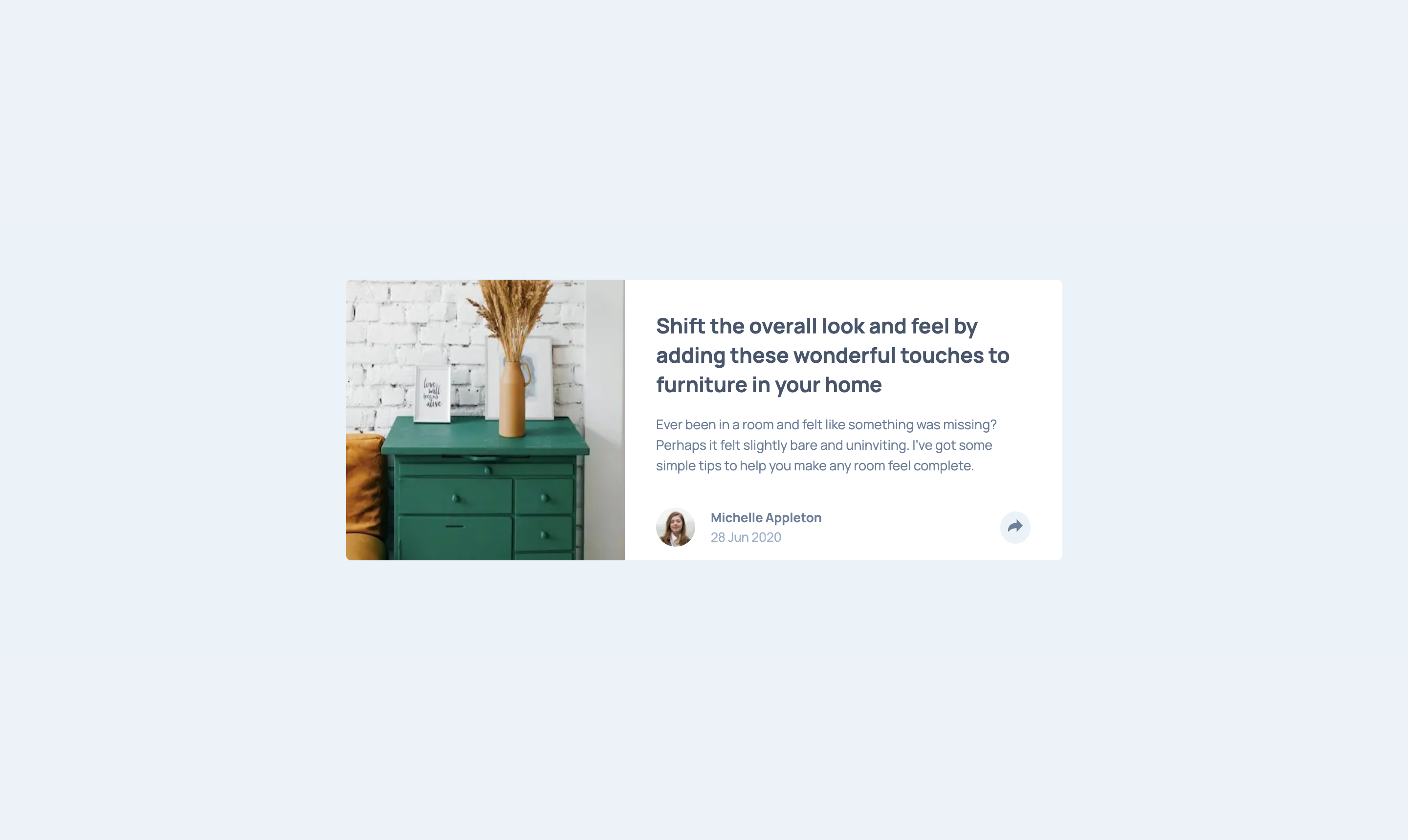
- See the social media share links when they click the share icon
Screenshot
Links
- Solution URL: https://github.com/rickMcGavin/fe-mentor-article-preview
- Live Site URL: https://fe-mentor-article-preview-bice.vercel.app/
My process
Built with
- Mobile-first workflow
- React - JS library
- Next.js - React framework
- Styled Components - For styles
- React Spring - For animations
What I learned
Again coding mobile first was a great idea. It made getting the initial work completed easy, and then scaling it up to desktop sort of just seemed like a breeze.
I was very pleased with the final results of the animations, especially desktop. On this project in particular I controlled the react-spring configurations by nesting ternaries. It's not very readable, but I give myself extra cool points for doing it. I also realized you can control the clamp of the config and other spring settings with different states.
Continued development
If I was going to finish this, or come across this again, I'd work harder to match the image position and scale with the design. I thought it looked fine as it was, but in the future should definitely take the time to figure out how to do what the design is calling for.
Author
- Website - Rick McGavin
- Frontend Mentor - @rickMcGavin
- Twitter - @rickMcGavin
