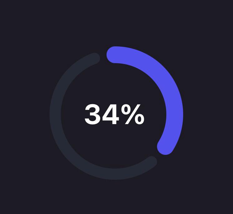
Progress Circle
A modern and stylized progress circle component
Made with svg and animated with the react-native-reanimated v2 library
Reanimated
·
RN-SVG
Usage
<ProgressCircle
  progress={35}
  progressColor="#5352EC"
  backgroundColor="#272935" />
Configuration
You can configure the CircularProgress-component by passing the following props:
| Name | Type | Default value | Description |
|---|---|---|---|
| progress | number (0-100) | required | Current progress |
| progressColor | string | required | Color of the progress line |
| backgroundColor | string | required | Color of the background line |
| size | number | 150 | Width and height of circle |
| padding | number | 4 | Padding applied around the circle |
| backgroundWidth | number | 12 | Thickness of background circle |
| progressWidth | number | 18 | Thickness of progress circle |
| duration | number | 800 | Duration of the animation in milliseconds |
| gap | number | 20 | Space between background line and progress line |
