Bikesharing Dashboard with Tableau
Utilize Tableau to Visualize Citibike Ridership Trends
Goals • Dataset • Tools Used • Results • Summary
Goals
We are using Tableau to study Citibike ridership trends in NYC, in order to convince investors that a bike-sharing program in a new city is a solid business proposal. To solidify the proposal, one of the key stakeholders would like to see a bike trip analysis.
For this analysis, we'll use Pandas to change the "tripduration" column from an integer to a datetime datatype. Then, using the converted datatype, you’ll create a set of visualizations to:
- Show the length of time that bikes are checked out for all riders and genders
- Show the number of bike trips for all riders and genders for each hour of each day of the week
- Show the number of bike trips for each type of user and gender for each day of the week.
Please see our Tableau Dashboard in the link below:
Dataset
I retrieved monthly ridership data from Citibikenyc in CSV format, which will be my Tableau data source
- Citi Bike Monthly Rider Data - August 2019: CSV file containing 2,344,223 rows of rider data
Tools Used
- Tableau Desktop: Powerful and robust data visualization software
Results
Using the visualizations we have in our Tableau Story, here are the results of our analysis of NY Citi Bike Ridership data.
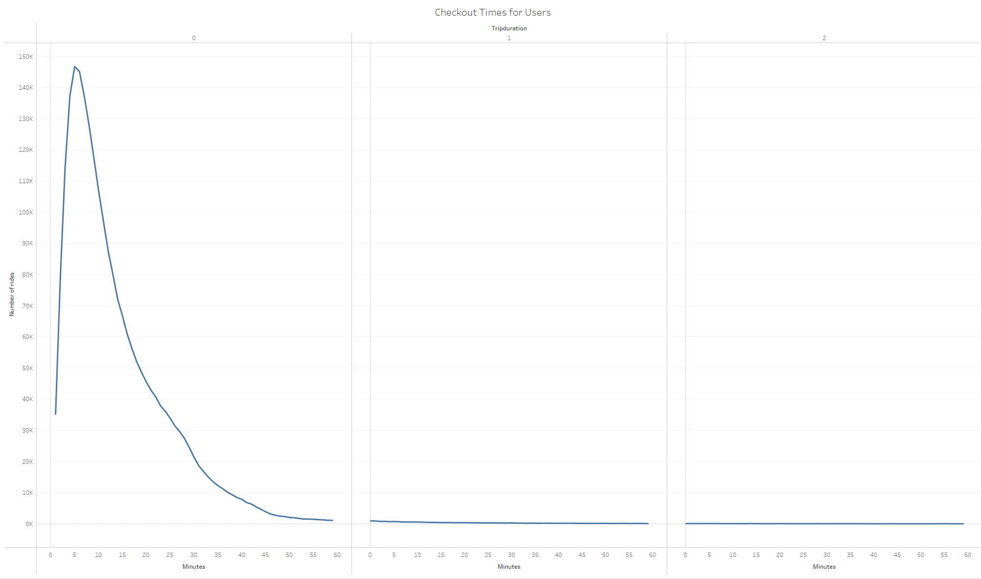
Checkout Times for Users
According to the below line graph, the vast majority of bike rides tend to last around 5 minutes:
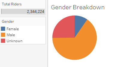
Gender Breakdown
The below pie chart indicates that males are the major target demographic:
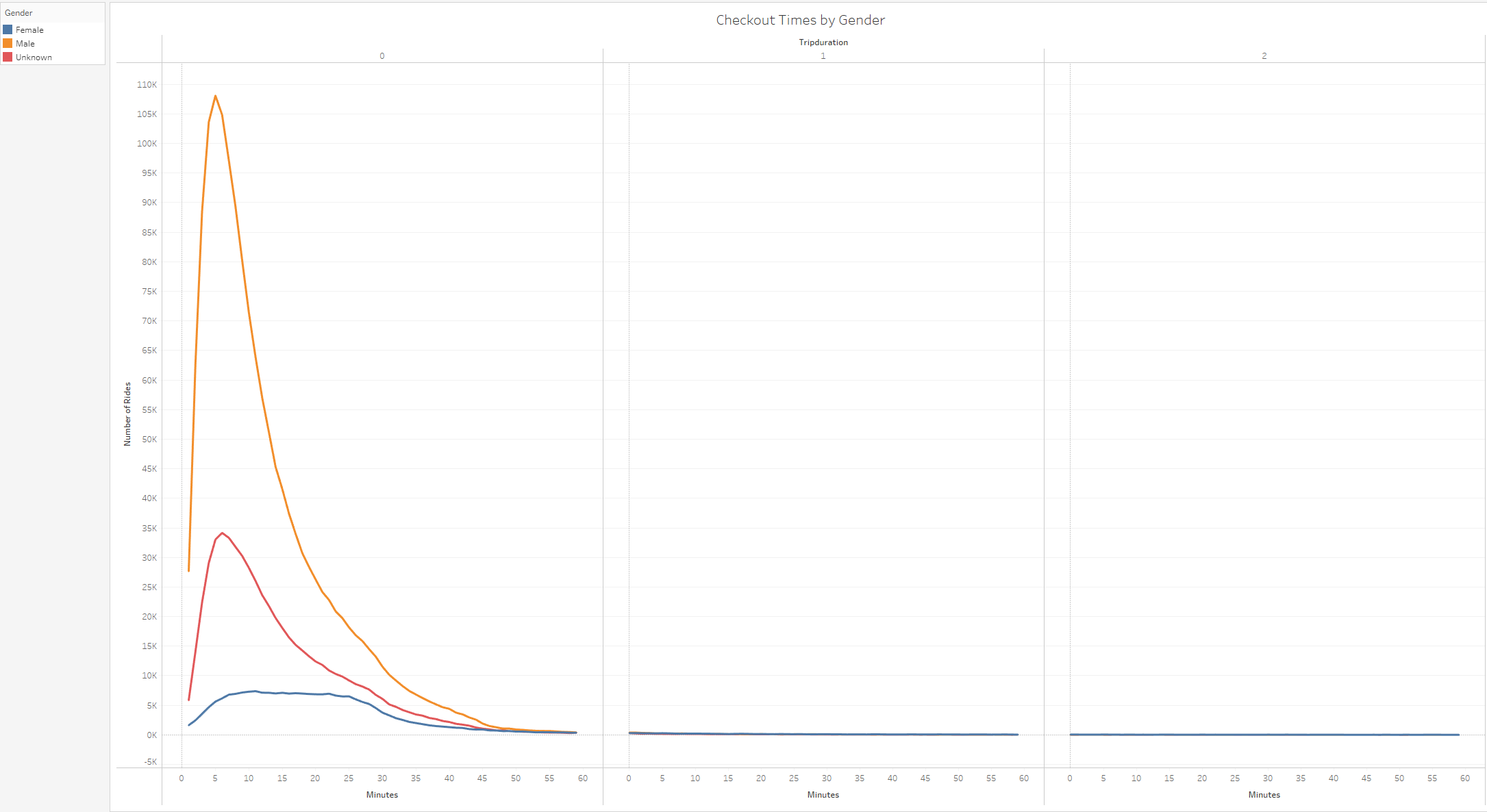
Checkout Times by Gender
Adding the gender layer on top of the trip duration data, we see that mostly males are using the citi bikes for short 5 minute rides:
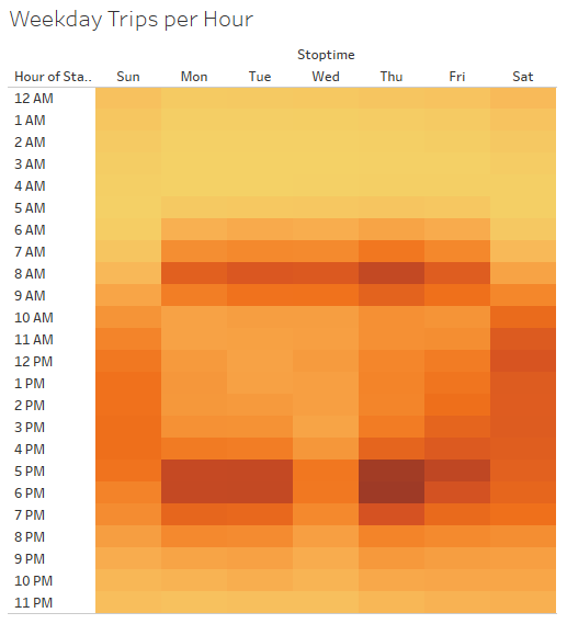
Weekday Trips Per Hour
The below chart outlines peak ridership by weekday and hour. 8-9 AM and 5-7 PM tend to be peak ridership times on weekdays. Off peak times during the week tend to happen from 10 AM - 5 PM; however during the weekend we're seeing increased ridership during these same hours.
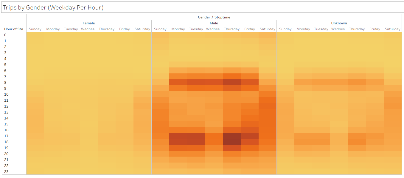
Trips by Gender (Per Weekday Per Hour)
Adding the gender layer to Weekday Trips per Hour, we see that males account for the majority of ridership during peak hours.
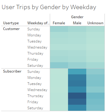
User Trips by Gender by Weekday
The below chart indicates that the bulk of ridership tend to be subscribers:
Bike Repairs
Given the major potential costs associated with mechanical breakdowns, we've introduced this visual that tracks the bike IDs and how many repairs they've had:
Summary
We've been able to process a CSV file with 2.3 Million rows of rider data and provide these helpful visual summaries for our sales pitch to investors. The above charts provide crucial information for our Iowa pilot. The data indicates that:
- Males are the target demographic
- Most riders are program subscribers
- Peak ridership hours happen during morning and evening weekday commutes
Along with the above visualizations, here are two additional ideas to punch up our sales deck and set you up for funding success:
- Additional demographic data would be very helpful, we'd like to determine the age range of the majority of bike share users
- In order to determine proper liability coverage, we'd like to visualize the most common accident types for NY Citi Bike riders
