Goals • Dataset • Tools Used • Results • Summary
Working at PyBer, the CEO tasked our group with analyzing local ride sharing data from January to early May 2019. In order to accomplish this analysis, we imported two CSV files containing a large amount of ride sharing data into panda dataframes housed in Jupyter Notebook. The panda dataframes allowed us to accurately summarize ride sharing data by city type using the groupby method. By importing the Matplotlib module, we were also able to visualize our findings, as requested by our CEO. Below you'll find our results, visualizations and recommendations based on our analysis of local ride sharing data.
We analyzed two CSV files hosted in an Amazon S3 server. Both files contain city and ridership data we'll summarize with Python visualizations
- City Data: 121 rows of city data in a CSV file
- Ride Data: 2,375 rows of ridership fare data in a CSV file
- Python: Programming language used to build automated auditing solution
- Pandas: Open source Python library providing high performance analysis tools
- Matplotlib: Open source Python library used for graphing and plotting
- Jupyter Notebook: Open source web based application used to run our python code
According to the above findings, the urban areas saw the most activity by total rides, and the most amount of drivers: followed respectively by suburban and rural areas. There is a direct relationship between the amount of riders, drivers and total fares. The urban areas saw the highest total fares, followed by suburban, then rural areas. Consequently, because of the concentration of drivers in the urban area, we also saw the lowest amount of Average Fare per Ride and Average Fare per Driver. This indicates that there is an inverse relationship between the amount of drivers and the average fares across the board. The rural areas had the lowest amount of drivers and rides, and the highest average fares.
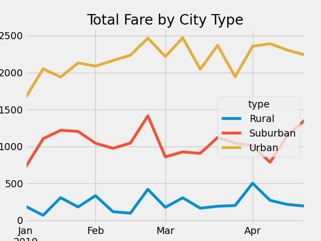
For this visualization, we added another dimension to our analysis, time. We tracked the fluctuations in total fare from the months of January to early May in each city type. A line chart was our recommendation because we felt it best illustrated total fares over a set period of time.
The positions of the urban, suburban and rural lines support our findings in the chart summary above. Urban areas saw the highests fares, followed by suburban and rural areas. Late February showed a spike in total fares for all three city types. We also noticed a dip in fares for urban and rural areas in late april, but a spike in fares in suburban areas.
Based on our findings, please see below three recommendations on how to allocate resources in the metro area:
- There is a major shortage of drivers in rural areas. We suggest using our findings to incentivize drivers primarily working in urban areas to take advantage of higher fares that come with rural ridership.
- Late February is showing a sharp spike upward in fares, followed another spike downward in fares in all three city types. It's worth investigating what might be causing this, possibly a holiday?
- We would suggest directing drivers to the suburban area in late April, since we're seeing a spike in fares in that area coupled with a drop in fares in the urban and rural areas. This could indicate higher rider demand in the suburban area at that time of the year.


