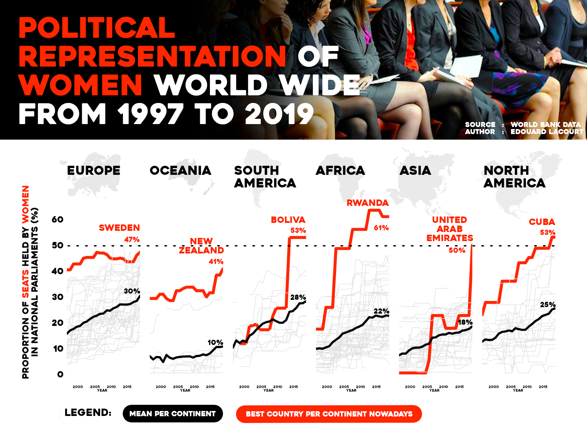
This data visualization was created in the makeover monday challenge context. Each week, the challenge is to rework a given chart.
This time, the chart to rework is part of portfolio realized by Operation Fistula association that wants to “educate and inform communities about gender inequality”.
There is obviously strong political interest at stake since they justify, on several occasions, the need of this visualization by the achievement of the SDG5 and more precisely the target 5.5 (“women’s full and effective participation and equal opportunities for leadership at all levels of decision-making in political, economic, and public life.”).
This data visualization aims to to show the difference of the proportion between men and women in terms of parliament seats per country. The message is also to show the evolution of this data over the years so the audience have a great idea of what was the situation in before (in 1997) and how it is now (2019). The goal here is more to show a global trend in the evolution of parliament seats held by woman allover the world.
- Unix system
- python 3.8
- pandas
- plotly.express
- pycountry
- pycountry_convert
