pyGHCND is a Python library for collecting and plotting weather data from NOAA's National Centers for Environmental Information (NCEI) Global Historical Climatology Network daily (GHCNd) datasets. These data are accessed using NCEI's Climate Data Online (CDO) API and filtered based on the corresponding attribute flags. Some statistical analyses on the data trends are then performed. The raw and statistical data tables (Pandas DataFrames) are saved to disk. Several plotting functions are provided to facilitate visualizing trends in these data over time.
- python >= 3.10
- requests >= 2.20
- pandas >= 1.5
- pyarrow >= 8.0
- scipy >= 1.10
- matplotlib >= 3.7
- openpyxl >= 3.0
- tqdm >= 4.60
- Caveats and Notes on GHCNd Data
- Simple Usage Example
- Basic Data Collection
- Raw Data Tables
- Statistical Analyses Table
- Plotting Function Overview
- Yearly Temperature Plot
- Recent Temperature Deviation Plot
- Precipitation Plot
- Daily Temperature Trend Plot
- Daily Trends Overview Plot
- Sorting Daily Trends
The GHCNd data are raw weather measurement data, and as such, they may suffer
from deviations caused by a variety of factors, such as changes in measurement
location/time/equipment/etc. The UCAR website has a nice whitepaper on the
GHCNd
data
that highlights some of these issues. Except for filtering measurements that
are flagged as being problematic, pyGHCND does not currently apply any
adjustments to compensate for these additional factors. With that being said,
the statistical analyses performed by this module need to be interpreted with
some caution.
The GHCNd network consists of a large number of weather stations that vary in
their yearly coverage and data quality. The US Historical Climate
Network
is a subset of the GHCNd stations that are deemed to contain data of higher
quality. The stations that are part of this network are flagged with 'HCN' in
the GHCNd station
list, for
example. These stations are good starting points for data analysis using
pyGHCND.
The following code block is a complete example of the data collection, analysis, and plotting using pyGHCND. The weather data in this example comes from the Missoula International Airport. With one exception, this code be saved into a .py file and executed from the command line, for example. The only additional step is requesting an API token from the Climate Data Online website and saving it into a file called 'token.txt'. A description of each line of code is found in the sections below.
from pyghcnd import GHCND, mplvis
import matplotlib.pyplot as plt
plt.style.use('ggplot')

with open('token.txt') as token_file:
    token = token_file.read().strip()
    temps = GHCND('USW00024153', token, data_folder='MissoulaMSO')
temps.update_data(status=True)

temps.stats.to_excel('MSO_stats.xlsx')

mplvis.plot_temp(temps)
mplvis.plot_temp_diffs(temps)
mplvis.plot_prcp(temps, ptype='SNPR')
mplvis.plot_daily_temp(temps, day=1, month=1)
mplvis.plot_daily_trends(temps)

for cat in ('TMIN', 'TMAX'):
    slope_sorted = temps.stats[cat]\
                        .sort_values(by='-log_p*abs_slope', ascending=False)
    first_slope = slope_sorted.iloc[0]
    month, day = first_slope.name
    mplvis.plot_daily_temp(temps, month=month, day=day, temp_type=cat)
The core element of pyGHCND is a simple object class called GHCND.
from pyghcnd import GHCND
To create a GHCND object instance, two pieces of data are necessary: an API
token and a GHCNd station ID. The API token is freely available from the
Climate Data Online website. The
desired station ID can be found using the NCEI mapping
tool, for example. The full
station ID will be something like "USW00024153", which corresponds to
the Missoula, Montana, airport. The station ID with the preceding "GHCND:"
-- e.g. "GHCND:USW00024153" -- is also acceptable.
The GHCND class has the following initialization call signature.
GHCND(stationid, token, store_type='parquet', data_folder='.')
The stationid and token are the strings representing the station ID and
API token as described above. The store_type keyword argument determines the
storage format for the raw and statistical data. The default ('parquet')
uses Parquet binary files, which were developed
specifically for column-oriented data (e.g. DataFrames). The data_folder
keyword argument sets the folder where data and plots will be stored. The
default is the current directory ('.'). Note: the stored data
files and plots have a fixed naming scheme, so downloading multiple datasets
into the same folder will overwrite previous data sets.
In the following example, a GHCND object instance for the historical weather
data at the Missoula International
Airport
will be created. This assumes that the API token has been saved into a
text file called 'token.txt' in the current directory (i.e. not the
data_folder directory). Note: this code will make an API call, so an
external internet connection is necessary.
with open('token.txt') as token_file:
    token = token_file.read().strip()
    temps = GHCND('USW00024153', token, data_folder='MissoulaMSO')
On initialization, the GHCND object performs several operations. First, an API
call is made to collect station metadata, such as the start and end dates for
the measurements at that location -- these are saved as the start_date and
end_date attributes, respectively. (The raw metadata is stored as the
private _station_info dictionary.) It then checks for the existence of the
given data folder. If it is not found, the folder is created. However, if the
folder is present, a check is performed to determine if previously
downloaded/processed data is present, and if so, these data are loaded into
the object instance (more info below). This makes it possible to manipulate
previously downloaded data or append newly downloaded information without
having to re-download the entire dataset.
The update_data method is used to download new data using the CDO API. This
method accepts only a single Boolean keyword argument: status. The default
for this argument is False, which means that the data will be downloaded
silently. If this argument is True, then a download status bar will be
printed to the screen, using the tqdm
package. The example below will download the
data with a progress bar.
temps.update_data(status=True)
The download process can be slow. The CDO API restrict a single data request to a total of 1000 data points, and only 5 requests can be made per second. Each year may consist of several thousand data points, so if data is being collected for long time intervals, the total number of requests will be substantial. For example, the Missoula airport has daily weather data from 1948 to the present. To protect against broken connections, a temporary file (pickle format) of raw download data is periodically saved in the data folder during the download process, and in the event that the download must be restarted, the temporary file will first be loaded as a starting point.
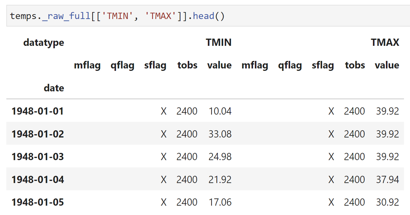
After completion of the data download, one private DataFrame attribute --
_raw_full -- will be created and saved to disk. A selection of this
DataFrame as rendered in a Jupyter notebook is shown below. This DataFrame is
stored as a "hidden" attribute because it is probably not necessary/desired to
work with this directly; however, it is instructive to view this table to
understand what the raw data looks like as it comes from the API and how it is
filtered, as described below. The API data is initially delivered in JSON
format, and after complete download, these data are reformatted into a Pandas
DataFrame indexed by the collection date. Temperatures are converted to
degrees Fahrenheit, and precipitation is converted to inches. The columns of
this DataFrame are the data types, such as max temp (TMAX), min temp (TMIN),
etc. Under these data type columns, there are several sub-columns for the
recorded value ("value") and the measurement attributes, such as the data
quality ("qflag"). The data types and attributes are described in the GHCNd
documentation. This DataFrame is saved to disk using the store_type selected
above.
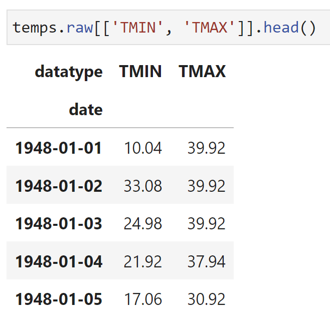
This full data set is then filtered to remove measurements flagged as being
problematic -- this filtered DataFrame is called raw. An example of this
DataFrame, as rendered in a Jupyter notebook, is shown below. Bad measurements
in the _raw_full DataFrame, as determined by their quality attribute
("qflag"), are replaced with NaN in the raw table. The raw DataFrame
retains the date index, but simplifies the columns to be only the measured
values for each data type. Two new columns are also created. The first is a
'yeardiff' column, which is only used for linear regression analysis as
detailed below. The second column, called SNPR, is calculated by the
equation (PRCP + SNOW/10) and is the rough estimate of the total liquid
precipitation on a particular day assuming that 1 inch of snow equals 0.1 inch
of liquid precipitation. The raw attribute is not saved to disk. If
previously downloaded data is reloaded in a new GHCND instance, the raw
DataFrame is instead recreated from the saved _raw_full DataFrame.
A variety of statistical analyses are then conducted on the filtered raw
data and saved into a stats DataFrame attribute. An example of this
DataFrame, as rendered in a Jupyter notebook, is shown below. Several of these
analyses are self-evident: lowest value=='min', highest value=='max',
average='mean', standard deviation='std'. However, the maximum and minimum
daily temperatures (TMAX and TMIN, respectively) are also subjected to a
linear regression analysis. In other words, these are the trends in the
highest and lowest temperatures for any given day in the year. The slope and
intercept of these trends are the 'slope' and 'icept' columns, respectively.
The 'p_slope' column is the p-value for the calculated slope. The two columns
'-log_p*slope' are the slopes weighted by the negative base-10 logarithm of
the p value. These values are convenient for ranking these slope values, as
will be described in the plotting section. This DataFrame is also saved to
disk using the store_type selected above.
These DataFrames attributes retain all of the methods for this object class as
well. For example, the statistics data can be saved as an Excel file using the
to_excel method.
temps.stats.to_excel('MSO_stats.xlsx')
Several plotting functions are also provided for visualizing the raw and
statistical weather data. Currently, these functions are only available for
Matplotlib and are found in the mplvis module, which can be imported
directly from pyghcnd.
from pyghcnd import GHCND, mplvis
A general call to the plotting functions is shown below -- additional positional and keyword arguments are discussed with the plotting examples below.
mplvis.general_function_call(ghcnd, ... , show=True, save=True, dpi=300)
The initial positional argument ghcnd must be a GHCND object instance
containing the data to be plotted. The final three keyword arguments --
show, save, and dpi -- control the plotting output. The show boolean
argument turns on/off visual display of the final figure using the
matplotlib.pyplot.show function. From the command line, this command will
open an interactive GUI window; in a Jupyter notebook, this will display the
plot after the code execution cell. The save boolean keyword argument turn on/off
saving of the final plot in the data_folder directory using the
matplotlib.pyplot.savefig function at the defined dpi value. The dpi
must be a positive integer. If both save and show are False, then no
output will be generated from the plotting function call.
Several examples of the plotting function output and argument descriptions are provided below. These examples are for the Missoula International Airport, and the weather data were updated in mid-March of 2023.
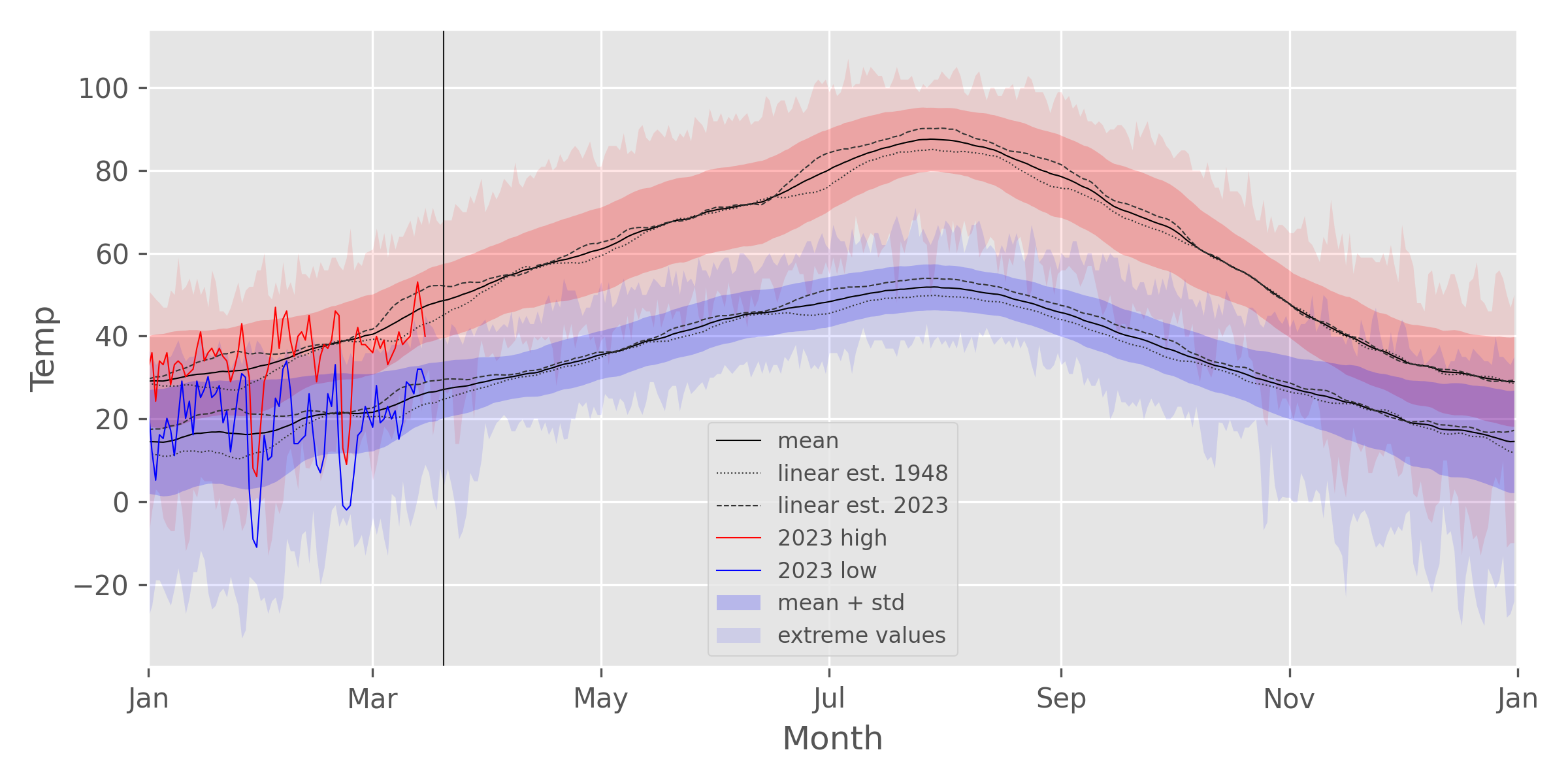
The plot_temp function is used to plot the statistical data as well as the
high/low temps for a given year, as shown above. The solid red and blue lines
are the 2023 high and low temps, respectively, and the solid black line is the
average daily temperature. The thin black vertical line indicates the current
date. The light blue/red shaded area shows the total range between the
largest and smallest of measured temperatures for that particular day. The
slightly darker shaded region shows the range defined by the average temp +/-
one standard deviation. I.e. 68% of the measured values fall in that range.
The dotted and dashed lines are the average temperatures estimated from the
linear regression analysis of the daily temperatures. For example, in the plot
shown, both the low and high daily temperatures have increased considerably
from 1948 (dotted line) to the present (dashed line) during January, March,
and the summer/early fall months. (But from this plot, it is not possible to
infer statistical significance from these changes.)
The call signature for this function is shown below.
mplvis.plot_temp(ghcnd, use_year=None, trends=True, smooth=15,
            show=True, save=True, dpi=300)
The use_year keyword argument is used to select a year for plotting the
high/low temps as an overlay on the statistical values. Its default of None
causes it to select the current year. The trends Boolean keyword argument
plots additional lines representing the high/low temperatures as extrapolated
from the linear regression equation fitted to the daily temperature values.
The smooth keyword argument is used to apply a simple
moving average smoothing function to some of the plotted data, which can
improve the appearance of the plots. The value can either be a positive
integer (default: 15) that represents the number of points to use in the
smoothing average, or this parameter can be None or False, which plots the
unsmoothed data.
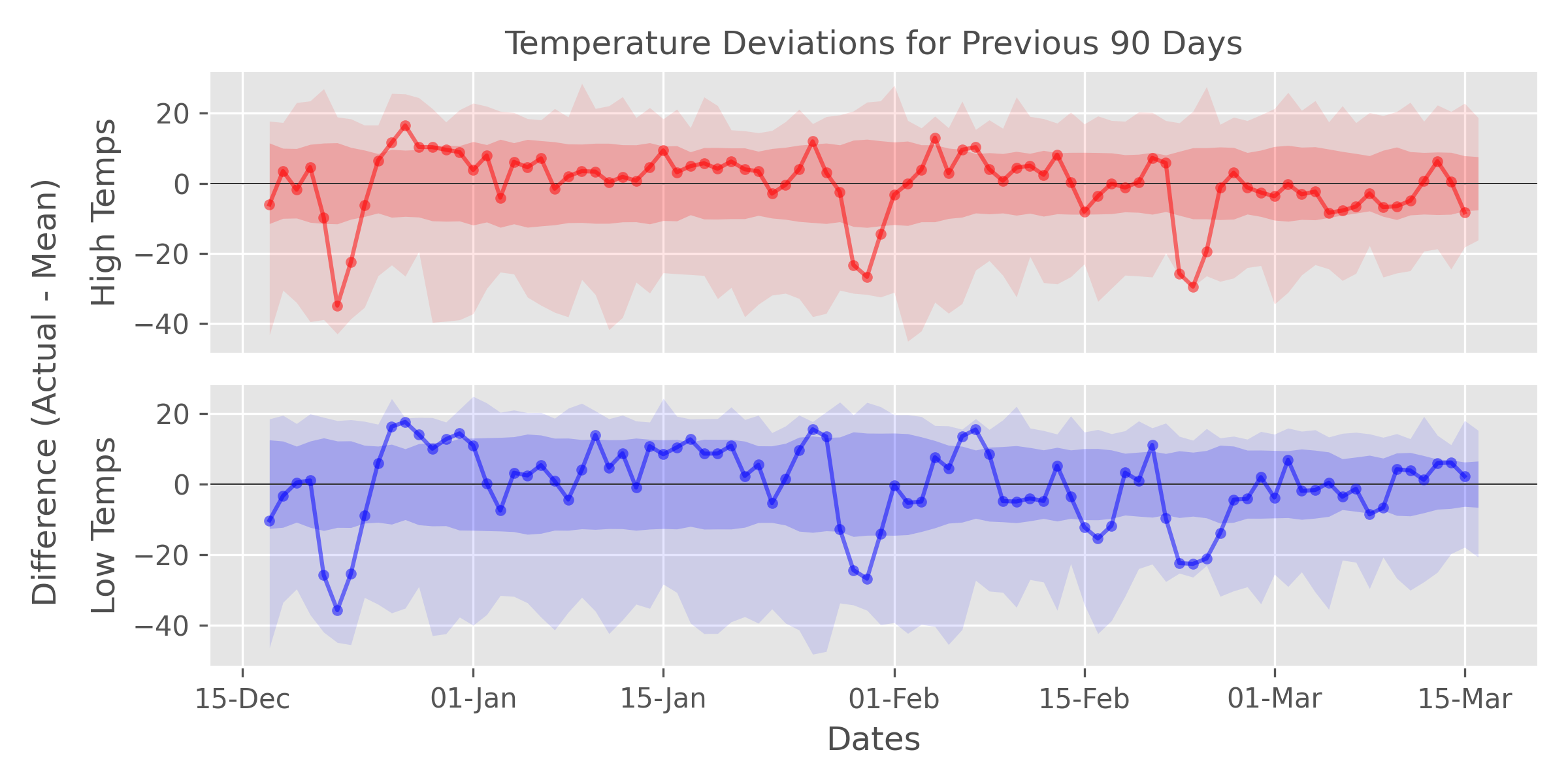
The plot_temp_diffs function is used to plot the deviations of the most
recent high/low temperatures from the average values. The color coding and
plotting elements are equivalent to the Yearly Temperature
Plot above. In this case, the center point (y = 0)
represents the average temperature for that particular day. Red/blue lines
greater than 0 are days that are warmer than average, and vice versa for
points below the center of the y-axis. In the example plot, the temperatures
for most days appear to be about average; however, there are a few
particularly cold streaks, with the cold snap in late February being records
lows for the daily high temperatures.
The call signature of this function is shown below.
mplvis.plot_temp_diffs(ghcnd, ndays=90, show=True, save=True, dpi=300)
The ndays keyword argument is a positive integer that determines the number
of days to use in the plot. The default (90) means that the deviations for
the final 90 days of data will be plotted.
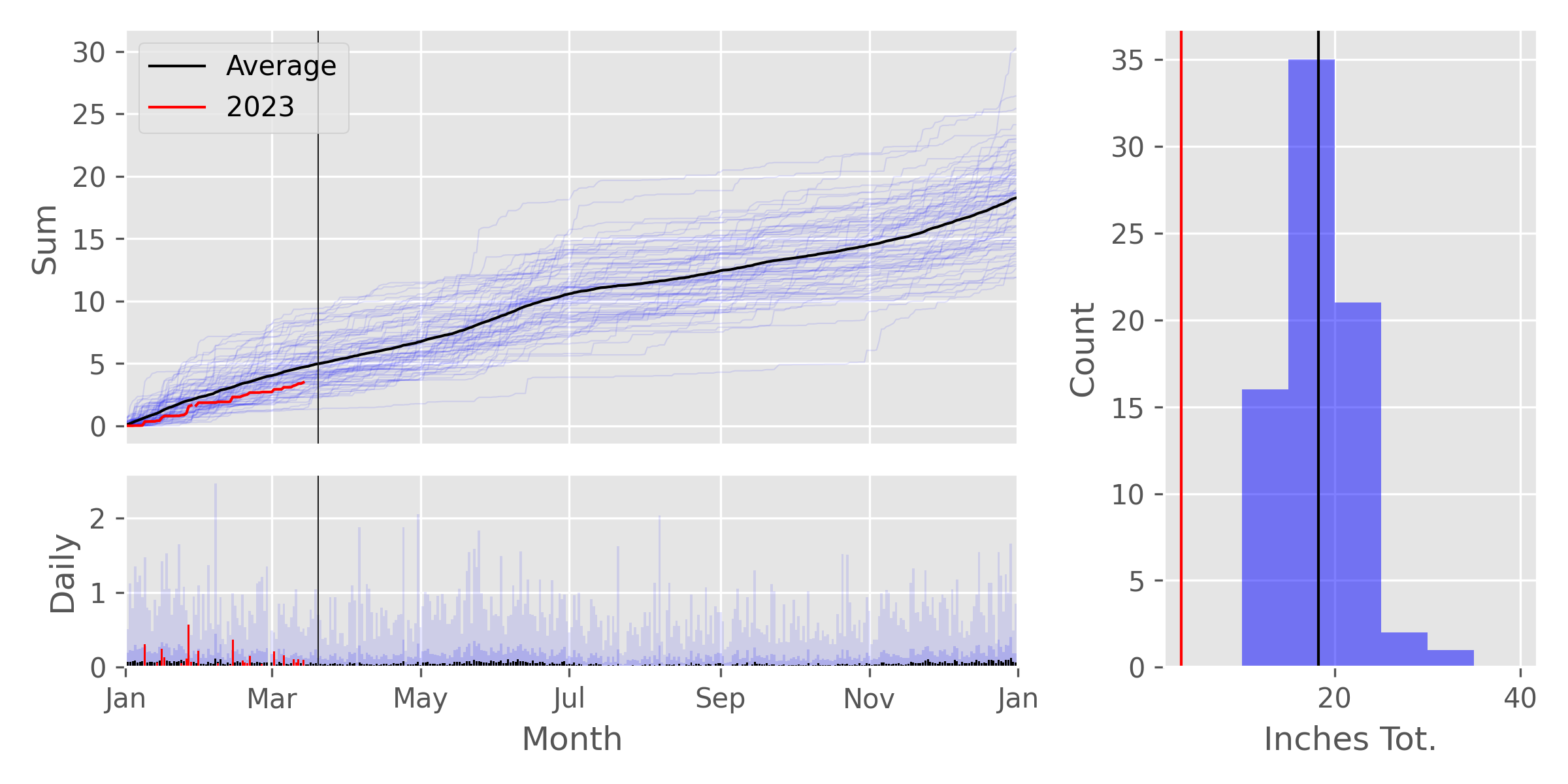
The plot_prcp function is used to plot various precipitation data, such as
the cumulative precipitation for the year, daily precipitation values, and a
distribution of yearly total precipitation. The figure consists of three
subplots. The upper left plot show the cumulative precipitation (in inches)
for the year. The solid black line is the average cumulative precipitation for
the year based on all the data, and the solid red line is the cumulative data
for the year defined by the use_year keyword argument, described below. The
thin, semi-transparent blue lines are cumulative precipitation for every year
for which enough data is present (see n_missing keyword argument below). The
lower left bar plot shows daily precipitation values. Black bars are the
average daily precipitation, and red bars are the measured precipitation for
the year determined by the use_year keyword argument. The darker blue bars
are the average daily precipitation plus one standard deviation, and the
lightest blue bars are the maximum precipitation for a given day. The
histogram on the right shows a distribution of total precipitation for all the
years of station data. The solid vertical black line shows the average total
precipitation for the year, and the solid red vertical line is the total
precipitation for the year defined by the use_year keyword argument.
The call signature for this function is as shown below.
mplvis.plot_prcp(ghcnd, use_year=None, ptype='PRCP', n_missing=10,
            show=True, save=True, dpi=300)
The use_year keyword argument a positive integer used to set the main
display year. If this argument is left with its default value of None, the
current year will be used. The ptype keyword argument is a string used to
select the type of data to plot. The acceptable values are 'PRCP'
(precipitation, default), 'SNOW' (snow), and 'SNPR' (sum of precipitation
and snow/10). The example shown above is using the 'SNPR' data. The
n_missing keyword is a positive integer that is used to filter out yearly
data for which the number of missing data are equal to or greater than this
value.
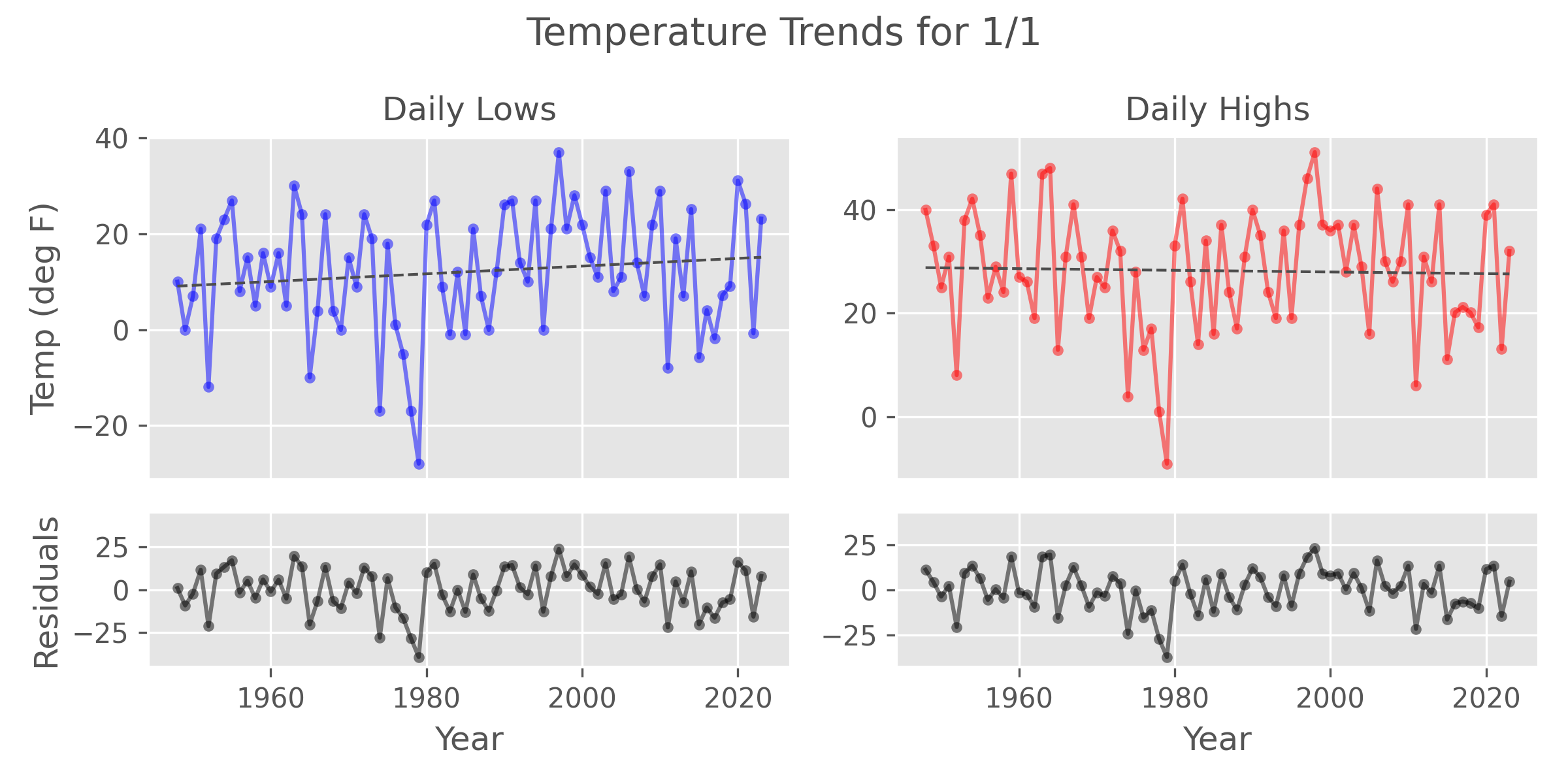
The plot_daily_temp function is used to plot high and low temperature trends
for a particular day of the year. The blue and red lines in the upper plots
are the measured low and high temperatures, respectively, for every year in
the stations records. The black line is a linear regression fit line for these
data. This line will either be a solid or dashed line, depending on the
p-value of the regression slope. If the p-value is greater than the p
keyword argument value, then the slope is not significant, and the trend line
will be dashed. Alternatively, statistically significant slopes will be
plotted as solid lines. For the example plot, it appears that these
temperatures do not show a statistically significant change over the lifetime
of the station data. A method for plotting the most significant trends will be
discussed below. The lower plots show the residuals, or trend minus actual
temperatures, for the low and high temperature values. Ideally, the residuals
should be randomly distributed about zero.
The call signature for this function is shown below.
mplvis.plot_daily_temp(ghcnd, month, day, temp_type='both', p=0.05,
              show=True, save=True, dpi=300):
The two positional arguments month and day are positive integers that
correspond to the month (1-12) and day (1-31) of the year for which to plot
the trends. The temp_type keyword argument is a string used to select the
type of data to plot. The default 'both' creates a plot for both the high
and low daily temps. This can also be 'TMIN' or 'TMAX', if a plot of only
the low or high temperature data, respectively, is desired. The p keyword
argument is a floating point number that corresponds to the p-value cutoff for
determining statistical significance. The default is 0.05, which corresponds
to a 95% confidence level.
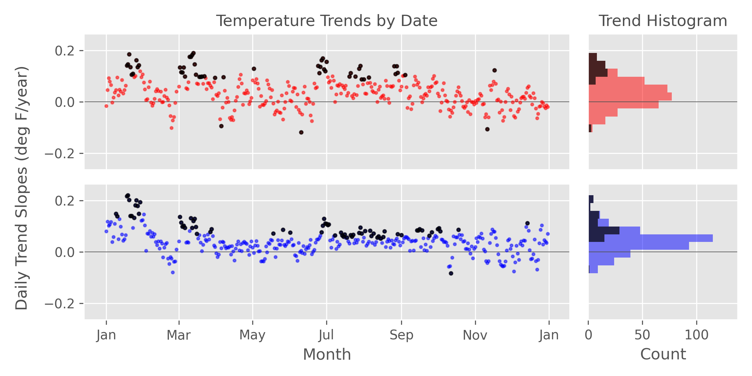
The plot_daily_trends function is used to plot all of the daily trend
information for every day on a single plot, which allows for comparisons of all
trends throughout the year. The left-hand
scatter plots show the daily trend slopes by date for the daily low and high
temps. Statistically significant trends, as defined by p-value<p keyword
argument value, are highlighted in black. The two plots on the right are
showing the same data but in histogram form. In this case, a considerable
number of days appear to be getting warmer in both the day and night.
The call signature for this function is shown below.
mplvis.plot_daily_trends(ghcnd, p=0.05, show=True, save=True, dpi=300)
The p keyword argument is a floating point number
that corresponds to a p-value cutoff for highlighting statistically
significant trends, as described below. The default 0.05 corresponds to a
95% confidence level cutoff.
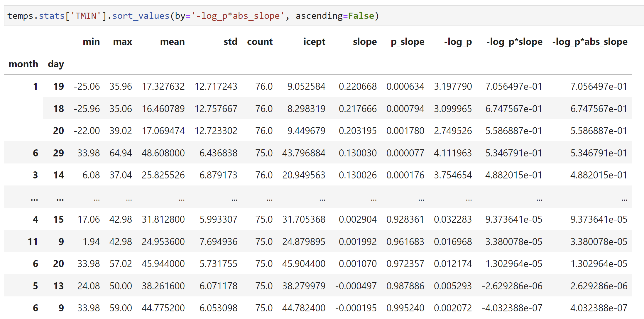
The slope values can be sorted directly; however, this does not take into
account the statistical significance of this fit parameter. Two additional
columns of data -- -log_p*slope and -log_p*abs_slope -- have been provided
to sort trends based on the p-value of the slope. The weighting in this case
is based on the -log10(p-value), which will be a larger positive value for
smaller (i.e. more significant) p-values. These weighting values are then
either multiplied by the slopes, -log_p*slope, which retains the sign of the
data. These can be used to find either the most positive or most negative
slope. The weights are also multiplied by the absolute value of the of the
slope data, -log_p*abs_slope, this can be used to find the most significant
slopes regardless of whether the temperatures are increasing or decreasing.
Sorting the daily temperature trends can be done using the builtin DataFrame sorting methods, as shown in Jupyter notebook code cell below.
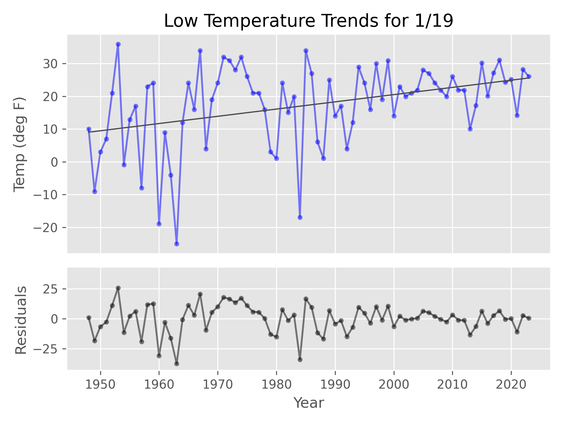
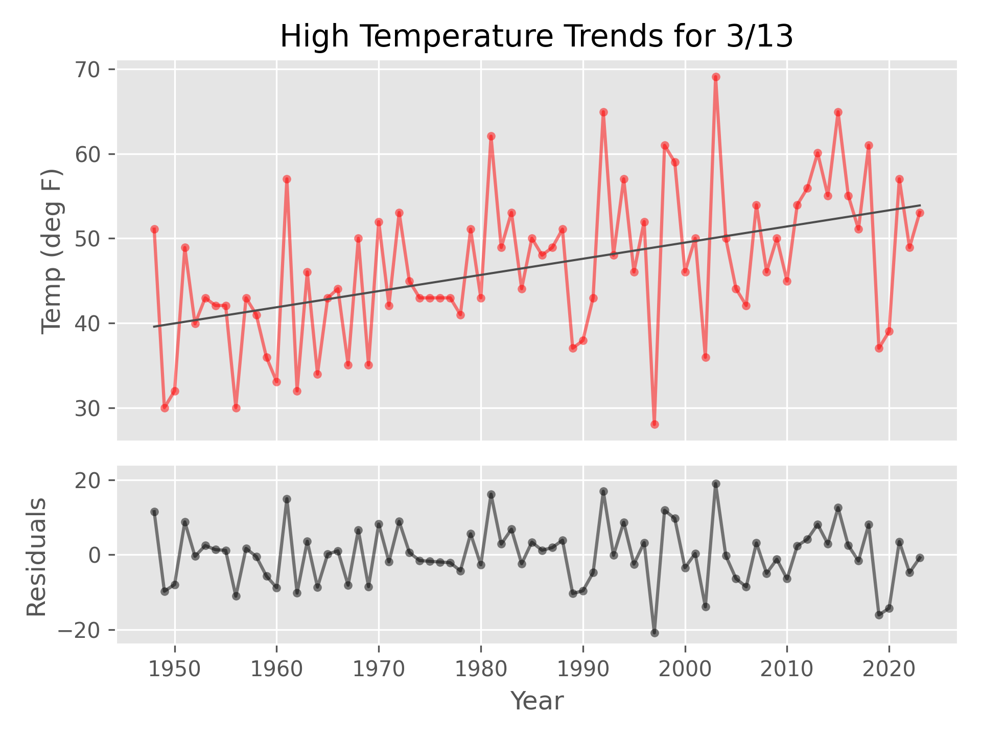
Using a simple loop and the plot_daily_temp function, this sorting code can
be used to plot the largest daily trend for both the high and low
temperatures, as shown below.
for cat in ('TMIN', 'TMAX'):
    slope_sorted = temps.stats[cat]\
                        .sort_values(by='-log_p*abs_slope', ascending=False)
    first_slope = slope_sorted.iloc[0]
    month, day = first_slope.name
    mplvis.plot_daily_temp(temps, month=month, day=day, temp_type=cat)
