Try it on CodeSandbox!
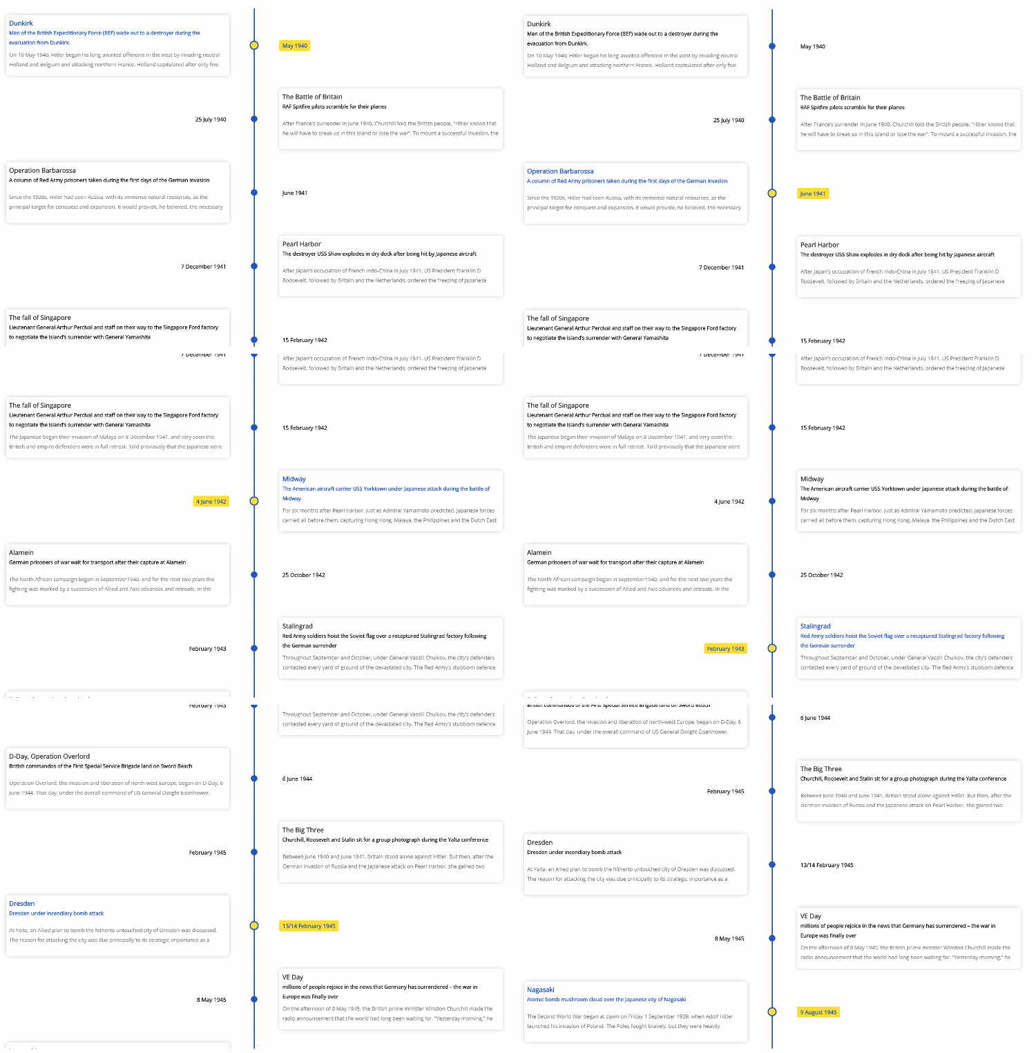
- 🚥 Render timelines in three different modes (Horizontal, Vertical, Tree).
- 🌲 Use the Tree mode to layout the timeline cards vertically in a tree like fashion.
- 📺 Auto play the timeline with the slideshow mode.
- 🖼️ Display Images & Videos in the timeline with ease.
- ⌨ Navigate the timeline via Keyboard.
- ⚡ Data driven API.
- 🔧 Optimized to render images & videos efficiently on (tree & vertical mode).
- 🎨 Customize colors with ease.
- 💪 Built with Typescript.
- 🎨 Styled with emotion.
- ⚡ Installation
- 🚀 Getting Started
- Props
- 📦Build Setup
- 🔨 Contributing
- 🧱 Built with
- 🔭 What's coming next
- Meta
yarn install react-chronoPlease make sure you wrap the component in a container that has a width and height.
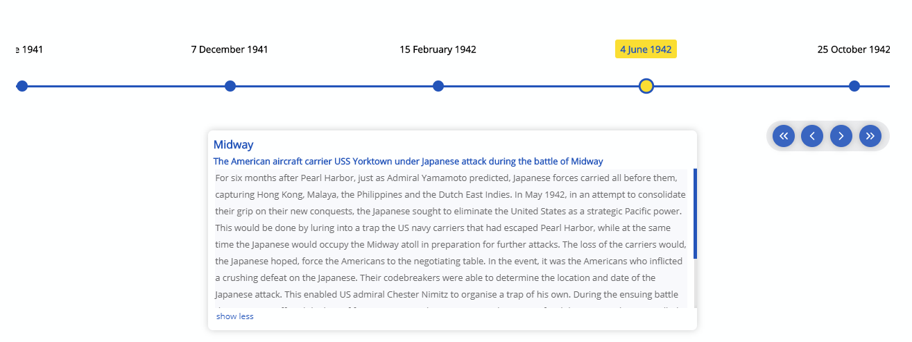
When no mode is specified, the component defaults to HORIZONTAL mode. Please check props for all the available options.
  import React from "react"
  import { Chrono } from "react-chrono";

  const Home = () => {
    const items = [{
      title: "May 1940",
      contentTitle: "Dunkirk",
      contentText:"Men of the British Expeditionary Force (BEF) wade out to..",
      media: {
        type: "IMAGE",
        source: {
          url: "http://someurl/image.jpg"
        }
      }
    }, ...];

    return (
      <div style={{ width: "500px", height: "400px" }}>
        <Chrono items={items} cardHeight={300} />
      </div>
    )
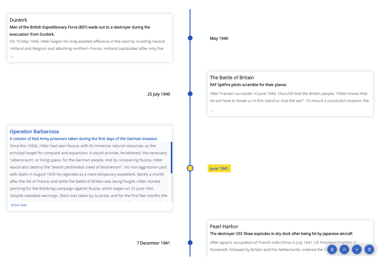
}To render the timeline vertically use the VERTICAL mode
  <div style={{ width: "500px", height: "950px" }}>
    <chrono
      items={items}
      mode="VERTICAL"
    />
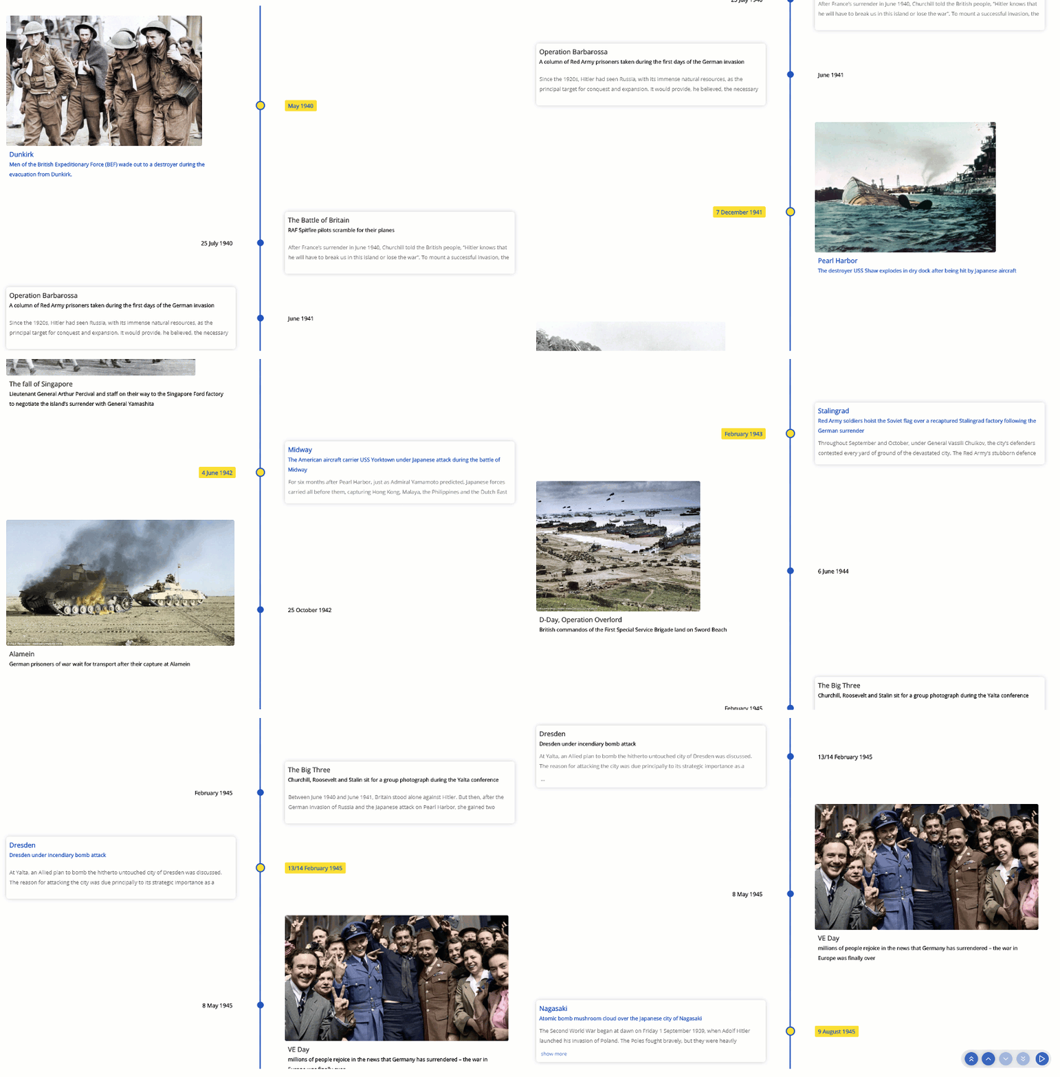
</div>In Tree mode the timeline is rendered vertically with cards alternating between left and right side.
  <div style={{ width: "500px", height: "950px" }}>
    <chrono
      items={items}
      mode="TREE"
    />
</div>Play the timeline automatically with the slideShow mode.
  <div style={{ width: "500px", height: "950px" }}>
    <chrono
      items={items}
      slideShow
      mode="TREE"
    />
</div>| name | description | default |
|---|---|---|
| mode | sets the layout of the component. can be HORIZONTAL, VERTICAL or TREE |
HORIZONTAL |
| items | collection of timeline items. This should be a collection of Timeline Item Model | [] |
| disableNavOnKey | prop to disable keyboard navigation. | false |
| slideShow | starts the timeline in slideshow mode. | false |
| slideItemDuration | The amount of delay in ms for the timeline points in slideshow mode. |
5000 |
| itemWidth | width of the timeline section in HORIZONTAL mode. |
300 |
| cardHeight | sets the minimum height of the timeline card. | 250 |
| theme | prop to customize the colors. |
react-chrono supports three modes HORIZONTAL, VERTICAL and TREE. No additional setting is required.
<chrono items={items} mode="HORIZONTAL" /> <chrono items={items} mode="VERTICAL" /> <chrono items={items} mode="TREE" />| name | description | type |
|---|---|---|
| title | title of the timeline item | String |
| contentTitle | title that is displayed on the timeline card | String |
| contentText | text displayed in the timeline card | String |
| media | media object to set image or video. | Object |
{
  title: "May 1940",
  contentTitle: "Dunkirk",
  media: {
    name: "dunkirk beach",
    source: {
      url: "http://someurl/image.jpg"
    },
    type: "IMAGE"
  },
  contentText:
    "Men of the British Expeditionary Force (BEF) wade out to a destroyer during the evacuation from Dunkirk."
}The timeline can be navigated via keyboard.
- For
HORIZONTALmode use your LEFT RIGHT arrow keys for navigation. - For
VERTICALorTREEmode, the timeline can be navigated via the UP DOWN arrow keys. - To easily jump to the first item or the last item in the timeline, use HOME or END key.
To disable keyboard navigation set disableNavOnKey to true.
<chrono items={items} disableNavOnKey />Both images and videos can be embedded in the timeline. Just add the media attribute to the Timeline Item model and the component will take care of the rest.
{
  title: "May 1940",
  contentTitle: "Dunkirk",
  media: {
    name: "dunkirk beach",
    source: {
      url: "http://someurl/image.jpg"
    },
    type: "IMAGE"
  }
}Videos start playing automatically when active will be paused when not active. Like images, videos are also automatically hidden when not in the visible viewport of the container.
{
  title: "7 December 1941",
  contentTitle: "Pearl Harbor",
  media: {
    source: {
      url: "/pearl-harbor.mp4",
      type: "mp4"
    },
    type: "VIDEO",
    name: "Pearl Harbor"
  }
}
Slideshow can be enabled by setting the slideShow prop to true. You can also set an optional slideItemDuration that sets the time delay between cards.
<chrono items={items} slideShow slideItemDuration={4500} />The itemWidth prop can be used to set the width of each individual timeline sections. This setting is applicable only for the HORIZONTAL mode.
Customize colors with theme prop.
<chrono items={items} titlePosition="BOTTOM" theme={{primary: "red", secondary: "blue" }} /># install dependencies
yarn install
# start dev setup
yarn run start
# run css linting
yarn run lint:css
# package lib
yarn run rollup- Fork it ( https://github.com/prabhuignoto/react-chrono/fork )
- Create your feature branch (
git checkout -b new-feature) - Commit your changes (
git commit -am 'Add feature') - Push to the branch (
git push origin new-feature) - Create a new Pull Request
- The Component is written in React and Typescript.
- Styled with emotion.
- Support for Mobile devices & Tablets (responsive).
- Support for embedding videos.
Prabhu Murthy – @prabhumurthy2 – prabhu.m.murthy@gmail.com
Distributed under the MIT license. See LICENSE for more information.


