The list of documents that I will use for this analysis can be found in this page.
Because the data is saved in different documents, first I will have to save each document inidividually and then read all of them.
I checked in the website and it looks like there is data from 2017 until the April of 2019. Later this data is called "BayWheels" so I will not use this data for this analysis and I will only use the data from 2017 until April 2019.
Also I checked the data manually and I found that in the case of the data from 2018 there is one extra column called "bike_share_for_all_trip" that doesn't exist in the data from 2017, so I will remove this column also for this analysis.
The data includes information about individual rides made in a bike-sharing system covering the greater San Francisco Bay area. The data is from 2017 until April 2019. The total amount of data is 3,254,325 rides.
In this inverstigation, I want to look at the differen characteristics of type of users and how the company can increase the amount of subscribers. I would like to know if there is some station in where the amount of the type of user Customer is using this service more than the type of user Subscriber. This can be seen as an oportunity to promote this service more in the area of this stations in where the company can increase the amount of subscribers.
In total there are 372 stations in where the users can take a bike.
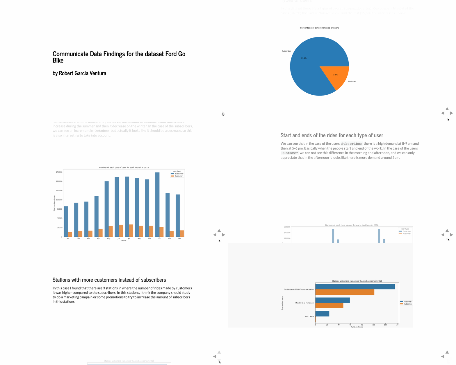
In this dataset there are 2 types of users (Subscriber and Customer). In most of the cases (84,5%) the user is Subscriber and the rest (15,5%) the user is Customer.
In the year 2018, the amount of customers and subscribers increase during the summer and then it decrease on the winter.
In 2018 the users Subscriber they have a high demand at 8-9 am and then at 5-6 pm. Basically when the people start and end of the work.
In the case of the users Customer there is not big difference in the morning and afternoon, and we only can appreciate that in the afternoon it looks like there is more demand around 5pm.
I found that there are 3 stations in where the number of rides made by customers it was higher compared to the subscribers. In this stations, I think the company should study to do a marketing campain or some promotions to try to increase the amount of subscribers in this stations.
For the presentation, I focus on all the important findings I did and that are discribed previously.
I started the presentation by showing the percentage of each type of user. Then I show the types of users for each month. Later, I show another plot with the start time and end time of all the rides for each type of user. As I said before, in this case the user will be available to see the difference between the subscribers and the customers. Finally, I presented a plot with the 3 stations in where the amount of customers is higher compared to the subscribers.
To run this report first you need to install the following libraries.
Use the package manager pip to install the following packages.
pip install numpy
pip install pandas
pip install matplotlib
pip install seaborn
pip install requests
pip install zipfile
pip install calendar
pip install json
Another option is to install Anaconda and some of this packages are already installed.
Pull requests are welcome. For major changes, please open an issue first to discuss what you would like to change.
This project is under the license MIT.
