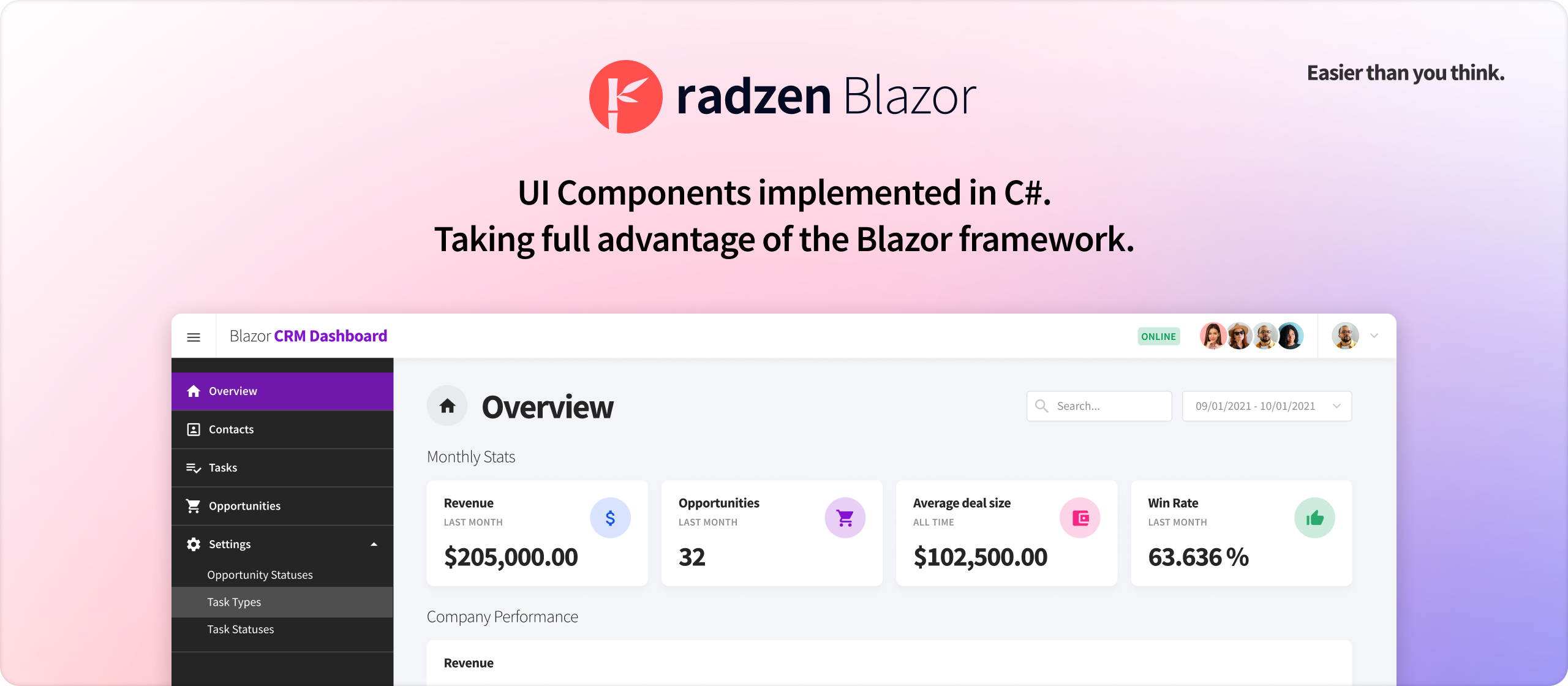
A set of 70+ free and open source native Blazor UI controls.
Radzen Blazor Components are open source and free for commercial use. You can install them from nuget or build your own copy from source.
Paid support is available as part of the Radzen Professional subscription.
The components are implemented in C# and take full advantage of the Blazor framework. They do not depend on or wrap existing JavaScript frameworks or libraries.
Blazor Server and Blazor WebAssembly are fully supported.
We add new components and features on a regular basis.
Short development cycle. We release as soon as new stuff is available. No more quarterly releases.
Everybody is welcome to visit the Radzen Community forum. Join the growing community and participate in the discussions!
The Radzen team monitors the forum threads, but does not guarantee a response to every question. For guaranteed responses you may consider the dedicated support option.
Dedicated support for the Radzen Blazor Components is available as part of the Radzen Professional subscription.
Our flagship product Radzen Blazor Studio provides tons of productivity features for Blazor developers:
- An industry-leading WYSIWYG Blazor design time canvas
- Scaffolding a complete CRUD applications from a database
- Built-in security - authentication and authorization
- Visual Studio Code and Professional support
- Deployment to IIS and Azure
- Dedicated support with 24 hour guaranteed response time
Radzen Blazor Components are distributed as a Radzen.Blazor nuget package. You can add them to your project in one of the following ways
- Install the package from command line by running
dotnet add package Radzen.Blazor - Add the project from the Visual Nuget Package Manager
- Manually edit the .csproj file and add a project reference
Open the _Imports.razor file of your Blazor application and add this line @using Radzen.Blazor.
Radzen Blazor components come with five free themes: Material, Standard, Default, Dark, Software and Humanistic.
To use a theme
- Pick a theme. The online demos allow you to preview the available options via the theme dropdown located in the header. The Material theme is currently selected by default.
- Include the theme CSS file in your Blazor application. Open
Pages\_Layout.cshtml(Blazor Server .NET 6+),Pages\_Host.cshtml(Blazor Server before .NET 6) orwwwroot/index.html(Blazor WebAssembly) and include a theme CSS file by adding this snippet<link rel="stylesheet" href="_content/Radzen.Blazor/css/material-base.css">
To include a different theme (i.e. Standard) just change the name of the CSS file:
<link rel="stylesheet" href="_content/Radzen.Blazor/css/standard-base.css">
Open Pages\_Layout.cshtml (Blazor Server .NET 6+), Pages\_Host.cshtml (Blazor Server before .NET 6) or wwwroot/index.html (Blazor WebAssembly) and include this snippet:
<script src="_content/Radzen.Blazor/Radzen.Blazor.js"></script>Use any Radzen Blazor component by typing its tag name in a Blazor page e.g.
<RadzenButton Text="Hi"></RadzenButton><RadzenButton Text=@text />
<RadzenTextBox @bind-Value=@text />
@code {
string text = "Hi";
}<RadzenButton Click="@ButtonClicked" Text="Hi"></RadzenButton>
@code {
void ButtonClicked()
{
}
}Use Radzen.Server.sln to open and run demos as Blazor server application or Radzen.WebAssembly.sln to open and run demos as Blazor WebAssembly application. Radzen.sln has reference to all projects including tests.


