Some friends and I run a Last Man Standing competition based on the Premier League and Championship. This is a low stakes football competition where each week everyone must pick a team and if they win you move to the next round. The person who is last out wins the pot. We have been running the game for a few weeks now with the organiser keeping an excel spreadsheet of everyone's picks and results.
Over the summer, when games weren't being played, I took it upon myself to generate an "Annual Report" that gives some stats on who has performed the best, what teams have been most successful and who was the most "winningest" person and team.
To provide a robust platform to analyse the costs and to hopefully make updating the stats each year easier, I used a mixture of python and PowerBI to clean, collate and display the results.
The first step was to take the organiser's Google Sheets record and convert it into excel. The initial structure was good for displaying results to a whatsapp group but not useful for data analysis
 |
|---|
| Input Data |
Unfortunately this was a manual process of pivoting the data to a more useful format, adding time and season detail and which player won. The biggest issue within the data was standardised naming of the teams, however once that was fixed the data was ready for analysis
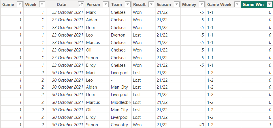
Once cleaned and imported into PowerBI the data looks as below. It contains the categorisation data, the winner and losses/winnings.
 |
|---|
| Cleaned Data |
To aid in analysis and to provide colour to the data a number of measures were generated.
- The length of time a player was out of the game, or "on the bench"
- The unique teams that a user selected
- How many times had each player won the game
- The length of each separate game to allow us to see the longest game in weeks
- The percentage losses for each player
- How much money has each player made
Two views were created for analysis.
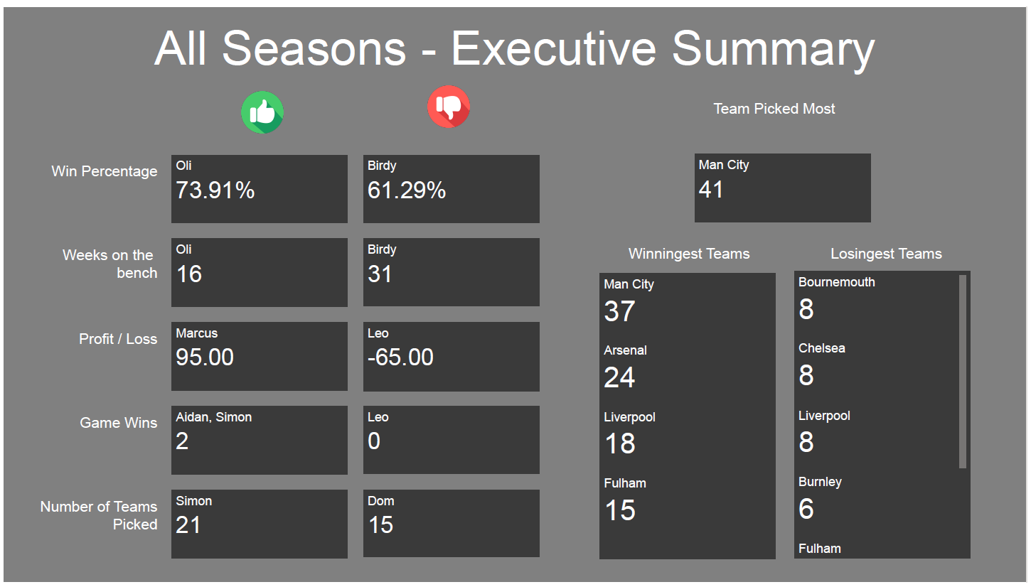
The "Executive Summary" which provides summary statistics for that season or for all time.
 |
|---|
| Executive Summary |
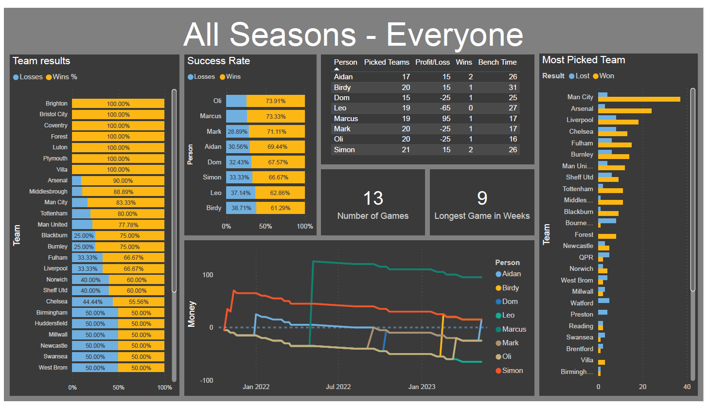
A more detailed view that provided all player's stats and some charts showing teams and winnings in more detail
 |
|---|
| Detailed View |
From the executive view we can see that:
- Oli was the best at selecting teams but was unfortunate not able to convert that into winnings.
- Birdy was unfortunate with his picks, which resulted in the most time on the bench for him. However he did manage to scrape a win while Leo was not as lucky.
- Not knowing loads about football I went for the favourites in most occasions which resulted in a low range of teams picked and unfortunately a middling win percentage.
- Unsurprisingly Man City were the team that were picked and also won the most when picked. They won the league both seasons we played.
- Bournemouth, Chelsea and Liverpool were the teams that disappointed the most.
After I sent out the first Annual Report at the end of the 22/23 season, it was mentioned that one of the measures people would be interested in who was the "unluckiest" player. Who picked teams that should have won but lost and who should feel the most annoyed at what results. To do this I investigated using the metric of XG or expected goals.
Expected goals is a measure of the quality of the chances that a team have within a game based on analysing the number of shots and the chance of a shot being scored based on similar shots from the past. My intuition would be that this measure could be used to measure the unluckiest player.
The issue around XG is that it is used frequently for betting algorithms and as such there were no open access APIs that would supply this metric. This meant I had to resort to web scraping. Luckily I found a website that gave the information I needed in scrapeable format which didn't limit web requests.
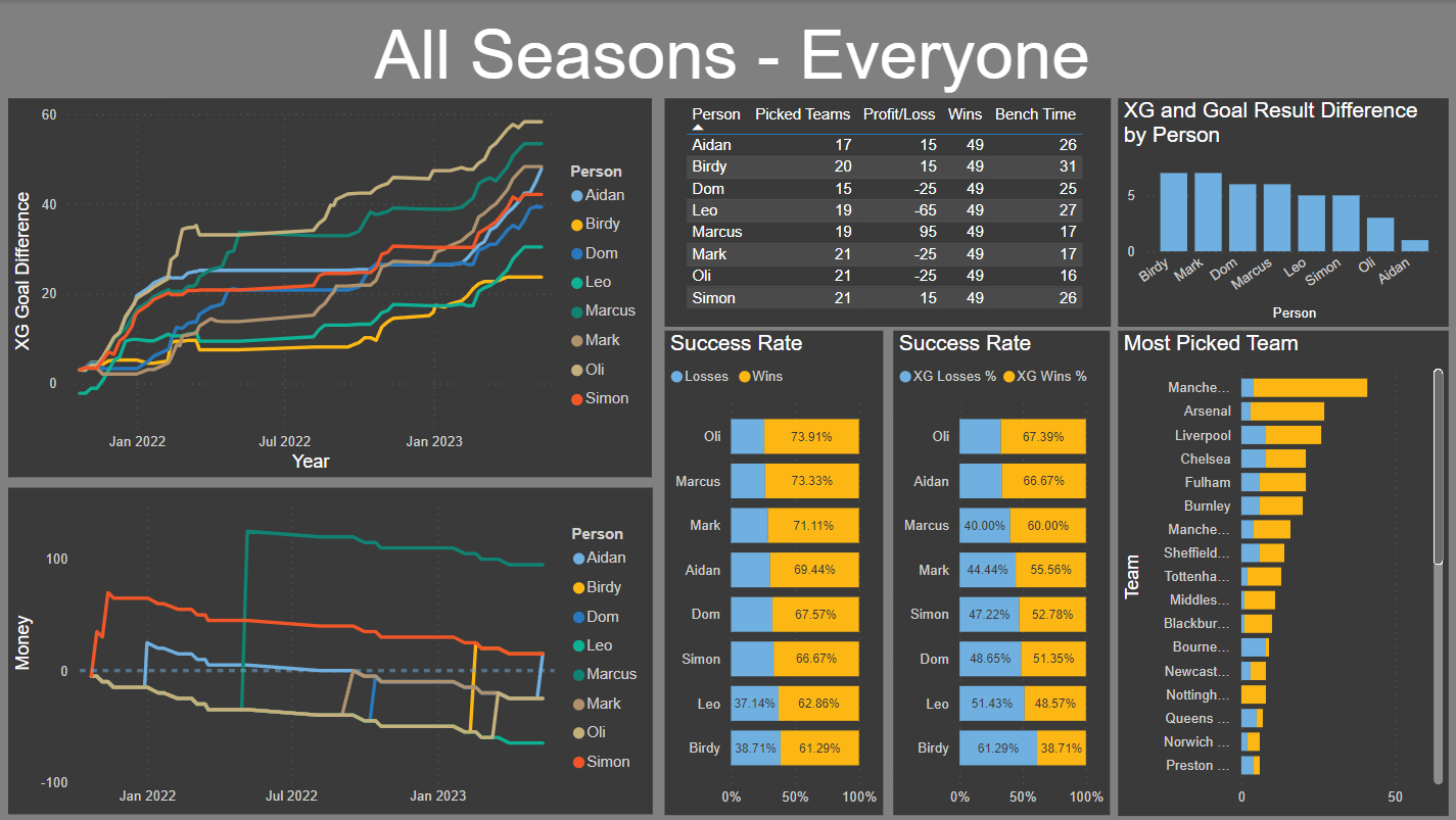
The inclusion of XG did complicate the data set however, as we now needed to know the opponents to a game and who was at home etc. After scraping and cleaning the data I could now generate a view on a player's total XG and how that has changed over time.
 |
|---|
| Detailed View with XG |
From this we can see that:
-
From the XG and Goal Result difference chart, everyone had a higher XG than actual goal difference.
-
From the XG success rate chart, Birdy was lucky to get the number of wins he did and so could be classed as the luckiest player, from an XG perspective.
-
Again from the XG success rate chart, Aidan should have been second most successful player and so could be classed as the unluckiest player, from an XG perspective.
-
Oli does have a claim to be the unluckiest player as he has recorded the most successful choices but these did not result in him winning the most money.
For the 23/24 season I would like to implement the following:
-
Implement XG in a more robust way as this was not included in the Annual Report for 22/23
-
Give the players a measure of the total time on the bench for all players for the season.
-
Which game was the most boring for the most people, i.e. which game had the most "person bench weeks"
I really enjoyed working with the data and seeing what visualisations I could generate. I think the report gives people something to either get angry about or to feel better about, dependant on the data.
I think I enjoyed making the dashboard than my friends enjoyed reading it, but it does give a mechanism to answer questions about the results that seem to come up occasionally. For example, is picking Chelsea a good idea, which it turns out, it probably isn't.