A solution to the Platzi - React practice course.
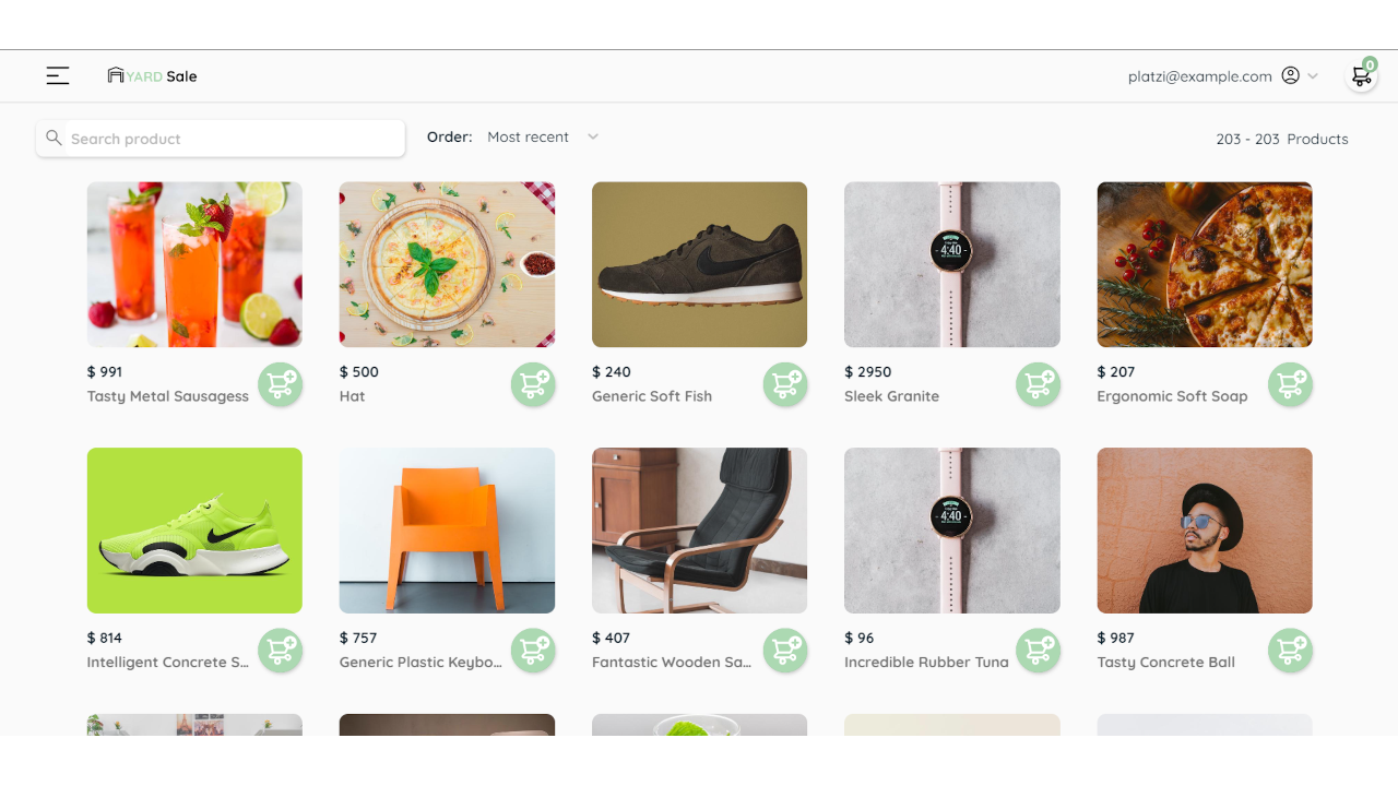
This is a simple Frontend app that simulates a client for an e-commerce using
the Platzi Fake Store API
Project live site URL: GH Pages - Live site
Users should be able to:
- See all products from the API on the homepage
- Search for a product using an
inputfield - Filter products by order using an
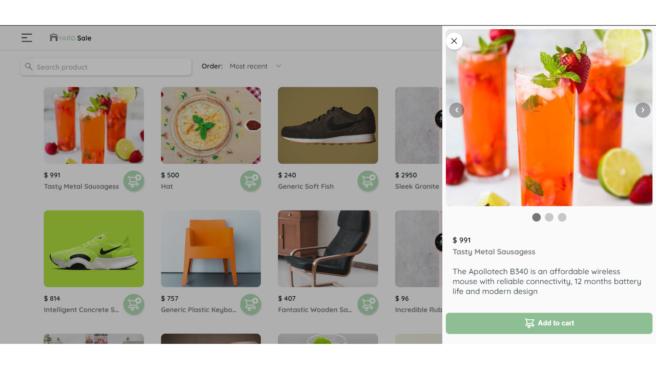
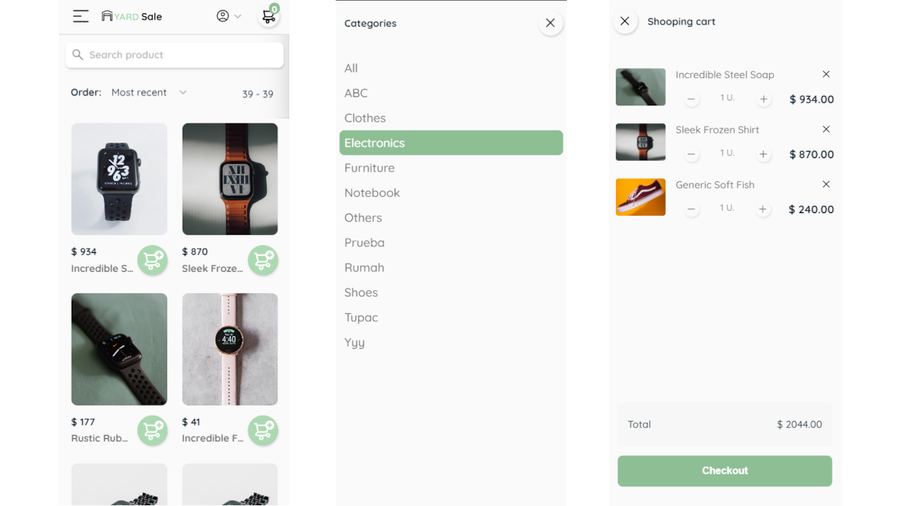
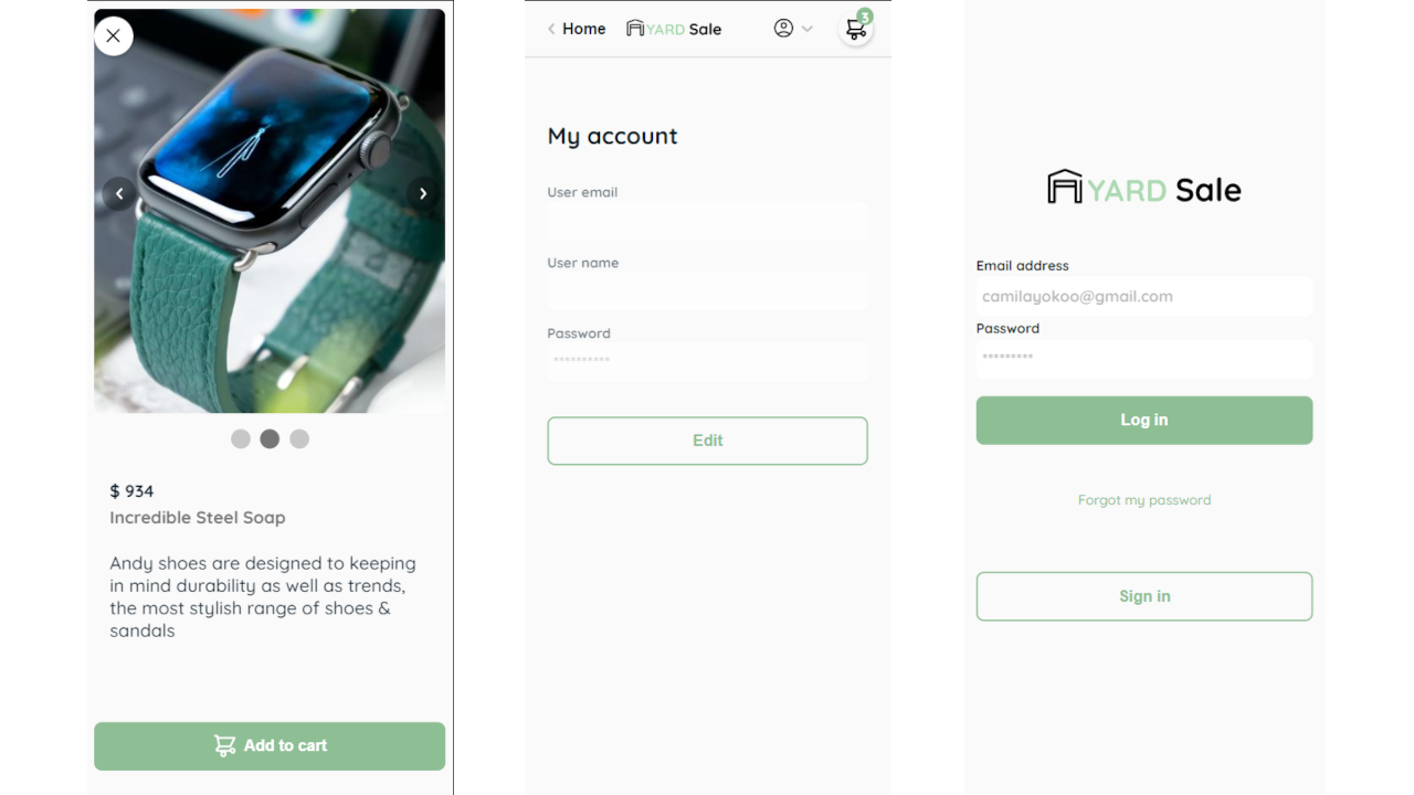
selectfield - Click on a product to see more detailed information on a side modal
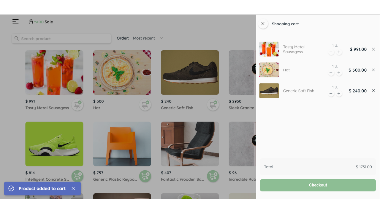
- Click on a
buttonto add a product to cart - See all products in cart in a side modal
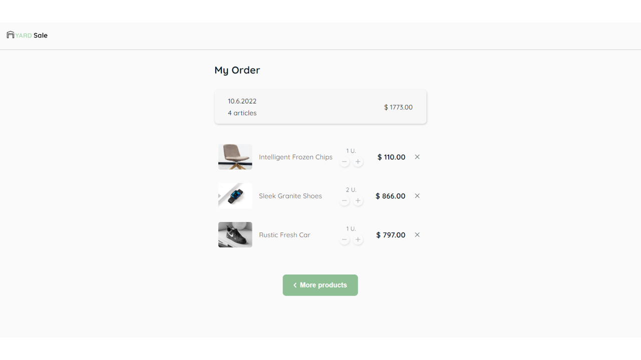
- See checkout on a separate page
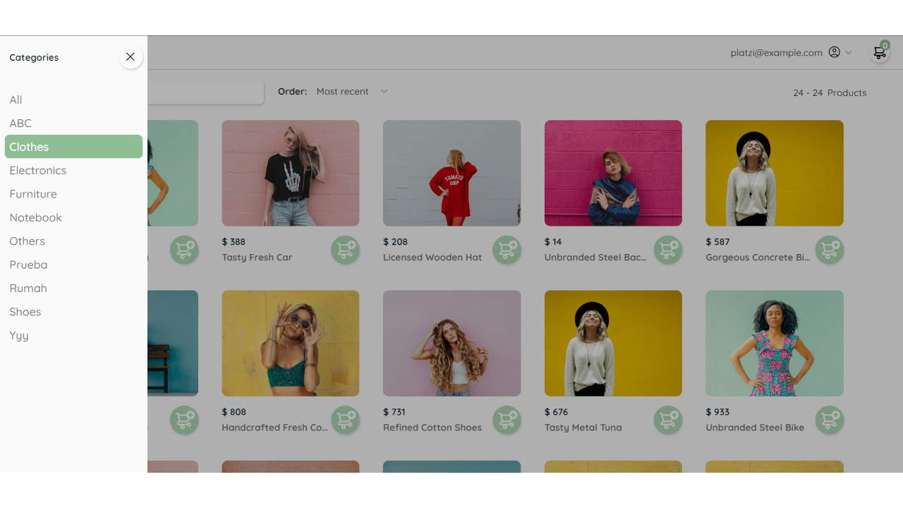
- Show products according to selected category
- Show different pages according to route:
- login
- recovery-password
- home
- account
- checkout
- category
- Live site URL: GH Pages - Live site
- Semantic HTML5 markup
- BEM naming convention
- Flexbox and CSS Grid
- SCSS
- Mobile-first-workflow
- React - JS Framework
- React-router-dom - Package for using React Router in web app
- React-hot-toast - Toast library for React
Buit with Webpack and Babel + plugins
npm installnpm run startnpm run buildGlobal state for products data got from API, using context API
Define functions in ProductState, then wrap with useMemo to send changes to Provider:
const getProductsByCategory = async (categoryId) => {
    const options = { method: "GET" };
    const request = await fetch(`${baseURL}/categories/${categoryId}/products`, options);
    const response = await request.json();

    dispatch({ type: GET_PRODUCTS, payload: response });
  };

const value = useMemo(() => ({
  getProducts,
  getCategories,
  addToCart,
  deleteFromCart,
  decreaseItemCart,
  getProductsByCategory,
  products: state.products,
  categories: state.categories,
  shoopingCart: state.shoopingCart,
}));

return (
  <ProductContext.Provider value={value}>
    {props.children}
  </ProductContext.Provider>
);
Then in a component only what is required is called
import ProductContext from "@context/products/ProductContext";

// ProductCard.jsx
const { addToCart } = useContext(ProductContext);

// ShoopingCart.jsx
const { shoopingCart } = useContext(ProductContext);

// CartItem.jsx
const { addToCart, deleteFromCart, decreaseItemCart } = useContext(ProductContext);

// Home.jsx
const {
    products,
    getCategories,
    getProducts,
    shoopingCart,
    getProductsByCategory,
  } = useContext(ProductContext);
Drawer is a container that allows to wrap elements to show on side as a modal, the component 'AsideDrawer.jsx' is used in conjunction with a custom hook 'useAsideDrawer':
// useAsideDrawer.jsx
import React, { useState, useEffect } from "react";

export const useAsideDrawer = (initialShowValue = false) => {
  const [isOpen, setIsOpen] = useState(initialShowValue);

  useEffect(() => {
    if (isOpen) document.documentElement.classList.add('scrollbar-none');
    else document.documentElement.classList.remove('scrollbar-none');
  }, [isOpen]);

  const hideDrawer = () => setIsOpen(false);
  const showDrawer = () => setIsOpen(true);
  const toggleDrawer = () => setIsOpen((value) => !value);

  return { isOpen, hideDrawer, showDrawer, toggleDrawer };
};In the same way a custom hook is used for the product image carousel.
// useImageCarrousel.jsx
import React, { useState, useEffect } from 'react';

export const useImageCarrousel = (initialSlides = []) => {
  const [slides, setSlides] = useState(initialSlides);
  const [current, setCurrent] = useState({});

  useEffect(() => {
    if (slides.length > 0) {
      setCurrent(slides[0]);
    }
  }, [slides]);

  const setPrevious = () => {
    if (current.index > 0) setCurrent(slides[slides.indexOf(current) - 1])
    else if (current.index === 0) setCurrent(slides[slides.length - 1])
  }

  const setNext = () => {
    if (current.index < slides.length - 1) setCurrent(slides[slides.indexOf(current) + 1])
    else if (current.index === slides.length - 1) setCurrent(slides[0])
  }
  return { slides, current, setCurrent, setSlides, setPrevious, setNext }
}The 'react-hot-toast' library has a feature that allows you to set your own component to display the alerts and customize the styles:
// render in Snackbar.jsx
return (
  <article
    className={`snackbar${severity ? ` snackbar--${severity}` : ""}`}
    style={{
      ...style,
      ...toastAnimation,
    }}
  >
    <Icon name={iconName[severity]} size={28} />
    <h2 className="snackbar__message">{message}</h2>
    <Button icon="close" iconSize={30} fab flat onClick={closeAction} />
  </article>
);
Using custom Snackbar component with react-hot-toast
// ProductCard.jsx
import toast from "react-hot-toast";
import Snackbar from "@containers/Snackbar";

const handleCartBtnClick = (e) => {
    e.stopPropagation();
    try {
      addToCart(data);
      toast.custom((t) => (
        <Snackbar
          show={t.visible}
          message="Product added to cart"
          severity="success"
          closeAction={() => toast.dismiss(t.id)}
        />
      ));
    } catch (error) {
      console.log(error);
      toast.custom((t) => (
        <Snackbar
          show={t.visible}
          message="An error has occurred"
          severity="error"
          closeAction={() => toast.dismiss(t.id)}
        />
      ));
}More API functions could be integrated like:
- Authentication with JWT
- Get products with pagination
- Manage user profile data (GET, CREATE, UPDATE)
- Frontend Mentor - @rojaence
- Twitter - @EndaraRonny
- LinkedIn - Ronny Endara
- Platzi - Profile
