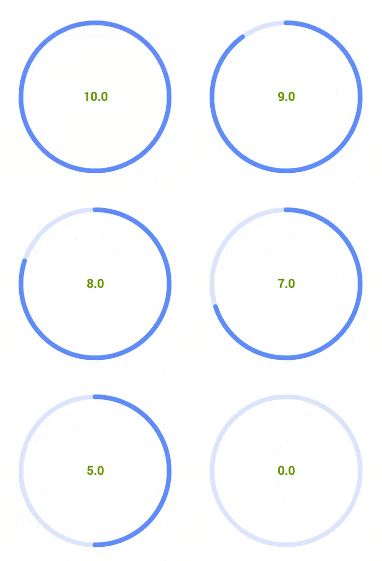
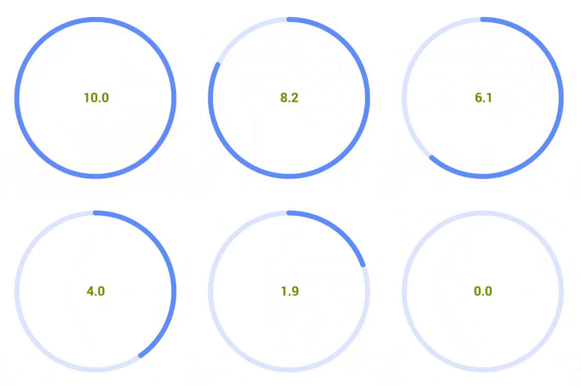
A special shoutout to @carlossotelo for his suggestions on anti-aliasing solutions
allprojects {
  repositories {
  ...
  maven { url 'https://jitpack.io' }
  }
} dependencies {
compile 'com.github.rjsvieira:circularView:1.3.0'
}Below is the configuration for the circleView presented on the first gif
<rjsv.circularview.CircleView
  android:id="@+id/circle_view"
  circleview:layout_constraintTop_toTopOf="parent"
  circleview:layout_constraintBottom_toBottomOf="parent"
  circleview:layout_constraintStart_toStartOf="parent"
  circleview:layout_constraintEnd_toEndOf="parent"
  android:layout_width="500dp"
  android:layout_height="500dp"
  circleview:suffixEnabled="true"
  circleview:suffixValue="EUR"
  circleview:arcBorderColor="@color/color_arc"
  circleview:arcColor="@color/color_arc"
  circleview:arcHasBorder="false"
  circleview:arcWidth="15dp"
  circleview:hasIndicator="false"
  circleview:indicatorColor="@color/theme_red_primary"
  circleview:indicatorRadius="6"
  circleview:progressColor="@color/color_progress"
  circleview:progressMaximumValue="10"
  circleview:progressMinimumValue="0"
  circleview:progressStepValue="1"
  circleview:progressStepAsInteger="false"
  circleview:progressWidth="15dp"
  circleview:textColor="@color/sample_green"
  circleview:textEnabled="true"
  circleview:textFont="fonts/Roboto-Bold.ttf"
circleview:textSize="36sp"/>| Attribute | Type | Description | Default |
|---|---|---|---|
| progressCurrentValue | float | The starting value | 0 |
| progressMaximumValue | float | The maximum allowed value of the circle view | 100 |
| progressMinimumValue | float | The minimum allowed value of the circle view | 0 |
| progressStepValue | float | The step allows the developer to set a constraint for the values the user can choose. If different from 0, the step will be considered and whenever the user moves the progress to a non-integer value, it will round it to its Ceiling or Floor (whichever is closer) | 0 |
| progressStepAsInteger | boolean | The step allows the developer to constraint the value to an integer rather than a float | false |
| progressBarSquared | boolean | If there is no indicator overlapping it, the progress bar can be set as squared or rounded | false |
| progressWidth | dimension | The width of the progress bar | |
| progressColor | color | The color of the progress bar | |
| suffixEnabled | boolean | Specifies whether a suffix can be added after the progress value. Used to indicate time or currencies, etc | false |
| suffixValue | string | The string value for the suffix. E.g. "EUR" | false |
| hasIndicator | boolean | The indicator is a simple small circle that leads the progress bar | false |
| indicatorColor | color | The indicator's color | |
| indicatorRadius | integer | Specifies the radius, if it exists, of the indicator | |
| arcWidth | dimension | The width of the circle's arc | 20 |
| arcColor | color | The color of the circle's arc. | |
| arcHasBorder | boolean | Defines whether the circle's arc has a border. By default, if has exists, has 1.2x the width of the circle's arc | |
| arcBorderColor | color | Specifies the arc's border color if the arc's border exists | false |
| hasText | boolean | Specifies whether the arc's current progress will be displayed in the center of the circle | true |
| textSize | dimension | Specifies the text size | 72 |
| textColor | color | Specifies the text color | |
| textFont | string | Specifies the custom font attribute | Typeface.DEFAULT |
| clockwise | boolean | Specifies whether the CircleView takes a clockwise or a counter-clockwise orientation | true |
| enabled | boolean | Specifies whether the user can interact (changing the progress) with the CircleView or not. Made with the intent of allowing the developer to lock the value and operate it without user interaction | true |
You can keep track of the values when they change as well as the moment when the point tracking starts or stops.
public interface CircleViewChangeListener {

    void onPointsChanged(CircleView circleView, float points);

    void onStartTracking(CircleView circleView);

    void onStopTracking(CircleView circleView);

}In order to facilitate animations (because yeah, animations are the coolest part of views), the custom CircleViewAnimation wrapper has been added. Configurations are few and easy to implement. Notes :
- The AnimationListener is bound to the View. Thus said, if the Activity goes to the background, the animation will be briefly paused until it comes back to the foreground.
- To complement the previous point, the method setTimerOperationOnFinish allows you to specify a Runnable that will run at the end of the duration regardless of the Activity's state
Consider the following example :
CircleView circleView = (CircleView) findViewById(R.id.circle_view);
CircleViewAnimation circleViewAnimation = new CircleViewAnimation(circleView)
 	.setAnimationStyle(AnimationStyle.CONTINUOUS)
    	.setDuration(circleView.getProgressValue())
        .setCustomAnimationListener(new Animation.AnimationListener() {
			@Override
			public void onAnimationStart(Animation animation) {
			    // Animation Starts
			}

			@Override
			public void onAnimationEnd(Animation animation) {
			    // Animation Ends
			}

			@Override
			public void onAnimationRepeat(Animation animation) {

            }
        }).setTimerOperationOnFinish(new Runnable() {
            @Override
            public void run() {
                // Run when the duration reaches 0. Regardless of the AnimationLifecycle or main thread.
                // Runs and triggers on background.
            }
        })
        .setCustomInterpolator(new LinearInterpolator());


