/llpeo

Learning with Label Proportions on Satellite Imagery

Primary LanguageJupyter Notebook

Lightweight learning with label proportions on satellite imagery

Raúl Ramos-Pollán, Universidad de Antioquia, Colombia, raul.ramos@udea.edu.co
Fabio A. González, Universidad Nacional de Colombia, fagonzalezo@unal.edu.co

Abstract

This work addresses the challenge of producing chip level predictions on satellite imagery when only label proportions at a coarser spatial geometry are available, typically from statistical or aggregated data from administrative divisions (such as municipalities or communes). This kind of tabular data is usually widely available in many regions of the world and application areas and, thus, its exploitation may contribute to leverage the endemic scarcity of fine grained labelled data in Earth Observation (EO). Learning from Label Proportions (LLP) applied to EO data is still an emerging field and performing comparative studies in applied scenarios remains a challenge due to the lack of standardized datasets. In this work, first, we show how simple deep learning and probabilistic methods generally perform better than standard more complex ones, providing a surprising level of finer grained spatial detail when trained with much coarser label proportions. Second, we provide a set of benchmarking datasets enabling comparative LLP applied to EO, providing both fine grained labels and aggregated data according to existing administrative divisions. Finally, we argue how this approach might be valuable when considering on-orbit inference and training.

The four datasets in our work with Sentinel2 RGB imagery and different labels are available at Zenodo:

region labels km2 resolution available at
colombia-ne esaworldcover 69193 10m https://zenodo.org/record/7935303
colombia-ne humanpop 69193 250m https://zenodo.org/record/7939365
benelux esaworldcover 72213 10m https://zenodo.org/record/7935237
benelux humanpop 72213 250m https://zenodo.org/record/7939348

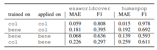
The Sentinel 2 image chips are the same in both colombia-ne datasets and both benelux, they differ on the labels. Observe that we train our models with label proportions that we obtain from these labels at coarser geometries (communes or municipalities). We only use the actual labels at to compute chip level performance metrics. In a real world scenario these fine grained labels would not be available, only the label proportions.

Running the experiments (tranining models)

  1. Download the zip file any of the datasets above and unzip, for instance under /opt/data
  2. Under scripts select the script for esaworldcover or humanpop that you want to run, and check the location of the DATASET variable is correct. The TAG will be used to report results to wandb
  3. Have your wandb token ready.
  4. Run the experiment:
cd scripts
sh run_esaworldcover.sh

while running, hiting ctrl-c once will abort training, but will still loop through the train, val and test datasets to measure and report results to wandb

you can also use the Docker files under docker to start a container configured with tensorflow to run your experiments on a GPU enabled machine.

Results and figures

The IPython notebooks under notebooks contain the code to generate the figures used in the paper (maps, metrics, etc.), run inference on saved models, etc.

The following figures are referenced within the paper. In turn, captions ocasionally point to results in the paper.

Figure 6. benelux area of interest, covering 72.213 $km^2$ (top left). Tiling of $1km \times 1km$ over the surroundings of Amsterdam (bottom left). Subdivision in communes (municipalities) used to compute label proportions (right).


Figure 7. colombia-ne area of interest, covering 69.191 km$^2$ (top left, on the north west of South America). Tiling of $1km \times 1km$ over the surroundings of the city of Bucaramanga (bottom left). Subdivision in communes (municipalities) used to compute label proportions (right).


Figure 8. Aggregated distributions of class proportions for colombia-ne and benelux (a,b,c,d). Observe that the distributions are quite similar when aggregated from communes and from chips, as it should be, since the chips cover 100% of communes. This is also a sanity check for the datasets. The small differences come from chips overlapping several communes at their borders. See Tables I and II for label meanings. Figure e) shows the distribution of commune sizes in both AOIs. Since each chip is 1 $km^2$ this also represents the distribution of communes sizes in $km^2$


Figure 9: benelux selected RGB images from the commune of Ichtegem (Belgium) with fine grained chip level labels (rows two and four) and proportions at chip level (rows 3 and 5). The commune level proportions are shown besides the chip level proportions for esaworldcover and humanpop. Recall that we are training using this commune proportions shown here assuming that chips do not have individual labels. When a chip intercepts more than one commune, such as chip 006c47afde9e5 below, its associated commune level proportions are obtained by combining the proportions of the communes it overlaps, weighted proportionally to the amount of overlapping with each commune. Proportions and labels for individual chips are used only to compute performance metrics. See Tables I and II for label meanings.


Figure 10: Data splitting for benelux (left) and colombia-ne (right) so that any commune (municipality) has all its chips within the same split. Train is purple, yellow is test, green is validation.


Figure 11: Predicting label proportions for esaworldcover over benelux classes 1, 2 and 3 with model downconv. White contours represent communes in test and validation. The rest are used in training. We include train, validation and test data to make the visualization easier, and mark in white the communes used for validation and train. This model has no overfitting so visualizing all data together should not distort the perception on its performance.


Figure 12: Predicting label proportions for esaworldcover over colombia-ne classes 1, 2 and 3 with model downconv. Recall that class 3 is largely under represented in this dataset. White contours represent communes in test and validation. The rest are used in training. We include train, validation and test data to make the visualization easier, and mark in white the communes used for validation and train. This model has no overfitting so visualizing all data together should not distort the perception on its performance.


Figure 13: Predicting label proportions for humanpop world cover over benelux class 2 (more than 1600 inhabitants/$km^2$) with model downconv. White contours represent communes in test and validation. The rest are used in training. We include train, validation and test data to make the visualization easier, and mark in white the communes used for validation and train. This model has no overfitting so visualizing all data together should not distort the perception on its performance.


Table cross inference In the case of humanpop for colombia-ne the large class imbalance produced all models to emit mostly a single class proportions prediction with the majority class. With this, we hypothesized on whether a lack of variability in training data would affect performance and, thus, we made cross inference, using models trained on benelux to predict labels in colombia-ne and the other way around. The following table shows the performance results when using using the downconv model trained in one region to make inference in the other region. We include the results from Table III for reference (rows 1 and 3). Observe that cross-region inference always degrades performance (row 1 vs row 2 and row 3 vs row 4).


Table footprint. Dataset footprint (storage size) for label proportions at commune level, computed as 2 bytes (for float16 to store a number $\in [0,1]$) $\times$ number of classes $\times$ number of communes; and for segmentation labels computed as 1 byte per pixel (for uint8 to store a class number) $\times$ (100 $\times$ 100) pixels per chip $\times$ the number of chips (one chip per km$^2$)