classed-components
💅 CSS Classes for the component age.
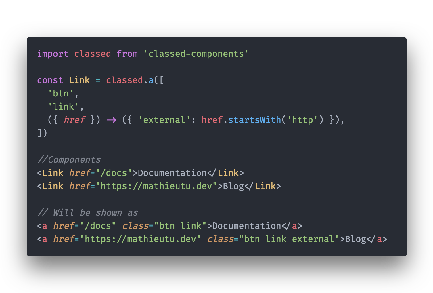
This package allows you to add a your css classes to your component with the power of Javascript, and with Css-in-JS style.
✨ Features:
Add you CSS classes in a fluent way to your React components, with:
- Template string.
- Array notation.
- Object notation.
And all of that with:
- Infinite recursivity,
- Functions receiving your components props to manage your classes.
- Top developer experience: deep Typescript typing.
Table of contents
Installation
yarn add classed-componentsUsage
You can create classed components with the classed method exported from classed-components, and passing your class to it. There are many way of doing that. We will try to document of all them in this section, but feel free to look at the tests to see all the features and the whole API.
You can create any standard Html X classed component by using classed.X, classed[X] or classed(X) method:
import classed from 'classed-components'

const Link = classed.a('all my classes')

<Link href="#">foo</Link> // <a href="#" className="all my classes">foo</a>
But you can also class any custom component as long it accepts a className prop:
import classed from 'classed-components'

const BlogLink = ({ className }) => (
  <a className={className} href="https://mathieutu.dev">Blog</a>
)

const MenuLink = classed(BlogLink)('all my classes')

<MenuLink/> // <a className="all my classes" href="https://mathieutu.dev">Blog</a>
Several advanced syntaxes are allowed:
Object syntax
You can pass an object to the method to dynamically toggle classes:
import classed from 'classed-components'
const hasError = true

const Input = classed.input({ 'text-danger': hasError })

<Input/> // <input className="text-danger"/>
The above syntax means the presence of the text-danger class will be determined by the truthiness of the constant hasError.
Array Syntax
We can pass an array to the method to apply a list of classes:
import classed from 'classed-components'
const inputClass = 'input'
const errorClass = 'text-danger'

const Input = classed.input([inputClass, errorClass])

<Input/> // <input className="input text-danger"/>
If you would like to also toggle a class in the list conditionally, you can do it with a ternary expression:
import classed from 'classed-components'
const hasError = true

const Input = classed.input(['input', hasError ? 'text-danger' : ''])

<Input/> // <input className="input text-danger"/>
This will always apply the input class, but will only apply text-danger when hasError is truthy.
However, this can be a bit verbose if you have multiple conditional classes. That's why it's also possible to use the array and object syntax inside array syntax:
import classed from 'classed-components'
const hasError = true

const Input = classed.input(['input', { 'text-danger': hasError }])

<Input/> // <input className="input text-danger"/>
Template string
You can use tagged template string to set your classes:
import classed from 'classed-components'

const Input = classed.input`
  input
  text-danger
`

<Input/> // <input className="input text-danger"/>
The placeholders are processed, and allow any type of other syntax:
import classed from 'classed-components'
const hasError = true

const Input = classed.input`
  input
  ${{ 'text-danger': hasError }}
`

<Input/> // <input className="input text-danger"/>
Functions
You can directly pass a function to the method, which will received the props of the component. The return type of this function can be any of other syntax.
import classed from 'classed-components'

const Input = classed.input(({ hasError }) => ['input', { 'text-danger': hasError }])

<Input hasError/> // <input className="input text-danger"/>
Functions can also be used directly nested in arrays and template strings:
import classed from 'classed-components'

const Input = classed.input(['input', ({ hasError }) => { 'text-danger': hasError }])

<Input hasError/> // <input className="input text-danger"/>
import classed from 'classed-components'
const Input = classed.input`
input
${({ hasError }) => hasError && 'text-danger'}
${({ isRequired }) => isRequired && 'required'}
`
<Input hasError/> // <input className="input text-danger"/>Nesting
All the syntaxes work together and could be infinetly nested, so this example will work:
import classed from 'classed-components'

const Input = classed.input`
  input
  ${({ hasError, isRequired, errorClass }) => [{ [errorClass]: hasError },  isRequired && 'required']}
`

<Input hasError errorClass="text-danger"/> // <input className="input text-danger"/>
Remaining className prop on classed components
The generated component will keep a className prop, and will merge all the classes you will pass through it.
It will so allow you to manage inheritance in your classed components, and compose easily your style.
import classed from 'classed-components'


const BaseInput = classed.input(({ hasError }) => ['input', { 'text-danger': hasError }])
const RequirableInput = classed(BaseInput)(({isRequired}) => ({ 'required': isRequired })

<Input hasError isRequired className="form-contact"/> // <input className="input text-danger required form-contact"/>
Typings
classed-components is highly typed.
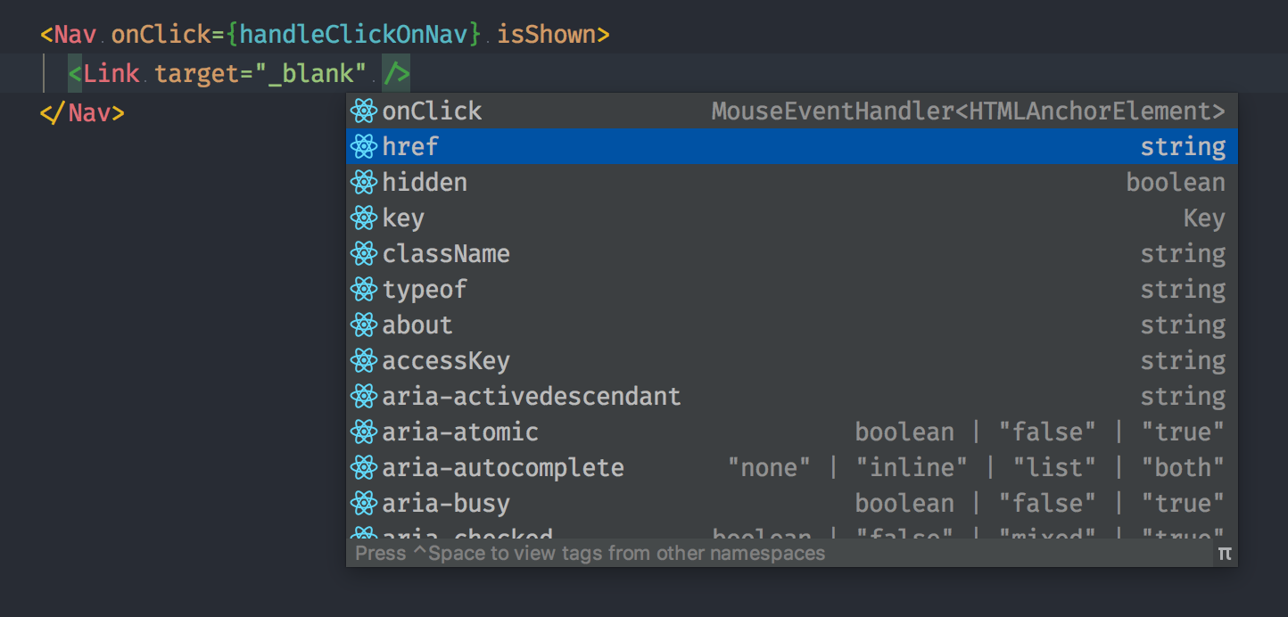
When using with Typescript, you will have all the available props of your original component in functions, and in the generated classed component.
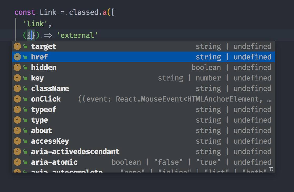
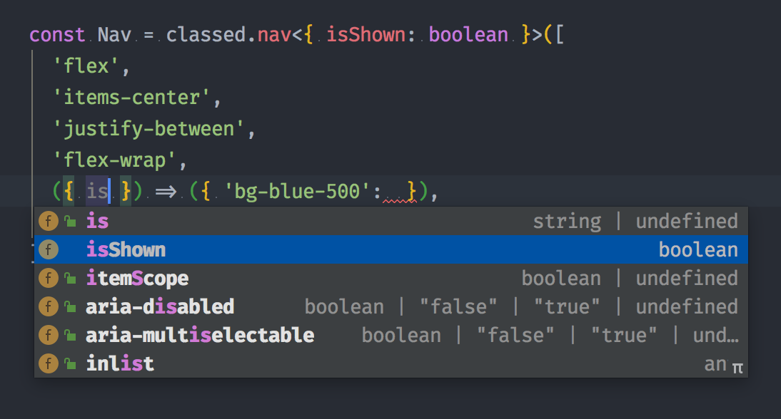
If you want to add some props to manage your styling, you can type them by setting the first generic of the function.
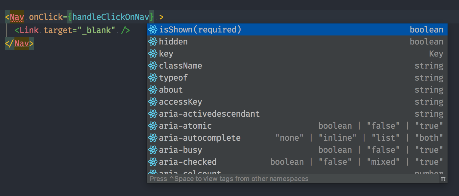
const Nav = classed.nav<{ isShown: boolean }>([
  'header',
  ({ isShown }) => ({ 'bg-blue-500': isShown }),
])
That way, the original props and the ones you add will be merged, and you will have a high quality auto-completion:
Examples
Soon: a code sandbox full example.
Here some components styled with TailwindCss
import { classed } from 'classed-components'
import { Link } from '../Link'

const Nav = classed.nav<{ isShown: boolean }>([
  'flex',
  'items-center',
  'justify-between',
  'flex-wrap',
  ({ isShown }) => ({ 'bg-blue-500': isShown }),
  'p-6',
])

const MenuLink = classed(Link)<{ isBlue: boolean }>`
  block
  mt-4
  lg:inline-block
  lg:mt-0
  text-blue-200
  hover:text-${({ isBlue }) => isBlue ? 'blue-500' : 'white'}
  mr-4
`

const BtnLink = classed(Link)<{ isBlue: boolean }>(({ isBlue }) => {
  const color = isBlue ? 'blue-500' : 'white'

  return [
    'inline-block',
    'text-sm',
    'px-4',
    'py-2',
    'leading-none',
    'border',
    'rounded',
    `text-${color}`,
    `border-${color}`,
    'hover:border-transparent',
    `hover:text-${color}`,
    `hover:bg-${color}`,
    'mt-4',
    'lg:mt-0',
  ]
})
A bug, a question?
Please feel free to tell me!
License
This package is an open-sourced software licensed under the MIT license.
Contributing
Issues and PRs are obviously welcomed and encouraged, for new features as well as documentation.
Thanks
Many thanks to actual and future contributors,
to @emotion-js for their great work about styling components,
and particular thanks to @mephju for letting this package having the already reserved classed-component name on npm.


