This repository contains an R package for visualizing data from the NCEI/WDS Global Significant Earthquake Database. The main functions it provides are for adding layers to ggplot where you can make a timeline showing the significant earthquakes across a given time period, and for generating leaflet maps showing the epicenters for significant earthquake events.
You can install this R package from GitHub using devtools:
library(devtools)
install_github("rizem2/noaa-earthquakes")Loading the relevant packages for these examples:
library(earthquakes)
library(tidyverse)
library(leaflet)
The functions provided with this package fall into 3 general categories: reading/cleaning data, creating ggplot2 layers, and generating leaflet maps.
This package comes with the raw data file
earthquakes-2021-03-08_17-02-58_-0500.tsv taken directly from the NCEI
database API along with three functions for reading and cleaning the raw
data:
eq_read_data- reads a raw data file into a data frame and formats some of the columns. It takes a filepath as an argument indicating the raw data file to be read into R. If called with no arguments, it defaults to the supplied .tsv file.eq_location_clean- splits theLOCATIONcolumn into aCOUNTRYandREGIONcolumn. Takes a dataframe as an argument, presumably the output fromeq_read_data. If called with no arguments, callseq_read_data.eq_clean_data- uses the rawYEAR,MONTH,DAYcolumns to form aDATEcolumn using lubridate. Takes a dataframe as an argument, presumably the output fromeq_location_clean. If called with no arguments, callseq_location_cleanand returns a fully “cleaned” dataframe of the supplied raw data.
Viewing the 10 most deadly earthquakes since the year 2000:
data <- eq_clean_data() %>%
    dplyr::filter(!is.na(TOTAL_DEATHS)) %>%
    dplyr::select(DATE, YEAR, COUNTRY, REGION, LONGITUDE, LATITUDE, MAG, TOTAL_DEATHS) %>%
  tidyr::drop_na()
data %>%
  dplyr::filter(YEAR > 1999) %>%
  dplyr::arrange(desc(TOTAL_DEATHS)) %>%
                   head(n = 10)
#> # A tibble: 10 x 8
#>    DATE       YEAR  COUNTRY  REGION        LONGITUDE LATITUDE   MAG TOTAL_DEATHS
#>    <date>     <chr> <chr>    <chr>             <dbl>    <dbl> <dbl>        <dbl>
#>  1 2010-01-12 2010  HAITI    PORT-AU-PRIN~     -72.5   18.5     7         316000
#>  2 2004-12-26 2004  INDONES~ SUMATRA:  AC~      95.9    3.32    9.1       227899
#>  3 2008-05-12 2008  CHINA    SICHUAN PROV~     103.    31.0     7.9        87652
#>  4 2005-10-08 2005  PAKISTAN MUZAFFARABAD~      73.6   34.5     7.6        76213
#>  5 2003-12-26 2003  IRAN     SOUTHEASTERN~      58.3   29.0     6.6        31000
#>  6 2001-01-26 2001  INDIA    GUJARAT:  BH~      70.2   23.4     7.7        20005
#>  7 2011-03-11 2011  JAPAN    HONSHU            142.    38.3     9.1        18429
#>  8 2015-04-25 2015  NEPAL    KATHMANDU; I~      84.7   28.2     7.8         8200
#>  9 2006-05-26 2006  INDONES~ JAVA:  BANTU~     110.    -7.96    6.3         5749
#> 10 2018-09-28 2018 INDONES~ SULAWESI 120. -0.178 7.5 4340The next two functions are used to add custom layers to ggplot
This package comes with a custom ggplot2 Geom GeomTimeline for
visualizing Earthquake characteristics (such as Magnitude, Death Toll,
Damages, etc.) on a timeline. To use this Geom, add a ggplot2 layer
using the function geom_timeline.
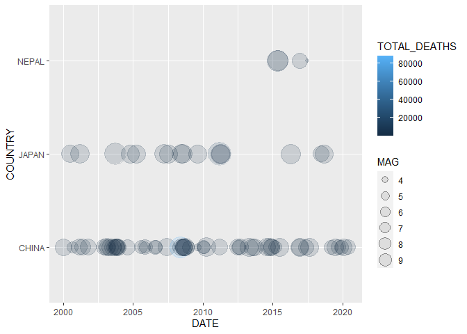
Plot a timeline of deadly earthquakes in 3 different countries:
data %>% dplyr::filter(YEAR > 1999,
                       COUNTRY %in% c("JAPAN", "CHINA","NEPAL")) %>%
    ggplot2::ggplot() +
    geom_timeline(aes(x = DATE,
                      y = COUNTRY,
                      size = MAG,
color = TOTAL_DEATHS))We can extend these visualizations even further by adding labels to our
timelines using the GeomTimelineLabel Geom. Simply add another ggplot2
layer using the geom_timeline_label in conjunction with
geom_timeline.
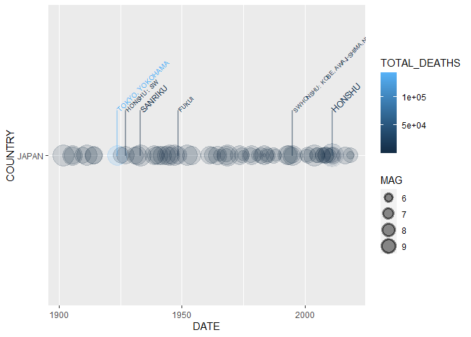
Labeling the 5 most deadly earthquakes (6 are shown since 5th is “tied”)
in the Japan since 1900, note that the column we use for labeling is
indicated by the mag aesthetic:
data %>% dplyr::filter(COUNTRY == "JAPAN",
                              YEAR >= 1900) %>%
  ggplot2::ggplot(aes(x = DATE,
                      y = COUNTRY,
                      size = MAG,
                      color = TOTAL_DEATHS,
                      label = REGION,
                      mag = TOTAL_DEATHS)) +
  geom_timeline() +
geom_timeline_label(aes(n_max = 5))The final two functions generate leaflet maps for visualizing earthquake
epicenters on actual maps. The first function eq_map generates a
leaflet map from a dataframe with columns LONGITUDE, LATITUDE, and
MAG. eq_map takes one argument annot_col which denotes the column
of the dataframe to be used for annotation, by default uses DATE.
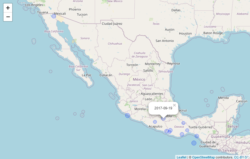
Plot the epicenters on a leaflet map:
data %>%
  dplyr::filter(COUNTRY == "MEXICO",
                YEAR >= 2000) %>%
  eq_map(annot_col = "DATE")
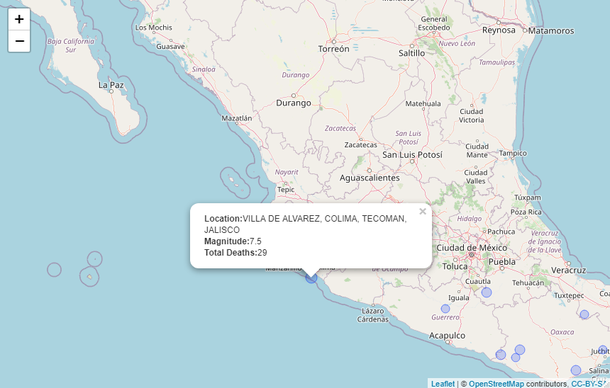
The function eq_create_label generates labels from the input
dataframe. We can use eq_create_label within dplyr::mutate to modify
the input dataframe by creating a column to store the desired pop-up
text as an HTML string. The generated pop-ups will display the location,
magnitude and total death count (if available) for any given earthquake.
data %>%
  dplyr::filter(COUNTRY == "MEXICO",
                YEAR >= 2000) %>%
  dplyr::mutate(popup_text = eq_create_label(.)) %>%
  eq_map(annot_col = "popup_text")


