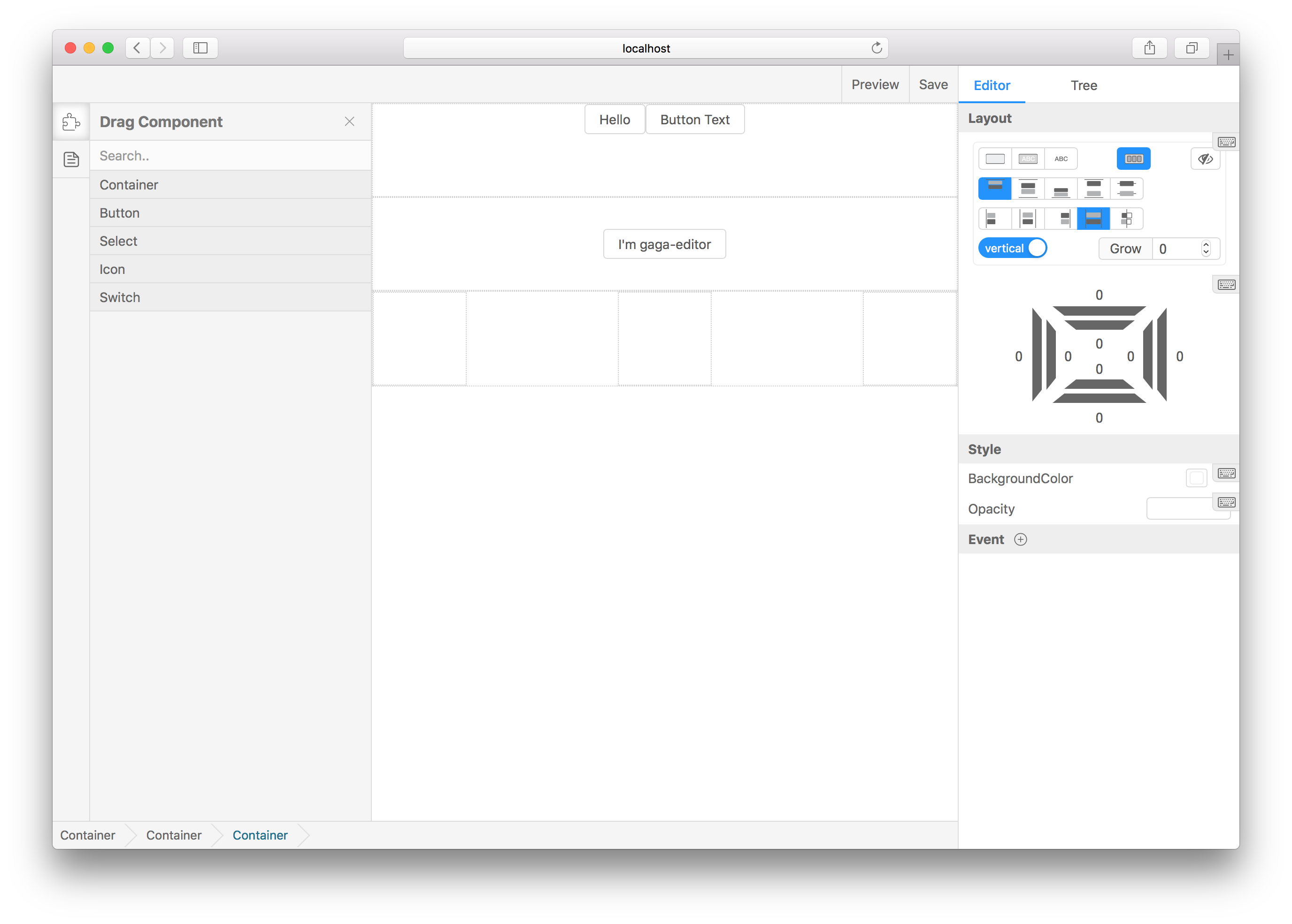
Help develops build a scalable website visualization builder.
npm i gaea-editor --saveAnd then, it's easy to use:
import Editor from 'gaea-editor';

ReactDOM.render(
  <div style={{ width: '100vw', height: '100vh' }}>
    <Editor />
  </div>,
  document.getElementById('react-root')
);- For vue - gaea-editor-vue, thanks CharlieLau.
You can add any react components to the drag menu, through the following line of code:
import BasicComponents from 'gaea-basic-components';
<Editor componentClasses={[...BasicComponents, CustomComponent1, CustomComponent2]} />;
BasicComponentssupportcontainer,button,icon,select,switch. And there must be at least one component to setisContainer=truethat can be used as outer container.Generally speaking, with
BasicComponentsconcat is ok, because the componentcontainerBasicComponentsoffered is a container.
Add editSetting to each component props, to let the editor know how to edit it visualizations:
defaultProps = {
  editSetting: {
    key: 'my-custom-key', // Unique key.
    name: 'Custom one', // The name shown in drag menu.
    isContainer: false, // Can be dragged in.
    editors: [
      {
        field: 'title',
        text: 'Text',
        type: 'string'
      }
    ] // Tell gaea-editor, which props can be edited and how to edit it.
  }
};gaea-editor provides several built-in type editing props. If you need to expand it, you can refer to custom plugin.
common field:
field: which props to edit. EX:valuevisiblestyle.backgroundColor.text: If exist, will appear in the form label to prompt the user.
The following are the built-in types:
Suitable for any string editing scene.
{
    type: 'string',
    text: 'Text',
    field: 'value'
}Suitable for any number editing scene.
In many cases, it is suggested that inputRange and outputRange be set to the same value.
{
    type: 'number',
    text: 'Text',
    field: 'value',
    data: {
        useSlider: true,
        step: 1,
        inputRange: [0, 100],
        outputRange: [0, 1]
    }
}Suitable for any boolean editing scene.
{
    type: 'boolean',
    text: 'Checked',
    field: 'value'
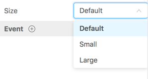
}Suitable for enumable editing scene.
{
    type: 'select',
    text: 'Text',
    field: 'value',
    data: [{
        text: 'Default',
        value: 0
    }, {
        text: 'Small',
        value: 1
    }, {
        text: 'Large',
        value: 2
    }]
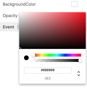
}Suitable for color picker editing scene.
{
    type: 'color',
    text: 'Text',
    field: 'style.backgroundColor',
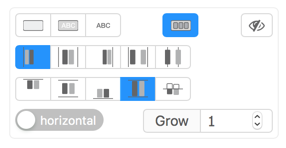
}Suitable for layout editing scene.
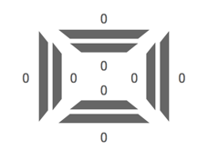
Because this type will edit multiple props properties, such as style.display style.flexDirection, so don't need to specify the field field.
{
    type: 'display',
    text: 'Text'
}Suitable for margin-padding editing scene.
Because this type will edit multiple props properties, such as margin padding, so don't need to specify the field field.
{
    type: 'box-editor',
    text: 'Text'
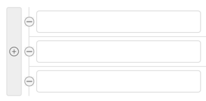
}Super type, allow visualizations to edit a array type props.
{
    type: 'array',
    text: 'values',
    data: 'string'
}
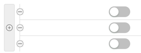
You can change string to boolean, than it can edit boolean array:
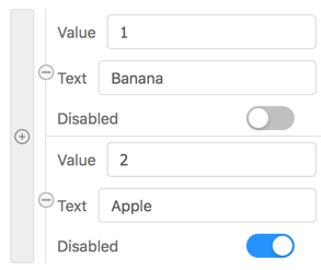
Super type, allow visualizations to edit a array type props.
Each field in data describes how the key should be edited in the object in array.
Each field in
datais aeditortype. You can even nestedarrayorobjecttype inside.
{
    type: 'array',
    text: 'Options',
    data: [{
        field: "value",
        type: "string",
        text: "Value"
    }, {
        field: "text",
        type: "string",
        text: "Text"
    }, {
        field: "disabled",
        type: "boolean",
        text: "Disabled"
    }]
}Super type, allow visualizations to edit a object type props.
Each field in data describes how the key should be edited in this object.
Each field in
datais aeditortype. You can even nestedarrayorobjecttype inside.
{
    type: 'object',
    text: 'Text',
    data: [{
        field: "name",
        type: "string",
        text: "Name"
    }, {
        field: "age",
        type: "number",
        text: "Age"
    }]
}You can add custom components, custom plugins, save callback, and read saved data.
| Props | Type | Description |
|---|---|---|
| onSave | (info?: string) => void |
When you click the Save button, feed back to you to save the information |
| defaultValue | object |
Editor initial value, you can pass the value of the onSave callback and resume the draft |
| componentClasses | Array<React.ComponentClass<IGaeaProps>> |
React classes. Any react component is supported, but you need some configuration information to tell the editor how to edit it. see custom-component-config |
| plugins | IPlugin[] |
Advanced usage for custom editor functionality. |
| locale | string | zh or cn |
| ViewportRender | React.ReactElement<any> | You can rewrite viewport element. |
| disableBuiltInPlugin | string[] | Disable built in plugins. |
| preComponents | Array<{ gaeaKey: string; components: IPreComponent[]; }> | See docs/basic.tsx |
export function renderGaeaEditor() {
  return (
    <Editor
      onSave={value => {
        // send the value data to your server.
      }}
    />
  );
}The defaultValue came from onSave.
export function renderGaeaEditor() {
  return <Editor defaultValue={value} />;
}class MyInput extends React.Component {
render() {
return <input />;
}
}
export function renderGaeaEditor() {
return <Editor componentClasses={[MyInput]} />;
}Read more in custom-component-config.
First you should install dob-react.
npm i dob-reactimport { Connect } from 'dob-react'
@Connect
class Plugin extends React.Component {
render() {
return 'plugin'
}
}
const plugin {
position: "mainToolEditorTypeShow",
class: ShowEditor
}
export function renderGaeaEditor() {
return (
<Editor plugins={[ Plugin ]}/>
)
}What is position? What can i do with plugin? See more in custom-plugin
Talk to us about gaea-editor using DingDing.
git clone https://github.com/ascoders/gaea-editor.git
cd gaea-editor
npm i
npm run docs
Will automatically open the default browser.
Step 1, get value by onSave method in gaea-editor:
import Editor from 'gaea-editor';

ReactDOM.render(<Editor onSave={value => saveToServer(value)} />, document.getElementById('react-root'));
step 2, install gaea-render, and pass value to it:
npm i gaea-renderimport Render from 'gaea-render';
const value = getValueFromServer(); // <Editor onSave={value => // From here. } />
ReactDOM.render(<Render value={value} />, document.getElementById('react-root'));By default, both gaea-editor and gaea-render using gaea-basic-components. You can overwrite it by these code:
import Editor from 'gaea-editor';
import Render from 'gaea-render';

ReactDOM.render(<Editor componentClasses={myCustomComponents} />, document.getElementById('react-editor'));
ReactDOM.render(<Render componentClasses={myCustomComponents} />, document.getElementById('react-render'));
Or concat gaea-basic-components:
import Editor from 'gaea-editor';
import Render from 'gaea-render';
import BasicComponents from 'gaea-basic-components';

ReactDOM.render(
  <Editor componentClasses={[...BasicComponents, myCustomComponents]} />,
  document.getElementById('react-editor')
);
ReactDOM.render(
  <Render componentClasses={[...BasicComponents, myCustomComponents]} />,
  document.getElementById('react-render')
);


