⚠️ Warning This is a learning project. It's not meant to be used in production environments.
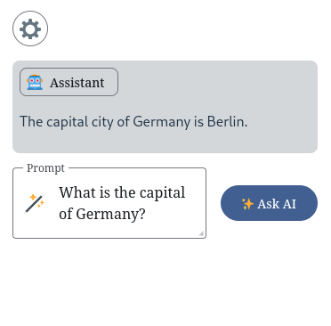
🚧 Work in progress 🚧 This is a native web component which provides basic AI chat functionality (single question, no history).
 |
 |
 |
 |
- Integrate it in your website - Use it in your vanilla website or with a framework which supports web components
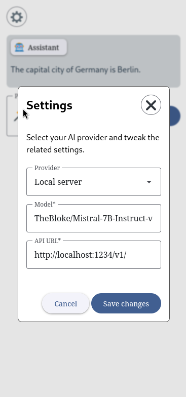
- Provider selection - You could use Open AI API or another local LLM server like LM Studio or LocalAI
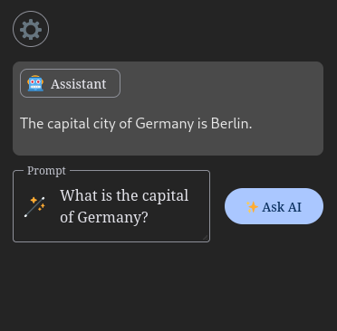
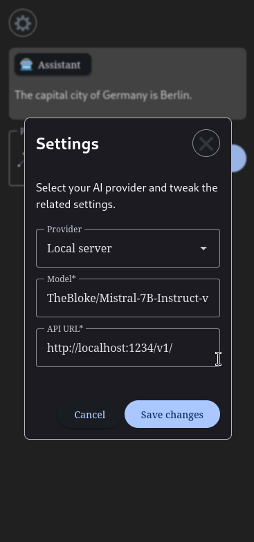
- Theming - Could be customized and adapted to light/dark user preferences
- Stream responses - The response is shown to you at same time it is generated
- Syntax highlight for code snippets
- 🟢 Database - The project is using IndexDB, under the hood. This is native, local database which modern browsers provide. Meaning any configuration you provide is stored locally on your machine,accessible only to you.
- AI prompts - Every question you ask has to be processed somewhere which leaves it to the AI provider to dictate the privacy level.
- 🟢 Local provider - Everything is stored locally
- 🟡 Open AI - Any prompts are send to Open AI's API for processing
- Add the module to your website
$ npm i @rumenpetrov/ai-chat-widget// index.js
import '@rumenpetrov/ai-chat-widget'<script type="module" src="https://esm.sh/@rumenpetrov/ai-chat-widget/dist/bundle.js"></script>- Get yourself a theme - You could use Material Theme Builder on the Web to generate all the CSS custom properties (design tokens) which the UI library we are using expects to function correctly and add them to you styles.
<!-- Quick light/dark theme example -->
<!doctype html>
<html lang="en">
  <head>
    ...
    <style>
      :root {
        color-scheme: light dark;

        font-family: system-ui, sans-serif;
        color: #213547;
        background-color: #ffffff;

        /* All generated tokens from the light theme you got form Material Theme Builder */
        --md-sys-color-primary: rgb(65 95 145);
        --md-sys-color-surface-tint: rgb(65 95 145);
        ...
      }

      @media (prefers-color-scheme: dark) {
        :root {
          color: rgba(255, 255, 255, 0.87);
          background-color: #242424;

          /* All generated tokens from the dark theme you got form Material Theme Builder */
          --md-sys-color-primary: rgb(170 199 255);
          --md-sys-color-surface-tint: rgb(170 199 255);
          ...
        }
      }
    }
    </style>
    ...
  </head>
  <body>
    ...
  </body>
</html>- Use the web component somewhere on your page
<acw-root></acw-root>- Make sure you select and configure your AI provider of choice - You could use the settings modal for this.
- The UI is based on Material web components which means you could use CSS custom properties to overwrite any of the tokens their components expose.
- There are part attributes spread around the UI which could be used for styling as well