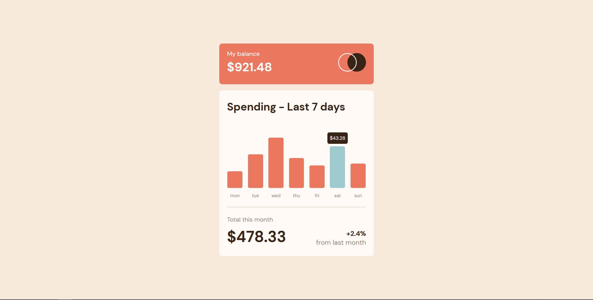
This is a solution to the Expenses chart component challenge on Frontend Mentor.
Users should be able to:
- View the bar chart and hover over the individual bars to see the correct amounts for each day
- See the current day’s bar highlighted in a different colour to the other bars
- View the optimal layout for the content depending on their device’s screen size
- See hover states for all interactive elements on the page
- Bonus: Use the JSON data file provided to dynamically size the bars on the chart
- Solution URL: https://github.com/rushabhhere/expenses-chart-component
- Live Site URL: https://expenses-chart-component.vercel.app
- Semantic HTML5 markup
- CSS custom properties
- Flexbox
- d3-scale and d3-array
- Vanilla JS
- Mobile-first workflow
- Vite
I intend to continue working on more such projects that involve data visualization.
