library(gander)
options(repr.plot.width = 15, repr.plot.height = 9)the main idea here, is to have an easy to use function that will plot all your variables to get you started on exploratory analysis.
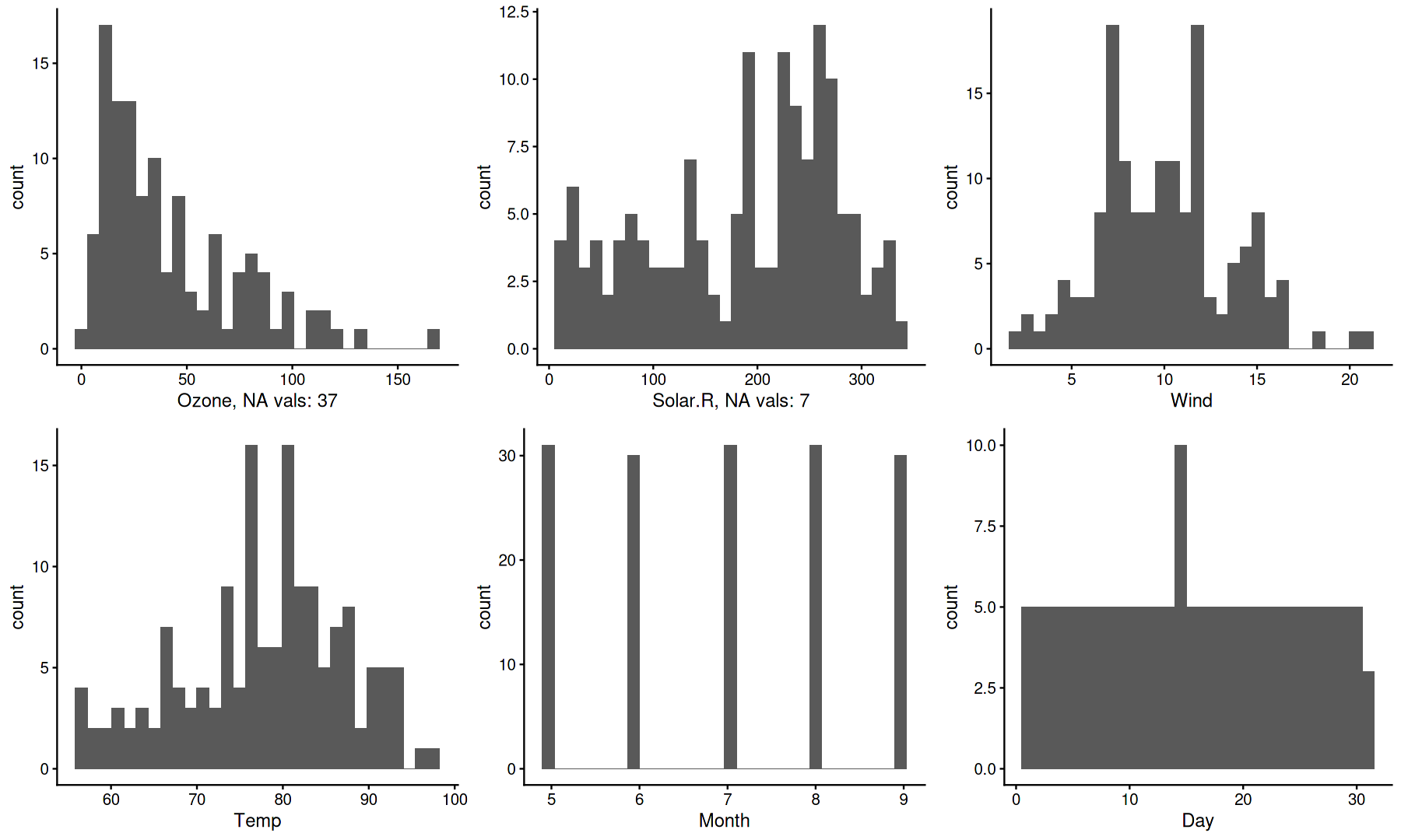
at a glance, you can see:
- how many variables you have
- how many observations you have
- distribution of values in each variable
- if a variable is discrete or continuous
- if there is any NA values
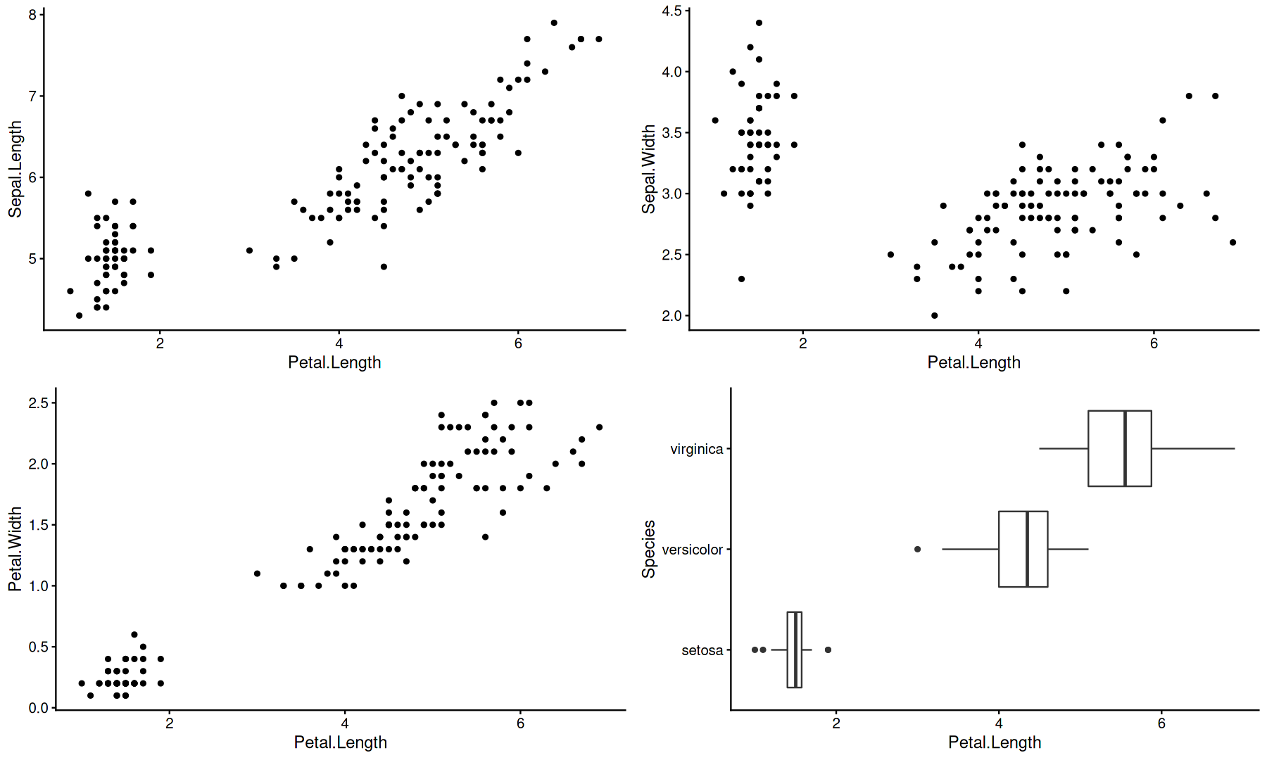
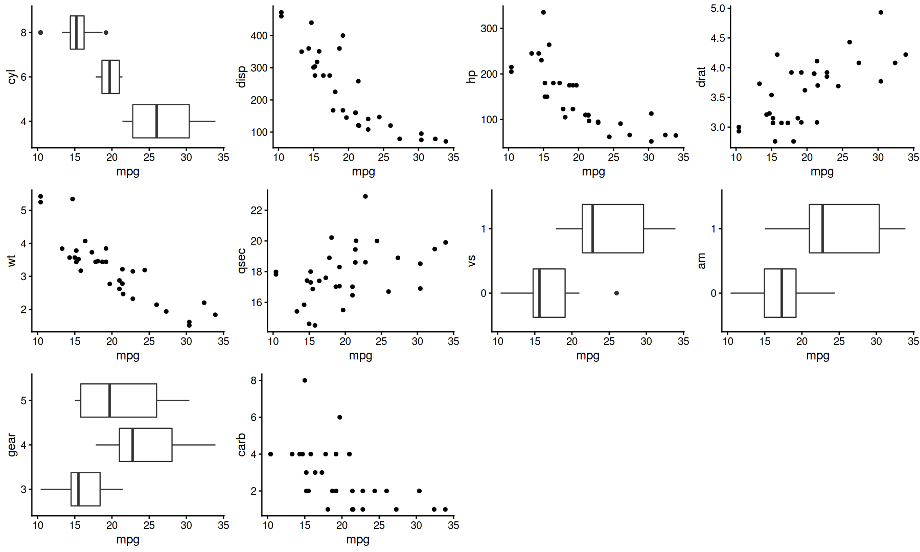
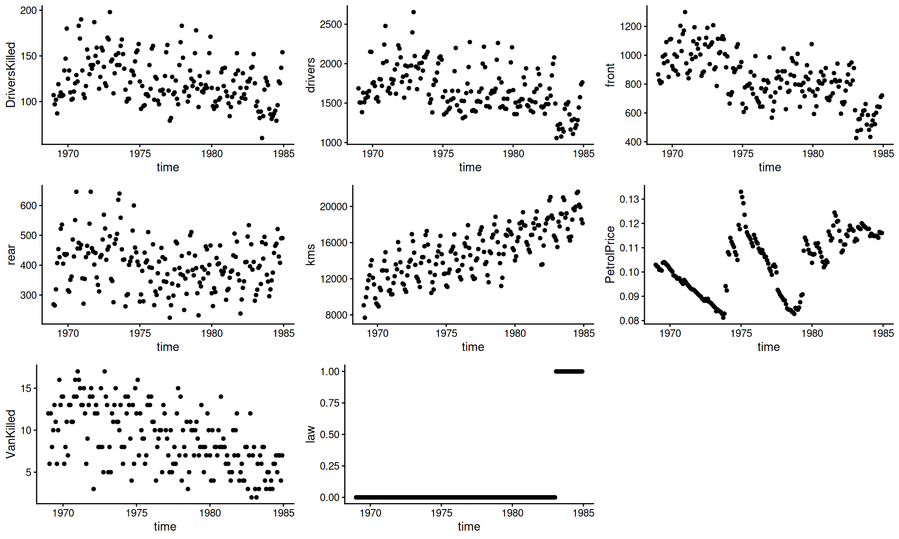
- interactions with a target variable
# plot distribution of all variables
gander(airquality)
# plot one variable x all others
gander(iris, Petal.Length)suppressMessages(library(tidyverse))
# works nicely with tidyverse stuff
# modify your data.frame and pipe to gander
mutate_at(mtcars, c("cyl","vs","am","gear"), factor) %>% gander(mpg)# plot timeseries data
gander(Seatbelts, time)# plot table data
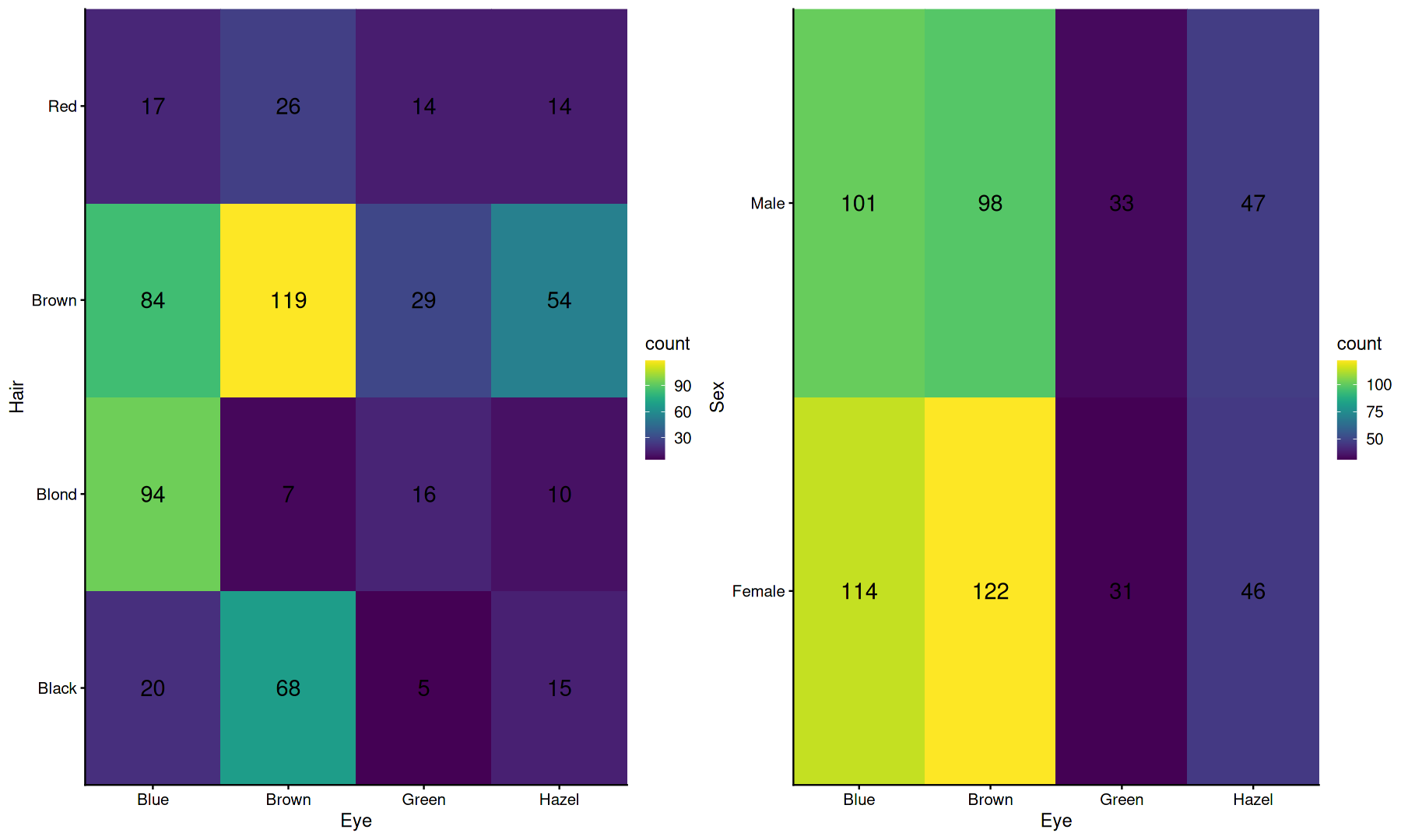
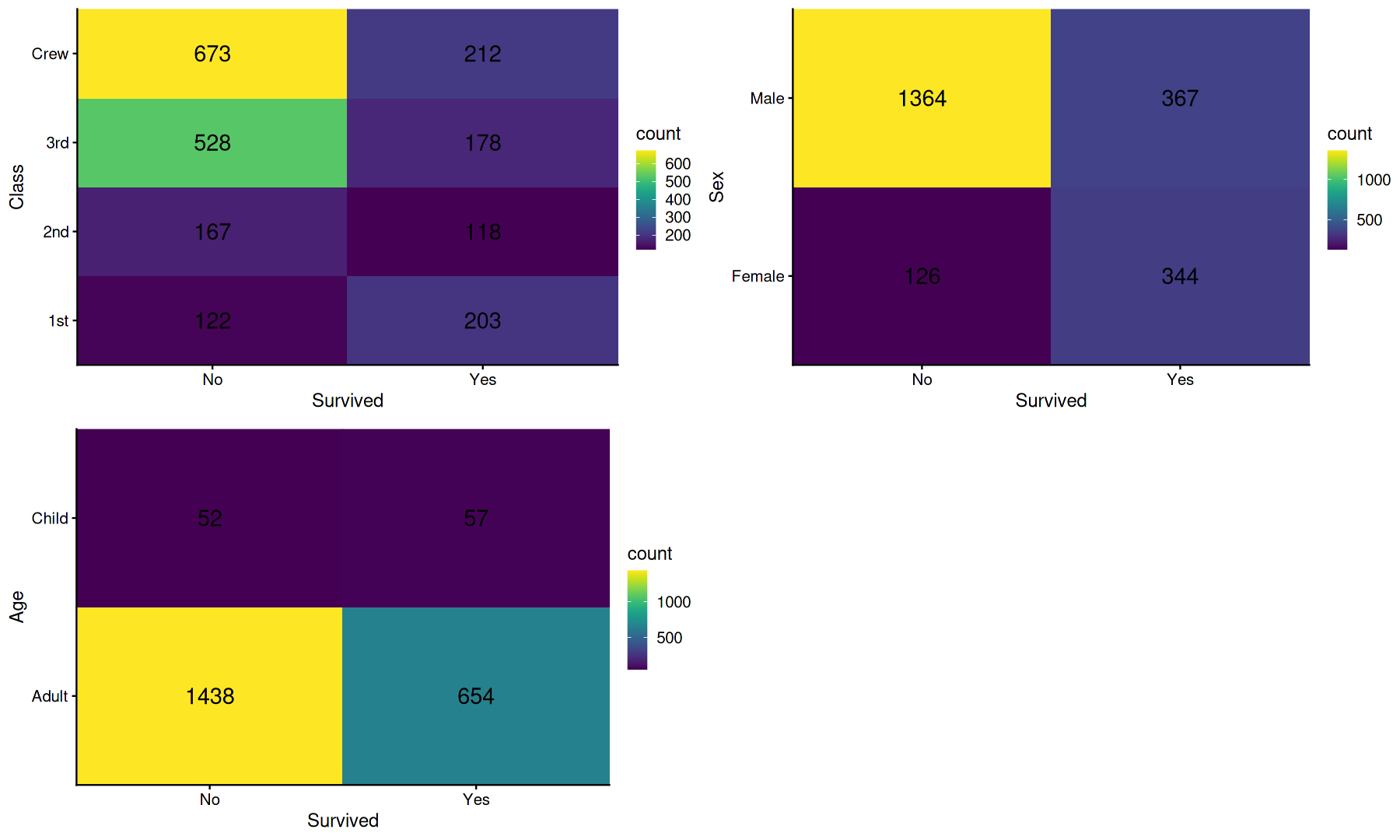
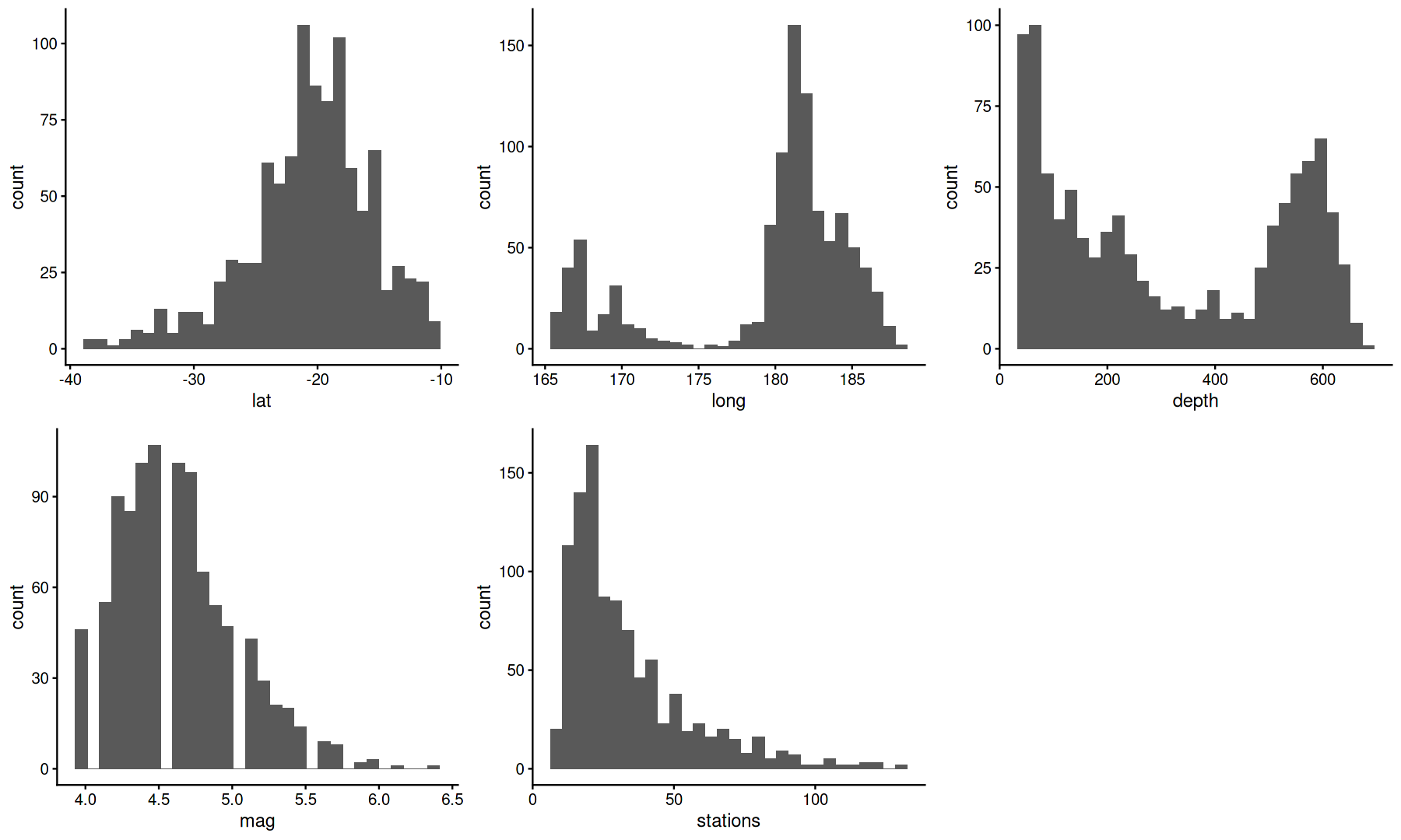
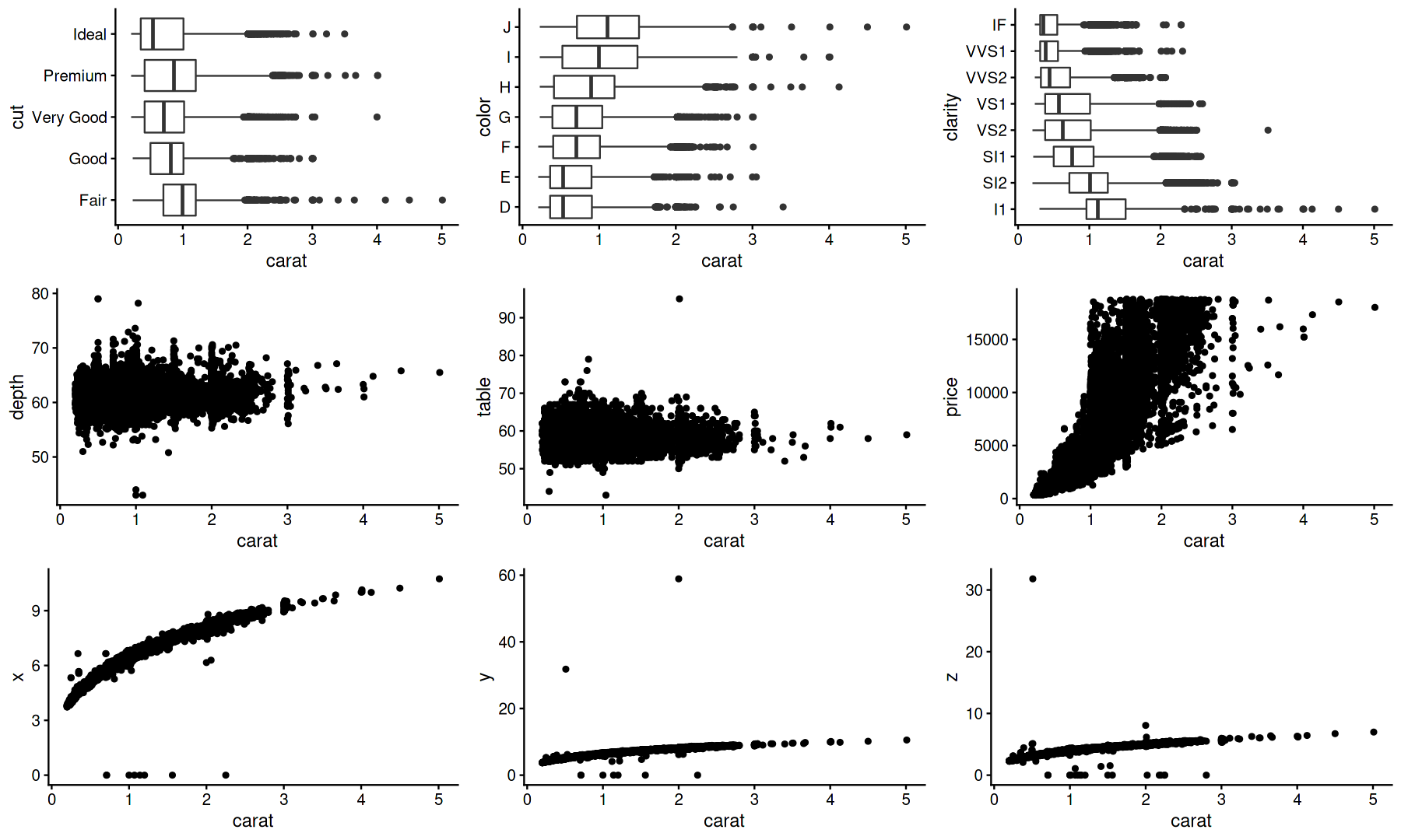
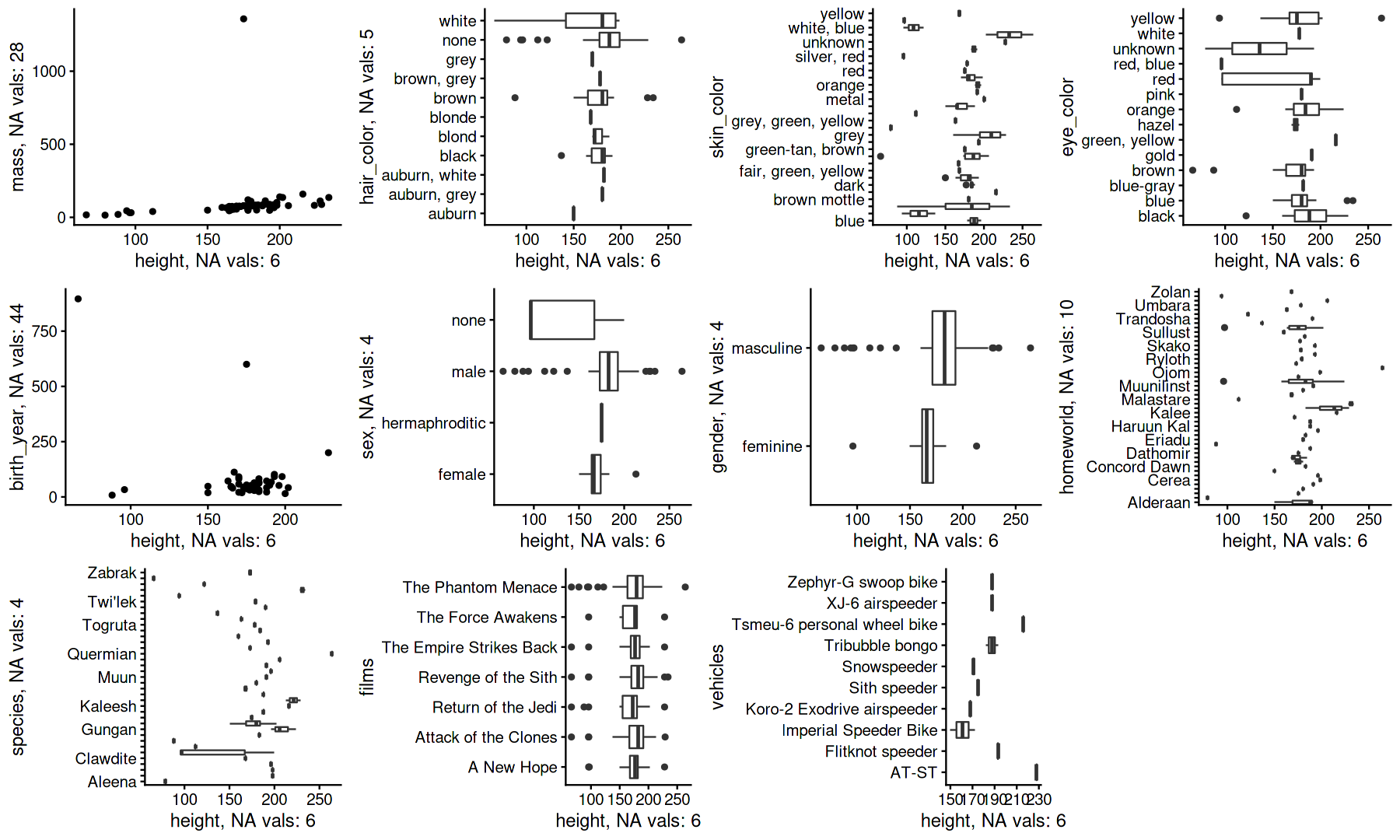
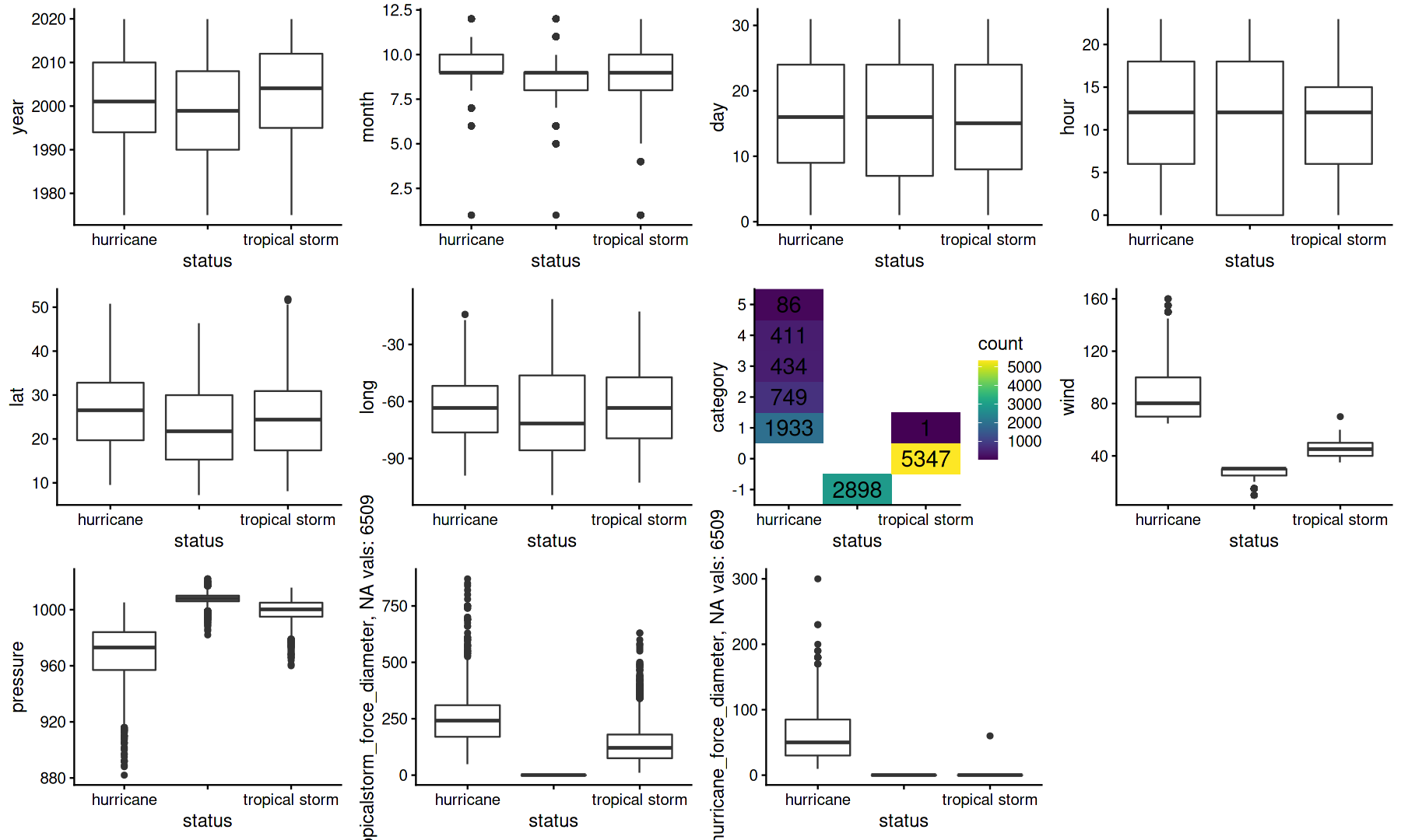
gander(HairEyeColor, Eye)gander(Titanic, Survived)gander(quakes)gander(diamonds, carat)select(starwars, -name, -starships) %>% gander(height)select(storms, -name) %>% gander(status)