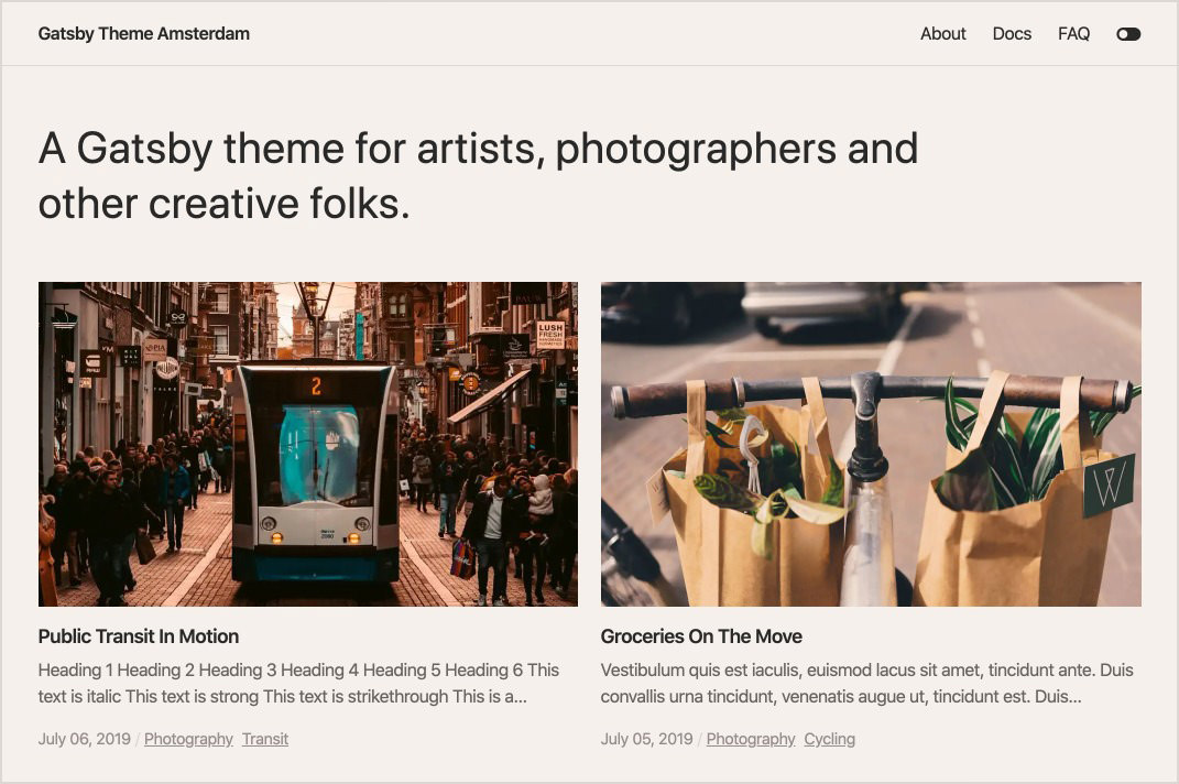
A Gatsby theme for artists, photographers and other creative folks.
- Minimal responsive design
- Optional page transitions
- Multiple grid options to display posts
- Customizable theme colors and typography with Theme UI
- MDX support
- SEO friendly component
- Mobile menu
- Optional scroll progress indicator
- Optional toggle to switch color modes
- Emotion using styled-components syntax
- Tags
- Pagination
- Offline support
This will generate a new site pre-configured to use Gatsby Theme Amsterdam.
gatsby new your-themed-site https://github.com/ryanwiemer/gatsby-starter-amsterdam- Install the theme
npm install --save gatsby-theme-amsterdamor
yarn add gatsby-theme-amsterdam- Add the theme to your
gatsby-config.js
// gatsby-config.js
module.exports = {
  plugins: [
    {
      resolve: 'gatsby-theme-amsterdam',
      options: {
        // See theme options section for more information
      },
    },
  ],
}| Key | Default Value | Description |
|---|---|---|
basePath |
/ |
Root URL for all posts. |
contentPath |
content |
Location of markdown files used for the posts. |
transitions |
true |
Include simple page transitions powered with framer-motion |
postsPerPage |
6 |
Determines the number of posts shown on each page. This effects both the posts and tag template. |
grid |
basic |
Determines the type of grid used on the posts and tag templates. Two available options: basic and list. |
progressIndicator |
true |
Include a progress indicator on the post template. |
colorToggle |
true |
Include a button in the menu to toggle the color modes. |
// gatsby-config.js
module.exports = {
  plugins: [
    {
      resolve: 'gatsby-theme-amsterdam',
      options: {
        // basePath defaults to '/'
        basePath: 'photography',
        // grid defaults to 'basic'
        grid: 'list',
      },
    },
  ],
}In addition to the theme options, there are a handful of items you can customize via the siteMetadata object in your site's gatsby-config.js.
// gatsby-config.js
module.exports = {
  siteMetadata: {
    // Used for the site title and SEO
    title: 'My Site Title',
    // Used for SEO
    description: 'My site description...',
    // Used for SEO. Do not include a trailing slash
    url: 'https://www.example.com',
    // Used for SEO. Must be the full URL for the default image
    image: 'https://www.example.com/og-image.jpg',
    // Used for SEO
    author: 'John Doe',
    // Used for an optional intro section at the top of the posts template
    intro: 'John Doe is a photographer....',
    // Used for the links in the menu
    menuLinks: [
      {
        name: 'Home',
        slug: '/',
      },
      {
        name: 'About',
        slug: '/about/',
      },
      {
        name: 'Contact',
        slug: '/contact/',
      },
    ],
    // Used for the links in the footer
    footerLinks: [
      {
        name: 'Dribbble',
        url: 'https://www.dribbble.com/johndoe',
      },
      {
        name: 'Instagram',
        url: 'https://www.instagram.com/johndoe',
      },
    ],
  },
}Gatsby Theme Amsterdam utilizes Theme UI. In order to customize the theme styling you must create a theme file and then override the default amsterdamTheme values. If you're familiar with Styled Components or Emotion it's the same as adapting the theme you pass to ThemeProvider.
All default values can be viewed here.
// src/gatsby-plugin-theme-ui/index.js

import amsterdamTheme from 'gatsby-theme-amsterdam/src/gatsby-plugin-theme-ui'

export default {
  ...amsterdamTheme,
  colors: {
    ...amsterdamTheme.colors,
    background: '#FCD5C0',
  },
}Posts are written in markdown / mdx format with either .md or .mdx and placed in the content directory at the root of the site unless a different contentPath is defined in the theme options. There are four front matter variables used in the theme which are shown below.
---
title: Hello World
date: 2019-07-06
cover: cover.jpg
tags: [greeting, blog]
---


