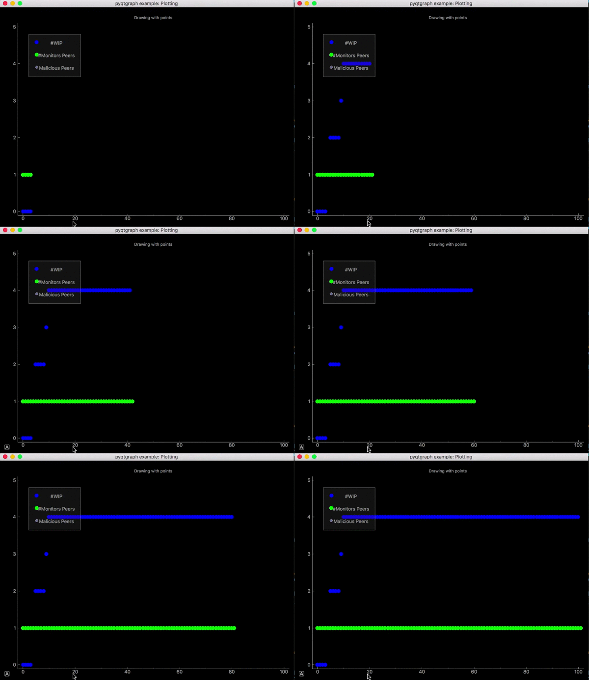
The purpose of this repository is to demonstrate plotting alternatives for the p2psp simulator. Since maplotlib is quite slow and sluggish and take quite much time for rendering. PyQtGraph is a very good alternative, as the sole purpose of using PyQtGraph is speed and improving real-time interactivity.
- pyqtgraph
- numpy
- PyQt 4.8+ or PySide
PyQtGraph use pyqt as backend so you would need to install pyqt. Visit http://www.pyqtgraph.org/ for other information.
I already have implemented, the whole Team Status plotting method (inside play.py) in pyqtgraph. And results are amazing. Earlier graphs were even not rendering properly on my Macintosh but now it is plotting like butter. Execute following command to plot team status.
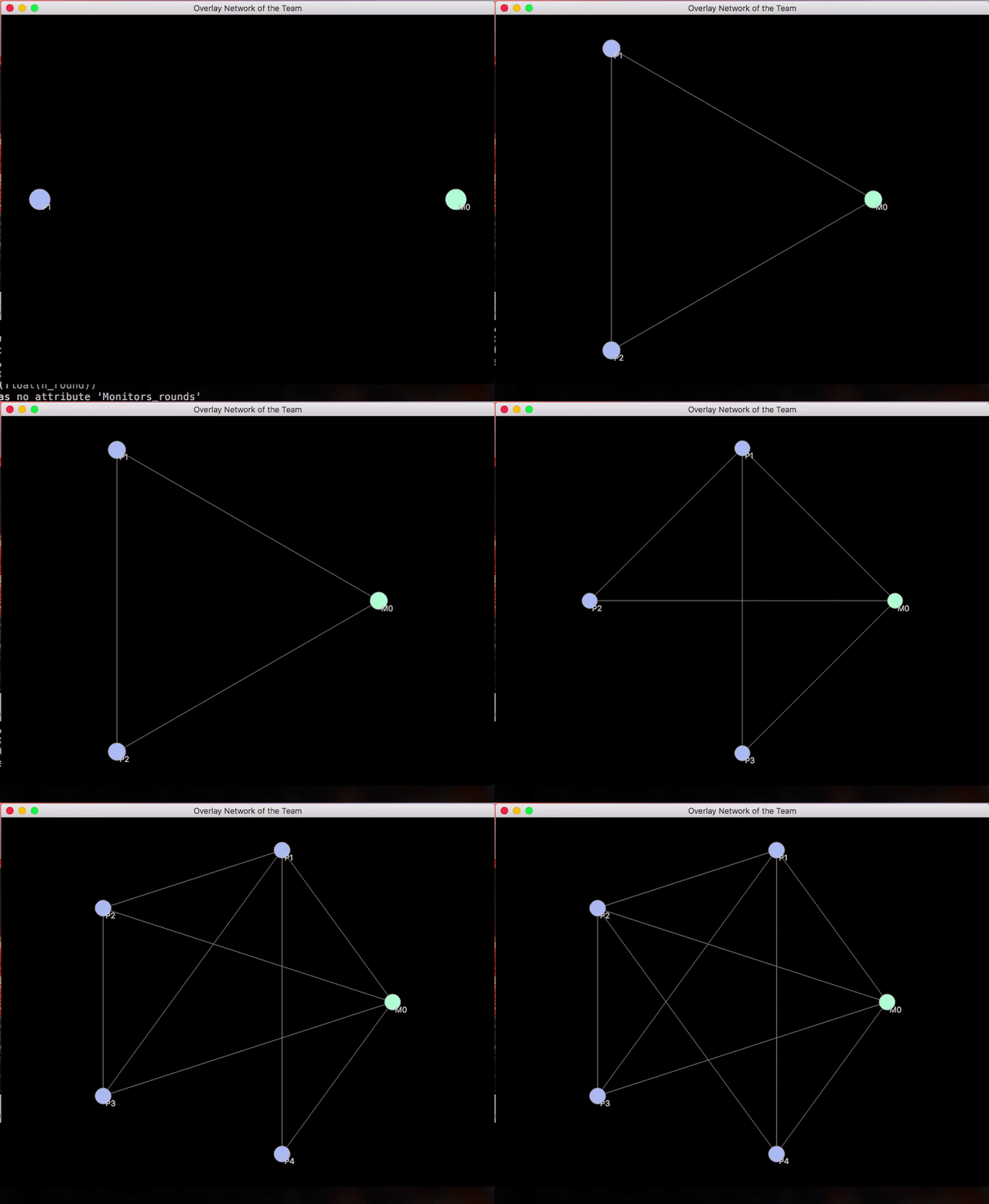
$ ./test.meIt shows how the network overlay evolves during the simulation.
Nodes represent the following entities:
- green: monitor/trusted peer (M/TPs)
- blue: regular peer (WIPs)
- red: malicious peer (MPs)
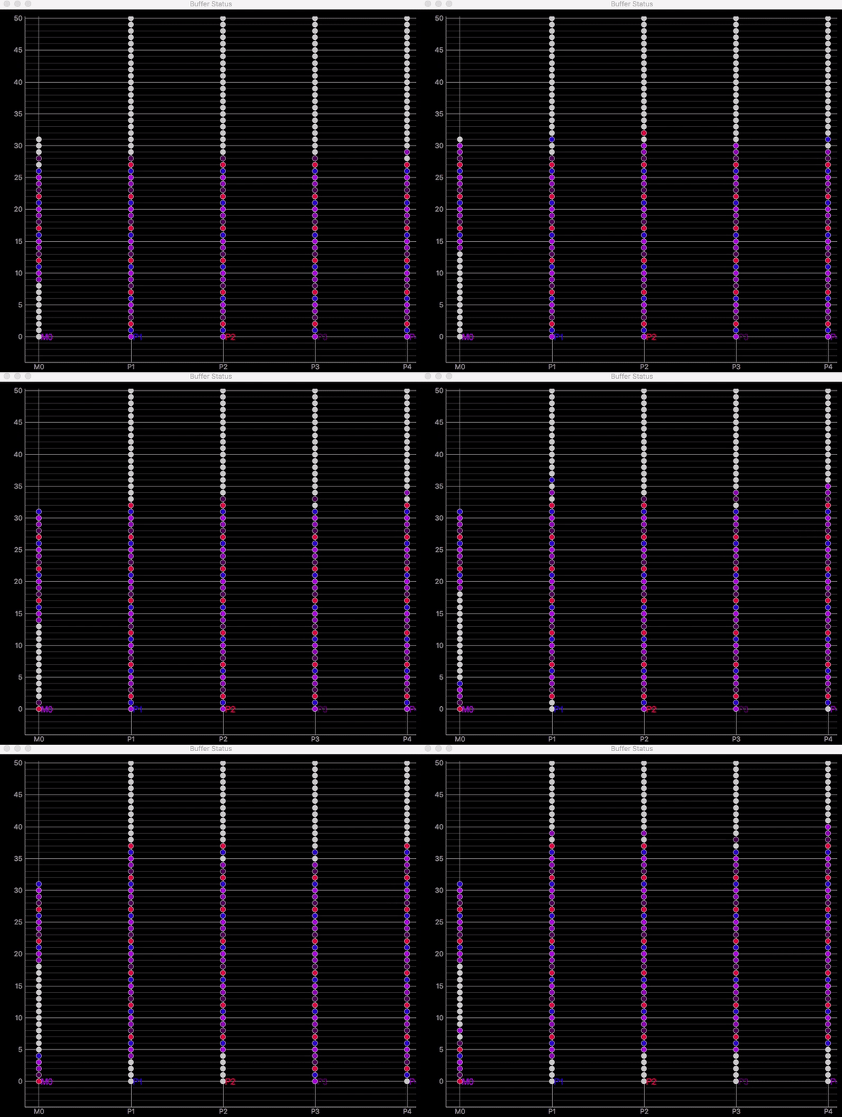
Buffer status for each peer. Each point in the chart represents a chunk in the buffer of a peer:
- black: chunk from the splitter.
- gray: chunk consumed.
- others: chunk from other peers. One different color for each peer.


