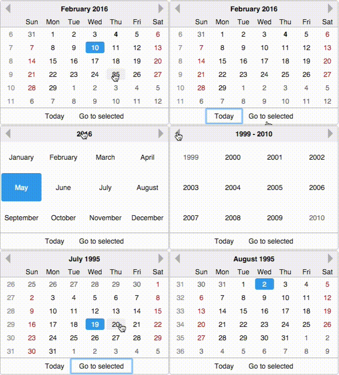
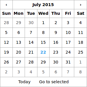
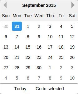
A date picker built especially for React, with love.
Click for LIVE DEMO!
$ npm install react-date-pickerRequire the css
require('react-date-picker/index.css');

var DatePicker = require('react-date-picker');
var date = '2014-10-10' //or Date.now()
function onChange(dateString, moment){
//...
}
<DatePicker
minDate='2014-04-04'
maxDate='2015-10-10'
date={date}
onChange={onChange}
/>Theming is done by requiring a specific css file.
By default, react-date-picker/index.css contains both structural styles and the default theme.
If you want to load a specific theme, make sure you load
require('react-date-picker/base.css')first (which contains only structural css rules), and then any css theme file. For now, there are two themes available:
react-date-picker/theme/default.cssreact-date-picker/theme/hackerone.css
require('react-date-picker/base.css');
require('react-date-picker/theme/hackerone.css');
var DatePicker = require('react-date-picker');

<DatePicker
    minDate='2014-04-04'
    maxDate='2015-10-10'
    date={date}
    onChange={onChange}
/>See changelog
Don't forget to include index.css or index.styl! ( require('react-date-picker/index.css') )
If you use the files from the dist directory, (eg: dist/react-date-picker.js), you will need to make sure you have both React and moment global variables, so make sure you include ReactJS and MomentJS
The preferred React version for react-date-picker is >=0.12. The initial version of react-date-picker worked with React 0.11.2 as well, but I do not intend to continue to support it, in order to be able to focus on advancing the current features and developing other high-quality React components.
For rendering the date picker with a custom locale, there are two options
The first option is to simply require the appropriate momentjs locale before require-ing react-date-picker
Example:
//make sure you require this first!
var nl = require('moment/locale/nl')

//and then require the date picker - it will use
//the locale you previously required

var DatePicker = require('react-date-picker')The second option is specifying the locale prop on the date picker. This assumes you have momentjs with the locale already into page (for example, you are using moment-with-locales.js)
<DatePicker locale="fr" />weekDayNames- either an array of week day names, or a function that returns an array. In case you specifyweekDayNamesas an array, it should have Sunday as the first day. If not specified, will be built withmomentjsusingmoment.weekdaysShort()weekStartDay: Number - Sun 0, Monday 1, etc... If not specified, the locale specific value will be uesd.locale: StringtodayText: StringgotoSelectedText: String
-
hideFooter: Boolean - by default footer is shown, so specify this to true if you don't want the footer -
hideHeader: Boolean - by default header is shown, so specify this to true if you don't want the header -
date: Date / String / Moment / Number - for controlled behavior. Make sure you also specify anonChangeprop -
range: Date / String / Moment / Number - for controlled behaviour make sure you also specify anonRangeChangeprop -
defaultDate: Date / String / Moment / Number - for uncontrolled behavior -
defaultRange: Date / String / Moment / Number - for uncontrolled behavior -
minDate: Date / String / Moment / Number -
maxDate: Date / String / Moment / Number -
dateFormat: String see moment.js formats. Default date format is 'YYYY-MM-DD' -
onChange: Function (dateText, moment, event) - called when the user selects a date -
onRangechange: Function (arrayText, arratMoment, event) - called when the user selects a range -
onSelect: Function(dateText, moment, view) - called when the user selects a year/month -
onNav: Function(dateText, moment, view, direction) - called when the user navigates to the next/previous month/year/decade. -
renderDay: Function - (optional) A function that should return a React DOM for the day cell. The first param is the props object. You can use this to have full control over what gets rendered for a day. -
onRenderDay: Function - (optional) A function that can manipulate the props object for a day, and SHOULD return a new props object. Use this for custom day styling. You can use this to take full control over the styles/css classes/attributes applied to the day cell in the month view. -
views: Object - an object that maps view names to factory functions. See the exportedDatePicker.views -
weekNumbers: Boolean (default false) - Shows weeknumbers - it's locale aware. -
weekNumberName: String / ReactElement (defaults to '') - What to render in the view header cell, above all week numbers. -
renderWeekNumber: Function - A function to render week number. Has the same behavior asrenderDay. -
onWeekChange: Function(weekDates, event) - When a week is clicked you get an array of the dates in that week -
highlightRangeOnMouseMove: Boolean (default true) - when hover mouse over a date, shows the range that will be selected if the date is clicked
dayFormat- The format in which days should be rendered (on the MonthView)monthFormat- The format in which months should be rendered (on the YearView)yearFormat- The format in which years should be rendered (on the DecadeView)
-
defaultViewDate: Date / String / Moment / Number - a date for the period to show in the picker. If none specified, defaults todateor to the current date. -
viewDate: Date / String / Moment / Number - controlled version fordefaultViewDate -
onViewDateChange: Function(dateText, moment , view) - called when navigating to another viewDate. -
defaultView: String - the view to render initially in the datepicker - if no defaultView is specified, the "month" view is rendered. Possible values: "month", "year", "decade". -
view: String - controlled version fordefaultView. -
onViewChange: Function - function called when the view is changed. If using the controlledviewversion, make sure you update theviewprop in this function if you want to navigate to another view as expected. -
navOnDateClick: Boolean - defaults to true. If false, will not navigate to the date that was clicked, even if that date is in the prev/next month -
alwaysShowPrevWeekBoolean - defaults to false. If false, when the month starts on the first day of the week (weekStartDay), no days from the previous month will be displayed. Otherwise the first row will display the last week from the previous month.
highlightWeekends: Boolean - defaults to false. By default, weekend days have the'dp-weekend'className, but this will also add the'dp-weekend-hightlight'className with a default redish color.
In order to change the date-picker border width/color with css, you'll have to specify a different border for the .date-picker and .date-picker .dp-cell classes.
You'll also probably want .dp-cell:first-child left border to be 0 and .dp-cell:last-child right border to be 0
.date-picker,
.date-picker .dp-cell {
    border: 1px solid red;
}
.date-picker .dp-cell:first-child {
    border-left: 0px;
}
.date-picker .dp-cell:last-child {
    border-right: 0px;
}function onRenderDay(props){
if (props.date.isBefore('2010-01-01')){
props.className += ' invalid'
}
props.style.border = '1px solid red'
return props
}
<DatePicker
onChange={this.onChange}
onRenderDay={onRenderDay}
/>When contributing, please work on the src dir.
You'll need to run the following commands:
$ npm run dev
# starts webpack-dev-server, which does all the bundling and live reloading
Now navigate to localhost:8080 With this setup, you have an environment which live-reloads all your changes, so you have a rapid development cycle.
In order to build a new production version, make sure you run npm run build (it builds the lib directory from the src directory, it concats all files and builds the dist directory, and also prepares the css files)
react-date-picker uses the awesome moment.js library ( Big thanks!)
If you don't use npm you can include any of the following:
dist/react-date-picker.js- the full sources. NOTE: You'll need to includeReactseparatelydist/react-date-picker.min.js- minified & optimized version. NOTE: You'll need to includeReactseparatelydist/react-date-picker.nomoment.js- the full sources. NOTE: You'll need to includeReactANDmoment.jsseparatelydist/react-date-picker.nomoment.min.js- minified & optimized version. NOTE: You'll need to includeReactANDmoment.jsseparately
For testing, it is required that you have io.js installed. The tests rely on https://www.npmjs.com/package/jsdom for a DOM implementation, which only works in io.js and not node.js
Before running tests, make sure you refresh the lib folder, which is built from the src folder (jsx is transpiled to normal js) by doing
$ npm run libNow you can safely run tests with
$ npm testor
$ makeFor watch mode, run
$ make test-wreact-date-picker is setup with CircleCI https://circleci.com/gh/zippyui/react-date-picker so every time a test fails we are notified on the failure.


