🚧 🚧 🚧 pickers-inputs is deprecated. Due to the lack of maintainers and increased code complexity, pickers-inputs is now deprecated in favor of react-date-time-picker-tz.
You can find the old code of pickers-inputs here.
React component library for handling date, time, and dateTime pickers with zone handling and customizable formats.
You can install the package via npm or yarn:
npm install pickers-inputs
# or
yarn add pickers-inputsImport InputPicker from pickers-inputs;
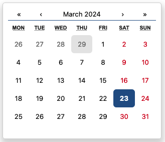
import { InputPicker, TimePicker } from "pickers-inputs";Add InputPicker like this:
<InputPicker
  type="date"
  value={selectedDate}
  onChange={(newValue) => {
    setSelectedDate(newValue);
  }}
/>
Add TimePicker like this:
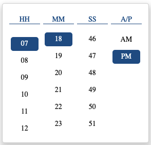
<TimePicker
  value={"2024-03-30 04:06:16 PM Asia/Calcutta"}
  onChange={(v) => {
    console.log(v);
  }}
  format="yyyy-LL-dd hh:mm:ss a z"
  outputZone="Europe/Moscow"
/>| Prop | Type | Description |
|---|---|---|
| type | "date", "time", "dateTime" | Select picker type. |
| value | string | Input value. |
| onChange | (value: string) => void | Fuction triggered when the value changes. Receives the new value as an argument. |
| format | string | Format the displayed value.(Input and output format will be the same.) |
| onHide | () => void | Fuction triggered when the picker is hidden. |
| onShow | () => void | Fuction triggered when the picker is shown. |
| mainContainerClassName | string | Class name(s) that will be added along with "main-box" to the main picker element. |
| mainContainerStyles | CSSProperties | Inline styles for the main container element. |
| selectedStyle | CSSProperties | Styles for the selected element. |
| outputZone | string | Specifies the output value based on the zone |