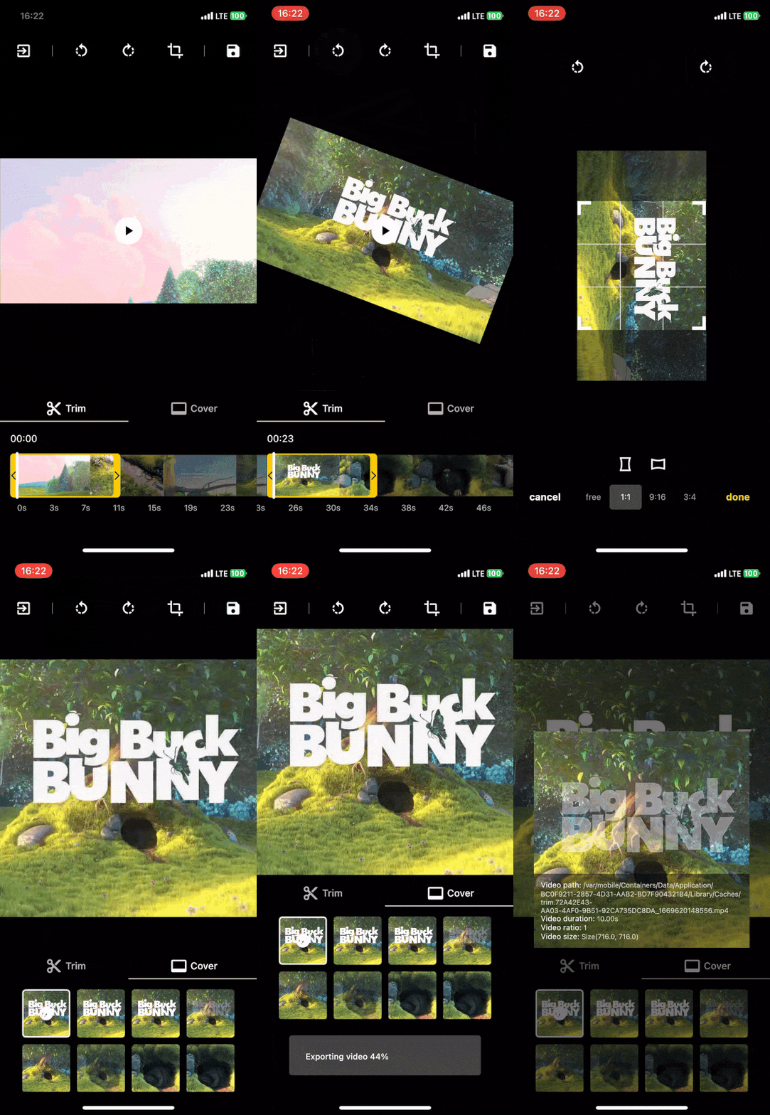
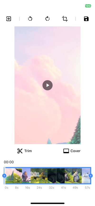
A video editor that allows to edit (trim, crop, rotate and scale) and choose a cover with a very flexible UI design.
The exportation is made using ffmpeg_kit_flutter library.
This library is written in Dart only but uses external packages such as ffmpeg_kit_flutter and video_thumbnail, which makes it available only on iOS and Android plaforms for now.
Following steps will help you add this library as a dependency in your flutter project.
- Run
flutter pub add video_editor, or add video_editor topubspec.yamlfile manually.
dependencies:
video_editor: ^2.1.0- Import the package in your code:
import 'package:video_editor/video_editor.dart';Since v1.3.0, video_editor uses ffmpeg_kit_flutter main release which supports the latest features. (More info on flutter FFmepeg kit)
Those Android API level and iOS deployment target are required to uses this package. If you're planing to target older devices, check about the LTS release.
| Android API Level |
iOS Minimum Deployment Target |
|---|---|
| 24 | 12.1 |
(The UI Design is fully customizable on the example)
| Example app running on an Iphone 11 pro | Customization example, light mode |
|---|---|
 |
 |
| Function | Description |
|---|---|
| initialize(aspectRatio) | Init the controller parameters, the video, the trim and the cover, call cropAspectRatio |
| rotate90Degrees(RotateDirection) | Rotate the video by 90 degrees in the direction provided |
| preferredCropAspectRatio | Update the aspect ratio of the crop area |
| setPreferredRatioFromCrop | Update the aspect ratio to the current crop area ratio |
| cropAspectRatio | Update the aspect ratio + update the crop area to the center of the video size |
| updateCrop | Update the controller crop min and max values |
| updateTrim | Update the controller trim min and max values |
| getMetaData(onCompleted) | Return the metadata of the video file in onCompleted function |
| exportVideo(onCompleted) | Return the generated video with the controller parameters in onCompleted function |
| extractCover(onCompleted) | Return the selected cover with the controller parameters in onCompleted function |
| Getter | Description |
|---|---|
| Duration startTrim | The start value of the trimmed area |
| Duration endTrim | The end value of the trimmed area |
| Duration trimmedDuration | The duration of the selected trimmed area |
| bool isTrimmed | Set to true when the trimmed values are not the default video duration |
| bool isTrimming | Set to true when startTrim or endTrim is changing |
| Duration maxDuration | The maxDuration possible for the trimmed area |
| Duration minDuration | The minDuration possible for the trimmed area |
| Offset minCrop | The top left position of the crop area (between 0.0 and 1.0) |
| Offset maxCrop | The bottom right position of the crop area (between 0.0 and 1.0) |
| Size croppedArea | The actual Size of the crop area |
| double? preferredCropAspectRatio | The preferred crop aspect ratio selected |
| bool isRotated | Set to true when the rotation is different to 0 |
| int rotation | The rotation angle set 0, 90, 180 and 270 |
| int cacheRotation | The sum of all the rotation applied in the editor |
| CoverData? selectedCoverVal | The selected cover thumbnail that will be used to export the final cover |
Click to expand widgets documentation
This widget is used to enable the crop actions on top of the video (CropGridViewer.edit), or only to preview the cropped result (CropGridViewer.preview).
| Param | Description |
|---|---|
| required VideoEditorController controller | The controller param is mandatory so every change in the controller settings will propagate in the crop view |
| EdgeInsets margin | The amount of space by which to inset the crop view, not used in preview mode |
Display the trimmer containing video thumbnails with rotation and crop parameters.
| Param | Description |
|---|---|
| required VideoEditorController controller | The controller param is mandatory so every change in the controller settings will propagate in the trim slider view |
| double height = 0.0 | The height param specifies the height of the generated thumbnails |
| double quality = 10 | The quality param specifies the quality of the generated thumbnails, from 0 to 100 (more info) |
| double horizontalMargin = 0.0 | The horizontalMargin param specifies the horizontal space to set around the slider. It is important when the trim can be dragged (controller.maxDuration < controller.videoDuration) |
| Widget? child | The child param can be specify to display a widget below this one (e.g: TrimTimeline) |
| bool hasHaptic = true | The hasHaptic param specifies if haptic feed back can be triggered when the trim touch an edge (left or right) |
| double maxViewportRatioo = 2.5 | The maxViewportRatio param specifies the upper limit of the view ratio |
Display the video timeline.
| Param | Description |
|---|---|
| required VideoEditorController controller | The controller param is mandatory so depending on the controller.maxDuration, the generated timeline will be different |
| double quantity = 8 | Expected quantity of elements shown in the timeline |
| EdgeInsets padding = EdgeInsets.zero | The padding param specifies the space surrounding the timeline |
| String localSeconds = 's' | The String to represents the seconds to show next to each timeline element |
| TextStyle? textStyle | The TextStyle to use to style the timeline text |
Display a couple of generated covers with rotation and crop parameters to updated the selected cover.
| Param | Description |
|---|---|
| required VideoEditorController controller | The controller param is mandatory so every change in the controller settings will propagate in the cover selection view |
| double size = 0.0 | The size param specifies the max size of the generated thumbnails |
| double quality = 10 | The quality param specifies the quality of the generated thumbnails, from 0 to 100 (more info) |
| double horizontalMargin = 0.0 | The horizontalMargin param need to be specify when there is a margin outside the crop view, so in case of a change the new layout can be computed properly. |
| int quantity = 5 | The quantity param specifies the quantity of thumbnails to generate |
| Wrap? wrap | The wrap widget to use to customize the thumbnails wrapper |
| Function? selectedCoverBuilder | To returns how the selected cover should be displayed |
Display the selected cover with rotation and crop parameters.
| Param | Description |
|---|---|
| required VideoEditorController controller | The controller param is mandatory so every change in the controller settings will propagate the crop parameters in the cover view |
| String noCoverText = 'No selection' | The noCoverText param specifies the text to display when selectedCover is null |
Click to expand style documentation
You can create your own CropStyle class to customize the CropGridViewer appareance.
| Param | Description |
|---|---|
| Color croppingBackground = Colors.black.withOpacity(0.48) | The croppingBackground param specifies the color of the paint area outside the crop area when copping |
| Color background = Colors.black | The background param specifies the color of the paint area outside the crop area when not copping |
| double gridLineWidth = 1 | The gridLineWidth param specifies the width of the crop lines |
| Color gridLineColor = Colors.white | The gridLineColor param specifies the color of the crop lines |
| int gridSize = 3 | The gridSize param specifies the quantity of columns and rows in the crop view |
| Color boundariesColor = Colors.white | The boundariesColor param specifies the color of the crop area's corner |
| Color selectedBoundariesColor = kDefaultSelectedColor | The selectedBoundariesColor param specifies the color of the selected crop area's corner |
| double boundariesLength = 20 | The boundariesLength param specifies the length of the crop area's corner |
| double boundariesWidth = 5 | The boundariesWidth param specifies the width of the crop area's corner |
You can create your own TrimStyle class to customize the TrimSlider appareance.
| Param | Description |
|---|---|
| Color background = Colors.black.withOpacity(0.6) | The background param specifies the color of the paint area outside the trimmed area |
| Color positionLineColor = Colors.red | The positionLineColor param specifies the color of the line showing the video position |
| double positionLineWidth = 2 | The positionLineWidth param specifies the width of the line showing the video position |
| Color lineColor = Colors.white | The lineColor param specifies the color of the borders around the trimmed area |
| Color onTrimmingColor = kDefaultSelectedColor | The onTrimmingColor param specifies the color of the borders around the trimmed area while it is getting trimmed |
| Color onTrimmedColor = kDefaultSelectedColor | The onTrimmedColor param specifies the color of the borders around the trimmed area when the trimmed parameters are not default values |
| double lineWidth = 2 | The lineWidth param specifies the width of the borders around the trimmed area |
| TrimSliderEdgesType borderRadius = 5 | The borderRadius param specifies the border radius around the trimmer |
| double edgesType = TrimSliderEdgesType.bar | The edgesType param specifies the style to apply to the edges (left & right) of the trimmer |
| double edgesSize | The edgesSize param specifies the size of the edges behind the icons |
| Color iconColor = Colors.black | The iconColor param specifies the color of the icons on the trimmed area's edges |
| double iconSize = 25 | The iconSize param specifies the size of the icon on the trimmed area's edges |
| IconData? leftIcon = Icons.arrow_left | The leftIcon param specifies the icon to show on the left edge of the trimmed area |
| IconData? rightIcon = Icons.arrow_right | The rightIcon param specifies the icon to show on the right edge of the trimmed area |
You can create your own CoverStyle class to customize the CoverSelection appareance.
| Param | Description |
|---|---|
| Color selectedBorderColor = Colors.white | The selectedBorderColor param specifies the color of the border around the selected cover thumbnail |
| double borderWidth = 2 | The borderWidth param specifies the width of the border around each cover thumbnails |
| double borderRadius = 5.0 | The borderRadius param specifies the border radius of each cover thumbnail |
Since v1.3.0, video_editor uses ffmpeg_kit_flutter main release which supports the latest features. If you want to support a wider range of devices you should use the LTS release. more info
To do this, add this to your pubspec.yaml:
dependency_overrides:
  ffmpeg_kit_flutter_min_gpl: ^5.1.0-LTS
On Android, if it gives a minSdkVersion error, try adding the following in /android/app/src/main/AndroidManifest.xml.
<manifest xmlns:android=... package=... xmlns:tools="http://schemas.android.com/tools" >
  <uses-sdk tools:overrideLibrary="com.arthenica.ffmpegkit.flutter"/>
</manifest>Many thanks to seel-channel who is the original creator of this library.


