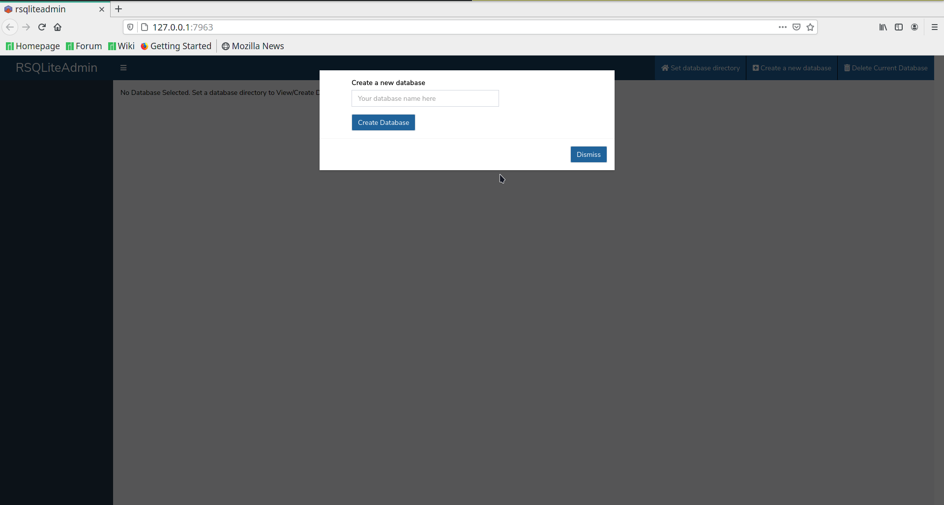
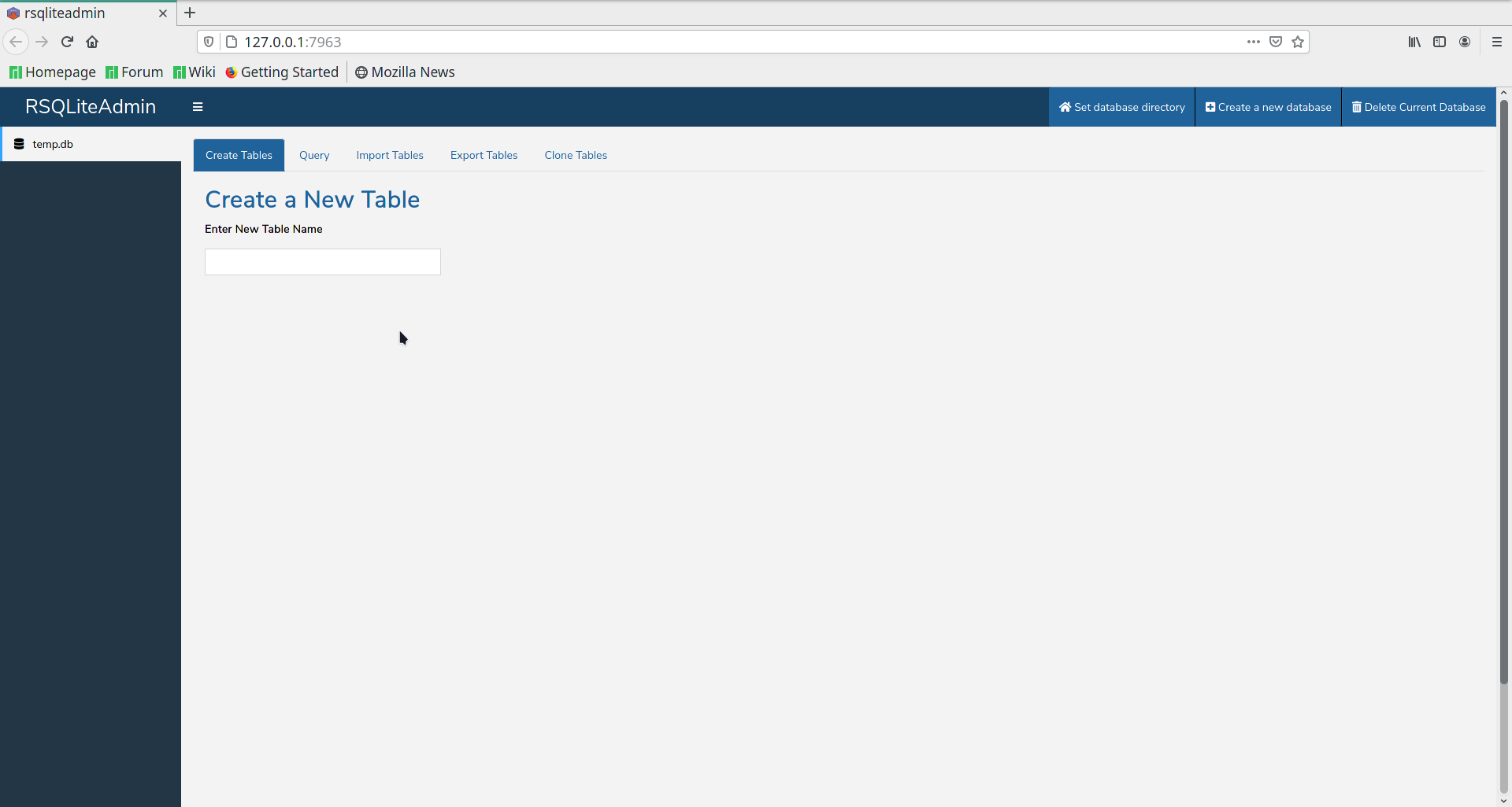
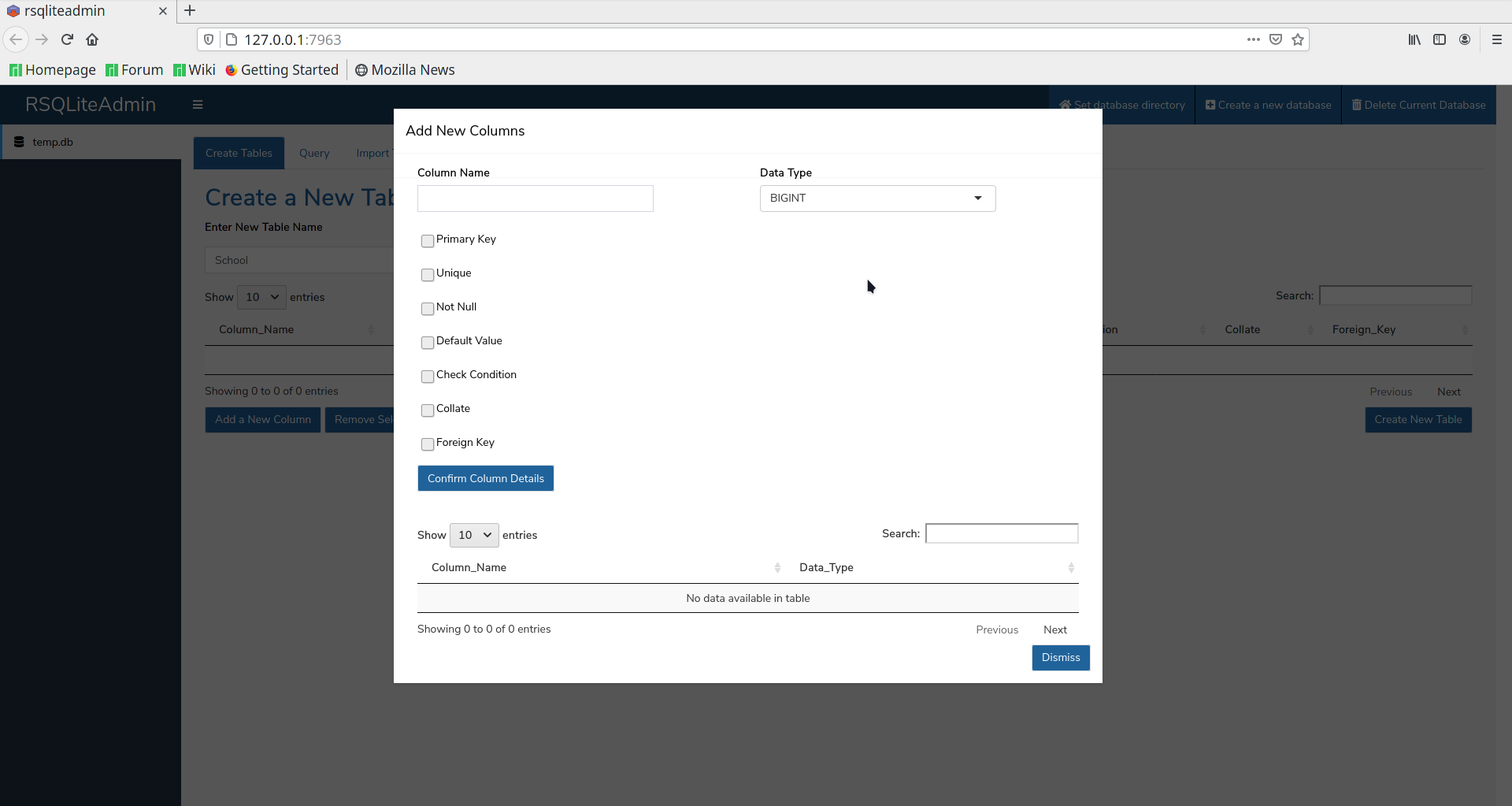
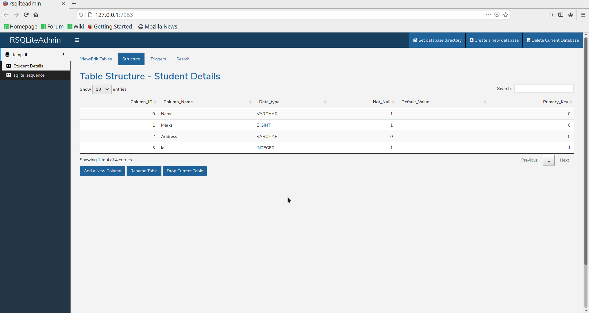
Install the package rsqliteadmin from CRAN and play around with all the features. Create a database, add a table and import some data. Edit, search and export it.
Run the app.
rsqliteadmin::run_rsqliteadmin()
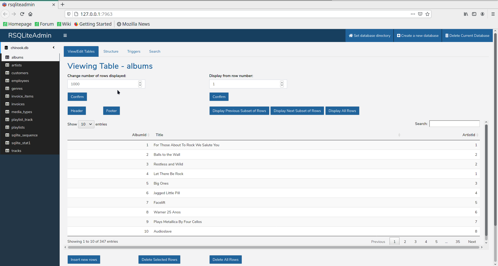
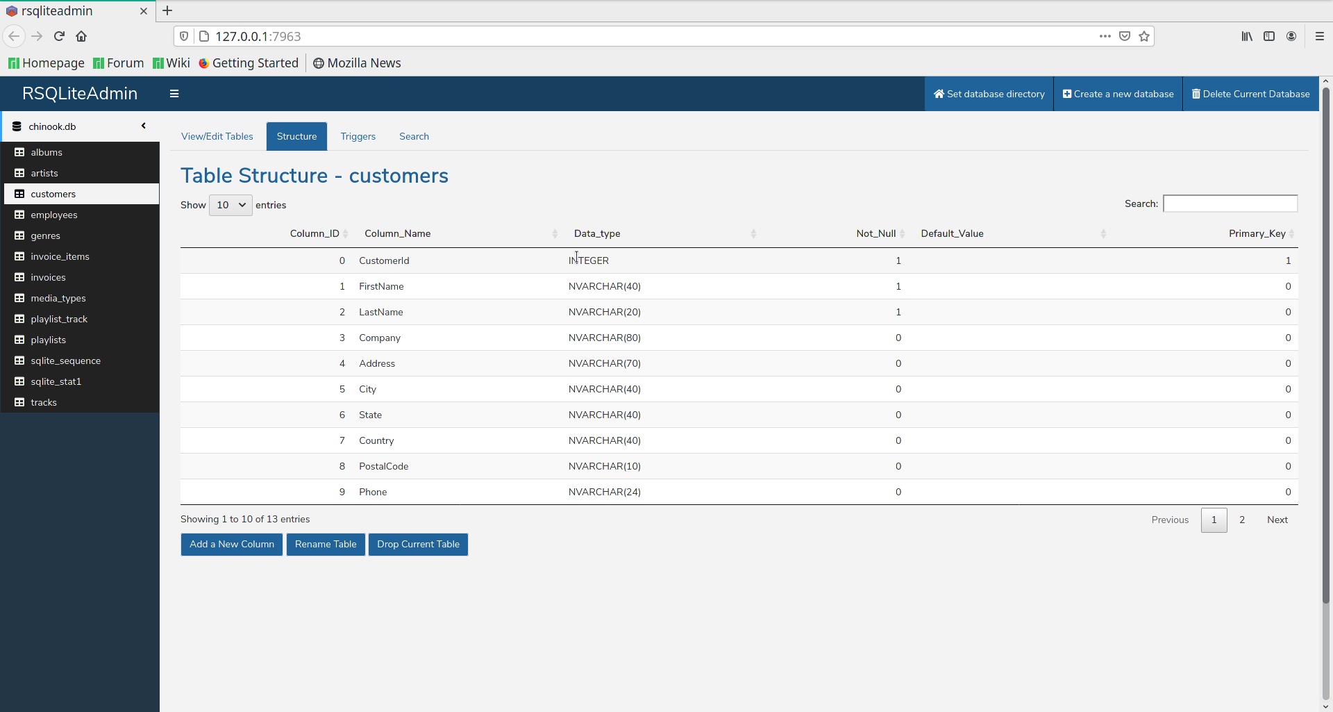
Following are the screenshots of databas and tables I have created in RSQLiteAdmin
We can import the database by setting the database directory to the folder containing the sqlite db. Following are screenshots of a digital media store DB I downloaded from https://www.sqlitetutorial.net/sqlite-sample-database/ and have imported in RSqliteAdmin.
Plot a time-series line chart on a dataset of your choice with different variables in a single chart. Customize it to make it clear and insightful.
In this test I have used the US economics time series dataset. Initially I have loaded the ggplot2 and set the minimalistic theme
> library(ggplot2)
> theme_set(theme_minimal())

> head(economics)
# A tibble: 6 x 6
  date         pce    pop psavert uempmed
  <date>     <dbl>  <dbl>   <dbl>   <dbl>
1 1967-07-01  507. 198712    12.6     4.5
2 1967-08-01  510. 198911    12.6     4.7
3 1967-09-01  516. 199113    11.9     4.6
4 1967-10-01  512. 199311    12.9     4.9
5 1967-11-01  517. 199498    12.8     4.7
6 1967-12-01  525. 199657    11.8     4.8
# … with 1 more variable: unemploy <dbl>
Using the tidyverse package to prepare the data and gather the two variables ‘psavert’ and ‘uempmed’ into key-value pairs.
library("tidyverse")
> # For data preparation
> library("tidyverse")
── Attaching packages ──────── tidyverse 1.3.0 ──
✓ tibble  3.1.0     ✓ dplyr   1.0.5
✓ tidyr   1.1.3     ✓ stringr 1.4.0
✓ readr   1.4.0     ✓ forcats 0.5.1
✓ purrr   0.3.4
── Conflicts ─────────── tidyverse_conflicts() ──
x dplyr::filter() masks stats::filter()
x dplyr::lag()    masks stats::lag()
> df <- economics %>%
+     select(date, psavert, uempmed) %>%
+     gather(key = "variables", value = "value", -date)
> head(df)
# A tibble: 6 x 3
  date       variables value
  <date>     <chr>     <dbl>
1 1967-07-01 psavert    12.6
2 1967-08-01 psavert    12.6
3 1967-09-01 psavert    11.9
4 1967-10-01 psavert    12.9
5 1967-11-01 psavert    12.8
6 1967-12-01 psavert    11.8
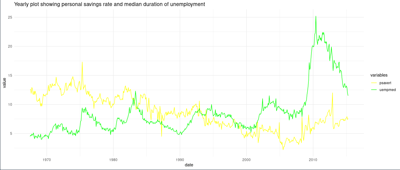
Visualise the data showing personal savings rate and median duration of unemployment throughout the years using geom_line() from ggplot2 package and customize them using scale_color_manual() and ggtitle() to further add data labels and titles to the plot respectively.
> # Data Visualization
> ggplot(df, aes(x = date, y = value)) +
+     geom_line(aes(color = variables)) +
+     scale_color_manual(values = c("yellow", "green")) + ggtitle("Yearly plot showing personal savings rate and median duration of unemployment")
Plot created by the above code is shown below:
