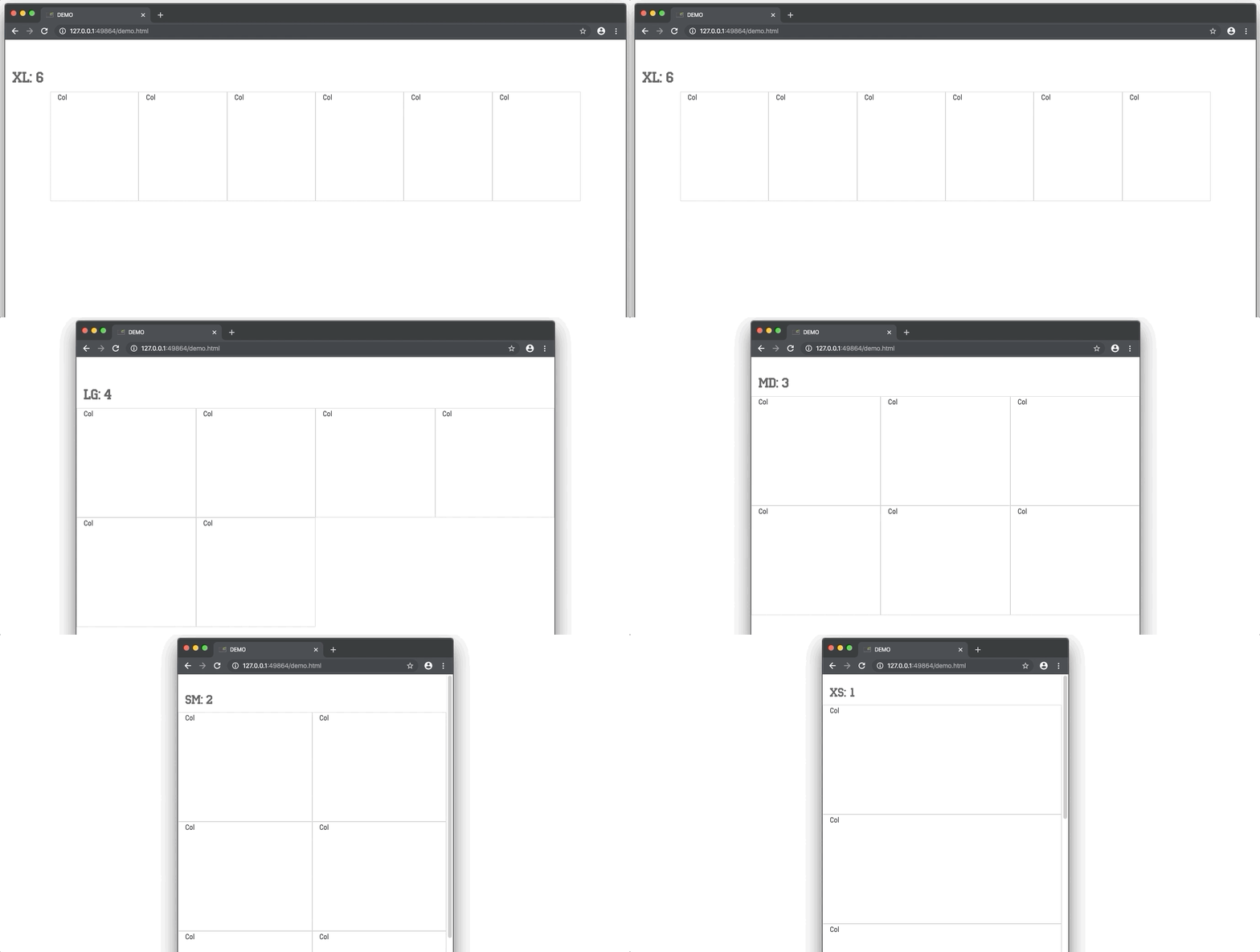
Tired of amount of classes you should apply to each column in bootstrap?
<div class="container">
    <div class="row">
        <div class="col-sm-6 col-md-4 col-lg-3 col-lg-2">Col</div>
        <div class="col-sm-6 col-md-4 col-lg-3 col-lg-2">Col</div>
        <div class="col-sm-6 col-md-4 col-lg-3 col-lg-2">Col</div>
        <div class="col-sm-6 col-md-4 col-lg-3 col-lg-2">Col</div>
        <div class="col-sm-6 col-md-4 col-lg-3 col-lg-2">Col</div>
        <div class="col-sm-6 col-md-4 col-lg-3 col-lg-2">Col</div>
    </div>
</div>Control number of columns by adding class to your .row
Define at least number of columns per line for extra small and small screens, or number for all breakpoint ranges:
<div class="container">
    <div class="row xs-up-1 sm-up-2 md-up-3 lg-up-4 xl-up-6">
        <div class="col">Col</div>
        <div class="col">Col</div>
        <div class="col">Col</div>
        <div class="col">Col</div>
        <div class="col">Col</div>
        <div class="col">Col</div>
    </div>
</div>

<!--or without specifying all the ranges: 1 col for xs, 2 for sm, md, 4 for lg and up-->
<div class="container">
    <div class="row xs-up-1 sm-up-2 lg-up-4">
        <div class="col">Col</div>
        <div class="col">Col</div>
        <div class="col">Col</div>
        <div class="col">Col</div>
        <div class="col">Col</div>
        <div class="col">Col</div>
    </div>
</div>- Include
bootstrap-block.cssfrom/dist/directory of this repository. Minified version is also available. - Add "up-to" classes to your row which defines number of columns per line on particular breakpoint
- That's it
5, 7, 11 columns in row? No problem!
.col-xs classes was removed from Bootstrap 4. But you still need to specify amount of columns per line for the screen width <576px using row xs-up-N classes to prevent horizontal stacking.
To prevent this behavior when you don't want to use extra small classes replace the xs-section in css file with this code:
@media (max-width: 575.98px) {
	div[class*="-up-"] {
		-webkit-flex-wrap: wrap;
		-moz-flex-wrap: wrap;
		-ms-flex-wrap: wrap;
		flex-wrap: wrap
	}
	div[class*="-up-"] > .col {
		-webkit-box-flex: 0 0 100%;
		-moz-box-flex: 0 0 100%;
		-webkit-flex: 0 0 100%;
		-ms-flex: 0 0 100%;
		flex: 0 0 100%;
		max-width: 100%
	}
}
That will made all the columns in row 100% width on the screen <576px. Be careful with class names containing "-up-" substring in this case.
By default, css is compiled with default bootstrap breakpoints. All the breakpoints, except xs uses min-width declarations.
$breakpoints:
(xs: 576px,
sm: 768px,
md: 992px,
lg: 1200px);
Feel free to change source SCSS from /src/ directory of this repository
Mixins for responsive breakpoints was taken from https://glennmccomb.com/articles/useful-sass-scss-media-query-mixins-for-bootstrap/
Donate a couple of bucks on paypal if you wanted.
